❌

Normal view

Stops Along the Path of Totality

12 August 2026 at 05:01
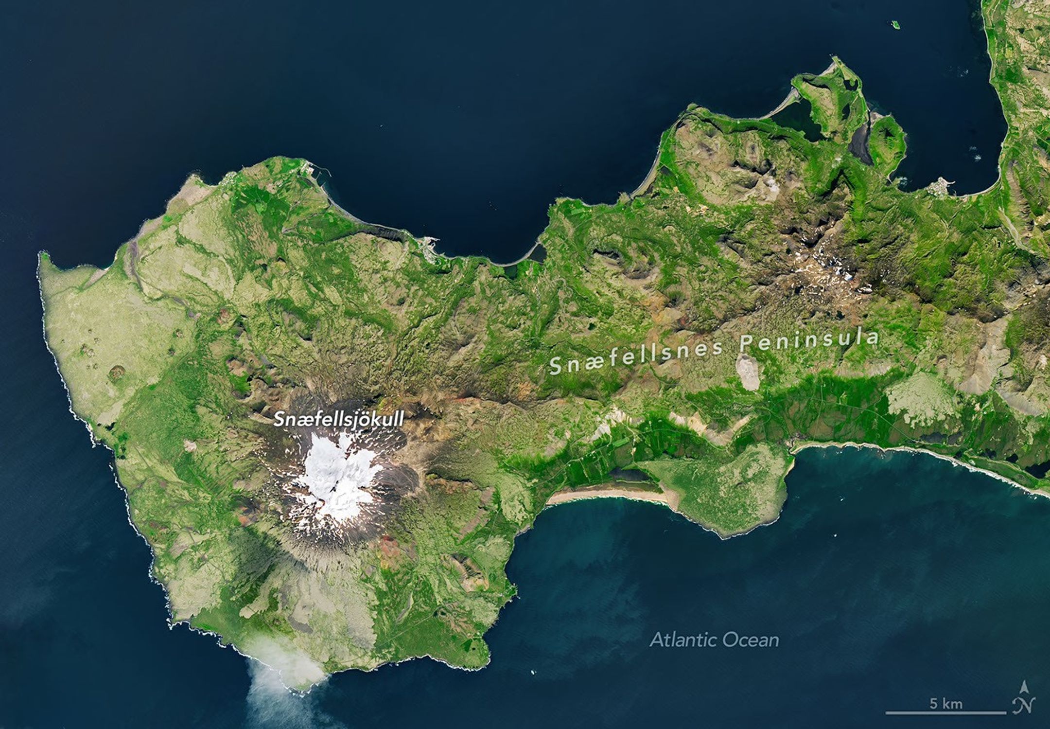
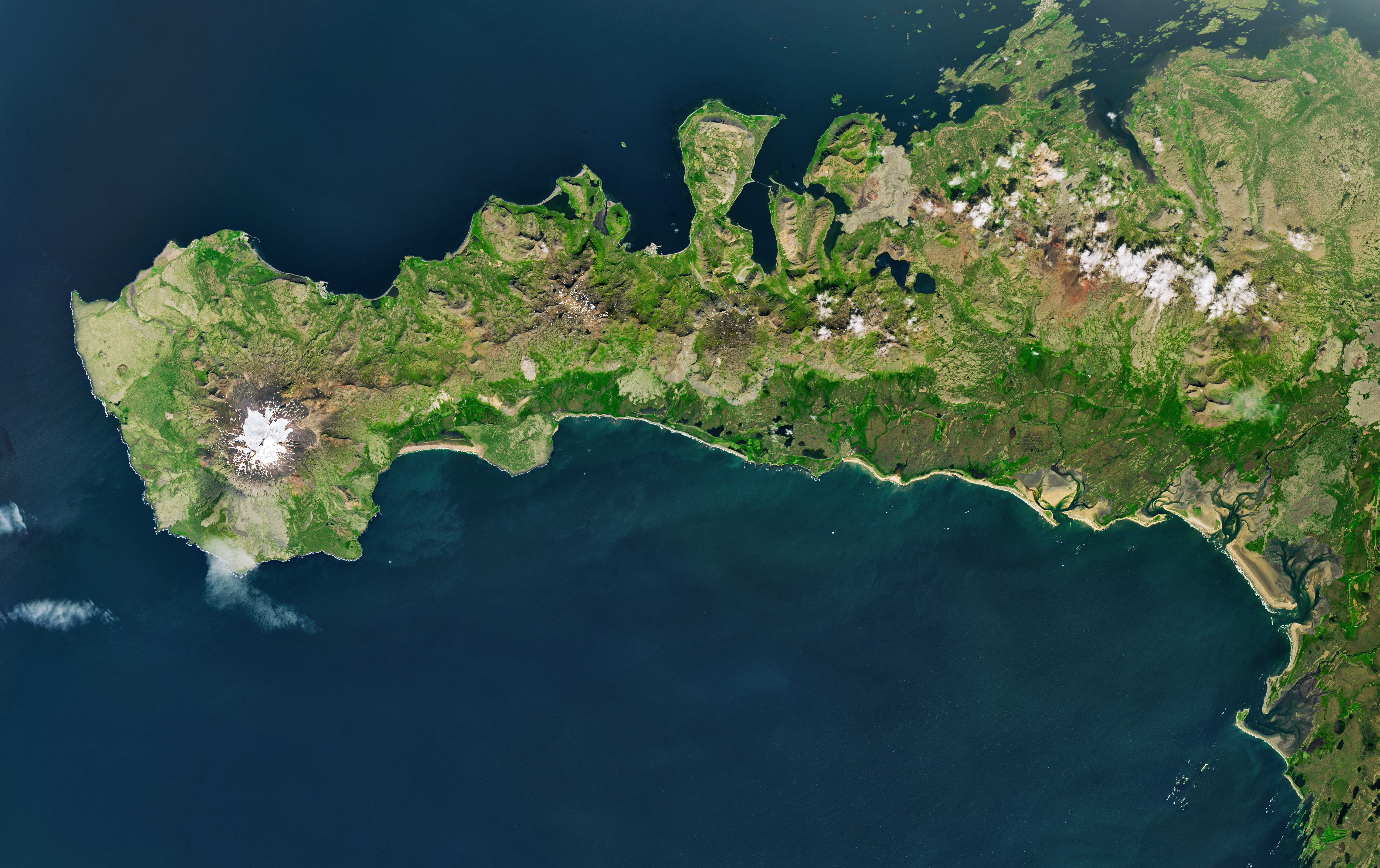
A peninsula in Iceland stretches across the image to the left. A prominent glacier-capped volcano sits near its western end.
The glacier-capped Snæfellsjökull volcano is the defining feature of Iceland’s Snæfellsnes peninsula, shown in this image acquired with the OLI (Operational Land Imager) on Landsat 9 on July 25, 2026.
NASA Earth Observatory/Michala Garrison

The Sun, Moon, and Earth align on August 12, 2026, to produce a total solar eclipse. When this celestial event last occurred, on April 8, 2024, the path of totality stretched across North America, giving millions the chance to glimpse the Sun’s corona. In 2026, the viewing locales are more limited; only a handful of land areas in the Northern Hemisphere, including parts of Iceland and Spain, fall within the path of totality.

On August 12, the Moon’s shadow will first cross over the Arctic Circle from northern Russia and then track along the eastern side of Greenland. At about 5:45 p.m. local time in Iceland (17:45 Universal Time), the country’s western fringes—including the Snæfellsnes peninsula, shown in the Landsat image above—will begin to experience totality. The greatest eclipse will occur near this sparsely populated peninsula when the Moon appears the largest and covers more of the Sun.
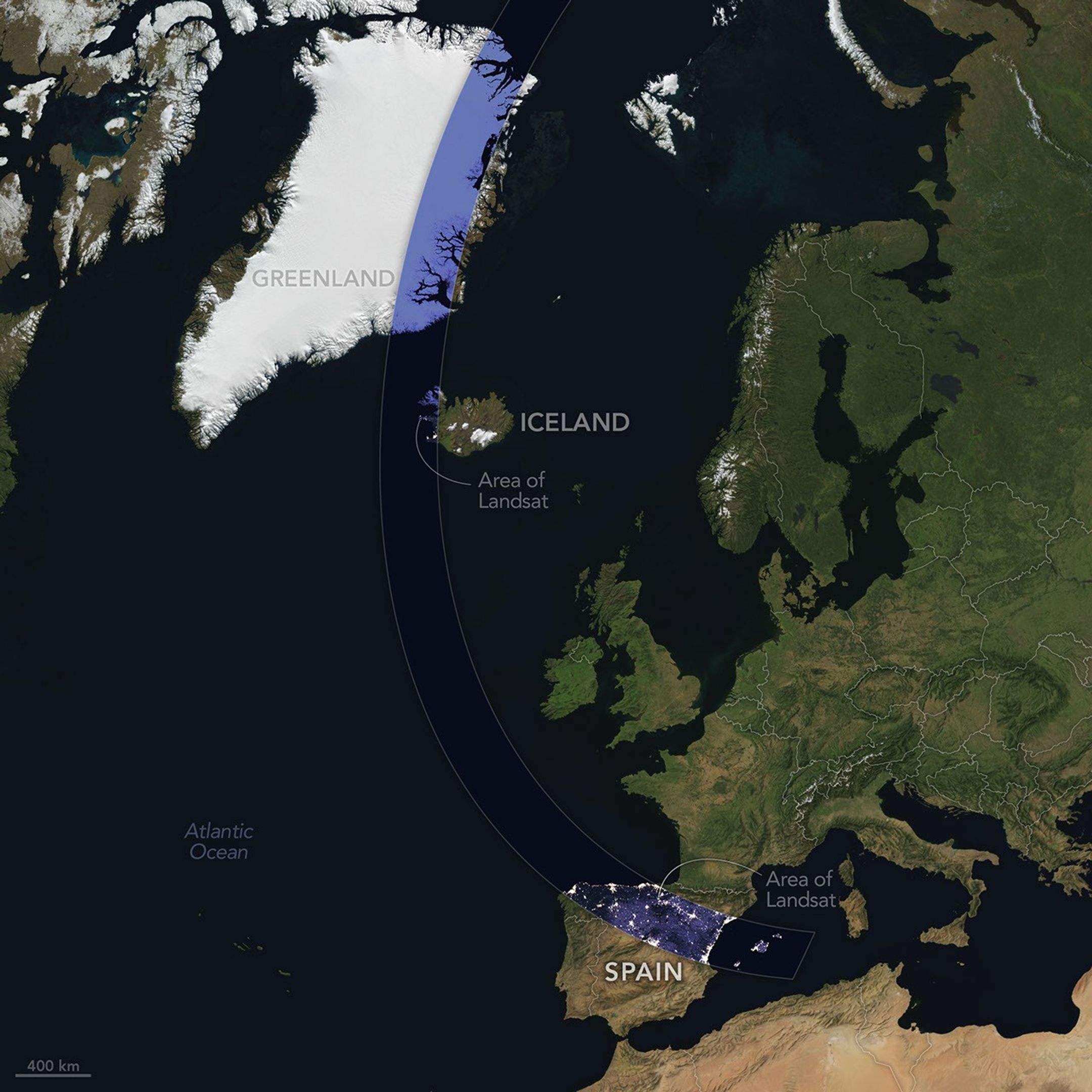
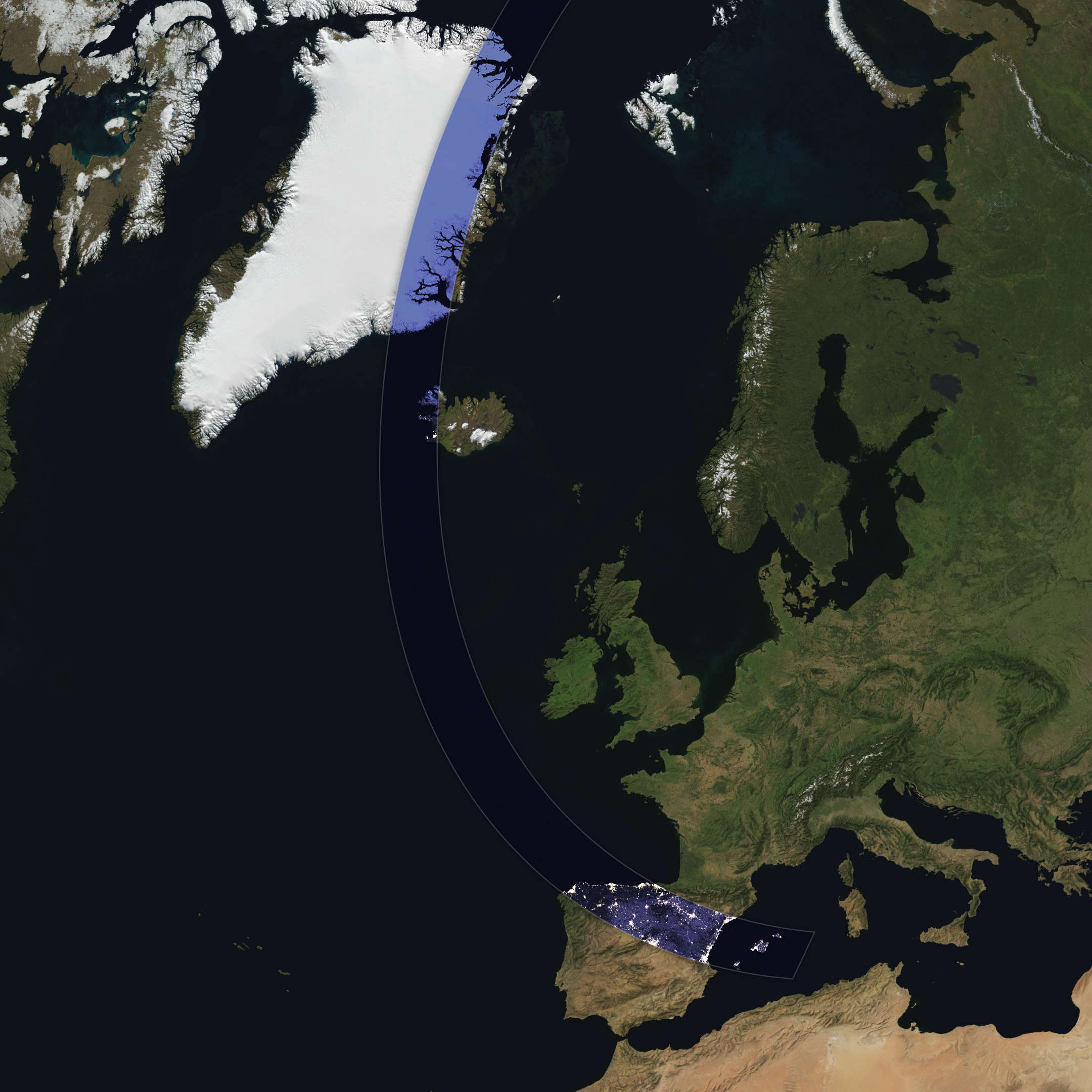
A map shows the path of totality of the solar eclipse on August 12, 2026, arcing across Greenland, Iceland, the North Atlantic, and Spain.
The path of totality of the solar eclipse on August 12, 2026, spans Greenland, Iceland, and Spain. The base imagery for the map comes from Blue Marble: Next Generation, with data from Black Marble shown in the path of totality. Blue Marble is built from scenes captured by MODIS (Moderate Resolution Imaging Spectroradiometer), while Black Marble is based on observations by the VIIRS (Visible Infrared Imaging Radiometer Suite) day-night band.
NASA Earth Observatory/Michala Garrison

The Snæfellsjökull volcano on the western end of the peninsula is covered in ice and last erupted about 1,800 years ago. It is the highlight of a national park of the same name, where people are expected to visit to view the eclipse. The stratovolcano even has a literary claim to fame: in Jules Verne’s A Journey to the Center of the Earth, characters venture underground through its crater, later emerging in an eruption of Stromboli, in Italy. In 2025, a broader area of the peninsula was designated a UNESCO biosphere reserve, containing over 70 percent of Iceland’s flora and an agglomeration of volcanic landscapes, wetlands, and grasslands.

From Iceland, the eclipse shadow, or umbra, progresses across the North Atlantic and reaches northern Spain shortly before sunset. It runs east-southeast across the country, much like the Ebro River (Río Ebro), seen in the Landsat image below.
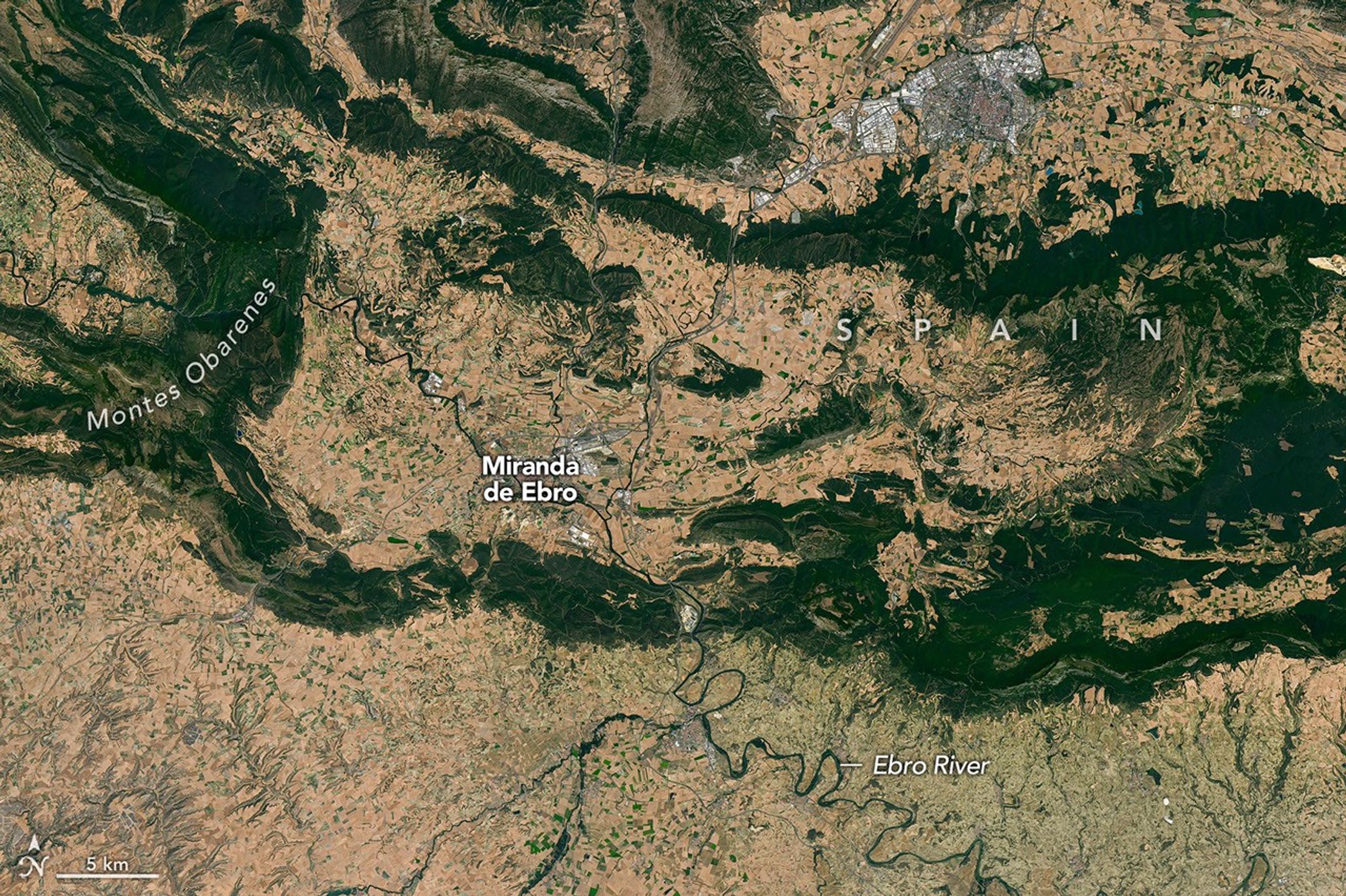
Meandering rivers cut through dark green mountain ridges, across agricultural land, and near several developed areas in northern Spain.

The Ebro River, meandering across northern Spain in this image acquired with the OLI (Operational Land Imager) on Landsat 8 on July 21, 2026, is in the path of totality of the August 2026 solar eclipse.
NASA Earth Observatory/Michala Garrison

The upper Ebro emerges from rugged terrain in Parque Natural de Montes Obarenes-San Zadornil, where it carves canyons and gorges through the eastern foothills of the Cantabrian Mountains. It then meanders through La Rioja, a region known for its vineyards. About 400 kilometers (250 miles) away, the river reaches a delta on the Mediterranean coast between Barcelona and Valencia.

Based on satellite measurements of cloud cover in August over several decades, viewers in Spain have a higher likelihood than those in Iceland of getting a clear look at the eclipse. And despite limited viewing opportunities in the path of totality, the rest of Europe, parts of Africa, Canada, and the northern and northeastern U.S. will experience a partial eclipse.

NASA Earth Observatory images and map by Michala Garrison, using Landsat data from the U.S. Geological Survey, base imagery from Blue Marble: Next Generation and Black Marble, and eclipse path data from Xavier Jubier. Story by Lindsey Doermann.

Downloads

A peninsula in Iceland stretches across the image to the left. A prominent glacier-capped volcano sits near its western end.

July 25, 2026

JPEG (14.69 MB)

A map shows the path of totality of the solar eclipse on August 12, 2026, arcing across Greenland, Iceland, the North Atlantic, and Spain.

August 12, 2026

JPEG (1.92 MB)

Meandering rivers cut through dark green mountain ridges, across agricultural land, and near several developed areas in northern Spain.


July 21, 2026

JPEG (34.46 MB)

References & Resources

You may also be interested in:

Stay up-to-date with the latest content from NASA as we explore the universe and discover more about our home planet.

Colonial National Historical Park

2 min read

The colonial communities of “America’s historic triangle” played defining roles in the road to American independence.

Article

Minute Man National Historical Park

3 min read

Sites relevant to the start of the American Revolutionary War are interspersed throughout the modern-day Boston metropolitan region.

Article

Earthset From the Lunar Far Side

2 min read

The crew of NASA’s Artemis II mission captured extraordinary images of our home planet during their journey around the far…

Article

Bountiful Roebuck Bay 

11 August 2026 at 05:01
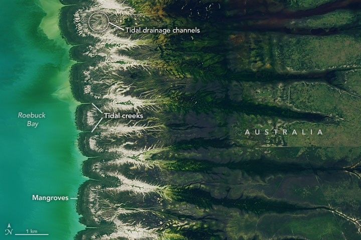
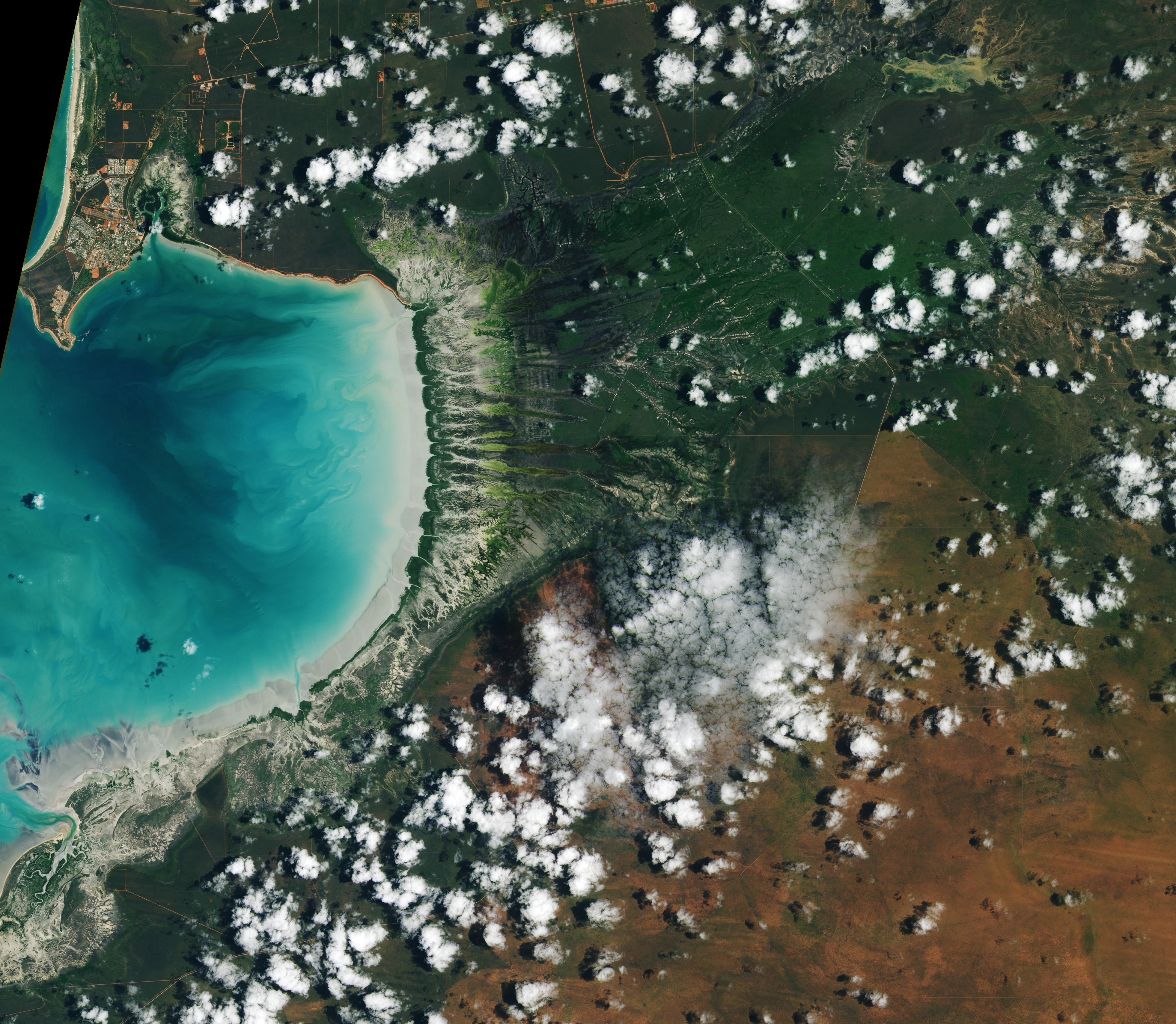
Blue coastal waters border a fringe of dark green mangroves with branching, linear tidal creeks and pale tidal flats and drainage channels visible to the east.
Water covers intertidal mudflats around Roebuck Bay in Western Australia, as seen in this image captured by the OLI (Operational Land Imager) on Landsat 8 on March 18, 2026.
NASA Earth Observatory / Lauren Dauphin

Editor’s Note: Today’s story is the answer to the August Puzzler.

Tides are among the clearest signs of the Moon’s pull on Earth. Just 239,000 miles (385,000 kilometers) away, the Moon’s gravity pulls on Earth’s oceans and solid crust, subtly distorting them into a more oblong shape with bulges roughly extending toward and away from the Moon.

High tides happen throughout Earth’s oceans, but in some places they leave an unusually strong fingerprint on the landscape. Among those places is Roebuck Bay, a crescent-shaped feature in the Kimberley region of Western Australia.

Roebuck Bay’s tidal range can reach a remarkable 9 meters (30 feet). Rising and falling tides repeatedly inundate and expose expansive mudflats, flood broad mangrove forests and salt marshes, and feed branching networks of tidal drainage channels. Many parts of Australia have tidal ranges of 2 meters or less. But the large range at Roebuck Bay is mostly a consequence of northwestern Australia’s unusually wide, shallow continental shelf, which helps amplify tides as they approach the coast.

The image at the top of the page shows the bay on March 18, 2026, when water levels were high. Green mangrove forests grow thickly along the shoreline and line the mouths of a network of evenly spaced, linear tidal creeks. These mangrove forests are dynamic. Analysis of decades of Landsat observations shows them expanding westward by nearly 2 meters per year as sediment from the waterways to the east accumulates in the sheltered bay.

Farther inland, branching networks of tidal drainage channels connect with the tidal creeks, giving the bay its feathered appearance. These channels, partially obscured by thick vegetation in March, were more visible earlier and later in the year, when vegetation was thinner.

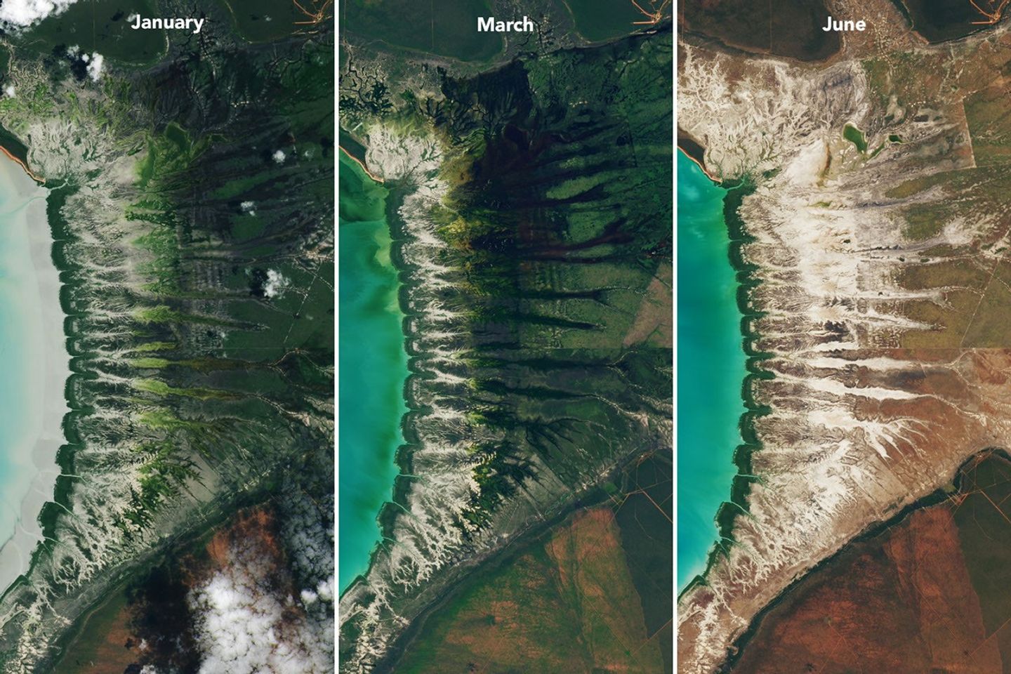
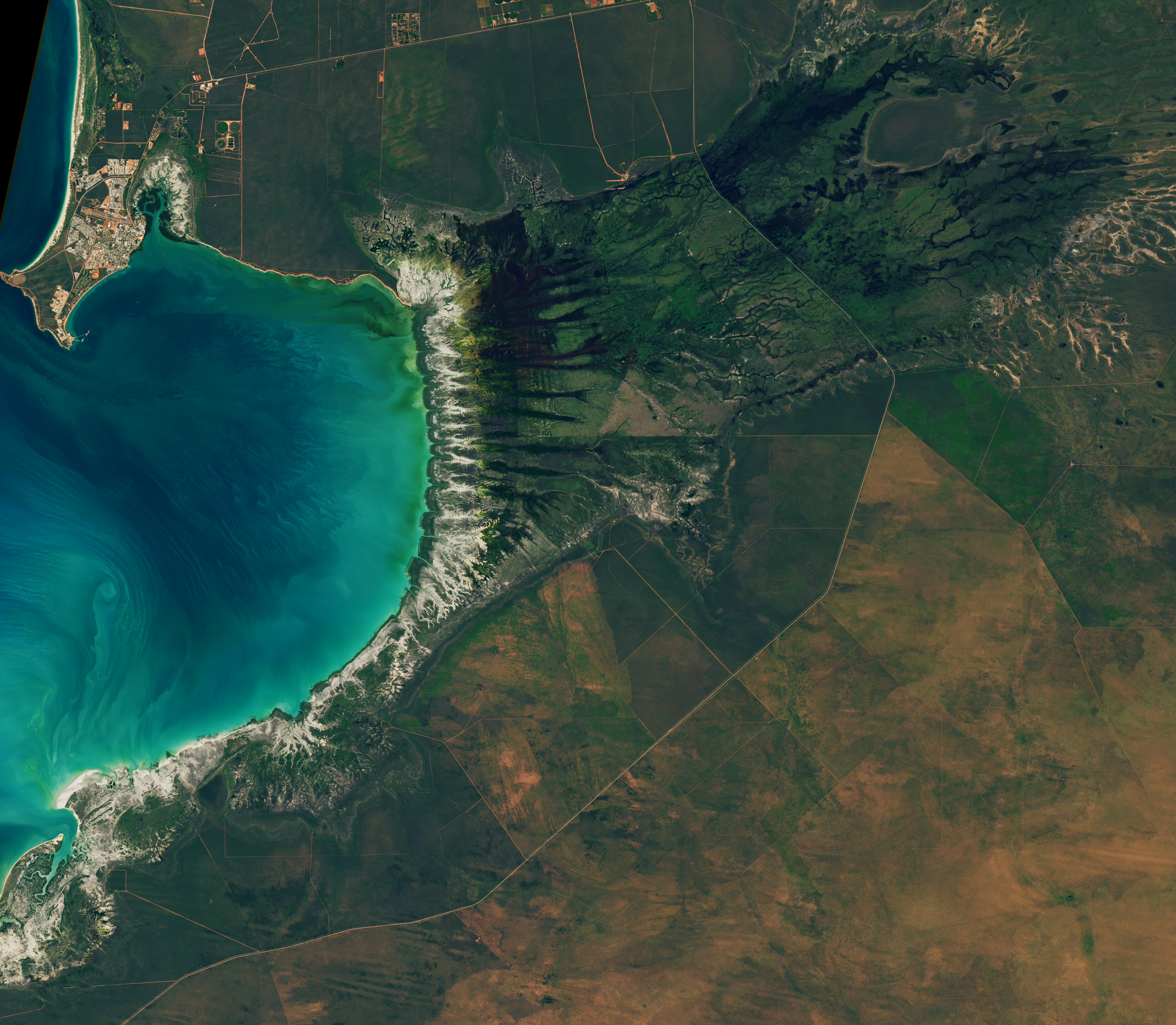
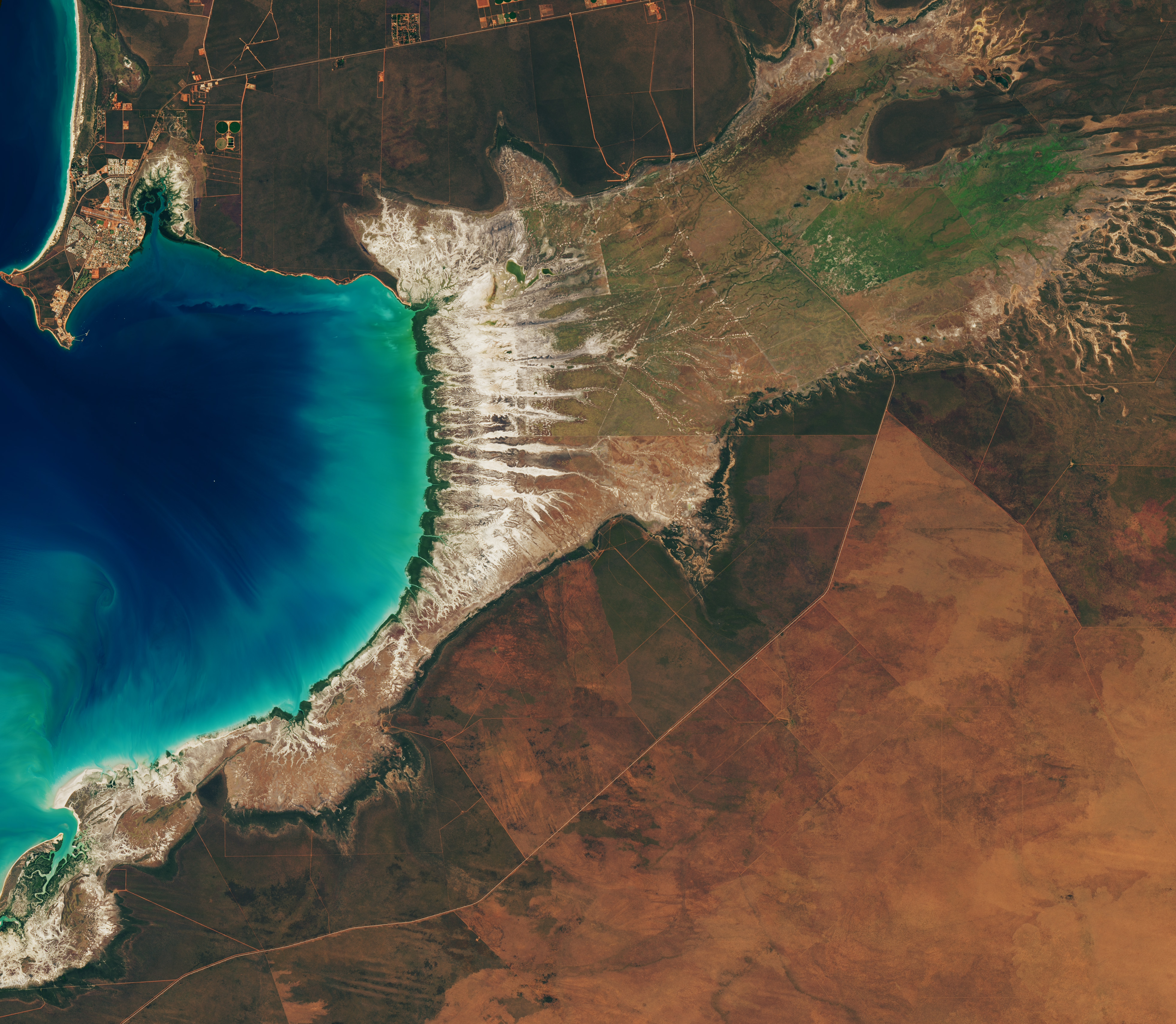
Landsat images from January 29 (left), March 18 (center), and June 30 (right) show seasonal changes. The tide was lower in the January image, exposing tan mudflats along the shoreline.
Around Roebuck Bay, inland vegetation greens after monsoon rains, peaking in March, and turns brown and dry by June. The Landsat 8 and 9 satellites captured these images throughout 2026.
NASA Earth Observatory / Lauren Dauphin

Monsoonal rains, typically falling between December and March, transform the landscape around the bay into lush grasslands and seasonal wetlands. As the rains fade in May and June and the dry season takes hold, these ephemeral grasses and sedge ecosystems die back, turning the landscape shades of gold and brown. The consistent spacing of the tidal creeks is likely not a tidal effect; it appears to be influenced by the regular spacing of linear dunes in the broader region, as seen in the plains to the east.

The bay’s dramatic tidal and seasonal changes are striking from above, and they also support a bounty of life on the ground. The mangroves serve as nurseries for crustaceans and fish, and the mudflats teem with dozens of types of invertebrates, including snails, worms, crabs, clams, and cockles. Shells and snails can reach an abundance of 2,500 per square meter, according to the Australian government.

This bounty of marine life is a major draw for birds. The bay, one of the most important sites for migratory birds in Australia and a key stop on the East Asian-Australasian Flyway, regularly hosts hundreds of thousands of birds, including plovers, godwits, and knots.

NASA Earth Observatory images by Lauren Dauphin, using Landsat data from the U.S. Geological Survey. Story by Adam Voiland.

Downloads

Tidal and seasonal shifts leave their mark on this crescent-shaped, productive bay in Western Australia's Kimberley region.

January 29, 2026

JPEG (3.65 MB)

Tidal and seasonal shifts leave their mark on this crescent-shaped, productive bay in Western Australia's Kimberley region.

March 18, 2026

JPEG (3.41 MB)

Tidal and seasonal shifts leave their mark on this crescent-shaped, productive bay in Western Australia's Kimberley region.

June 20, 2026

JPEG (3.61 MB)

References & Resources

You may also be interested in:

Stay up-to-date with the latest content from NASA as we explore the universe and discover more about our home planet.

Contours of the James Bay Lowlands
3 min read

After the Laurentide Ice Sheet retreated from present-day Hudson Bay, rebounding land has revealed striking nearshore topography.

Article
Why Maine’s Sandy Shorelines Turn Jagged
4 min read

Differences in the underlying bedrock and how rivers distribute sediment make the coastlines west of Portland look unlike those northeast…

Article
San Francisco’s Metropolitan Mosaic
3 min read

Urban development, green spaces, and maritime activity converge in this Northern California city.

Article

The post Bountiful Roebuck Bay  appeared first on NASA Science.

Bountiful Roebuck Bay 

11 August 2026 at 05:01
Blue coastal waters border a fringe of dark green mangroves with branching, linear tidal creeks and pale tidal flats and drainage channels visible to the east.
Water covers intertidal mudflats around Roebuck Bay in Western Australia, as seen in this image captured by the OLI (Operational Land Imager) on Landsat 8 on March 18, 2026.
NASA Earth Observatory / Lauren Dauphin

Editor’s Note: Today’s story is the answer to the August Puzzler.

Tides are among the clearest signs of the Moon’s pull on Earth. Just 239,000 miles (385,000 kilometers) away, the Moon’s gravity pulls on Earth’s oceans and solid crust, subtly distorting them into a more oblong shape with bulges roughly extending toward and away from the Moon.

High tides happen throughout Earth’s oceans, but in some places they leave an unusually strong fingerprint on the landscape. Among those places is Roebuck Bay, a crescent-shaped feature in the Kimberley region of Western Australia.

Roebuck Bay’s tidal range can reach a remarkable 9 meters (30 feet). Rising and falling tides repeatedly inundate and expose expansive mudflats, flood broad mangrove forests and salt marshes, and feed branching networks of tidal drainage channels. Many parts of Australia have tidal ranges of 2 meters or less. But the large range at Roebuck Bay is mostly a consequence of northwestern Australia’s unusually wide, shallow continental shelf, which helps amplify tides as they approach the coast.

The image at the top of the page shows the bay on March 18, 2026, when water levels were high. Green mangrove forests grow thickly along the shoreline and line the mouths of a network of evenly spaced, linear tidal creeks. These mangrove forests are dynamic. Analysis of decades of Landsat observations shows them expanding westward by nearly 2 meters per year as sediment from the waterways to the east accumulates in the sheltered bay.

Farther inland, branching networks of tidal drainage channels connect with the tidal creeks, giving the bay its feathered appearance. These channels, partially obscured by thick vegetation in March, were more visible earlier and later in the year, when vegetation was thinner.

Landsat images from January 29 (left), March 18 (center), and June 30 (right) show seasonal changes. The tide was lower in the January image, exposing tan mudflats along the shoreline.
Around Roebuck Bay, inland vegetation greens after monsoon rains, peaking in March, and turns brown and dry by June. The Landsat 8 and 9 satellites captured these images throughout 2026.
NASA Earth Observatory / Lauren Dauphin

Monsoonal rains, typically falling between December and March, transform the landscape around the bay into lush grasslands and seasonal wetlands. As the rains fade in May and June and the dry season takes hold, these ephemeral grasses and sedge ecosystems die back, turning the landscape shades of gold and brown. The consistent spacing of the tidal creeks is likely not a tidal effect; it appears to be influenced by the regular spacing of linear dunes in the broader region, as seen in the plains to the east.

The bay’s dramatic tidal and seasonal changes are striking from above, and they also support a bounty of life on the ground. The mangroves serve as nurseries for crustaceans and fish, and the mudflats teem with dozens of types of invertebrates, including snails, worms, crabs, clams, and cockles. Shells and snails can reach an abundance of 2,500 per square meter, according to the Australian government.

This bounty of marine life is a major draw for birds. The bay, one of the most important sites for migratory birds in Australia and a key stop on the East Asian-Australasian Flyway, regularly hosts hundreds of thousands of birds, including plovers, godwits, and knots.

NASA Earth Observatory images by Lauren Dauphin, using Landsat data from the U.S. Geological Survey. Story by Adam Voiland.

Downloads

Tidal and seasonal shifts leave their mark on this crescent-shaped, productive bay in Western Australia's Kimberley region.

January 29, 2026

JPEG (3.65 MB)

Tidal and seasonal shifts leave their mark on this crescent-shaped, productive bay in Western Australia's Kimberley region.

March 18, 2026

JPEG (3.41 MB)

Tidal and seasonal shifts leave their mark on this crescent-shaped, productive bay in Western Australia's Kimberley region.

June 20, 2026

JPEG (3.61 MB)

References & Resources

You may also be interested in:

Stay up-to-date with the latest content from NASA as we explore the universe and discover more about our home planet.

Contours of the James Bay Lowlands

3 min read

After the Laurentide Ice Sheet retreated from present-day Hudson Bay, rebounding land has revealed striking nearshore topography.

Article

Why Maine’s Sandy Shorelines Turn Jagged

4 min read

Differences in the underlying bedrock and how rivers distribute sediment make the coastlines west of Portland look unlike those northeast…

Article

San Francisco’s Metropolitan Mosaic

3 min read

Urban development, green spaces, and maritime activity converge in this Northern California city.

Article

El Niño Alters Marine Life in the Pacific

10 August 2026 at 05:01


june 2025
june 2026

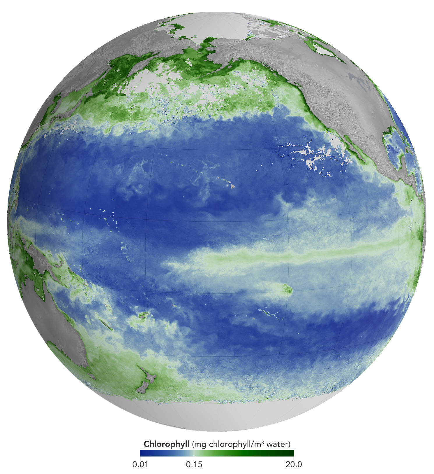
A global map centered on the Pacific Ocean shows a band of green across the equatorial region, indicating the presence of chlorophyll in surface waters.
NASA Earth Observatory/Michala Garrison

A global map centered on the Pacific Ocean shows a narrow band of green in the eastern equatorial region, indicating the presence of chlorophyll in surface waters. The central equatorial Pacific appears blue, meaning chlorophyll concentrations are low.
NASA Earth Observatory/Michala Garrison

A global map centered on the Pacific Ocean shows a band of green across the equatorial region, indicating the presence of chlorophyll in surface waters.
NASA Earth Observatory/Michala Garrison
A global map centered on the Pacific Ocean shows a narrow band of green in the eastern equatorial region, indicating the presence of chlorophyll in surface waters. The central equatorial Pacific appears blue, meaning chlorophyll concentrations are low.
NASA Earth Observatory/Michala Garrison

june 2025

june 2026


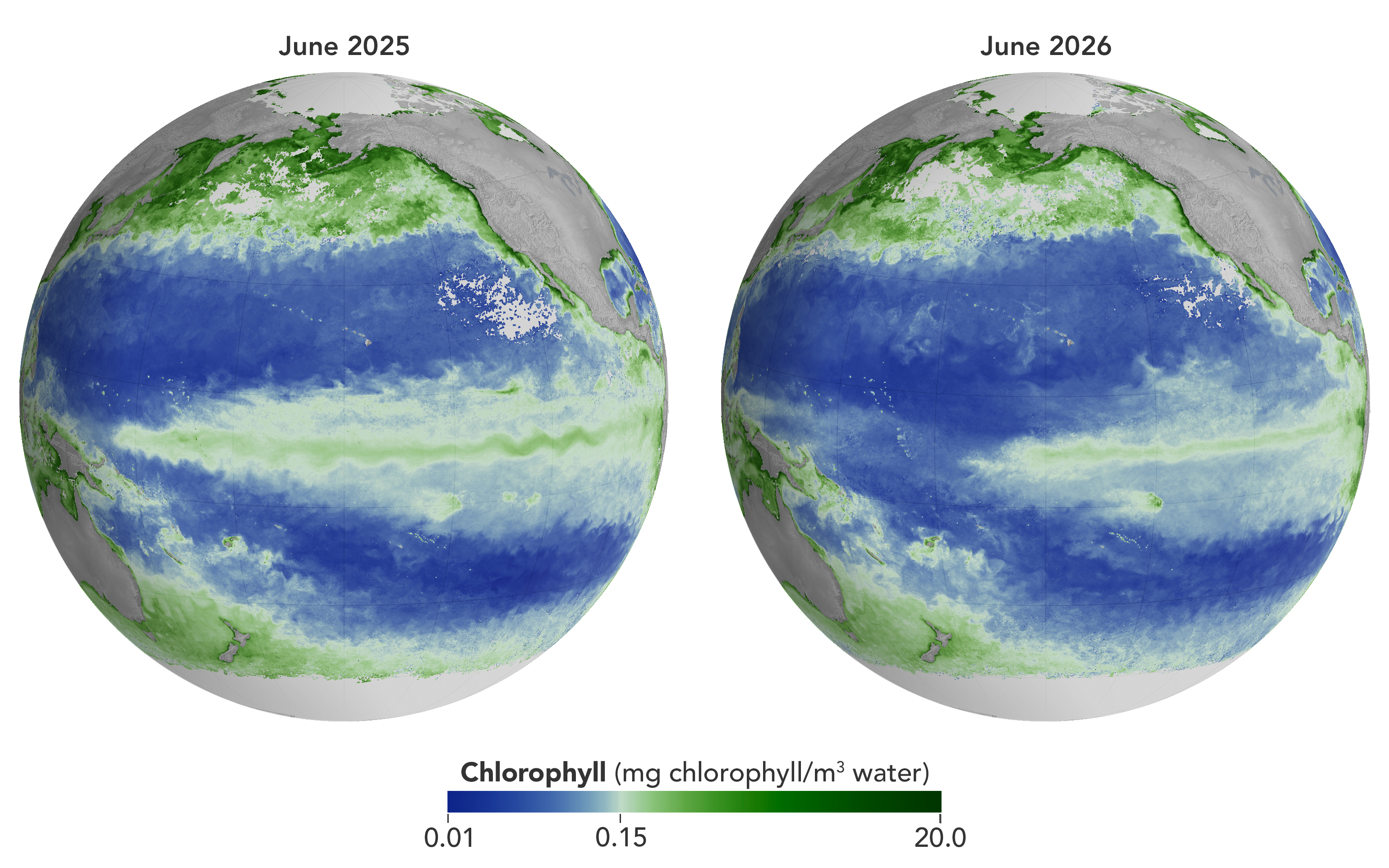
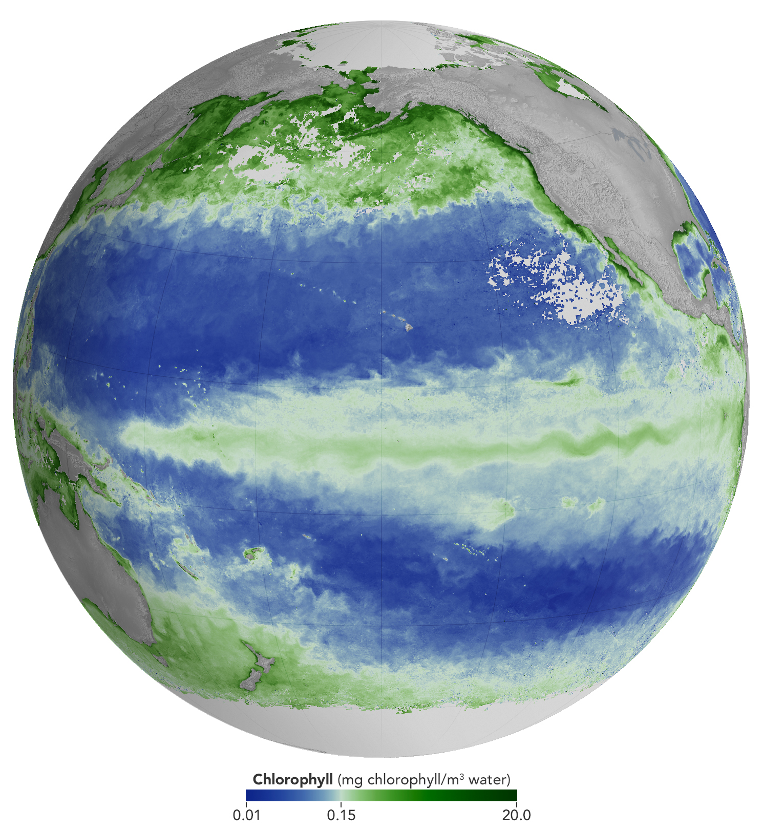
Concentrations of chlorophyll in the equatorial Pacific deviate from normal during El Niño events. These maps depict monthly average chlorophyll concentrations for June 2025 (left), under neutral conditions, and June 2026 (right), as El Niño was strengthening. Data come from the OCI (Ocean Color Instrument) on NASA’s PACE (Plankton, Aerosol, Cloud, ocean Ecosystem) satellite and are based on measurements of green and blue light from the ocean reflected back to the sensor. NASA Earth Observatory images by Michala Garrison.

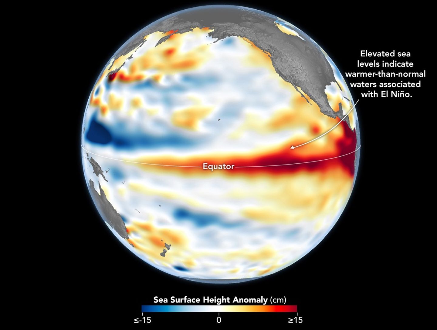
As of June 2026, El Niño has officially arrived. This naturally recurring phenomenon is characterized by warmer-than-normal water temperatures in parts of the equatorial Pacific along with changes to atmospheric and oceanic circulation patterns. Its regional effects range from desert floods to delayed monsoons to shifts in where tropical cyclones are more likely to form.

NOAA’s Climate Prediction Center expects the current El Niño to continue to strengthen through the end of 2026, with a 97 percent chance of lasting through early Northern Hemisphere spring 2027. Even during El Niño’s early stages, satellites have observed characteristic changes along the equatorial Pacific, such as warmer-than-normal sea surface temperatures and higher-than-normal sea surface height.

Among the first ecological downstream effects are changes to the marine food web. The maps above show chlorophyll-a concentrations—the pigment present in most phytoplankton—as observed by the OCI (Ocean Color Instrument) on NASA’s PACE (Plankton, Aerosol, Cloud, ocean Ecosystem) satellite. In June 2025 (left), conditions were neutral, while in June 2026 (right), El Niño was strengthening.

The most noticeable difference appears in the central Pacific, around the equator due north of New Zealand: chlorophyll concentrations, an indication of phytoplankton abundance, are substantially lower in 2026. This change is expected, said Matthew Kehrli and Graham Trolley, oceanographers in the Ocean Ecology Laboratory at NASA’s Goddard Space Flight Center. That’s because during an El Niño, easterly equatorial trade winds weaken, the warm surface layer of the ocean extends deeper, and the upwelling of cool, nutrient-rich water that typically fuels phytoplankton growth is suppressed.  

As the El Niño progresses, the scientists anticipate the differences in the central Pacific will become more pronounced. “This may manifest as a greater difference in values across the current region, as a broadening region of reduced surface chlorophyll-a concentration, or both, depending on the behavior of the equatorial trade winds,” they said.

Reductions in phytoplankton have ripple effects through the marine food web, including in coastal regions. Less food is available for zooplankton, as well as for fish, seabirds, and marine mammals. Peru’s anchovy fisheries have seen profound declines in catch during past El Niños, driven similarly by warmer surface waters, reduced upwelling, and lower phytoplankton abundance. In 2026, Peru’s Ministry of Production repeatedly suspended the fishery to safeguard the country’s main fishing resource. Pelicans have been seen venturing into Peruvian ports and urban areas in search of food.

Although the disruptions to marine life can be severe, a post-El Niño “chlorophyll rebound,” with higher-than-normal concentrations in the equatorial Pacific, can occur. Research suggests that higher iron concentrations delivered in ocean currents, as well as dust arriving from drier land in parts of Central and South America, help fuel the resurgence—a rebound that doesn’t require a follow-on La Niña. La Niña, which often follows El Niño events, can also produce elevated chlorophyll concentrations. A strong La Niña in 1998–1999 set off a large phytoplankton bloom in the eastern Pacific and a dramatic increase in fish populations.

Scientists have new tools available for studying this sort of variability. The PACE mission launched in February 2024, making this the first complete El Niño event for which the satellite will gather global, near-daily hyperspectral measurements. “The scientific community will be able to observe the 2026 El Niño with data across more wavelengths of light than ever before,” Kehrli and Trolley said.

To better understand effects on life in the ocean, researchers hope to use PACE data to gauge the responses of specific phytoplankton communities to El Niño. And the possibilities extend beyond the marine realm, the scientists note. PACE’s sensors can measure plant pigment composition on land and clouds and aerosols in the atmosphere, all of which are influenced by El Niño.

NASA Earth Observatory images by Michala Garrison, using PACE data from the NASA Ocean Biology Distributed Active Archive Center OB.DAAC and processed by Matthew Kehrli. Story by Lindsey Doermann.

Downloads

A global map centered on the Pacific Ocean shows a band of green across the equatorial region, indicating the presence of chlorophyll in surface waters.

June 2025

JPEG (1.40 MB)

A global map centered on the Pacific Ocean shows a narrow band of green in the eastern equatorial region, indicating the presence of chlorophyll in surface waters. The central equatorial Pacific appears blue, meaning chlorophyll concentrations are low.

June 2026

JPEG (1.37 MB)

A global map centered on the Pacific Ocean shows a narrow band of green in the eastern equatorial region, indicating the presence of chlorophyll in surface waters. The central equatorial Pacific appears blue, meaning chlorophyll concentrations are low.

June 2025 + June 2026

JPEG (2.85 MB)

References & Resources

You may also be interested in:

Stay up-to-date with the latest content from NASA as we explore the universe and discover more about our home planet.

El Niño Is Underway

4 min read

Satellite observations of sea surface height indicated that the 2026 event continued to strengthen in early June.

Article

Color Off the Mid-Atlantic Coast

4 min read

Something is brewing in shallow waters offshore of Delaware, New Jersey, Maryland, and Virginia.

Article

Sizing Up the Sargassum Belt

6 min read

Seaweed composing the Great Atlantic Sargassum Belt hit near-record levels in June 2026, with the Caribbean Sea and Gulf of…

Article

Sensing the Poles’ Hidden Heat

7 August 2026 at 05:00
Surface temperatures across Earth’s poles pulse with the seasons, as seen in this animation based on two years of data collected by NASA’s PREFIRE (Polar Radiant Energy in the Far-InfraRed Experiment) mission.
NASA/Chad Greene

At the top and bottom of the planet, the seasons arrive on a schedule all their own. Satellite data from a mission measuring infrared energy reveal just how differently—and how dramatically—surface temperatures swing across two full years at the poles.

In this animation, surface temperatures across the Arctic and Antarctic pulse between cold (dark blue) and milder to warm (lighter blue to red). Data for the animation come from NASA’s PREFIRE (Polar Radiant Energy in the Far-InfraRed Experiment) satellites. The mission’s twin CubeSats began collecting science data in July 2024 and have now captured two complete seasonal cycles at each pole.
Because the two poles sit in opposite hemispheres, their seasons occur at opposite times—and the swing between seasons differs, too. In the Arctic, cold, dark winters give way to summers warm enough to thaw vast stretches of tundra and sea ice. In Antarctica, Earth’s coldest continent, summer temperatures rarely climb above freezing before the bitter cold of winter returns.

Surface temperatures, and how they fluctuate, offer a window into Earth’s energy budget, the net flow of energy into and out of the Earth system. Sunlight absorbed by the surface is re-radiated as infrared heat, which bounces between Earth’s surface and atmosphere before escaping to space. The poles play an important role in this process. Atmospheric and ocean circulation carries excess heat absorbed in the tropics toward the poles, where it radiates away to space, helping regulate the planet’s temperature.

“By measuring invisible heat radiating from Earth’s coldest places, PREFIRE is helping scientists understand why the poles are changing so rapidly, and what those changes might mean for the rest of the planet,” said Chad Greene, a glaciologist at NASA’s Jet Propulsion Laboratory.

Scientists have long known that far-infrared radiation accounts for nearly 60 percent of the energy Earth loses to space, but that portion of the spectrum—invisible to human eyes—had never been comprehensively measured on a global scale. By directly tracking this invisible energy in near-real-time, the PREFIRE mission is helping scientists refine models and gain a better understanding of the Earth system.

“Weather systems, river flows, shipping routes, and ice sheet stability are all influenced by energy movement in a part of the spectrum that only PREFIRE can see,” said Tristan L’Ecuyer, an atmospheric scientist at the University of Wisconsin-Madison and principal investigator of the PREFIRE mission. “Now that the invisible has been made visible, we can begin to improve weather and climate predictions that industries, our national defense, and Arctic communities rely on.”

Maps courtesy of Chad Greene, NASA/JPL, using data from NASA’s PREFIRE mission. Story by Kathryn Hansen.

References & Resources

You may also be interested in:

Stay up-to-date with the latest content from NASA as we explore the universe and discover more about our home planet.

A Moonlit Earth as Seen From Artemis II

4 min read

An astronaut’s photo, taken en route to the Moon, reveals our planet and its place in space in a novel…

Article

Earthset From the Lunar Far Side

2 min read

The crew of NASA’s Artemis II mission captured extraordinary images of our home planet during their journey around the far…

Article

June 2026 Satellite Puzzler

2 min read

Your challenge is to tell us the location of the satellite image and why it is interesting.

Article

Sizing Up the Sargassum Belt

29 July 2026 at 05:00
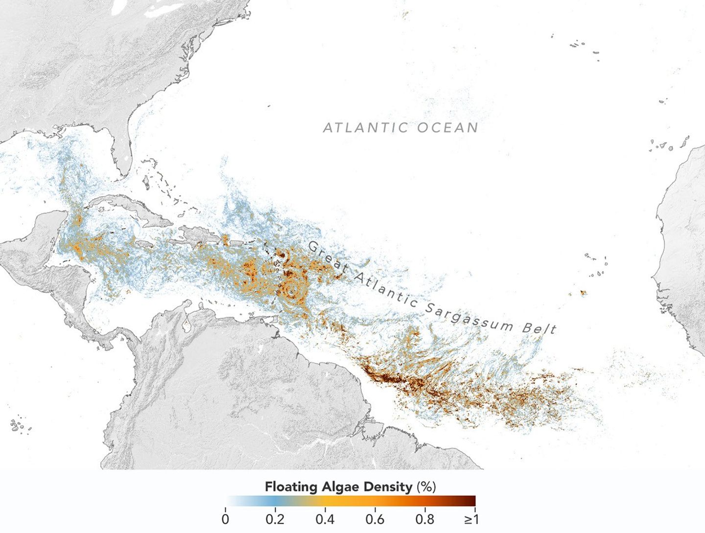
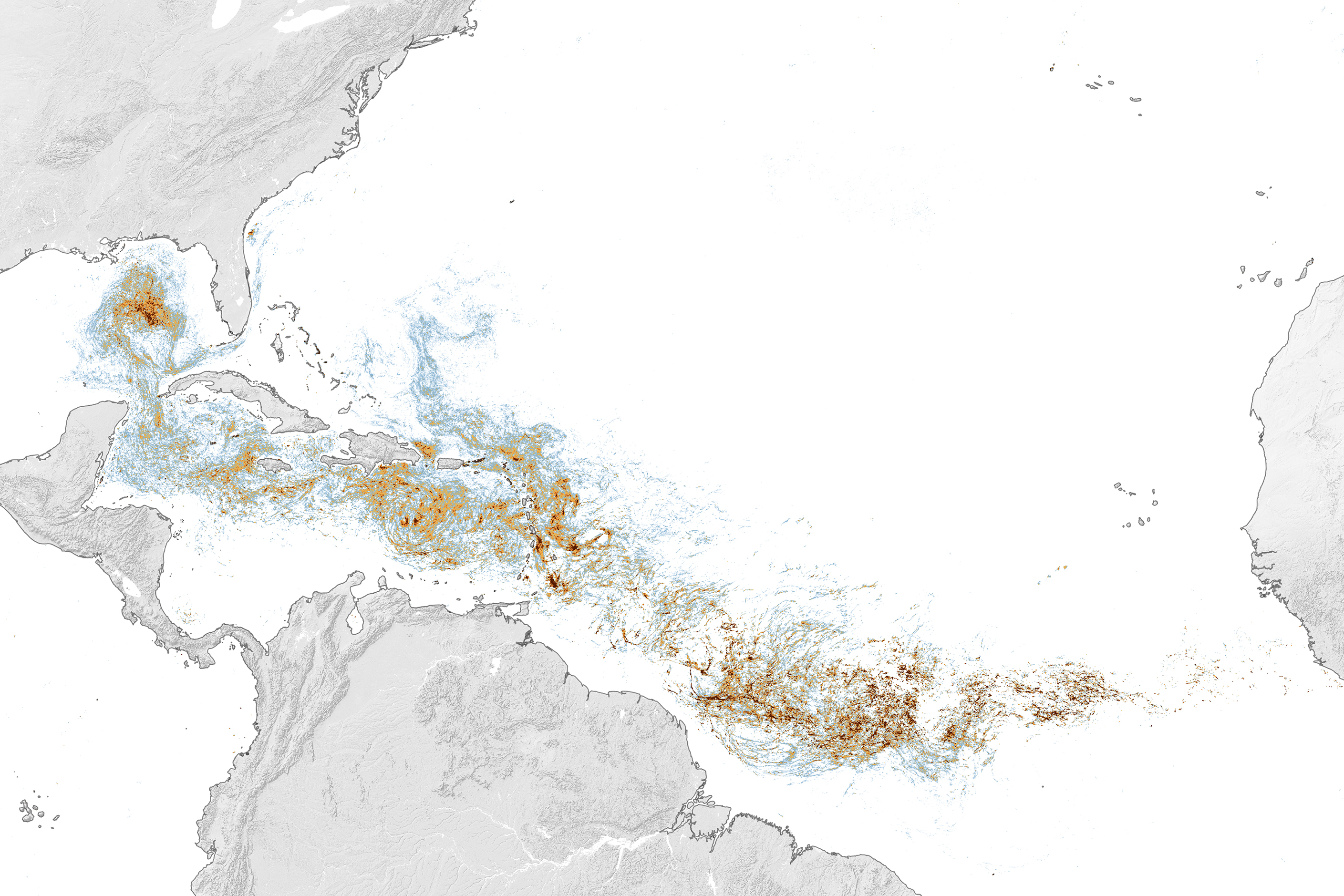
Map of the Atlantic Ocean showing Sargassum density from low (blue) to high (red) in June 2026, with the highest concentrations in the tropical Atlantic.
This map, based on data from the OCI (Ocean Color Instrument) on NASA’s PACE (Plankton, Aerosol, Cloud, ocean Ecosystem) satellite, shows Sargassum highly concentrated in the tropical Atlantic in June 2026.
NASA Earth Observatory/Lauren Dauphin

Sargassum, a type of brown floating algae, has shifted its range in recent decades, thinning out in the North Atlantic’s Sargasso Sea while proliferating in the tropical Atlantic. That trend, underway since 2011, continued in 2026 as the algae, commonly known as a type of seaweed, reached its annual peak in June across a stretch of ocean known as the Great Atlantic Sargassum Belt.

The belt’s Sargassum abundance in June 2026 made it the second-highest Sargassum year in the satellite record, slightly behind 2025, according to scientists at the University of South Florida (USF) College of Marine Science. Regionally, the Caribbean Sea and the Gulf of America (Gulf of Mexico) both hit record highs, according to USF’s June 2026 Sargassum outlook. The western and eastern Caribbean saw 3.6 and 9 million metric tons, respectively, while the Gulf saw 5 million metric tons—nearly double its previous record, also set in 2025. 

“The belt is a basin-scale phenomenon that can have devastating local-scale impacts throughout the Caribbean and Gulf, and satellite observations are the only method that captures both scales on a daily basis,” said Brian Barnes, a marine scientist at the Optical Oceanography Laboratory at USF. “The tracking done by our lab helps communities know the current extent of Sargassum and prepare for what’s to come.”

In moderate amounts in the open ocean, Sargassum provides habitat for turtles, invertebrates, fish, and birds, and adds oxygen to the water through photosynthesis. But too much of it near shore can tangle and suffocate marine life, and mats that sink can smother corals and seagrasses. On beaches, decomposing Sargassum releases hydrogen sulfide, a rotten-egg-smelling gas that’s a potential problem for both ecosystems and tourism.

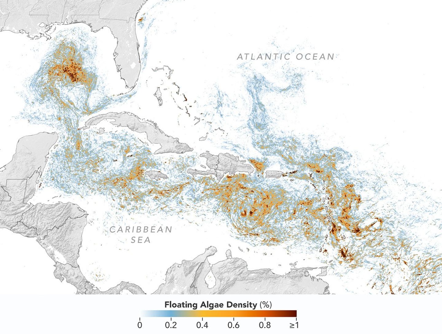
The map above shows Sargassum density in the tropical Atlantic Ocean in June 2026. Red and orange areas are where Sargassum densities were the highest. Note that although the “belt” appears continuous, discrete Sargassum mats are scattered across the ocean surface. The map is based on satellite measurements of how much of the ocean surface was covered by the seaweed, averaged per pixel across all observations made in June by the OCI (Ocean Color Instrument) on NASA’s PACE (Plankton, Aerosol, Cloud, ocean Ecosystem) satellite.

A detailed map of the Atlantic Ocean centered on the Caribbean Sea shows Sargassum density from low (blue) to high (red) in June 2026.
This detailed view of the same PACE OCI map highlights Sargassum concentrations across the Caribbean Sea and Gulf of America, both of which saw record-high amounts of the floating algae in June 2026.
NASA Earth Observatory/Lauren Dauphin

Ocean currents and winds shape the Sargassum belt, which, despite the patchiness, stretches nearly continuously from West Africa to the Gulf and holds a fairly steady “width” from the western tropical Atlantic westward, explained Chuanmin Hu, also an optical oceanographer at USF. The ocean currents have also spared Florida’s west coast from inundation this summer, while delivering large amounts of seaweed to the Florida Keys and the state’s east coast. The bulk of the Sargassum, however, is visible in the Caribbean Sea, shown in detail above, where problems associated with inundation have been more severe, Hu said.

Data for the maps were provided by Lin Qi, an oceanographer at NOAA’s Center for Satellite Applications and Research, who has been working to generate Sargassum maps based on data from PACE, which was launched in February 2024. The work extends that of Qi and colleagues at USF’s Optical Oceanography Laboratory. This team first developed Sargassum detection techniques using MODIS (Moderate Resolution Imaging Spectroradiometer) on NASA’s long-running Terra and Aqua satellites and VIIRS (Visible Infrared Imaging Radiometer Suite) on the NOAA-20 satellite—data that have been a key component of USF’s Sargassum Watch System and of research into the seaweed’s longer-term trends.

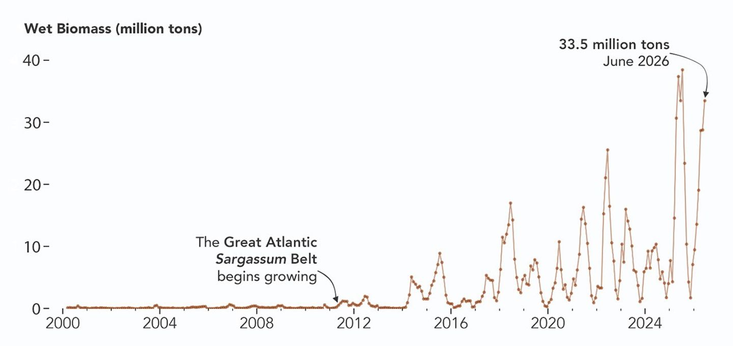
Satellites detect Sargassum by its signals in reflected sunlight. Because of its plant structure and chlorophyll pigments, Sargassum reflects more near-infrared light than water. Scientists flag pixels where the reflectance spikes above the levels produced by plain seawater, and then they use the strength of this spike to estimate Sargassum density, which refers to the fraction of ocean surface covered by the seaweed in each pixel. Density estimates can then be converted into biomass, or the total weight of Sargassum present within a pixel, which is how the longer-term trends in the chart below are tracked.

A chart of Sargassum biomass detected by MODIS since the early 2000s, showing amounts increasing beginning in 2011, with progressively higher spikes through summer 2025 and 2026.
NASA Earth Observatory/Lauren Dauphin

The chart above uses the continuous MODIS record since March 2000 to show how Sargassum biomass across the Great Atlantic Sargassum Belt has changed through June 2026. Notice the uptick beginning around 2011, when the belt was first developing, and the seasonal dips in winter and peaks in spring and summer. The record high in July 2025 stands out, followed by the quick rise in early 2026—especially in the first four months of the year—that culminated in the year’s peak in June. More recent observations, not yet reflected in the chart, indicate Sargassum biomass declined through the following month of July.

“Since the initial appearance of the Great Atlantic Sargassum Belt in 2011, the total Sargassum amount in the Atlantic Ocean has increased substantially, more than doubling every five years,” Hu said. He added that the exact mechanism is still being investigated, but it’s possibly related to ocean warming, multiple nutrient sources, and the fact that large Sargassum mats attract other organisms—such as nitrogen-fixing bacteria—that can supply additional nutrients to sustain further growth.

Alongside data from MODIS and VIIRS, OCI data from PACE now feeds into the Sargassum Watch System’s near-real-time daily and weekly composite maps. A recent study of the central-west Atlantic led by Qi, spanning May through August 2024, found that OCI offers several advantages over its predecessors, observing more of the ocean and detecting Sargassum with greater sensitivity.  
Hu noted that the added pixels from OCI can improve near-real-time monitoring and analyses of short-term fluctuations. And its higher sensitivity, he said, will also lead to improved maps during winter months, “thus helping understand Sargassum changes over time.”

Additionally, the study’s authors found that OCI’s hyperspectral capability makes it the only sensor able to spectrally discriminate Sargassum pixels across the Atlantic Ocean “without ambiguity,” adding confidence to the interpretation of detected image features—especially in parts of the Atlantic where another type of floating algae, Trichodesmium, has been reported.

“I think I can speak for all project members, past and present, in sharing how rewarding it is to see the promise of PACE’s advancements come to life,” said Jeremy Werdell, PACE project scientist at NASA’s Goddard Space Flight Center. “OCI has started a true renaissance in aquatic ecosystem monitoring from space.”

NASA Earth Observatory maps and chart by Lauren Dauphin, using PACE and MODIS data courtesy of Lin Qi (NOAA), and Brian Barnes and Chuanmin Hu (University of South Florida, Optical Oceanography Laboratory). Story by Kathryn Hansen.

Downloads

Map of the Atlantic Ocean showing Sargassum density from low (blue) to high (red) in June 2026, with the highest concentrations in the tropical Atlantic.

June 2026

JPEG (2.43 MB)

References & Resources

You may also be interested in:

Stay up-to-date with the latest content from NASA as we explore the universe and discover more about our home planet.

Color Off the Mid-Atlantic Coast

4 min read

Something is brewing in shallow waters offshore of Delaware, New Jersey, Maryland, and Virginia.

Article

A Turquoise Tint for the Black Sea

3 min read

Phytoplankton added a milky blue hue to the waters of the Black Sea and nearby waterways in spring and summer…

Article

El Niño Is Underway

4 min read

Satellite observations of sea surface height indicated that the 2026 event continued to strengthen in early June.

Article

Smoke Blankets Oregon

28 July 2026 at 05:01
Long plumes of gray wildfire smoke stream northeast from a line of fires in central and eastern Oregon, including the Beachcomb, Shingle, and Second Flat fires that threatened communities.
Smoke pours from dozens of large fires in Oregon in this image captured by MODIS (Moderate Resolution Imaging Spectroradiometer) on NASA’s Aqua satellite on July 26, 2026.
NASA Earth Observatory/Michala Garrison

Dry thunderstorms that popped up over the Cascade Range on the evening of July 15, 2026, peppered Oregon and Washington with thousands of lightning strikes as they moved east across the states. By the following day, NASA satellites had begun to detect large numbers of wildland fires burning throughout central and eastern Oregon.

Though initially small, these blazes strengthened as they were fanned by gusty winds and raced through landscapes parched by extreme drought and baking in summer heat. When NASA’s Aqua satellite captured the image shown above on the afternoon of July 26, smoke poured northeast from dozens of large fires that had collectively charred hundreds of square miles. The fires produced a blanket of haze, prompting state officials to issue air quality advisories for eastern Oregon.

Many communities faced evacuation orders as more than 10,000 firefighters battled wildfires throughout the state. On the day the image was captured, the largest active fires were the Hay Creek Complex, Brewer, Big Grass, Akawa Butte, and Powder River fires. Several of these blazes were less than 5 percent contained, according to the National Interagency Fire Center. State officials invoked Oregon’s Emergency Conflagration Act to protect communities as they responded to particularly threatening fires such as the Shingle, Bench, Beachcomb, and Second Flat fires.

Government satellite data are part of a global system of observations used to track fire behavior and analyze emerging trends. Among the real-time wildfire monitoring tools that NASA makes available are FIRMS (Fire Information for Resource Management System), the Worldview browser, and the Fire Event Explorer.
As of July 27, 2026, fires in Oregon had burned more than one million acres, according to news outlets. Meanwhile, the National Interagency Fire Center reported that fires had burned more than 4 million acres across the United States. The 10-year average (2016-2025) for this point in the season is 3.4 million acres.

NASA Earth Observatory image by Michala Garrison, using MODIS data from NASA EOSDIS LANCE and GIBS/Worldview. Story by Adam Voiland.

Downloads

Long plumes of gray wildfire smoke stream northeast from a line of fires in central and eastern Oregon, including the Beachcomb, Shingle, and Second Flat fires that threatened communities.

July 26, 2026

JPEG (3.07 MB)

References & Resources

You may also be interested in:

Stay up-to-date with the latest content from NASA as we explore the universe and discover more about our home planet.

Fires Tear Through Nebraska Grasslands

3 min read

Dry, warm, and windy conditions across the U.S. Great Plains led to extreme fire activity in March 2026.

Article

Cottonwood Fire Chars Utah

5 min read

The blaze burned more than 150 square miles and swept through parts of a ski resort.

Article

Fires Rage in Georgia

3 min read

Firefighters are battling two destructive blazes in the southern part of the state as drought grips the U.S. Southeast.

Article

A Million-Panel Project

24 July 2026 at 05:01


June 16, 2024
June 6, 2026

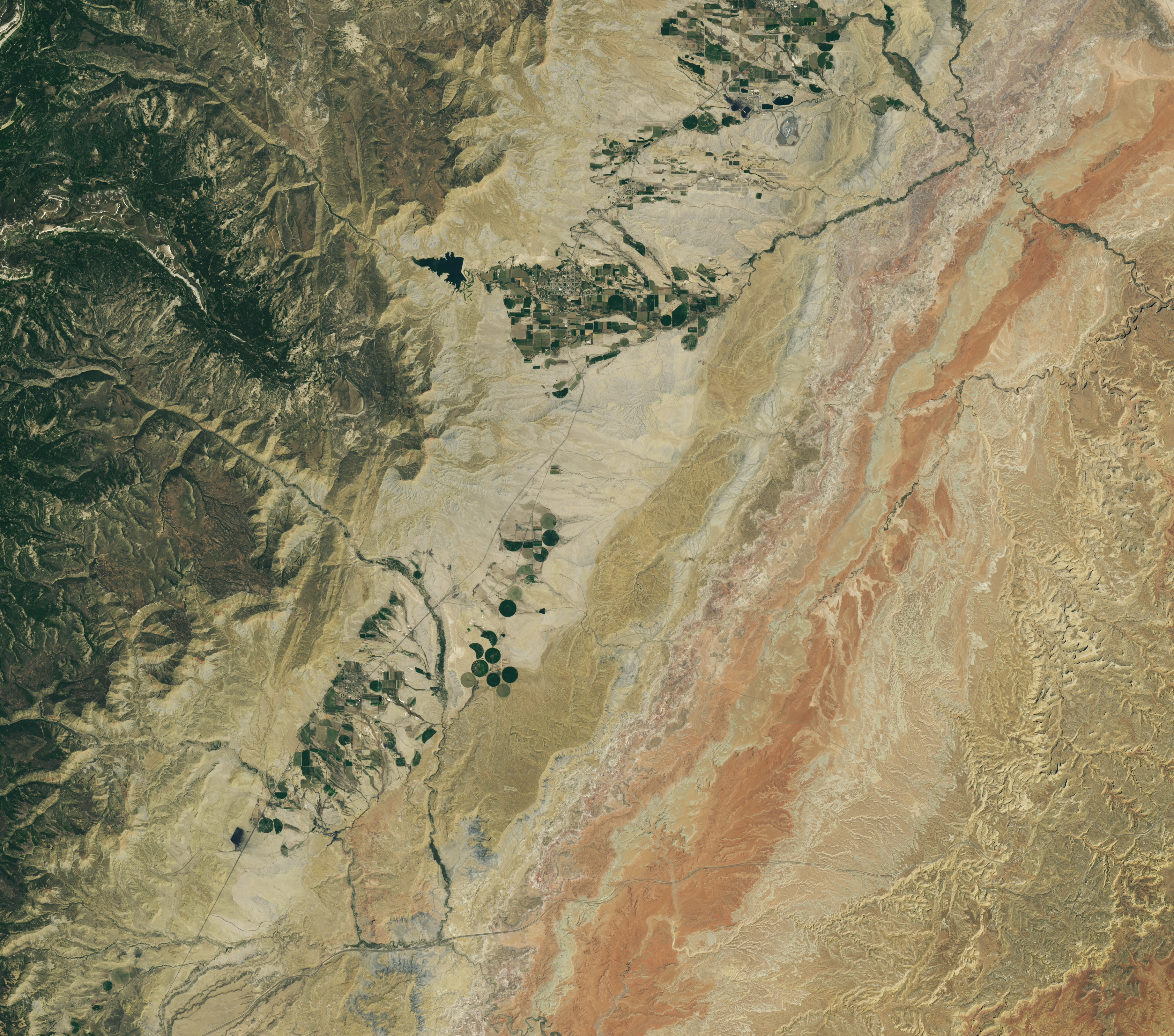
A dry, tan-colored valley containing a few circular irrigated fields runs roughly north-south through the image.
NASA Earth Observatory / Lauren Dauphin

Grid-like arrays of solar panels cover parts of a valley floor in a brown, dry-looking area of Utah.
NASA Earth Observatory / Lauren Dauphin

A dry, tan-colored valley containing a few circular irrigated fields runs roughly north-south through the image.
NASA Earth Observatory / Lauren Dauphin
Grid-like arrays of solar panels cover parts of a valley floor in a brown, dry-looking area of Utah.
NASA Earth Observatory / Lauren Dauphin

June 16, 2024

June 6, 2026


The nearly one million photovoltaic panels of a solar energy and battery storage facility in Utah appear in the right image, acquired with the OLI (Operational Land Imager) on Landsat 8 on June 6, 2026. The same sensor captured the left image on June 16, 2024. NASA Earth Observatory images by Lauren Dauphin.

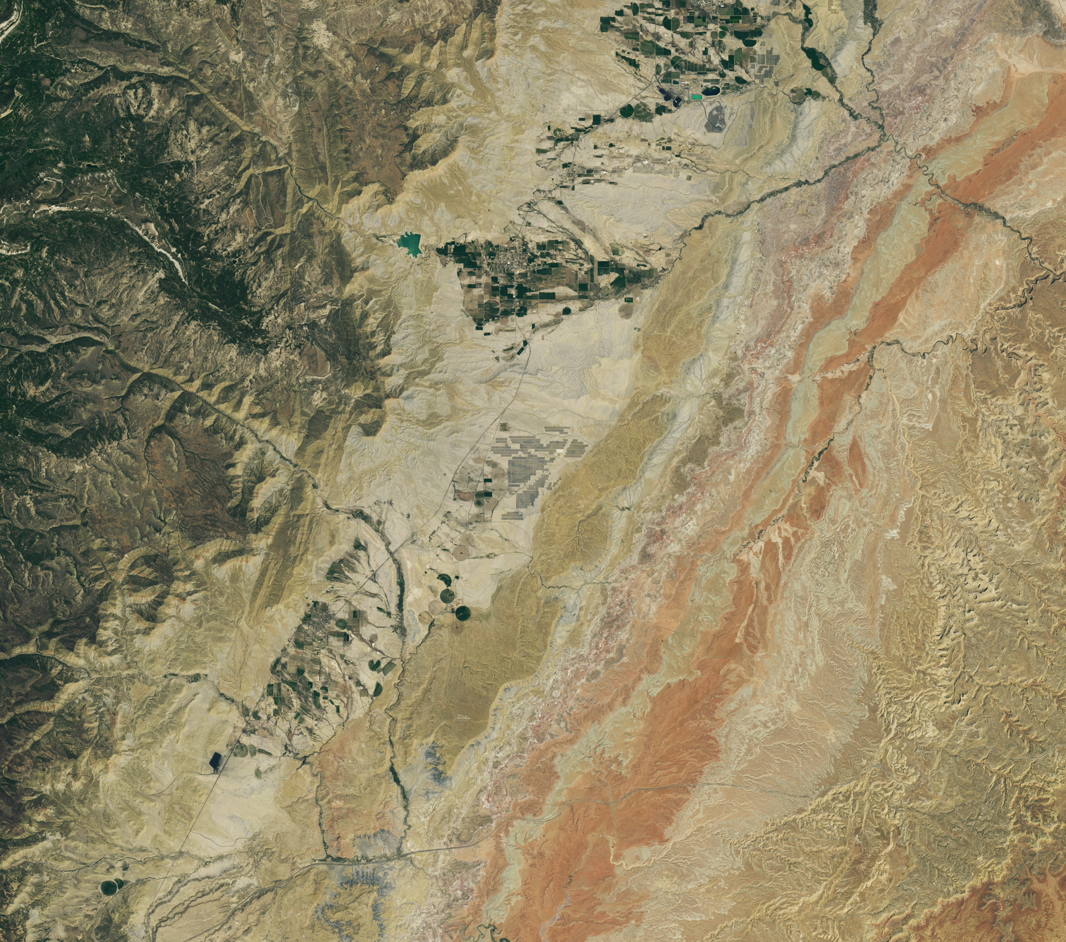
Historically, central Utah’s Castle Valley has been a coal hub, with mining operations on the slopes of the Wasatch Plateau to the west active since the late 1800s. A different energy development arrived in the region in June 2026, when a large solar power and battery storage plant came online in the sunny valley about 130 miles (210 kilometers) southeast of Salt Lake City.

The recently constructed Green River Energy Center, seen in the Landsat 8 image above (right), features nearly one million solar panels and roughly 500 batteries on several square miles of previously undeveloped land. The facility has 400 megawatts of solar-generating capacity with another 400 megawatts of battery storage. That places it among the many utility-scale solar power and battery storage projects that the U.S. Energy Information Administration expects to be plugged into the country’s grid in 2026.

The Utah facility is slated to supply power to Salt Lake City and other areas across the state, according to news reports, and project staff estimate it could produce enough electricity for more than 100,000 homes. With its integrated battery storage, the plant has the potential to generate power at all hours, even when the Sun isn’t shining. And the Green River Energy Center can build on Castle Valley’s energy legacy by utilizing existing transmission lines originally built for coal-fired power plants in the area.

Though Utah adopted coal as its state rock and has long relied on it for energy, other sources, such as solar and geothermal, are becoming larger parts of the state’s energy mix. In 2025, coal fueled about half of the state’s electricity generation, down from about 75 percent in 2015. Meanwhile, solar grew to account for about 14 percent of generation in 2025, up from nearly zero a decade before. Satellite data can be useful to planners and policymakers involved in energy transitions for assessing the potential of renewable energy systems and tracking their adoption and performance.

NASA Earth Observatory images by Lauren Dauphin, using Landsat data from the U.S. Geological Survey. Story by Lindsey Doermann.

Downloads

A dry, tan-colored valley containing a few circular irrigated fields runs roughly north-south through the image.

June 16, 2024

JPEG (9.90 MB)

Grid-like arrays of solar panels cover parts of a valley floor in a brown, dry-looking area of Utah.

June 6, 2026

JPEG (4.50 MB)

References & Resources

You may also be interested in:

Stay up-to-date with the latest content from NASA as we explore the universe and discover more about our home planet.

Picturing Earth in a New Light

3 min read

A recent analysis revealed where artificial light at night has intensified, as well as where it has diminished.

Article

Ahuachapán and Its Restive Neighbors

3 min read

From a geothermal hotspot to the one-time “Lighthouse of the Pacific,” the heat is on beneath the volcanic landscape of…

Article

A Moonlit Earth as Seen From Artemis II

4 min read

An astronaut’s photo, taken en route to the Moon, reveals our planet and its place in space in a novel…

Article

Shaping the Emerald City

20 July 2026 at 05:01
A top-down photo of the greater Seattle area shows a mix of light-colored developed areas and green parks and neighborhoods. Puget Sound and Lake Washington run along Seattle’s west and east sides, respectively.
June 16, 2026

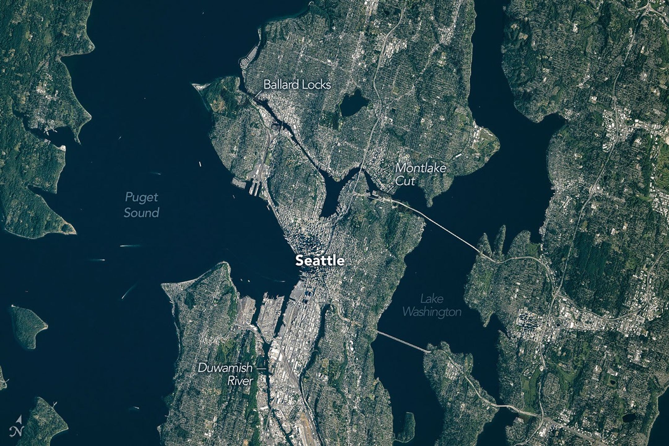
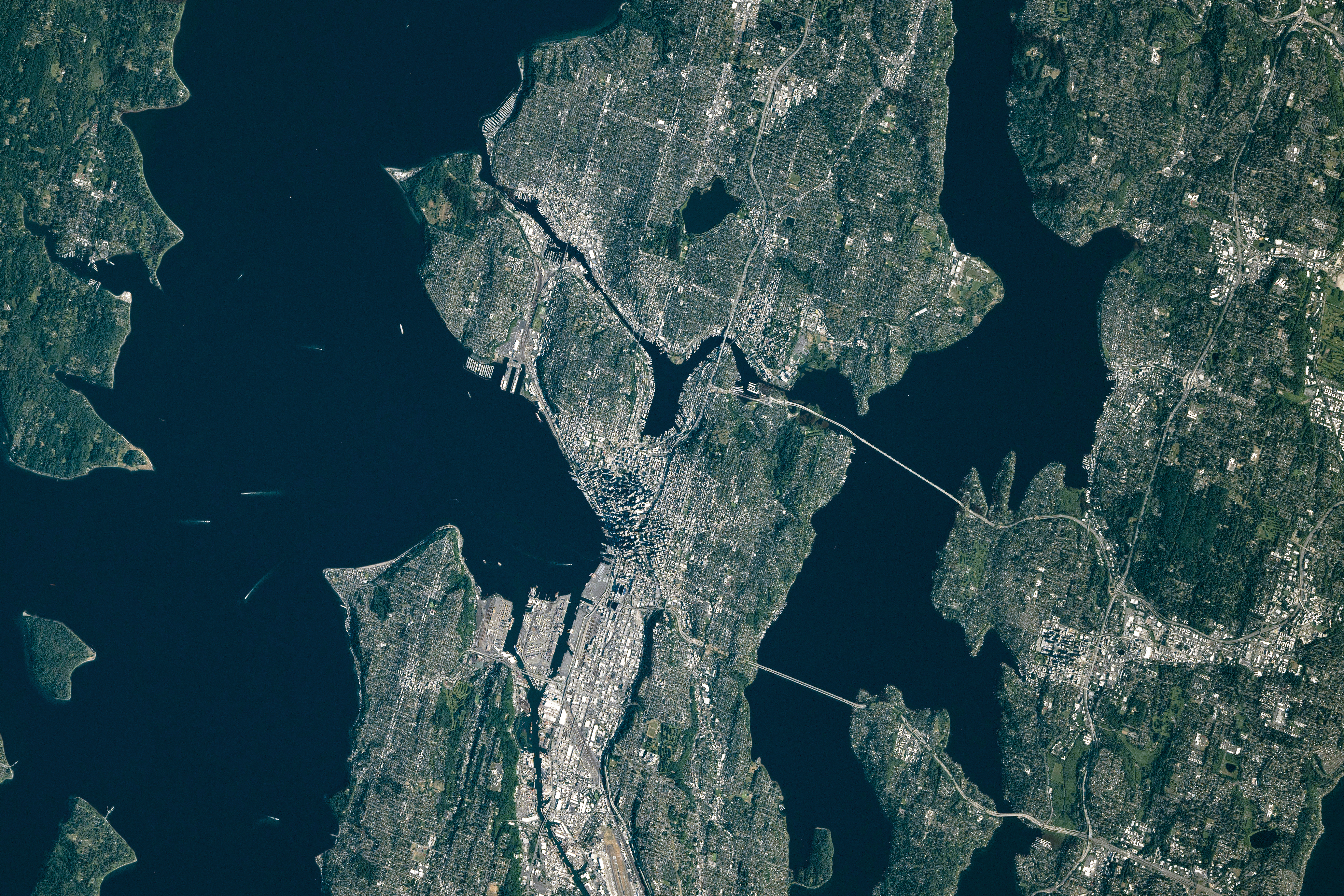
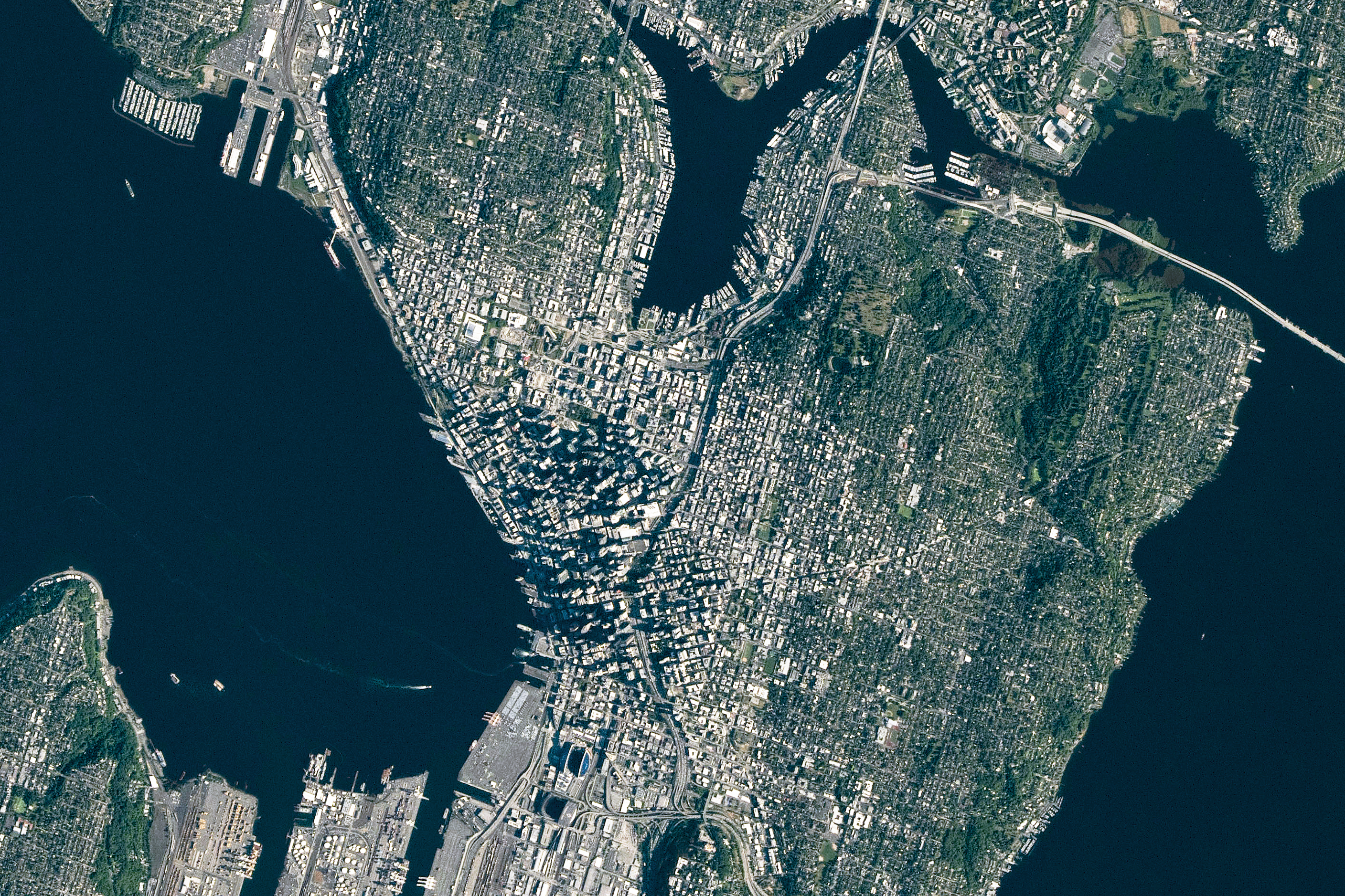
Seattle, Washington—sometimes known as the “Emerald City”—was glimmering in the morning sunlight when an astronaut aboard the International Space Station took this photo on June 16, 2026. The city’s parks and tree-filled neighborhoods lend a lush, green look to the metropolis, while tall buildings downtown cast long shadows and ships navigate surrounding waterways.

The broad contours of the city’s landscape and the water around it owe their shape to the advance and retreat of glaciers during the last ice age. Between roughly 18,000 and 16,000 years ago, the Puget lobe of the Cordilleran ice sheet covered the area in a mass of ice up to 3,300 feet (1,000 meters) thick. The glacier scoured the basins now occupied by Puget Sound and the region’s lakes. 

The glacier left its mark above water, too. Several of Seattle’s notorious hills (of which there are seven or more, depending on who’s counting) are drumlins. These elongated mounds of glacial debris run north-south, parallel to the direction of the ice’s movement. East-west travelers in the city, facing challenging ups and downs, may attest to this topographic trend.

The ice also transported large boulders called glacial erratics from more northerly locations and deposited them around the region. A particularly large erratic, the Wedgwood Rock, stands about 20 feet (6 meters) tall and draws its name from the North Seattle neighborhood in which it rests.

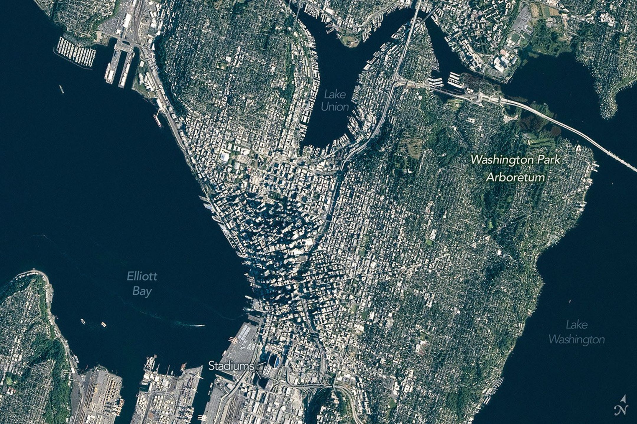
A top-down photo focuses on downtown Seattle, where tall buildings cast long shadows. Green neighborhoods and parks surround the dense urban development, and large waterbodies lie to the east and west.
June 16, 2026

In more recent times, humans have undertaken projects to rework the topography. Notable alterations include leveling Denny Hill north of downtown and filling in tideflats at the mouth of the Duwamish River south of downtown, which created around 1,300 acres of new land. Seattle’s professional sports stadiums sit atop this fill.

This photo was acquired after several development projects to update waterfront infrastructure downtown, initiated in 2010, were completed. These include a new ferry dock and terminal, a rebuilt seawall, and a tunnel to replace an above-ground highway and create more inviting public access to the waterfront.

Some replumbing of the region’s waterways is apparent from the astronaut’s perspective, as well. In the 1910s, the Army Corps of Engineers built canals on either side of Lake Union to connect Puget Sound (an inlet of the Pacific Ocean) with Lake Washington. Starting in 1916, the Montlake Cut connected Lake Washington to Lake Union, and the Ballard Locks, northwest of Lake Union, began raising and lowering watercraft between the freshwater lakes and tidal Puget Sound. As a result of this project, Lake Washington’s water level dropped about 9 feet (3 meters) and ceased draining from its natural outlet at its southern end.

Today, the waters in and around Seattle support many uses: container ships, cruise ships, car and passenger ferries, floatplanes, and recreational craft ply the sound and lakes. And as for Seattle’s emerald nickname, pockets of old-growth forest still exist within city limits, containing centuries-old trees such as Douglas fir, Western red cedar, and Western hemlock. Seattleites often spot wildlife such as bald eagles, coyotes, and sea lions in the city’s various habitats.

Astronaut photograph ISS074-E-723719 was acquired on June 16, 2026, with a Nikon Z9 digital camera using a focal length of 560 millimeters. It is provided by the ISS Crew Earth Observations Facility and the Earth Science and Remote Sensing Unit at NASA Johnson Space Center. The image was taken by a member of the Expedition 74 crew. The image has been cropped and enhanced to improve contrast, and lens artifacts have been removed. The International Space Station Program supports the laboratory as part of the ISS National Lab to help astronauts take pictures of Earth that will be of the greatest value to scientists and the public, and to make those images freely available on the Internet. Additional images taken by astronauts and cosmonauts can be viewed at the NASA/JSC Gateway to Astronaut Photography of Earth. Story by Lindsey Doermann.

Downloads

A top-down photo of the greater Seattle area shows a mix of light-colored developed areas and green parks and neighborhoods. Puget Sound and Lake Washington run along Seattle’s west and east sides, respectively.

June 16, 2026: Wide view

JPEG (14.37 MB)

A top-down photo focuses on downtown Seattle, where tall buildings cast long shadows. Green neighborhoods and parks surround the dense urban development, and large waterbodies lie to the east and west.

June 16, 2026: Detailed view

JPEG (6.72 MB)

References & Resources

You may also be interested in:

Stay up-to-date with the latest content from NASA as we explore the universe and discover more about our home planet.

Farming in Ancient Lake Agassiz

3 min read

The glacial lake left a layer of silt and clay in southeastern Manitoba, creating fertile farmland that was divided during…

Article

A Most Unusual Lake

4 min read

Lake Unter-See in Antarctica, sealed beneath thick ice, has unusual water chemistry and cone-shaped microbial structures resembling some of Earth’s…

Article

Tyndall’s Trail of Bergs

4 min read

Ice splintered off the southern Patagonia glacier and drifted across a growing glacial lake.

Article

Ontario Wildfire Smoke Moves East

16 July 2026 at 05:00
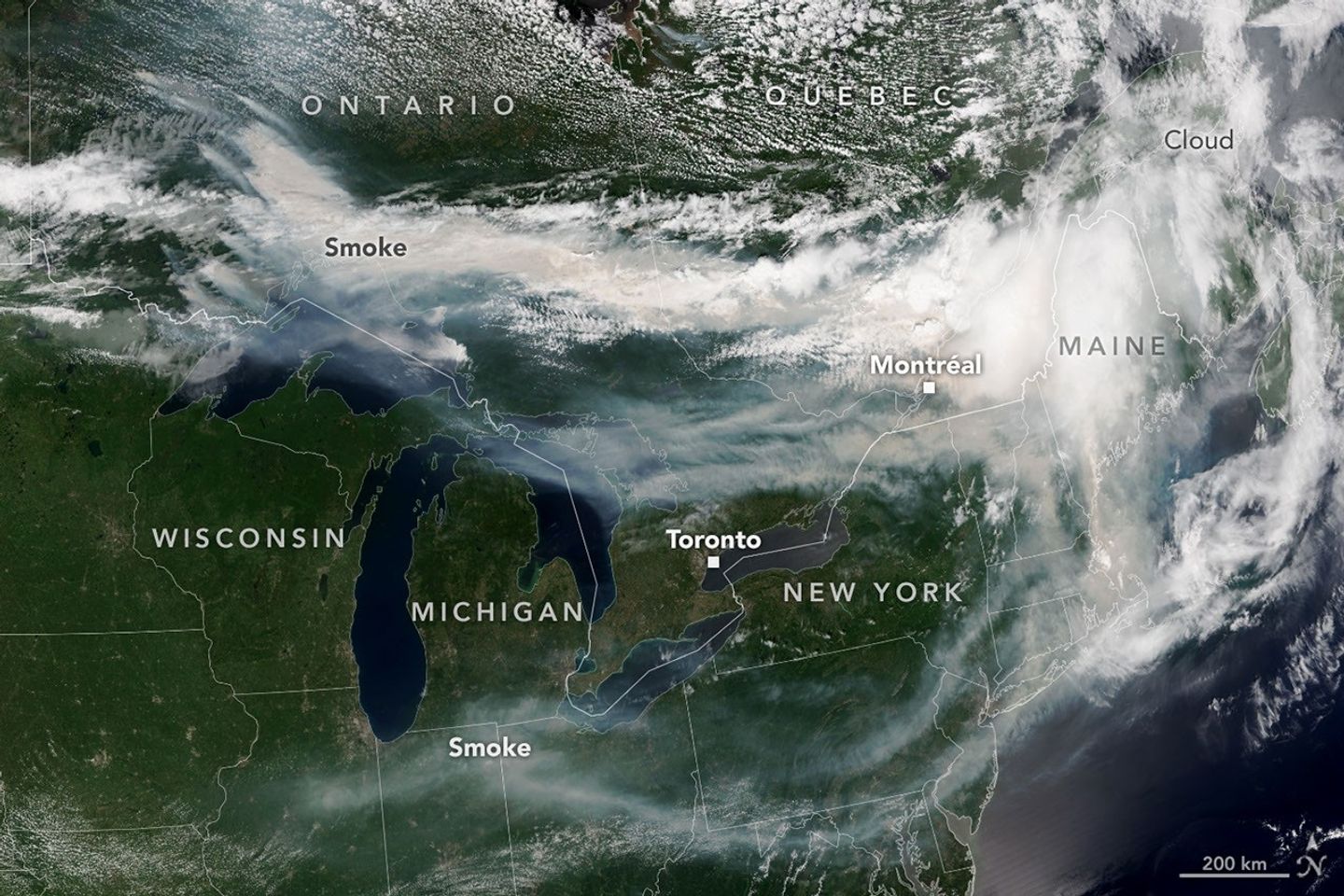
A satellite image shows brown smoke from wildfires in Ontario, Canada, streaming east across parts of Canada and the U.S. Areas of white clouds are mixed in with the smoke.
Smoke from wildland fires pours eastward over Canada and the U.S. in an image captured on the afternoon of July 14, 2026, by the VIIRS (Visible Infrared Imaging Radiometer Suite) on the NOAA-21 satellite.
NASA Earth Observatory/Lauren Dauphin

After a slow start to Canada’s 2026 fire season, activity picked up by the end of June amid dry, warm conditions and returned closer to the 25-year average. By mid-July, almost 850 fires were actively burning across the country, according to the Canadian Interagency Forest Fire Centre. More than 180 of those were burning in Ontario.

This NOAA-21 image, acquired on the afternoon of July 14, 2026, shows smoke billowing from the Ontario fires. Winds carried the smoke primarily southeast over much of the southern part of the province, as well as parts of Quebec and the U.S. Midwest and Northeast, tinting the sky shades of gray and yellow and the Sun orange in many areas.

The smoke’s impact on air quality varied, depending largely on altitude. In areas where smoke was high in the atmosphere, air quality impacts were negligible; where it drifted closer to the ground, conditions worsened. Air quality in Toronto, for instance, reached unhealthy levels, according to AirNow. People in the southern parts of the province were also grappling with a heat wave, compounding the health risks.

Much of the smoke came from fires in Northwestern Ontario, where eight blazes saw significant growth on July 13 and 14. The fires prompted officials to issue evacuation orders for several communities in this part of the province, according to news reports.

As of July 14, fires across Canada have burned 1.9 million hectares (4.7 million acres) since the start of the year—still well below the season totals from the extreme fire years of 2023 and 2025. How the rest of the season plays out remains to be seen. A seasonal fire outlook—compiled by wildland fire experts from the U.S., Canada, and Mexico—shows where fire conditions are more or less likely through July, August, and September.

NASA Earth Observatory image by Lauren Dauphin, using VIIRS data from NASA EOSDIS LANCE , GIBS/Worldview , and the Joint Polar Satellite System (JPSS). Story by Kathryn Hansen.

Downloads

A satellite image shows brown smoke from wildfires in Ontario, Canada, streaming east across parts of Canada and the U.S. Areas of white clouds are mixed in with the smoke.

July 14, 2026

JPEG (3.96 MB)

References & Resources

You may also be interested in:

Stay up-to-date with the latest content from NASA as we explore the universe and discover more about our home planet.

Fighting Fire With Fire
3 min read

In fire-prone ecosystems in Australia’s Northern Territory, prescribed burns are lit to minimize the severity of fires later in the…

Article
Fires Tear Through Nebraska Grasslands
3 min read

Dry, warm, and windy conditions across the U.S. Great Plains led to extreme fire activity in March 2026.

Article
Cottonwood Fire Chars Utah
5 min read

The blaze burned more than 150 square miles and swept through parts of a ski resort.

Article

The post Ontario Wildfire Smoke Moves East appeared first on NASA Science.

Ontario Wildfire Smoke Moves East

16 July 2026 at 05:00
A satellite image shows brown smoke from wildfires in Ontario, Canada, streaming east across parts of Canada and the U.S. Areas of white clouds are mixed in with the smoke.
Smoke from wildland fires pours eastward over Canada and the U.S. in an image captured on the afternoon of July 14, 2026, by the VIIRS (Visible Infrared Imaging Radiometer Suite) on the NOAA-21 satellite.
NASA Earth Observatory/Lauren Dauphin

After a slow start to Canada’s 2026 fire season, activity picked up by the end of June amid dry, warm conditions and returned closer to the 25-year average. By mid-July, almost 850 fires were actively burning across the country, according to the Canadian Interagency Forest Fire Centre. More than 180 of those were burning in Ontario.

This NOAA-21 image, acquired on the afternoon of July 14, 2026, shows smoke billowing from the Ontario fires. Winds carried the smoke primarily southeast over much of the southern part of the province, as well as parts of Quebec and the U.S. Midwest and Northeast, tinting the sky shades of gray and yellow and the Sun orange in many areas.

The smoke’s impact on air quality varied, depending largely on altitude. In areas where smoke was high in the atmosphere, air quality impacts were negligible; where it drifted closer to the ground, conditions worsened. Air quality in Toronto, for instance, reached unhealthy levels, according to AirNow. People in the southern parts of the province were also grappling with a heat wave, compounding the health risks.

Much of the smoke came from fires in Northwestern Ontario, where eight blazes saw significant growth on July 13 and 14. The fires prompted officials to issue evacuation orders for several communities in this part of the province, according to news reports.

As of July 14, fires across Canada have burned 1.9 million hectares (4.7 million acres) since the start of the year—still well below the season totals from the extreme fire years of 2023 and 2025. How the rest of the season plays out remains to be seen. A seasonal fire outlook—compiled by wildland fire experts from the U.S., Canada, and Mexico—shows where fire conditions are more or less likely through July, August, and September.

NASA Earth Observatory image by Lauren Dauphin, using VIIRS data from NASA EOSDIS LANCE , GIBS/Worldview , and the Joint Polar Satellite System (JPSS). Story by Kathryn Hansen.

Downloads

A satellite image shows brown smoke from wildfires in Ontario, Canada, streaming east across parts of Canada and the U.S. Areas of white clouds are mixed in with the smoke.

July 14, 2026

JPEG (3.96 MB)

References & Resources

You may also be interested in:

Stay up-to-date with the latest content from NASA as we explore the universe and discover more about our home planet.

Fighting Fire With Fire

3 min read

In fire-prone ecosystems in Australia’s Northern Territory, prescribed burns are lit to minimize the severity of fires later in the…

Article

Fires Tear Through Nebraska Grasslands

3 min read

Dry, warm, and windy conditions across the U.S. Great Plains led to extreme fire activity in March 2026.

Article

Cottonwood Fire Chars Utah

5 min read

The blaze burned more than 150 square miles and swept through parts of a ski resort.

Article

Super Typhoon Bavi

9 July 2026 at 05:01
The eyewall of a super typhoon is partially illuminated by moonlight in a nighttime satellite image.
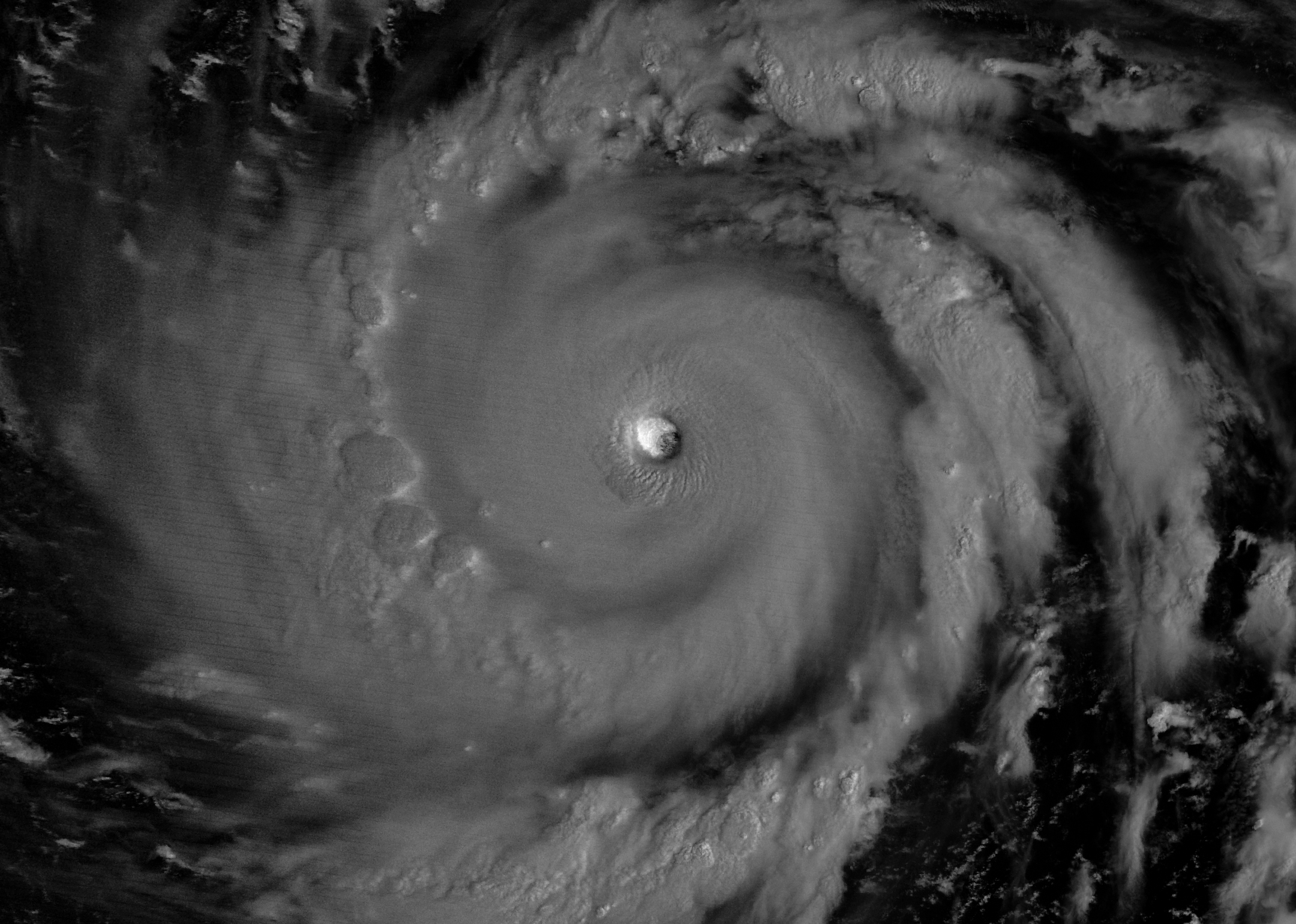
Moonlight illuminates the western side of Super Typhoon Bavi’s eyewall at about 15:30 Universal Time on July 5 (1:30 a.m. local time on July 6). The image was acquired with the VIIRS (Visible Infrared Imaging Radiometer Suite) day-night band on the NOAA-20 satellite.
NASA Earth Observatory/Michala Garrison

In early July 2026, for the second time in three months, a powerful typhoon crossed the U.S. Northern Mariana Islands and Guam in the North Pacific Ocean. Super Typhoon Bavi was at peak intensity when it neared the islands on the night of July 5, bringing winds of 290 kilometers (180 miles) per hour, along with torrential rain and dangerous storm surge.

This nighttime image, captured by the VIIRS (Visible Infrared Imaging Radiometer Suite) on the NOAA-20 satellite, shows Bavi’s eye at about 15:30 Universal Time on July 5 (1:30 a.m. local time on July 6). Light from the Moon, which was in the waning gibbous phase, illuminates the eyewall’s western side. The eye passed over Rota, north of Guam, several hours after the image was acquired.

Bavi became a super typhoon in the early hours of July 4 local time while tracking west over the warm ocean. Satellite observations indicated that sea surface temperatures were around 30 degrees Celsius (86 degrees Fahrenheit) in the region. Bavi was the third tropical cyclone in 2026 to reach category 5 intensity on the Saffir-Simpson wind scale.

The typhoon caused extensive damage across Guam, Rota, and Saipan, according to news reports, downing power poles and lines; flooding roads and littering them with debris; and damaging buildings, including a water distribution station on Rota. U.S. Coast Guard crews worked to clear navigation hazards in the waterways around Guam and the Northern Marianas and reopen ports as dangerous marine conditions subsided, according to reports. This damage comes on top of destructive winds and flooding from Super Typhoon Sinlaku, which crossed the islands in mid-April.

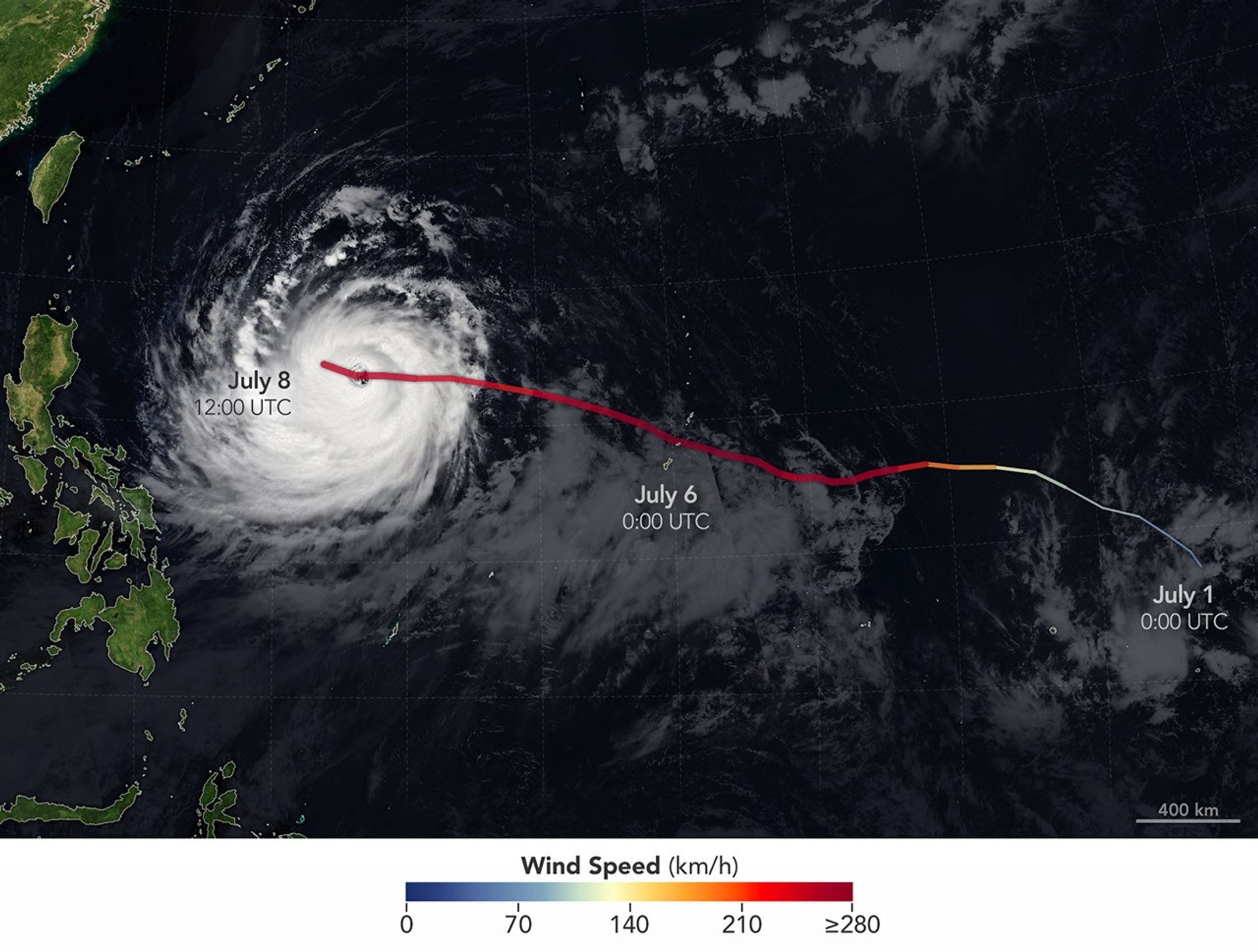
The spiraling clouds of Super Typhoon Bavi appear over the Philippine Sea southeast of Taiwan. The storm’s westward track is shown in colors corresponding to wind speed.
Super Typhoon Bavi tracked west over the Northern Mariana Islands toward Asia in early July 2026. The storm’s clouds and path are overlaid on a Blue Marble: Next Generation image built from scenes captured by the MODIS (Moderate Resolution Imaging Spectroradiometer). The image of the storm was captured by the VIIRS (Visible Infrared Imaging Radiometer Suite) on the NOAA-21 satellite on July 8, 2026, at about 04:30 Universal Time.
NASA Earth Observatory/Michala Garrison

On July 8, Bavi remained a powerful typhoon as it moved west over the Philippine Sea. In the early afternoon, when the image above was captured, the National Weather Service reported maximum sustained wind speeds of 250 kilometers (155 miles) per hour. Forecasts indicated the typhoon’s track could bend northwest toward Taiwan, the Ryukyu Islands of southern Japan, and mainland China and weaken over the next several days.

Writing in Yale Climate Connections, meteorologist Jeff Masters said that Bavi is the type of storm that might be expected when a strong El Niño event is building, which is currently the case. El Niño-year typhoons may form farther east, giving them more time over warm water to intensify before curving toward Asia, Masters explained, “resulting in a greater chance of reaching Category 5 intensity.”

NASA Earth Observatory images by Michala Garrison, using data from NASA EOSDIS LANCE, GIBS/Worldview, and the Joint Polar Satellite System (JPSS), and hurricane track data from the U.S. Naval Research Laboratory. Story by Lindsey Doermann.

Downloads

The eyewall of a super typhoon is partially illuminated by moonlight in a nighttime satellite image.

July 5, 2026

JPEG (1.47 MB)

The spiraling clouds of Super Typhoon Bavi appear over the Philippine Sea southeast of Taiwan. The storm’s westward track is shown in colors corresponding to wind speed.

July 8, 2026

JPEG (1.54 MB)

References & Resources

You may also be interested in:

Stay up-to-date with the latest content from NASA as we explore the universe and discover more about our home planet.

Super Typhoon Sinlaku

3 min read

The violent storm aimed at the U.S. Northern Mariana Islands and Guam in mid-April 2026.

Article

Typhoon Jangmi

2 min read

The sprawling storm promised to deliver torrential rain across a wide swath of southern Japan.

Article

Gravity Waves From Super Typhoon Sinlaku

4 min read

Satellites observed striking upper-atmosphere phenomena generated by an intensifying tropical cyclone.

Article

Cottonwood Fire Chars Utah

8 July 2026 at 05:01


June 5
June 29

Mountainous landscapes appear green and untouched by fire in a satellite image acquired on June 5, 2026.
NASA Earth Observatory/Michala Garrison

An image of the same area shows a large brown patch spanning much of the image in an image acquired after the fire on June 29, 2026.
NASA Earth Observatory/Michala Garrison

Mountainous landscapes appear green and untouched by fire in a satellite image acquired on June 5, 2026.
NASA Earth Observatory/Michala Garrison
An image of the same area shows a large brown patch spanning much of the image in an image acquired after the fire on June 29, 2026.
NASA Earth Observatory/Michala Garrison

June 5

June 29


A burned landscape spans more than 150 square miles (390 square kilometers) of rugged terrain northwest of Junction, Utah, as seen in this pair of images captured by the OLI (Operational Land Imager) on Landsat 8 and Landsat 9 on June 5, 2026 (left) and June 29, 2026 (right). NASA Earth Observatory images by Michala Garrison.

After a winter of below-average snowpack and an unusually warm and dry start to summer, the National Interagency Fire Center warned that the Great Basin and parts of the Rockies faced an elevated risk of wildfires in July 2026.

The warning proved accurate. By July 7, firefighters labored to contain nearly three dozen large, early-season wildland fires that raced through forests in several parts of the western U.S. Utah was among the most active states, with fires having charred 558 square miles (1,445 square kilometers) and four major fires that were not fully contained still burning.

The Cottonwood fire ranked as one of Utah’s—and the country’s—largest and most destructive fires of the year so far. As of July 7, it had burned 150 square miles (390 square kilometers), just shy of the Babylon fire in eastern Utah. Landsat 9 captured the false-color image (bands 7-5-4) above (right) on June 29, 2026, when blackened vegetation spanned a large patch of rugged terrain along the Beaver River. The image on the left shows the same area on June 5, a few weeks before the fire ignited. In this band combination of shortwave infrared, near infrared, and visible light, unburned vegetation appears bright green, snow is blue, and clouds are white.

Ponderosa pine, oak, sagebrush, and grasses were among the vegetation types that burned. Officials with the state’s forestry division told news media that the Cottonwood fire had destroyed up to 150 structures. Eagle Point Ski Resort, which lost more than 100 condos and 30 cabins, also reported damage to four of its five chairlifts.

The damage to forests was extensive, though isolated patches survived largely unscathed, remaining as green oases within the broader burned area. Among them were the forests around Tushar Campground, the site of a 4-H summer camp. Beaver County officials credited years of forest treatments, such as clearing brush and trimming branches, with helping save the campground and surrounding forests.

The fire spreads especially rapidly on June 23 and June 26. The fire perimeters in this visualization are based on data from NASA’s Fire Events Data Suite.
NASA Earth Observatory/Michala Garrison

As the fire spread, NASA’s Fire Events Data Suite (FEDS) tracked its progression and rate of growth. The visualization above, based on the FEDS system, shows the fire surging on June 23 and tripling in size over 12 hours that day as it spread to the north, east, and south. It also grew rapidly on June 26, when it made a run to the north. FEDS draws on data from the VIIRS (Visible Infrared Imaging Radiometer Suite) sensors aboard the Suomi NPP, NOAA-20, and NOAA-21 satellites, which detect active fires day and night by their thermal infrared signature.

FEDS is one of several tools available to firefighters and emergency management officials when responding to fires. First responders often rely on higher-resolution airborne imagers or on firefighters walking fire edges to map perimeters. FEDS offers a different advantage: consistent, easily accessible data that do not need to be specially requested, according to Tempest McCabe, a University of Maryland scientist based at NASA’s Goddard Space Flight Center who helped develop the tool. As a result, FEDS often detects a fire’s start earlier than other sources and tracks blazes for their full duration. To capitalize on strengths like these, the FEDS team is working closely with operational fire behavior analysts, with support from NASA’s FireSense program, to better understand and anticipate periods of rapid fire spread.

A total of 1,289 firefighters have been deployed to the Cottonwood fire, according to InciWeb, a website managed by the National Interagency Fire Center. As of July 7, the fire was 56 percent contained, but forecasters expect a hot, dry weather pattern to persist in the coming days, with fire behavior likely to be “very active to extreme” over the next 72 hours.

Government satellite data are part of a global system of observations used to track fire behavior and analyze emerging trends. Among the real-time wildfire monitoring tools that NASA makes available are FIRMS (Fire Information for Resource Management System), the Worldview browser, and the Fire Event Explorer.

As of July 7, 2026, fires had burned 5,265 square miles (13,636 square kilometers) across the United States, according to the National Interagency Fire Center. That’s 46 percent more than the 10-year average (2016-2025) for that point in the season.

NASA Earth Observatory images by Michala Garrison, using Landsat data from the U.S. Geological Survey and fire perimeter data from the Fire Events Data Suite. Story by Adam Voiland.

Downloads

Mountainous landscapes appear green and untouched by fire in a satellite image acquired on June 5, 2026.

June 5, 2026

JPEG (1.39 MB)

An image of the same area shows a large brown patch spanning much of the image in an image acquired after the fire on June 29, 2026.

June 29, 2026

JPEG (1.41 MB)

An animation shows the expansion of the fire between June 23 and July 7, with the burned area from the fire beginning as a small patch near Beaver, Utah, and then spreading north, east, and south.

FEDS fire perimeter (June 23-July 7)

JPEG (1.80 MB)

References & Resources

You may also be interested in:

Stay up-to-date with the latest content from NASA as we explore the universe and discover more about our home planet.

Fires Tear Through Nebraska Grasslands

3 min read

Dry, warm, and windy conditions across the U.S. Great Plains led to extreme fire activity in March 2026.

Article

Fire’s Footprint on Santa Rosa Island

3 min read

A wildland fire charred grassland, coastal sage scrub, and chaparral across one-third of the island, the second largest of the…

Article

Smoke Rises Over Big Cypress National Preserve

2 min read

The National fire has burned tens of thousands of acres within the Florida preserve, fueled by vegetation dried by prolonged…

Article

July 2026 Satellite Puzzler

7 July 2026 at 16:48
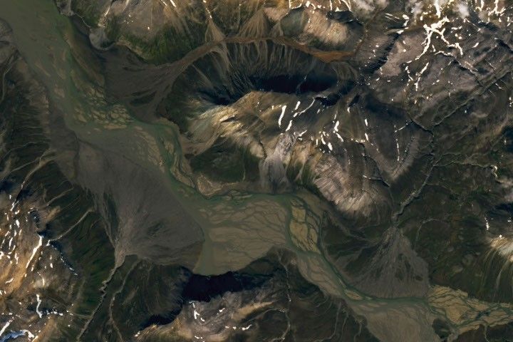
A braided river meanders across the image. Smaller streams empty into the wide channel from either side, forming fan-shaped deposits.

Every month, NASA Earth Observatory features a puzzling satellite image. The July 2026 puzzler appears above. 

Your Challenge
I
dentify the location shown in this satellite image. Share what clues you see, where you think it is, and what makes this place interesting or unique to you.

How to Answer
Submit your response using this form and select “Puzzler Answer” as the topic. Please include your preferred name or alias.

You can keep it simple and just guess the location. Want to impress us? Tell us which satellite and instrument captured the image, which spectral bands were used, or point out a subtle detail about the geology or history of the area. If something catches your eye, or if this is your home or means something to you, we’d love to hear about it.

The Prize
We can’t offer prize money or a trip to space to see Earth like satellites and astronauts do. But we can offer something almost as rewarding: puzzler bragging rights.

About a week after the challenge, we’ll post the answer at the top of this page, along with a link to an Earth Observatory Image of the Day story that explains the image in more detail. We’ll recognize the first person who correctly guesses the location, and we may also highlight readers who share especially thoughtful or interesting answers. By submitting a response, you acknowledge that your comments may be edited, excerpted, and published on this page.

Until then, zoom in, look closely, and enjoy the challenge. See you at the reveal!

The World Cup From 250 Miles Up

7 July 2026 at 05:00
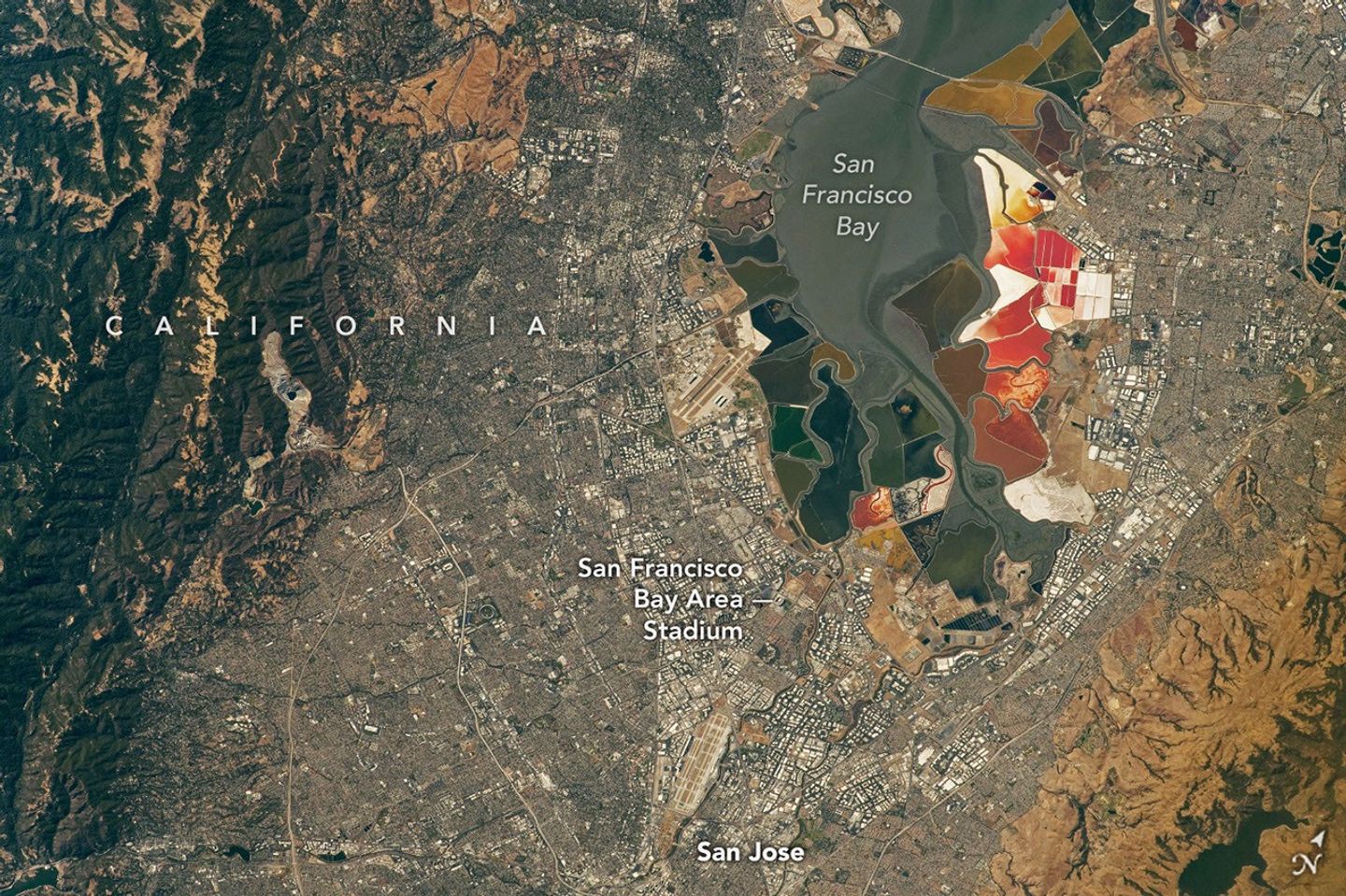
An aerial view of the San Francisco Bay Area Stadium, middle-left, is surrounded by urban infrastructure. Colorful ponds of the southern San Francisco Bay are visible toward the top.
July 26, 2022

In summer 2026, sixteen stadiums across North America hosted matches as part of the FIFA World Cup. Over the years, astronauts aboard the International Space Station have captured a top-down view of the infrastructure, landscapes, and ecosystems surrounding many of these venues.  

Six of the matches were played at the San Francisco Bay Area Stadium, beginning on June 13 with a match-up between Qatar and Switzerland. This stadium (also called Levi’s Stadium) is located in Santa Clara, California, adjacent to San Jose and around 40 miles (64 kilometers) south of San Francisco. An astronaut aboard the International Space Station took this photo (above) on July 26, 2022.

The stadium, completed in 2014, is surrounded by a mix of recreational, housing, and business infrastructure. The scene includes the southern part of San Francisco Bay, which is 23 years into a 50-year effort to restore up to 90 percent of the region’s salt ponds to tidal wetlands and marshlands, while retaining some of its salt-making heritage.

The Bay Area hosted its sixth and final World Cup match on July 1, when the U.S. faced off against Bosnia and Herzegovina in a knockout match. The U.S. advanced to the round of 16 following a 2-0 win.

An aerial view of the San Francisco Bay Area Stadium, middle-left, is surrounded by urban infrastructure. Colorful ponds of the southern San Francisco Bay are visible toward the top.
April 17, 2022

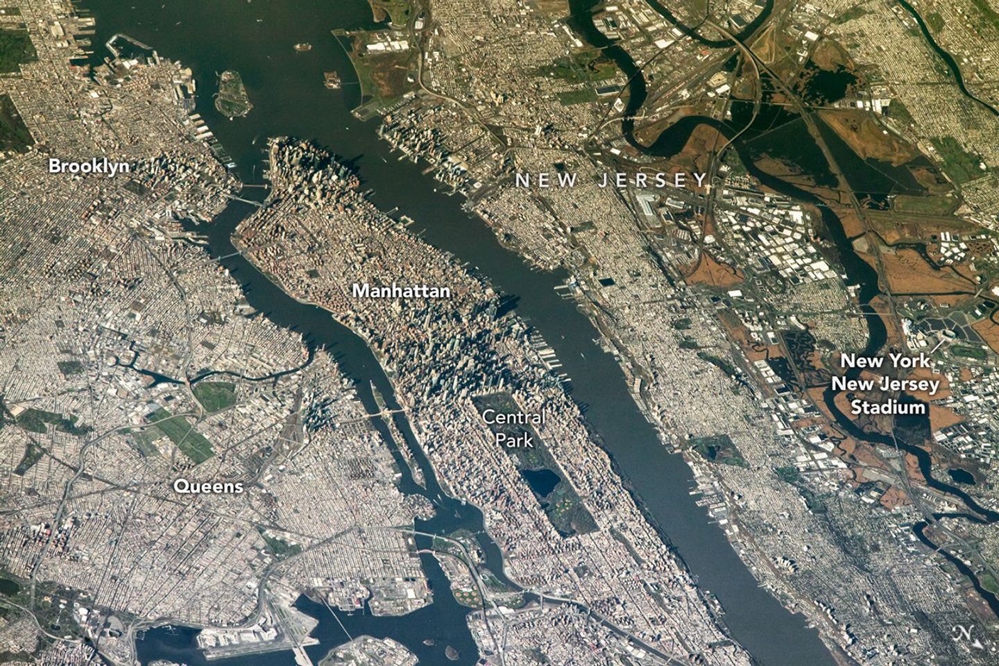
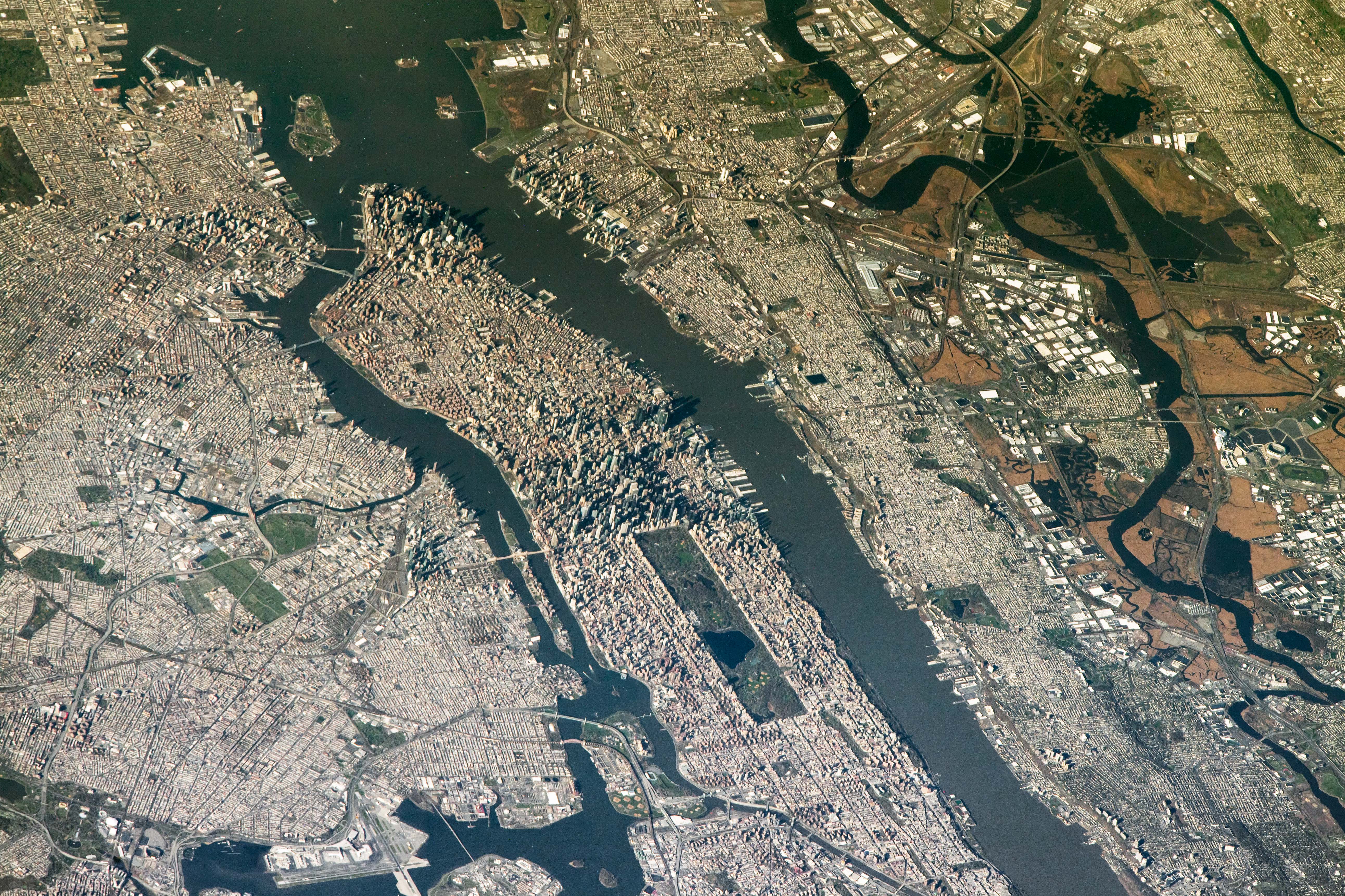
The FIFA World Cup final is scheduled for July 19 at New York New Jersey Stadium, part of the Meadowlands Sports Complex, in East Rutherford, New Jersey. The stadium (also called MetLife Stadium) sits along the New Jersey Turnpike, west of Midtown Manhattan. Note that north is toward the bottom-right of this photo, captured by an astronaut on April 17, 2022.

The area has seen centuries of human impact. Colonists cleared wetlands and cedar forest for settlements, and development for a range of economic and industrial uses followed. In the 20th century, it became an unregulated dumping ground. In recent decades, though, wetland restoration efforts have occurred alongside the development of the sports and entertainment complex.

Other World Cup host cities have also appeared in astronaut photography and satellite imagery. Guadalajara Stadium (Estadio Akron), Los Angeles Stadium (SoFi Stadium), Houston Stadium (NRG Stadium/Reliant Stadium), and BC Place Vancouver (BC Place) are among the venues that have been observed from above.

Astronaut photograph ISS067-E-202213 was acquired on July 26, 2022, with a Nikon D5 digital camera using a focal length of 400 millimeters, and astronaut photograph ISS067-E-18580 was acquired on April 17, 2022, with a Nikon D5 digital camera using a focal length of 1150 millimeters. They are provided by the ISS Crew Earth Observations Facility and the Earth Science and Remote Sensing Unit at NASA Johnson Space Center. The images were taken by a member of the Expedition 67 crew. The images have been cropped and enhanced to improve contrast, and lens artifacts have been removed. The International Space Station Program supports the laboratory as part of the ISS National Lab to help astronauts take pictures of Earth that will be of the greatest value to scientists and the public, and to make those images freely available on the Internet. Additional images taken by astronauts and cosmonauts can be viewed at the NASA/JSC Gateway to Astronaut Photography of Earth. Story by Kathryn Hansen.

Downloads

An aerial view of the San Francisco Bay Area Stadium, middle-left, is surrounded by urban infrastructure. Colorful ponds of the southern San Francisco Bay are visible toward the top.

July 26, 2022

JPEG (17.97 MB)

An aerial view shows the New York New Jersey Stadium and surrounding Meadowlands on the right, with the dense urban landscape of Manhattan Island centered in the frame.

April 17, 2022

JPEG (3.18 MB)

References & Resources

You may also be interested in:

Stay up-to-date with the latest content from NASA as we explore the universe and discover more about our home planet.

Great Balls of Fire

4 min read

An astronaut on the International Space Station was surprised to photograph a shower of light streaking through the darkness while…

Article

San Francisco’s Metropolitan Mosaic

3 min read

Urban development, green spaces, and maritime activity converge in this Northern California city.

Article

A Moonlit Earth as Seen From Artemis II

4 min read

An astronaut’s photo, taken en route to the Moon, reveals our planet and its place in space in a novel…

Article

Playing the Moon Game 

24 June 2026 at 05:01
A satellite image shows part of Alaska’s Katmai National Park. A chain of snowy mountain peaks stretches from the bottom left corner to the right side of the image. The Valley of Ten Thousand Smokes is a long, tan-colored feature runs toward the northwest in the upper-left.
September 29, 2025

In preparing to visit the Moon’s surface, soon-to-be lunar explorers in NASA’s Apollo program first ventured into a variety of unfamiliar landscapes on Earth. A couple of these trips, in the summers of 1965 and 1966, took astronauts to Alaska’s remote Katmai National Park for simulations of field geology in Moon-like environments.

In one exercise, which they called “playing the Moon game,” pairs of astronauts were placed at unfamiliar field sites and asked to pretend as if they were on the Moon. By the account of William Phinney, Apollo’s science training coordinator, they were tasked with collecting representative geologic samples and practicing how to communicate their observations to scientists.

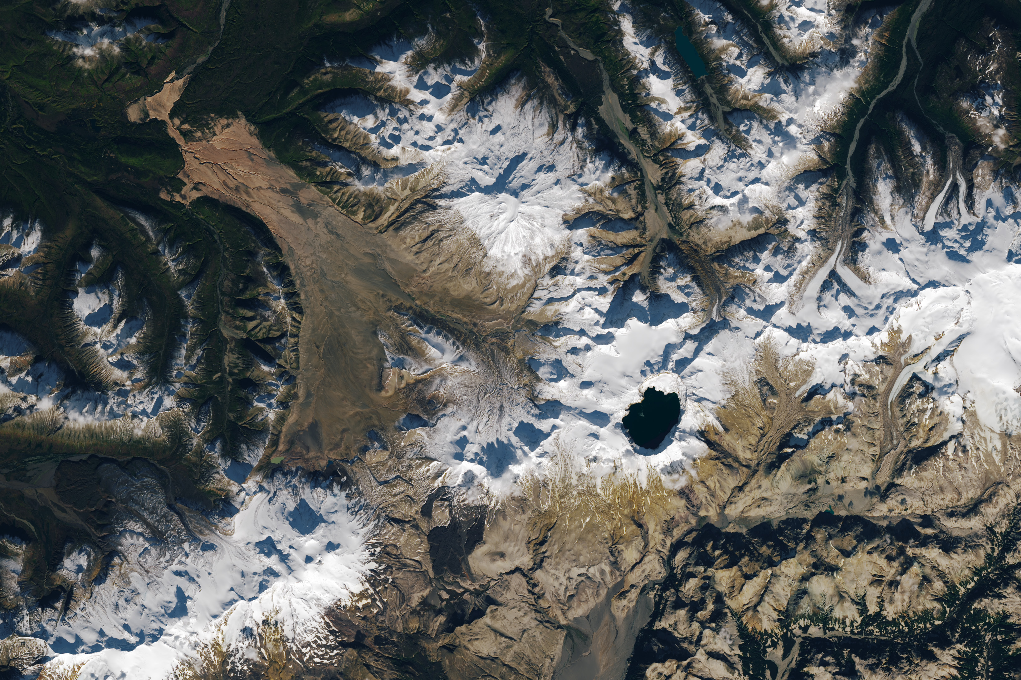
A detailed satellite image centers on the Valley of Ten Thousand Smokes in Alaska. The tan-colored feature runs southeast-to-northwest. Snowy peaks appear on the right side of the image, and green, forested valleys fill the left side.
September 29, 2025

The Alaskan setting for the Moon game was an unusual volcanic landscape called the Valley of Ten Thousand Smokes. The valley is full of debris deposited by the 1912 eruption of Novarupta—the largest volcanic event on Earth in the 20th century.

The images above, acquired on September 29, 2025, with the OLI (Operational Land Imager) on Landsat 9, show the massive ash flow deposited by Novarupta. The layer measures up to 660 feet (200 meters) thick and was emplaced at a searing 1,380 degrees Fahrenheit (750 degrees Celsius). 

The Valley of Ten Thousand Smokes, shown in the 1917 photo below, is so named because of the abundance of fumaroles—gas and steam-emitting vents—that filled the valley for a decade after the eruption. A few hundred persisted more than 10 years, with some lasting until the 1990s.

Three people stand in the foreground of this black-and-white photo, silhouetted by steam coming from a fumarole. A dark, barren landscape dotted with plumes of rising steam extends into the background.
1917

Scientists initially suspected that the monster eruption occurred at Mount Katmai, a neighboring volcano with a large caldera located 6 miles (10 kilometers) east of Novarupta’s dome. However, they later determined that the eruption actually occurred at Novarupta—whose name means “new eruption”—after stealing magma from beneath Katmai. As the magma chamber emptied, Katmai collapsed, forming the 2.5-mile-wide (4-kilometer-wide) caldera present today.

The volcanic landscape in the Valley of Ten Thousand Smokes is far fresher than the ancient lava flows that formed the Moon’s volcanic features. But for the Apollo astronauts, it offered an “excellent opportunity to view volcanic materials and landforms in nearly pristine condition,” Phinney wrote. They studied evidence of fumaroles and examined vertical sections of the deposits where streams had eroded deep gorges.

This photo shows a broad valley filled with tan-colored volcanic material in the foreground and snowy mountains in the background. The ashy volcanic deposits create a mostly flat valley floor, except where steep-sided chasms formed by erosion run through it.
June 9, 1991

Researchers continue to visit this Alaskan wilderness in search of clues that could help decipher the geology of the Moon and Mars. In 2024, the Goddard Instrument Field Team (GIFT) trekked to the Valley of Ten Thousand Smokes to study its icy volcanic landscape. Like the valley, Mars contains glaciers and ice sheets layered with dust and ash, a dynamic and difficult-to-interpret environment.

Advancing lunar science, the GIFT team also collected samples from rock formations comparable to the Moon’s Gruithuisen Domes. These mysterious features are made of hardened lava with a different composition than the surrounding rock. With more to learn about our nearest celestial neighbor, the spirit of the Moon game lives on in the 21st century.

NASA Earth Observatory images by Lauren Dauphin, using Landsat data from the U.S. Geological Survey. Photos from National Geographic Society Katmai expeditions photographs, Archives and Special Collections, Consortium Library, University of Alaska Anchorage, and from the U.S. Geological Survey Volcano Hazards Program. Story by Lindsey Doermann. 

Downloads

A satellite image shows part of Alaska’s Katmai National Park. A chain of snowy mountain peaks stretches from the bottom left corner to the right side of the image. The Valley of Ten Thousand Smokes is a long, tan-colored feature runs toward the northwest in the upper-left.

September 29, 2025

JPEG (2.64 MB)

References & Resources

You may also be interested in:

Stay up-to-date with the latest content from NASA as we explore the universe and discover more about our home planet.

Scoria Cones on Earth and Mars

7 min read

The hill-shaped features are a sign of explosive volcanic activity—a rarity on the Red Planet.

Article

A Volcanic Medley Near Mammoth Lakes 

4 min read

A massive, old caldera and more recently formed craters shape the landscape in the eastern Sierra Nevada.

Article

A Full Moon Checkup

3 min read

Once a month during the full Moon, Landsat 9 turns from Earth to image the lunar surface, helping keep the…

Article

Playing the Moon Game 

24 June 2026 at 05:01
A satellite image shows part of Alaska’s Katmai National Park. A chain of snowy mountain peaks stretches from the bottom left corner to the right side of the image. The Valley of Ten Thousand Smokes is a long, tan-colored feature runs toward the northwest in the upper-left.
September 29, 2025

In preparing to visit the Moon’s surface, soon-to-be lunar explorers in NASA’s Apollo program first ventured into a variety of unfamiliar landscapes on Earth. A couple of these trips, in the summers of 1965 and 1966, took astronauts to Alaska’s remote Katmai National Park for simulations of field geology in Moon-like environments.

In one exercise, which they called “playing the Moon game,” pairs of astronauts were placed at unfamiliar field sites and asked to pretend as if they were on the Moon. By the account of William Phinney, Apollo’s science training coordinator, they were tasked with collecting representative geologic samples and practicing how to communicate their observations to scientists.

A detailed satellite image centers on the Valley of Ten Thousand Smokes in Alaska. The tan-colored feature runs southeast-to-northwest. Snowy peaks appear on the right side of the image, and green, forested valleys fill the left side.
September 29, 2025

The Alaskan setting for the Moon game was an unusual volcanic landscape called the Valley of Ten Thousand Smokes. The valley is full of debris deposited by the 1912 eruption of Novarupta—the largest volcanic event on Earth in the 20th century.

The images above, acquired on September 29, 2025, with the OLI (Operational Land Imager) on Landsat 9, show the massive ash flow deposited by Novarupta. The layer measures up to 660 feet (200 meters) thick and was emplaced at a searing 1,380 degrees Fahrenheit (750 degrees Celsius). 

The Valley of Ten Thousand Smokes, shown in the 1917 photo below, is so named because of the abundance of fumaroles—gas and steam-emitting vents—that filled the valley for a decade after the eruption. A few hundred persisted more than 10 years, with some lasting until the 1990s.

Three people stand in the foreground of this black-and-white photo, silhouetted by steam coming from a fumarole. A dark, barren landscape dotted with plumes of rising steam extends into the background.
1917

Scientists initially suspected that the monster eruption occurred at Mount Katmai, a neighboring volcano with a large caldera located 6 miles (10 kilometers) east of Novarupta’s dome. However, they later determined that the eruption actually occurred at Novarupta—whose name means “new eruption”—after stealing magma from beneath Katmai. As the magma chamber emptied, Katmai collapsed, forming the 2.5-mile-wide (4-kilometer-wide) caldera present today.

The volcanic landscape in the Valley of Ten Thousand Smokes is far fresher than the ancient lava flows that formed the Moon’s volcanic features. But for the Apollo astronauts, it offered an “excellent opportunity to view volcanic materials and landforms in nearly pristine condition,” Phinney wrote. They studied evidence of fumaroles and examined vertical sections of the deposits where streams had eroded deep gorges.

This photo shows a broad valley filled with tan-colored volcanic material in the foreground and snowy mountains in the background. The ashy volcanic deposits create a mostly flat valley floor, except where steep-sided chasms formed by erosion run through it.
June 9, 1991

Researchers continue to visit this Alaskan wilderness in search of clues that could help decipher the geology of the Moon and Mars. In 2024, the Goddard Instrument Field Team (GIFT) trekked to the Valley of Ten Thousand Smokes to study its icy volcanic landscape. Like the valley, Mars contains glaciers and ice sheets layered with dust and ash, a dynamic and difficult-to-interpret environment.

Advancing lunar science, the GIFT team also collected samples from rock formations comparable to the Moon’s Gruithuisen Domes. These mysterious features are made of hardened lava with a different composition than the surrounding rock. With more to learn about our nearest celestial neighbor, the spirit of the Moon game lives on in the 21st century.

NASA Earth Observatory images by Lauren Dauphin, using Landsat data from the U.S. Geological Survey. Photos from National Geographic Society Katmai expeditions photographs, Archives and Special Collections, Consortium Library, University of Alaska Anchorage, and from the U.S. Geological Survey Volcano Hazards Program. Story by Lindsey Doermann. 

Downloads

A satellite image shows part of Alaska’s Katmai National Park. A chain of snowy mountain peaks stretches from the bottom left corner to the right side of the image. The Valley of Ten Thousand Smokes is a long, tan-colored feature runs toward the northwest in the upper-left.

September 29, 2025

JPEG (2.64 MB)

References & Resources

You may also be interested in:

Stay up-to-date with the latest content from NASA as we explore the universe and discover more about our home planet.

Scoria Cones on Earth and Mars
7 min read

The hill-shaped features are a sign of explosive volcanic activity—a rarity on the Red Planet.

Article
A Volcanic Medley Near Mammoth Lakes 
4 min read

A massive, old caldera and more recently formed craters shape the landscape in the eastern Sierra Nevada.

Article
Restless Kīlauea Launches Lava and Ash
3 min read

Episode 43 of the Hawaiian volcano’s current eruption was marked by high lava fountains and widespread ash dispersal.

Article

The post Playing the Moon Game  appeared first on NASA Science.

American Historical Landscapes

23 June 2026 at 20:00

American Historical Landscapes

From Civil War battlegrounds to industrial landmarks to the country’s earliest national parks, these places helped shape the United States we know today.

Washington, the capital of the United States of America

An Earth Observatory Collection

An Early “Decoration Day” Celebration
4 min read

In a precursor to Memorial Day, people in Charleston, South Carolina, honored fallen Civil War troops with flowers, songs, and…

May 25, 2026
How Long, Not Long 
4 min read

After marching from Selma, Martin Luther King Jr. stood on the steps of the state capitol in Montgomery, Alabama, and…

Jan 19, 2026
The Erie Canal Turns 200
4 min read

The colossal project created a valuable connection between the U.S. interior and the Atlantic Ocean when it opened in October…

Sep 29, 2025
The First Labor Day Parade
3 min read

New York City’s Manhattan Island was the site of the nation’s first Labor Day parade on September 5, 1882.

Sep 1, 2025
The Potomac Island Where History Took Flight
4 min read

Samuel Pierpont Langley conducted the first successful flight of an unpiloted, engine-driven, heavier-than-air craft from a houseboat near Chopawamsic Island…

Aug 19, 2025
Lost Towns of the Quabbin
4 min read

Forests play a key role in filtering the waters of a reservoir in central Massachusetts that’s home to submerged towns…

Aug 11, 2025
A BIG Moment for Apollo 11
4 min read

Well-wishers in Hawaii welcomed the astronauts on July 26, 1969, after they landed on the Moon, splashed down in the…

Jul 24, 2025
A Most “Pleasantly Situated” Estate
5 min read

The farms and gardens of Mount Vernon played a central role in the life of America’s first president.

Feb 17, 2025
Laboring at Big Bend Tunnel
4 min read

The setting for John Henry’s legendary contest with a steam-powered drill may have been this tunnel through Big Bend Mountain…

Sep 2, 2024
Escaping Home
5 min read

Harriet Tubman preferred to navigate the woods and waterways of Maryland’s Eastern Shore on winter nights when guiding enslaved people…

Feb 17, 2024
A Place of Rest
3 min read

The Armed Forces Retirement Home in Washington is the oldest continually operating retirement home for military personnel in the United…

Nov 11, 2023
Home of the Brave
2 min read

Dry pine forests near Fayetteville, North Carolina, are the setting for one of the largest military bases in the world.

Nov 11, 2022
Voyageurs National Park
3 min read

From 18th-century fur traders to modern-day vacationers, plenty of travelers have passed through this watery landscape in northern Minnesota.

Oct 10, 2022
Freedom’s Fortress
4 min read

Old Point Comfort was among the first places where enslaved people were traded in colonial America—and a hub of resistance…

Jun 19, 2022
The Avenues of America
3 min read

Wide, diagonal avenues radiate from the Capitol building in Washington, D.C., outward through the city.

Jul 4, 2021
Juneteenth in Galveston
4 min read

The issuing of General Order No. 3 by Union troops on June 19, 1865, marked the official end of slavery…

Jun 19, 2021
America’s First National Wildlife Refuge
3 min read

A bird-loving farmer living near Florida’s Pelican Island helped spur the creation of a national system of wildlife refuges.

Feb 1, 2021
Changing Atlanta
4 min read

Martin Luther King Jr. came of age in one of the fastest growing cities in the United States.

Jan 18, 2021
Charleston, West Virginia
3 min read

Nestled in a river valley in the Allegheny Mountains, the city first attracted weary travelers, who then stayed for the…

Aug 30, 2020
Laboring in Pullman
3 min read

The Chicago neighborhood was the epicenter of a railroad strike that played a key role in the establishment of Labor…

Sep 2, 2019
Colonial National Historical Park
2 min read

The colonial communities of “America’s historic triangle” played defining roles in the road to American independence.

Jul 4, 2018

The post American Historical Landscapes appeared first on NASA Science.

Tropical Storm Arthur

19 June 2026 at 05:00
Natural color
brightness temperature
Tropical Storm Arthur’s white storm clouds cover the waters off the U.S. Gulf Coast. Some clouds extend inland over parts of Texas and Louisiana.
NASA Earth Observatory/Michala Garrison
White and purple areas of cloud off the Gulf Coast indicate the cooler areas of cloud tops associated with Tropical Storm Arthur.
NASA Earth Observatory/Michala Garrison
Natural color
brightness temperature
Images from the MODIS (Moderate Resolution Imaging Spectroradiometer) on NASA’s Terra satellite show Tropical Storm Arthur on the morning of June 17, 2026. The left image is natural color; the right shows infrared signals known as brightness temperature. NASA Earth Observatory images by Michala Garrison.

Tropical Storm Arthur, the first named storm of the 2026 Atlantic hurricane season, brought high winds and heavy rain to the U.S. Gulf Coast in mid-June.

NASA’s Terra satellite captured this natural-color image (left) at 10:30 a.m. Central Time (15:30 Universal Time) on June 17. The second image (right) depicts infrared signals known as brightness temperature, which help distinguish cooler cloud tops (white and purple) from the warmer surface below (yellow and orange). Around the time these images were acquired, the system had just recently been designated a tropical storm, according to the National Hurricane Center (NHC).

Though Arthur stayed below hurricane strength, it still delivered strong winds to parts of the Gulf Coast as it tracked northeast. The storm had maximum sustained winds of 40 miles (65 kilometers) per hour around the time these images were captured. Tropical-storm-force winds extended 175 miles (280 kilometers) from the storm’s center, the NHC reported. Measurements at Galveston, Texas, for instance, showed a gust of 48 miles per hour.

The storm also produced heavy rainfall that the National Weather Service warned could lead to life-threatening flash flooding. Estimates from IMERG (the Integrated Multi-Satellite Retrievals for GPM), a product of the GPM (Global Precipitation Measurement) mission, showed high rainfall rates over Gulf waters and extending inland on June 17.

As Arthur weakened and became less organized, it continued to bring abundant moisture to central Gulf Coast states on June 18. The National Weather Service reported rainfall rates of 3 inches (7.6 centimeters) per hour in southeastern Louisiana. Forecasts indicated that storm-total rainfall amounts could exceed 12 inches (30 centimeters) in areas, with some locations seeing totals approaching 20 inches (51 centimeters).

NASA Earth Observatory images by Michala Garrison, using MODIS data from NASA EOSDIS LANCE and GIBS/Worldview. Story by Kathryn Hansen.

Downloads

Tropical Storm Arthur’s white storm clouds cover the waters off the U.S. Gulf Coast. Some clouds extend inland over parts of Texas and Louisiana.

June 17, 2026: Natural color

JPEG (2.94 MB)

White and purple areas of cloud off the Gulf Coast indicate the cooler areas of cloud tops associated with Tropical Storm Arthur.

June 17, 2026: Brightness temperature

JPEG (2.51 MB)

References & Resources

You may also be interested in:

Stay up-to-date with the latest content from NASA as we explore the universe and discover more about our home planet.

Typhoon Jangmi
2 min read

The sprawling storm promised to deliver torrential rain across a wide swath of southern Japan.

Article
Tropical Cyclone Narelle Crosses Australia
3 min read

The powerful storm lashed the northern edge of the continent with damaging winds and drenching rain as it made landfall…

Article
Super Typhoon Sinlaku
3 min read

The violent storm aimed at the U.S. Northern Mariana Islands and Guam in mid-April 2026.

Article

The post Tropical Storm Arthur appeared first on NASA Science.

El Niño Is Underway

18 June 2026 at 05:00
A global map centered on the Pacific Ocean shows a band of red, higher-than-normal water levels across the central and eastern equatorial Pacific and a broad patch off the coast of South America.
Higher-than-normal sea surfaces (red) are visible in the central and eastern Pacific on June 8, 2026, a few days before El Niño was declared. Data for the map were acquired by the Sentinel-6 Michael Freilich satellite and processed by scientists at NASA’s Jet Propulsion Laboratory (JPL).
NASA Earth Observatory/Lauren Dauphin

El Niño, characterized by warmer-than-normal water temperatures in parts of the equatorial Pacific, made its return in June 2026. Observations of sea surface height from the Sentinel-6 Michael Freilich satellite that month indicated that the 2026 event was continuing to strengthen.  

The natural, recurring phenomenon can have widespread effects, typically bringing wetter conditions to the U.S. Southwest and drought to countries in the western Pacific, such as Indonesia and Australia. NOAA declared an El Niño on June 11, after sea surface temperatures in the central and eastern equatorial Pacific measured at least 0.5 degrees Celsius above average for several consecutive months.

Meanwhile, NASA scientists have been observing a complementary sign of El Niño: areas of elevated sea surface height. When ocean water warms, it expands in volume and causes the sea surface to rise—making the water’s height a reliable indicator of ocean temperatures. Warmer-than-normal temperatures, hence higher sea surface heights, in parts of the equatorial Pacific Ocean are associated with El Niño.

The map above depicts sea surface height anomalies across the central and eastern Pacific Ocean as observed on June 8, 2026. Shades of red indicate sea levels that were higher than average. Normal sea level conditions appear white, and lower areas are blue.  

Data for the map were acquired by the Sentinel-6 Michael Freilich satellite—launched in 2020 by NASA and led by ESA (European Space Agency)—and processed by scientists at NASA’s Jet Propulsion Laboratory (JPL). Note that signals related to seasonal cycles and long-term trends have been removed to highlight sea level anomalies associated with El Niño and other short-term natural phenomena.

Earlier in spring 2026, the satellite started to detect precursor signs of El Niño as swells of warm water hundreds of miles wide, known as Kelvin waves, moved from the western Pacific to the eastern Pacific. That happens when trade winds in the western equatorial Pacific weaken and then temporarily reverse to blow from the west. Warm water piles up in the east, deepening the warm surface layer, lowering the thermocline, and suppressing the upwelling that usually keeps waters along the Pacific coasts of the Americas cooler.

This buildup of heat beneath the water’s surface is what sea surface height observations capture. It goes beyond surface temperature measurements to indicate how much heat is stored in the subsurface. That’s important because a shallow warm layer might not have much impact on climate and weather, while a large reservoir of heat below the surface can matter more.

According to JPL sea level researcher Severine Fournier, deputy project scientist for Sentinel-6 Michael Freilich, conditions in the western Pacific on June 8 looked similar to those from the same time in 1997, a year when an exceptionally strong El Niño emerged. Warm conditions in the eastern Pacific in 2026 have lagged behind, however, with fewer Kelvin waves built up by the same date.

Still, more warm Kelvin waves appeared to be approaching the eastern Pacific, meaning El Niño was still strengthening. Whether it catches up to 1997 depends on ocean activity in the coming weeks. “For now, it looks like it’s going to be a big one—more so than I would have said last week—but we still need more observations to know what’s going to happen.”

NASA Earth Observatory image by Lauren Dauphin, using modified Copernicus Sentinel data (2023) processed by the European Space Agency and further processed by Josh Willis, Severin Fournier, and Kevin Marlis/NASA/JPL-Caltech. Story by Kathryn Hansen.

Downloads

A global map centered on the Pacific Ocean shows a band of red, higher-than-normal water levels across the central and eastern equatorial Pacific and a broad patch off the coast of South America.

June 8, 2026

JPEG (1.19 MB)

References & Resources

You may also be interested in:

Stay up-to-date with the latest content from NASA as we explore the universe and discover more about our home planet.

Barents Sea Tied to Low Arctic Sea Ice
4 min read

Patches of open water in the region contributed to low sea ice extent across the Arctic in March 2026, which…

Article
New Eruption in the Bismarck Sea
5 min read

Satellite imagery shows a surge of new volcanic activity in the ocean near Papua New Guinea.

Article
Color Off the Mid-Atlantic Coast
4 min read

Something is brewing in shallow waters offshore of Delaware, New Jersey, Maryland, and Virginia.

Article

The post El Niño Is Underway appeared first on NASA Science.

❌