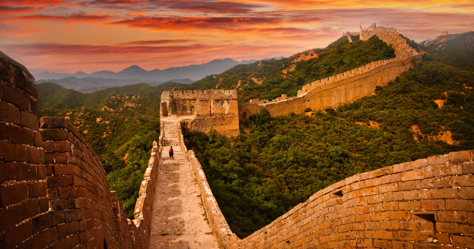
The Great Wall of China is not actually visible from space with the naked eye — astronauts from Apollo to the ISS have confirmed it — and the popular myth that it is predates space travel itself, with the best-known version coming from a 1932 Ripley’s Believe It or Not cartoon
“The Great Wall of China is not visible from orbit with the naked eye. It’s too narrow, and it follows the natural contours and colours of the landscape.” So wrote the Canadian astronaut Chris Hadfield from the International Space Station during his five-month tour in 2012-2013. Hadfield’s posting was one of dozens of public statements from astronauts who have attempted, and failed, to see the Great Wall from orbit. The consensus among people who have been to space is unambiguous. The wall is not visible from the International Space Station, was not visible from any Apollo mission, was not visible from the Soviet Salyut and Mir stations, and was not visible to China’s first astronaut, Yang Liwei, who spent 21 hours in orbit on the Shenzhou V mission in October 2003.
The result has produced a small but durable embarrassment for the popular fact that “the Great Wall of China is the only human-made object visible from space.” The claim is one of the most widely-repeated pieces of geographical trivia in modern circulation, taught in textbooks, repeated in documentaries, and frequently invoked in casual conversation. It is wrong on at least three counts. The wall is not visible. It is not the only human-made object. And the claim itself predates the technology that would have been needed to verify it.
What astronauts actually report
According to BBC Sky at Night Magazine’s review of the question, the issue with the Great Wall is straightforward: it is too narrow and too poorly differentiated from its surroundings to be visible at orbital distances. The wall averages roughly 5 to 9 metres in width along most of its length. The International Space Station orbits at approximately 400 kilometres altitude. At that scale, the wall is far below the resolving power of the unaided human eye. The wall is also constructed largely of local materials — stone, rammed earth, brick — that share the colour of the surrounding landscape, eliminating the contrast that would be necessary to pick out a narrow feature against its background.
Yang Liwei was direct about the matter when he returned from orbit in 2003. According to Al Jazeera’s coverage of his post-flight interview, Yang told China Central Television that “the scenery was very beautiful, but I didn’t see the Great Wall.” The statement was politically inconvenient enough that Chinese state media reported it carefully, and the country’s geography textbooks were subsequently revised to remove the claim that the Great Wall was visible from space. The American astronaut Leroy Chiao, then commander of the International Space Station, took what is generally considered the first verifiable photograph of the wall from orbit on 24 November 2004, using a digital camera with a 180mm telephoto lens. A second, more famous Chiao photograph followed on 20 February 2005, taken with a 400mm lens in favourable conditions with snow cover and shadows helping to identify the position of the wall against the landscape. Even with the better lens, only short sections of the wall could be identified, and only after extensive comparison with maps.
The Apollo astronauts addressed an even stronger version of the claim. The original popular framing held that the Great Wall was visible from the Moon, a claim several Apollo crews had the opportunity to test directly. Alan Bean of Apollo 12 famously said: “The only thing you can see from the Moon is a beautiful sphere, mostly white, some blue and patches of yellow, and every once in a while some green vegetation. No man-made object is visible at this scale.” Neil Armstrong, Buzz Aldrin, Michael Collins, Jim Lovell, and Jim Irwin all confirmed the same observation. From lunar distance, Earth is a marble. No surface features of any kind, natural or artificial, can be distinguished.
What is visible from orbit
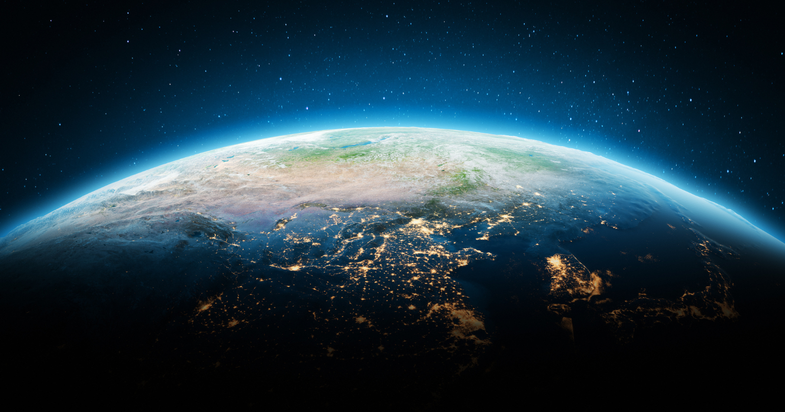
The interesting part of the story, often lost in the popular framing, is what astronauts can in fact see. According to NBC News’s coverage of the question, which interviewed astronaut Ed Lu of Expedition Seven aboard the ISS, astronauts in low Earth orbit can readily see cities, highways, airports, bridges, large dams, ships at sea, and the wakes of large vessels. At night, the artificial lighting of major cities is visible from orbit as bright patterns against the dark sides of continents. Sufficiently large vehicles — aircraft on runways, container ships — can be made out with the naked eye. The list of human-made objects visible from the International Space Station with no optical aid runs to dozens of categories.
The reason these things are visible and the Great Wall is not has to do with size and contrast, not with the impressive scale or fame of the structure in question. The Great Pyramid of Giza, much shorter than the Great Wall but far wider — about 230 metres on each side — is closer to the threshold of orbital visibility, particularly at low sun angles when the play of light and shadow distinguishes it against the surrounding desert. Astronauts have attempted to see the Pyramid with the naked eye and have produced inconsistent reports. The Great Wall, despite being orders of magnitude longer, is at least an order of magnitude too narrow to compete.
Where the myth came from
The most widely-circulated modern version of the claim is generally traced to a Ripley’s Believe It or Not cartoon published in 1932, which stated that the Great Wall of China was “the mightiest work of man, the only one that would be visible to the human eye from the Moon.” Ripley’s was, at the time, one of the most popular newspaper features in the United States, syndicated to hundreds of papers with a combined readership in the tens of millions. The cartoon planted the claim firmly in mid-20th-century popular consciousness, and from there it propagated through textbooks, encyclopaedias, and casual conversation for the next several decades.
The 1932 cartoon was not the earliest version of the idea. The English antiquarian William Stukeley, in a letter dated 1754 about Hadrian’s Wall and later published in his Family Memoirs (1887), wrote that “this mighty wall of four score miles in length is only exceeded by the Chinese Wall, which makes a considerable figure upon the terrestrial globe, and may be discerned at the Moon.” Stukeley’s remark, written more than two centuries before any human had been to space, is the earliest documented version of the claim. The English journalist and travel writer Henry Norman repeated a similar assertion in his 1895 book on the Far East, calling the wall “the only work of human hands on the globe visible from the Moon.” Both of these earlier sources existed in obscurity until historians traced the popular myth backward. Ripley’s, in 1932, brought the claim out of antiquarian obscurity and into the mass cultural mainstream.
The Ripley’s organisation has, in the decades since, hosted on its own website a careful debunking of the claim that originated in one of its cartoons. The Great Wall, the modern Ripley’s article notes, cannot be seen from the Moon, cannot reliably be seen with the naked eye from the International Space Station, and required favourable conditions and a long telephoto lens for even the most successful orbital photograph of it. The claim that survived in popular culture for seven decades was never tested against orbital observation until orbital observation became possible, and the moment it was tested, it failed.
The post The Great Wall of China is not actually visible from space with the naked eye — astronauts from Apollo to the ISS have confirmed it — and the popular myth that it is predates space travel itself, with the best-known version coming from a 1932 Ripley’s Believe It or Not cartoon appeared first on Space Daily.