Reading view

Scientists identify a cell type in the brain that was previously ignored and it may explain why human memory has no known upper limit

The human brain contains roughly 86 billion neurons. That number appears in almost every popular account of memory and intelligence, and it tends to carry an implicit argument: that the scale of human cognition follows from the scale of this cell count. What is less often mentioned is that the brain contains a roughly comparable number of a different cell type entirely, one that researchers have treated, for most of the history of neuroscience, as little more than biological scaffolding.

A paper published on 23 May in the Proceedings of the National Academy of Sciences puts forward a new hypothesis about what those cells, called astrocytes, might actually be doing. The work comes from a team at MIT: lead author Leo Kozachkov, Jean-Jacques Slotine, a professor of mechanical engineering and brain and cognitive sciences, and Dmitry Krotov of the MIT-IBM Watson AI Lab, who is the paper’s senior author. Their claim is not that astrocytes have been misunderstood in any dramatic sense; it is the more careful suggestion that they may be doing computational work that neurons, on their own, cannot account for.

This is a hypothesis supported by a mathematical model. The experimental work needed to test it has not yet been done.

The storage problem

The standard model for thinking about memory storage in neural networks is the Hopfield network, formalised by John Hopfield in his influential 1982 paper and drawing on earlier independent work by Shun-Ichi Amari in the early 1970s. Hopfield networks store information as patterns across connections between neurons, and they have been used as a working model for how the brain encodes and retrieves memories. The problem is that they can only store a limited amount of information, far less than what the human brain demonstrably holds. A modified version, known as dense associative memory, can store considerably more, but it requires couplings between more than two neurons at a time. Conventional synapses connect exactly two neurons: one presynaptic, one postsynaptic. There is no obvious biological mechanism for the higher-order coupling that dense associative memory requires.

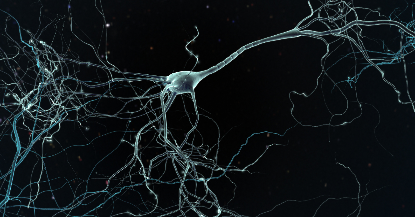
Astrocytes are where the MIT team’s argument begins. These are star-shaped cells with long, thin extensions called processes, each of which can wrap around an individual synapse. An astrocyte can contact hundreds of thousands of synapses. When an astrocyte process wraps around a synapse, it creates what is called a tripartite synapse: a three-way junction involving the astrocyte process, the presynaptic neuron, and the postsynaptic neuron. Astrocytes cannot fire electrical action potentials the way neurons do, but they communicate through calcium signalling and can release signalling molecules called gliotransmitters into the synaptic junction.

The key move in the MIT model is to treat each tripartite synaptic domain not as a passive structural unit but as a computational one. Rather than thinking of an astrocyte as a single entity, the researchers treat it as a collection of semi-independent processes, each capable of sensing neural activity and feeding information back. The coupling this creates is not between two neurons but between the astrocyte process and the two neurons it connects. That is precisely the higher-order coupling that dense associative memories require.

What the model actually shows

“By conceptualising tripartite synaptic domains as the brain’s fundamental computational units,” says Maurizio De Pitta, an assistant professor of physiology at the Krembil Research Institute at the University of Toronto who was not involved in the study, “the authors argue that each unit can store as many memory patterns as there are neurons in the network. This leads to the striking implication that, in principle, a neuron-astrocyte network could store an arbitrarily large number of patterns, limited only by its size.”

The phrase “arbitrarily large” is worth pausing on. It does not mean infinite. It means that the model does not hit the ceiling that traditional neuron-only networks hit, and that the practical limit appears to scale with the network’s own dimensions. In this reading, the reason human memory has no known upper bound is not that the brain has found some exotic mechanism; it is that the brain may be exploiting a storage architecture that neuroscience has not, until recently, thought to look for.

The model also has something to say about energy efficiency. Because the ratio of stored information to computational units is high, and grows with network size, the system stores more per unit than a conventional Hopfield architecture. The authors suggest this fits with what is known about the brain’s actual energy budget.

What recent neuroscience has supported

The case for taking astrocytes seriously as more than support cells has been building for some years, though it has not yet hardened into consensus. Within the past few years, experimental work has begun to suggest a more active role. Studies disrupting astrocyte-neuron connections in the hippocampus have reported impairments in both memory storage and retrieval, and advances in calcium imaging resolution have made it possible to observe astrocytes and neurons coordinating their activity in real time. These findings establish that something is happening without settling what, and the field has not yet reached consensus on their interpretation.

“Originally, astrocytes were believed to just clean up around neurons,” Slotine says in the MIT release, “but there’s no particular reason that evolution did not realise that, because each astrocyte can contact hundreds of thousands of synapses, they could also be used for computation.”

The question the Kozachkov et al. paper is trying to answer is a narrower one: given what astrocytes do, what kind of computation could they plausibly be performing? The answer the model gives is memory encoding via dense associative memory, with information stored in the spatiotemporal patterns of calcium flow within the astrocyte, conveyed back to neurons through gliotransmitter release.

What the paper does not establish

The authors are direct about the speculative status of their work. “We hope that one of the consequences of this work could be that experimentalists would consider this idea seriously and perform some experiments testing this hypothesis,” Krotov says. The path from a plausible model to a confirmed mechanism is long, and many plausible models do not survive experimental contact. There is currently no way to test this hypothesis by reading the paper; what the paper does is make the case that testing it is worth the effort.

There is also a risk in reading the model too expansively. The dense associative memory architecture predicts certain mathematical properties of memory storage, but mapping those properties onto the full range of human memory, its emotional colouring, its selectivity, its susceptibility to distortion, requires considerably more work. The model addresses storage capacity. It does not address what gets stored, or why some memories persist, and others do not.

The Hopfield network context is worth keeping in mind here. John Hopfield received the Nobel Prize in Physics in 2024, shared with Geoffrey Hinton, for foundational work on artificial neural networks — work recognised for shaping the development of modern machine learning. The MIT paper extends that framework into a domain Hopfield’s original model could not reach. Whether the extension accurately describes what the brain is doing is, as yet, an open question.

The implication for how the brain is studied

There is a tendency in accounts of the brain to treat it as a neuron-first system, with everything else as secondary infrastructure. The attention given to neurons is not arbitrary; they are the cells that fire, that carry electrical signals, that form the visible substrate of perception and movement and speech. But a brain that uses half its cell count for functions that remain poorly understood is a brain with an incomplete accounting.

What the Kozachkov et al. paper adds to that picture is a specific, testable claim: that the three-way synaptic junction formed by an astrocyte and two neurons may be doing memory work that neuron-to-neuron connections alone cannot. If experiments bear that out, the implication is not just that astrocytes matter. It is that the unit of computation we have been studying, the synapse between two neurons, is not the brain’s actual basic unit of memory storage.

That would require some revision to a great deal of what has been written about the brain. It would not require discarding it.

The post Scientists identify a cell type in the brain that was previously ignored and it may explain why human memory has no known upper limit appeared first on Space Daily.

  •  

JWST found a fully formed galactic bar where theory said one couldn’t possibly exist yet — and it quietly rewrites how the universe’s earliest giants stopped making stars

JWST found a fully formed galactic bar where theory said one couldn't possibly exist yet — and it quietly rewrites how the universe's earliest giants stopped making stars

Astronomers using the James Webb Space Telescope have spotted a fully formed stellar bar inside a massive galaxy that existed when the universe was barely a tenth of its current age, a structure that current models say should not be possible. The find locates the bar inside a galaxy at high redshift, viewed in the early universe.

Bars are long, cigar-shaped concentrations of stars that cut across the centers of disk galaxies. The Milky Way has one. So do a significant fraction of nearby spirals. They are supposed to be slow-cooked features, products of billions of years of gravitational settling inside a dynamically cold, stable disk.

GN20 did not get the memo.

barred spiral galaxy JWST

A structure that defies three predictions at once

The bar stretches several kiloparsecs from end to end, comparable in scale to the bar in the present-day Milky Way. Its existence collides with three separate theoretical expectations.

The first: bars of that size should collapse under their own gravity unless embedded in a sufficiently massive, kinematically cold stellar disk. Young galaxies were thought to lack that scaffolding.

The second: simulations have long suggested bars need billions of years to organize. GN20 simply hasn’t existed long enough.

The third, and perhaps the most damaging: high gas fractions, which dominate early galaxies, were believed to suppress bar formation by disrupting the orbital resonances that hold a bar together.

Observations suggest all three problems dissolve under a single condition: the presence of highly turbulent gas across the inner disk at high gas fraction.

Confirmation from a second instrument

The JWST detection does not stand alone. The stellar bar structure aligns with independent dust mapping carried out by millimeter-wave observations. Two instruments operating at radically different wavelengths see the same elongated structure cutting through the galaxy’s interior.

That agreement matters. JWST is sensitive enough to occasionally pick up structures that turn out to be artifacts of dust geometry or projection. Independent views of the cold dust distribution close that escape hatch.

A cosmic funnel feeding a monster

GN20 is one of the most extreme star-forming galaxies in the early universe, producing more than 1,000 solar masses of new stars per year. For comparison, the Milky Way forms stars at a much lower rate.

The bar appears to be part of the reason. Bars act as gravitational conveyor belts, torquing gas out of stable orbits and channeling it toward the galactic center. The high star formation rate is likely being driven by the bar funneling gas and dust into the center, where it triggers an intense nuclear starburst in the gas-rich disk, and fuels the potential active galactic nucleus.

That last clause carries weight. If a bar is dumping fuel into a nascent supermassive black hole at high redshift, it offers a mechanism for the rapid black hole growth JWST has been documenting across the early cosmos. Astronomers have struggled to explain how black holes built up to billions of solar masses so quickly after the Big Bang. A turbulent, bar-driven feeding system is one answer.

Why dead galaxies might owe their death to bars

The most provocative implication of the find concerns galaxies that are no longer forming stars at all. Massive elliptical galaxies in the present-day universe are red, quiet, and effectively dead. They burned through their gas early and never recovered.

How they died has been an open question for decades. Recent work on post-starburst systems suggests the shutdown is abrupt rather than gradual. Post-starburst galaxies represent a small fraction of all galaxies and show signs of having recently hosted enormous bursts of star formation before falling silent. These galaxies carry substantially less molecular gas than their still-active counterparts.

A bar like GN20’s offers a plausible mechanism for that depletion. Channel gas inward fast enough, light it on fire in a nuclear starburst, feed an active galactic nucleus, and a galaxy can exhaust or expel its cold gas reservoir within a cosmologically short window. What remains is a quenched elliptical.

GN20 may be a snapshot of exactly that process in motion. The bar is not just an unexpected structure. It may be the murder weapon.

What turbulence changes

The theoretical wrinkle is turbulence. Standard bar-formation models treat the gas-rich interior of a young galaxy as fundamentally unstable terrain. Cold, smooth disks form bars. Hot, chaotic ones do not.

But the GN20 observations imply something else. Turbulence at high gas fraction may actually stabilize the bar by providing internal pressure support, preventing the runaway collapse that would otherwise unwind the structure. The same turbulence that should make bar formation impossible might be what makes it possible at this epoch.

If that interpretation holds, simulations of early galaxy evolution will need substantial revision. Many existing models do not resolve turbulent gas dynamics at the scales required to capture this physics.

A growing pattern of early maturity

GN20 fits inside a broader JWST trend: the early universe keeps looking more mature than it should. Webb has now spotted bars within the first two billion years after the Big Bang, host galaxies of quasars at extreme redshifts, and disk structures that classical models said could not yet exist.

The pattern is consistent enough that it has stopped being a series of one-off anomalies. Early galaxies appear to have built recognizable structure faster, brighter, and more efficiently than pre-Webb theory allowed.

What happens next

Follow-up work will likely concentrate on resolving the kinematics inside GN20’s bar in greater detail, ideally with ALMA or further millimeter-wave campaigns that can clock the gas velocity field. If the turbulent-stabilization hypothesis is right, the gas should display velocity dispersions far above what is seen in nearby barred spirals.

For theorists, the GN20 result is uncomfortable in a useful way. It points to a specific, testable physical ingredient that current models underweight. Hydrodynamic simulations that properly resolve turbulent, gas-rich disks at high redshift are now the obvious next step.

For everyone else, GN20 is one more reminder that the early universe was not a quiet, formless place waiting to grow up. It was already building the bones of the galaxies we recognize today, and doing so in ways the textbooks did not predict.

The post JWST found a fully formed galactic bar where theory said one couldn’t possibly exist yet — and it quietly rewrites how the universe’s earliest giants stopped making stars appeared first on Space Daily.

  •  

A study of adults aged 62 to 92 found that basic motor control — drawing lines, placing dots — remains almost identical between people with and without cognitive impairment, meaning the hands stay capable long after the processes that organise thought have started to change

There is something quietly striking in the image. An older adult — perhaps 86, perhaps older — sits before a digitizing tablet and draws horizontal lines. The pen moves steadily across the surface. The lines come out clean and even. The hand does not falter. The hand, it turns out, does not know.

A new study published in Frontiers in Human Neuroscience has examined what happens to handwriting and motor control in older adults with and without cognitive impairment, and one of its most arresting findings is precisely this: when it comes to basic pen-motor tasks — placing dots on a surface, drawing horizontal lines — the two groups are effectively indistinguishable. The degradation of cognitive function that researchers can detect through standardized assessments leaves no measurable trace in the elementary mechanics of holding and moving a pen.

The basic motor infrastructure holds. What begins to separate the groups is something more demanding: the cognitive work that handwriting also requires.

What the study measured, and how

The research, led by Ana Rita Matias and colleagues at the Universidade de Évora and collaborating Portuguese institutions and published in May 2026, recruited 58 institutionalised older adults ranging in age from 62 to 99. Thirty-eight participants had been classified as cognitively impaired, with a mean age of 86.05 years. Twenty were cognitively healthy, with a mean age of 84.35 years. Cognitive status was established using two standard clinical instruments: the Mini-Mental State Examination and the Clock Drawing Test.

Each participant completed a series of tasks on a Wacom digitizing tablet fitted with an inking pen — a device that captures not just what is written but the kinematics of how it is written: pen velocity, pressure, the duration of strokes, the number of discrete movements, the pauses between them. This is the critical advantage of digital capture over conventional paper-based assessment. What the eye cannot see, the tablet records.

The tasks fell into two categories. The first were simple motor tasks: a dots task, in which participants were asked to place at least ten dots on the tablet surface within twenty seconds, and a lines task, in which they were asked to draw at least ten horizontal lines in the same time. These tasks required control of the pen but little else. No language processing. No memory retrieval. No composing of meaning.

The second category was more demanding: four handwriting-speed tasks involving the copying and dictation of sentences. Copying a sentence allows the writer to keep the source text in view. Dictation does not. The words arrive as sound, must be held in working memory, parsed for meaning, translated into motor sequences, and then committed to the page — all while the auditory trace is already fading.

Where the difference appears — and where it does not

The dots and lines tasks did not significantly discriminate between the two groups. This is the finding worth pausing on. Cognitive impairment, at the level where it is detectable by standard clinical tools, has not yet disrupted the peripheral motor system. The hand moves. The pen responds. The basic loop between intention and execution remains functionally intact.

The dictation tasks told a different story. Here the researchers found statistically significant differences between the cognitively impaired and cognitively healthy groups. One task in particular — referred to in the paper as WS3, a dictated sentence — produced the strongest discriminatory signal. Two features of the kinematic data were especially predictive: Duration, the total time taken to complete the task, and Number of Strokes, the count of discrete pen movements. Both variables significantly predicted cognitive group membership.

Participants with cognitive impairment took longer and produced more fragmented output — more individual pen movements to accomplish the same written result. The hand was still moving. But the coordination between the cognitive processes that organise language and the motor processes that execute it had become less fluent, more effortful, more interrupted.

As the authors write in their conclusion: “Handwriting kinematics, especially temporal and stroke-related features, are sensitive indicators of cognitive impairment when assessed under high cognitive–motor load.”

Why handwriting carries cognitive signal

Handwriting has attracted sustained interest from researchers studying cognitive decline precisely because it occupies a peculiar position: it is both a motor act and a cognitive one, and the two are difficult to disentangle by observation alone. The digitizing tablet changes that. By capturing kinematics in real time, it makes visible the hesitations, the micro-pauses, the multiplying strokes that a simple reading of the finished text would never reveal.

What the tablet captures, in effect, is cognitive load expressed through movement. When a task places high demands on working memory — as dictation does — the motor system has fewer resources available to it. The result is not necessarily illegible handwriting. The result is handwriting that takes longer, that requires more individual pen lifts, that shows the seams of the effort it took to produce.

The distinction between copying and dictation is not incidental to this research — it is the mechanism. Copying a sentence is primarily a perceptual-motor task. The writer looks at words and reproduces them. Dictation requires the writer to be, briefly, a language processor: receiving, holding, decoding, and transcribing without the safety net of visible text. That additional cognitive burden is where the between-group difference becomes measurable.

Earlier research in this area has identified kinematic features — pen velocity, in-air time, the ratio of time spent writing to time spent pausing — as markers that correlate with cognitive status in conditions including mild cognitive impairment and Alzheimer’s disease. What the Matias study adds is a careful separation between tasks that load the motor system alone and tasks that load the cognitive-motor system together. The separation clarifies which element of handwriting carries the diagnostic signal.

The case for handwriting-based screening

The researchers position their findings as support for digitally mediated handwriting tasks as screening tools for cognitive decline. The argument has practical force. A digitizing tablet is low-cost relative to neuroimaging and requires no specialist clinical infrastructure. Handwriting is, for most older adults, a deeply familiar act — ecologically valid in the language of assessment research, meaning it does not require participants to learn a new task or adapt to an unfamiliar paradigm. It is something people have done for decades, and the act of doing it again in a clinical or care context carries little of the anxiety or performance pressure that some formal cognitive assessments introduce.

For populations in institutional care — the population this study recruited — such considerations are not trivial. Fatigue, unfamiliarity, and distress can all contaminate cognitive assessment data. A brief handwriting task, completed at a table with a pen in hand, is a different kind of ask than a sustained battery of memory and attention tests.

The study also raises the possibility of longitudinal monitoring: repeated handwriting assessments over time could track subtle kinematic changes before they manifest as detectable impairment on conventional screening tools. The tablet captures what the eye misses. Over months or years, the data might record the earliest drift in the coordination between thought and hand.

What the hand does not know

The human detail at the centre of this research is the one that stays. An older adult draws horizontal lines on a tablet. The hand moves cleanly. The pen does not hesitate. By the measure of the task — ten lines in twenty seconds — the performance is equivalent to that of someone whose cognition, by clinical assessment, remains fully intact.

The hand, performing that task, is not reporting on what is happening elsewhere. The motor infrastructure is preserved. The elementary act of guiding a pen across a surface — the muscle coordination, the proprioceptive feedback, the fine motor loop that learned to hold a pen in childhood and has held one ever since — continues to operate as it has always operated.

What changes, and what the digitizing tablet can detect, is the integration. The moment handwriting becomes more than a motor act — the moment it requires the writer to hold language in mind, to compose and convert and commit — the kinematic signature of cognitive change begins to appear in the data. Not as tremor. Not as a loss of motor control. As duration. As the number of strokes it takes to get the words down.

The hands stay capable. The research is careful to say so. What shifts is the coordination between capability and the cognitive processes that direct it. That coordination, it turns out, is where cognitive impairment first makes itself legible to a machine that is paying close enough attention.

Produced with AI assistance. Reviewed by the Space Daily editorial team before publication.


The post A study of adults aged 62 to 92 found that basic motor control — drawing lines, placing dots — remains almost identical between people with and without cognitive impairment, meaning the hands stay capable long after the processes that organise thought have started to change appeared first on Space Daily.

  •  

The Great Wall of China is not actually visible from space with the naked eye — astronauts from Apollo to the ISS have confirmed it — and the popular myth that it is predates space travel itself, with the best-known version coming from a 1932 Ripley’s Believe It or Not cartoon

“The Great Wall of China is not visible from orbit with the naked eye. It’s too narrow, and it follows the natural contours and colours of the landscape.” So wrote the Canadian astronaut Chris Hadfield from the International Space Station during his five-month tour in 2012-2013. Hadfield’s posting was one of dozens of public statements from astronauts who have attempted, and failed, to see the Great Wall from orbit. The consensus among people who have been to space is unambiguous. The wall is not visible from the International Space Station, was not visible from any Apollo mission, was not visible from the Soviet Salyut and Mir stations, and was not visible to China’s first astronaut, Yang Liwei, who spent 21 hours in orbit on the Shenzhou V mission in October 2003.

The result has produced a small but durable embarrassment for the popular fact that “the Great Wall of China is the only human-made object visible from space.” The claim is one of the most widely-repeated pieces of geographical trivia in modern circulation, taught in textbooks, repeated in documentaries, and frequently invoked in casual conversation. It is wrong on at least three counts. The wall is not visible. It is not the only human-made object. And the claim itself predates the technology that would have been needed to verify it.

What astronauts actually report

According to BBC Sky at Night Magazine’s review of the question, the issue with the Great Wall is straightforward: it is too narrow and too poorly differentiated from its surroundings to be visible at orbital distances. The wall averages roughly 5 to 9 metres in width along most of its length. The International Space Station orbits at approximately 400 kilometres altitude. At that scale, the wall is far below the resolving power of the unaided human eye. The wall is also constructed largely of local materials — stone, rammed earth, brick — that share the colour of the surrounding landscape, eliminating the contrast that would be necessary to pick out a narrow feature against its background.

Yang Liwei was direct about the matter when he returned from orbit in 2003. According to Al Jazeera’s coverage of his post-flight interview, Yang told China Central Television that “the scenery was very beautiful, but I didn’t see the Great Wall.” The statement was politically inconvenient enough that Chinese state media reported it carefully, and the country’s geography textbooks were subsequently revised to remove the claim that the Great Wall was visible from space. The American astronaut Leroy Chiao, then commander of the International Space Station, took what is generally considered the first verifiable photograph of the wall from orbit on 24 November 2004, using a digital camera with a 180mm telephoto lens. A second, more famous Chiao photograph followed on 20 February 2005, taken with a 400mm lens in favourable conditions with snow cover and shadows helping to identify the position of the wall against the landscape. Even with the better lens, only short sections of the wall could be identified, and only after extensive comparison with maps.

The Apollo astronauts addressed an even stronger version of the claim. The original popular framing held that the Great Wall was visible from the Moon, a claim several Apollo crews had the opportunity to test directly. Alan Bean of Apollo 12 famously said: “The only thing you can see from the Moon is a beautiful sphere, mostly white, some blue and patches of yellow, and every once in a while some green vegetation. No man-made object is visible at this scale.” Neil Armstrong, Buzz Aldrin, Michael Collins, Jim Lovell, and Jim Irwin all confirmed the same observation. From lunar distance, Earth is a marble. No surface features of any kind, natural or artificial, can be distinguished.

What is visible from orbit

The interesting part of the story, often lost in the popular framing, is what astronauts can in fact see. According to NBC News’s coverage of the question, which interviewed astronaut Ed Lu of Expedition Seven aboard the ISS, astronauts in low Earth orbit can readily see cities, highways, airports, bridges, large dams, ships at sea, and the wakes of large vessels. At night, the artificial lighting of major cities is visible from orbit as bright patterns against the dark sides of continents. Sufficiently large vehicles — aircraft on runways, container ships — can be made out with the naked eye. The list of human-made objects visible from the International Space Station with no optical aid runs to dozens of categories.

The reason these things are visible and the Great Wall is not has to do with size and contrast, not with the impressive scale or fame of the structure in question. The Great Pyramid of Giza, much shorter than the Great Wall but far wider — about 230 metres on each side — is closer to the threshold of orbital visibility, particularly at low sun angles when the play of light and shadow distinguishes it against the surrounding desert. Astronauts have attempted to see the Pyramid with the naked eye and have produced inconsistent reports. The Great Wall, despite being orders of magnitude longer, is at least an order of magnitude too narrow to compete.

Where the myth came from

The most widely-circulated modern version of the claim is generally traced to a Ripley’s Believe It or Not cartoon published in 1932, which stated that the Great Wall of China was “the mightiest work of man, the only one that would be visible to the human eye from the Moon.” Ripley’s was, at the time, one of the most popular newspaper features in the United States, syndicated to hundreds of papers with a combined readership in the tens of millions. The cartoon planted the claim firmly in mid-20th-century popular consciousness, and from there it propagated through textbooks, encyclopaedias, and casual conversation for the next several decades.

The 1932 cartoon was not the earliest version of the idea. The English antiquarian William Stukeley, in a letter dated 1754 about Hadrian’s Wall and later published in his Family Memoirs (1887), wrote that “this mighty wall of four score miles in length is only exceeded by the Chinese Wall, which makes a considerable figure upon the terrestrial globe, and may be discerned at the Moon.” Stukeley’s remark, written more than two centuries before any human had been to space, is the earliest documented version of the claim. The English journalist and travel writer Henry Norman repeated a similar assertion in his 1895 book on the Far East, calling the wall “the only work of human hands on the globe visible from the Moon.” Both of these earlier sources existed in obscurity until historians traced the popular myth backward. Ripley’s, in 1932, brought the claim out of antiquarian obscurity and into the mass cultural mainstream.

The Ripley’s organisation has, in the decades since, hosted on its own website a careful debunking of the claim that originated in one of its cartoons. The Great Wall, the modern Ripley’s article notes, cannot be seen from the Moon, cannot reliably be seen with the naked eye from the International Space Station, and required favourable conditions and a long telephoto lens for even the most successful orbital photograph of it. The claim that survived in popular culture for seven decades was never tested against orbital observation until orbital observation became possible, and the moment it was tested, it failed.

The post The Great Wall of China is not actually visible from space with the naked eye — astronauts from Apollo to the ISS have confirmed it — and the popular myth that it is predates space travel itself, with the best-known version coming from a 1932 Ripley’s Believe It or Not cartoon appeared first on Space Daily.

  •  

A cheetah can go from a standstill to about 60 miles an hour in roughly three seconds, out-accelerating many sports cars, but it can’t hold that speed for long

Three seconds. That is roughly how long a cheetah needs to go from a dead stop to about 60 miles an hour.  The Cheetah Conservation Fund goes a little further, citing acceleration to a top speed past 110 km/h in just over three seconds.

Numbers like these tend to get pressed into a familiar comparison: the cheetah out-accelerates a sports car. The comparison is not wrong but it often leaves out the fact that the animal sustains this only for about half a minute before it has to stop.

Why the supercar comparison holds, and where it breaks

On the acceleration figure alone, the cheetah genuinely keeps pace with fast machinery. A three-second sprint to 60 mph sits in the same range as a great many high-performance cars, and beats most ordinary ones outright.

For context, a Toyota GR Supra 3.0 can do 0–60 mph in 3.9 seconds, while Car and Driver note that a 2025 Porsche 911 Carrera reaches that speed in 3.1 seconds. Sure, the quickest performance cars are now faster — the BMW M3 Competition xDrive at 2.8 seconds to 60 mph — but that only makes the comparison stranger: a wild animal is operating in the same acceleration conversation as serious modern machinery.

The comparison breaks down on duration. A supercar can hold its top speed for as long as the road and the fuel allow. A cheetah cannot. As put by the Cheetah Conservation Fund, “Prey must be caught within about 30 seconds, as maximum speed can only be maintained briefly”. The engine and the chassis are not the same thing as the fuel tank, and in a cheetah the tank is small.

There is a second wrinkle. The headline top speeds, the 110-plus figures, mostly come from captive or estimated conditions. When researchers actually measured wild cheetahs at work, the picture changed.

What the wild data showed

In 2013, Alan Wilson and colleagues at the Royal Veterinary College published a Nature study that fitted five wild cheetahs in Botswana with custom GPS-and-motion collars and recorded 367 hunting runs. The fastest run they captured was striking but earthbound: a top speed of about 93 km/h, or 58 mph. Most hunts involved only moderate speeds. Note that this figure is the top speed in this sample of wild animals, not the species ceiling.

The more telling number is the average. Most runs in the study were well below that record, with the typical chase topping out around 33 mph. The cheetahs were not maxing out. They were managing.

The 30-second ceiling, and the myth around it

So why does the sprint end so soon? For decades the textbook answer was overheating. The cheetah, the story went, hits a thermal ceiling and has to stop before it cooks itself. That figure, a body temperature of 40.5 C, traced back to a single 1973 treadmill experiment in which cheetahs ran at only about 30 km/h.

The physiologist Robyn Hetem put the problem plainly. Hetem noted that the long-standing overheating theory traced back to that single early study. Her 2013 work on free-living cheetahs measured body temperature minute by minute and found it averaged just 38.4 C when chases ended, well below the supposed limit. The animals stopped, but they were not overheating.

If not heat, then what? That question is not fully settled. Hetem’s own candidate is energy, and she keeps it hedged: the cheetahs “may just run out of energy after 30 seconds of sprinting.” Oxygen debt and the sheer cost of anaerobic effort sit somewhere in that explanation. 

Built for the moment, not the chase

What emerges from the data is a different animal than the speedometer suggests. The cheetah’s gift is not sustained velocity. It is the explosive opening, the burst. Its impressive top speed is something it can reach but rarely needs to hold.

The three-second sprint is real. What the collars added is the part the comparison to cars leaves out: the animal is engineered around a window it cannot hold open for long, and almost everything it does in a hunt is an attempt to finish before that window shuts.

The post A cheetah can go from a standstill to about 60 miles an hour in roughly three seconds, out-accelerating many sports cars, but it can’t hold that speed for long appeared first on Space Daily.

  •  

Blue Origin’s New Glenn exploded on its Cape Canaveral pad on May 28 — and the costliest casualty may be the lunar timeline NASA had bet on it just two days earlier

Blue Origin just lost a New Glenn on the pad, and the real casualty isn't the rocket — it's the lunar timeline NASA quietly bet on a week earlier

Blue Origin’s New Glenn rocket exploded on its launch pad at Cape Canaveral on the evening of May 28, destroying the vehicle and inflicting heavy damage on Launch Complex 36 during what was meant to be a routine static-fire test. No one was injured, but the loss has grounded the company’s only heavy-lift pad indefinitely — and it landed two days after NASA had publicly tied a piece of its Moon program to exactly this rocket.

The failure happened at roughly 9 p.m. Eastern as the first stage’s seven BE-4 engines fired. The rocket was being readied for the NG-4 mission, scheduled for as soon as June 4 with a payload of Amazon Leo broadband satellites. Amazon has confirmed no satellites were aboard during the test.

New Glenn rocket launch pad

The worst pad incident at the Cape in nearly a decade

The fireball at Launch Complex 36 is the most destructive event at Cape Canaveral since SpaceX lost a Falcon 9 during a fueling test at neighboring SLC-40 in September 2016. That pad sat dormant for about 16 months before returning to service in December 2017. A loss of this magnitude, depending on the structural damage, could follow a similar timetable.

Video circulated within minutes. The blast was visible across the Space Coast, with a mushroom cloud rising over Brevard County and debris scattered across the pad. Space Launch Delta 45 later warned that debris could wash ashore along public areas in the days and weeks afterward.

Blue Origin acknowledged an anomaly during the hotfire test within roughly half an hour and said all personnel were accounted for.

Bezos and Isaacman respond

Jeff Bezos addressed the loss publicly that night on X. “All personnel are accounted for and safe,” he wrote, adding that it was too early to know the root cause but the company was already working to find it, and that it would rebuild and return to flight.

NASA Administrator Jared Isaacman — who only two days earlier had named Blue Origin hardware to the agency’s first Moon Base mission — said NASA was assessing near-term mission impacts and would provide timeline updates as information became available.

The choreography is by now familiar from high-stakes commercial space failures: acknowledge the loss, frame it as part of the iterative process, get back to the pad. What is different this time is the dependency stack that has built up around New Glenn over the past two years.

Amazon’s constellation hits a wall

Amazon has 24 launches under contract with Blue Origin for its Amazon Leo broadband constellation, with NG-4 slated to carry the first batch of satellites. The entire manifest is now suspended with no resumption date until LC-36 is rebuilt and New Glenn returns to flight.

Leo is already under FCC-imposed deployment deadlines, and every grounded launch tightens that timeline. Amazon faces uncomfortable questions about whether to diversify away from Blue Origin’s heavy lifter, even as alternatives remain scarce. SpaceX, the only operator with comparable cadence, is a direct competitor to Leo through Starlink.

Smaller commercial customers, including those who have looked at New Glenn for direct-to-device launches, are likely to shift toward Falcon 9 manifests already running near capacity.

The Artemis dependency problem

The explosion’s most consequential ripple reaches NASA’s lunar program. Just two days earlier, on May 26, NASA had announced its Moon Base plan, naming Blue Origin’s Mk1 “Endurance” lander to fly the first privately funded lunar lander mission — Moon Base I — to the Shackleton Connecting Ridge near the lunar south pole, carrying NASA’s SCALPSS and a Lunar Retroreflector Array, targeting no earlier than fall 2026.

Endurance launches on New Glenn. The vehicle that would have carried it is now scattered across LC-36, and the pad it would have flown from is the damaged one.

A program already under strain

New Glenn’s operational record is short and uneven. It first flew in January 2025, reaching orbit but failing to recover its booster. NG-2 in November 2025 carried NASA’s ESCAPADE Mars probes and landed its booster for the first time. NG-3, launched April 19, 2026, landed the booster again but suffered an upper-stage cryogenic leak that stranded an AST SpaceMobile satellite in the wrong orbit. The FAA grounded the vehicle, and Blue Origin only received clearance to resume flights on May 22 — six days before this static-fire failure.

NASA’s broader lunar architecture is not positioned to absorb new delays gracefully. The Blue Moon lander, which NASA is counting on as one of two crewed-landing options, also depends on New Glenn to reach space. A rocket that cannot fly cannot demonstrate the launch reliability the agency wants to see before committing crews to Artemis missions later this decade.

The institutional question

Heavy-lift development is brutally hard. SpaceX absorbed multiple Falcon 9 losses on its way to dominance, and Starship has exploded repeatedly during test campaigns. The industry’s tolerance for these failures has grown because the iterative model has produced results.

What sets this incident apart is the timing. Blue Origin secured a flagship NASA role on May 26; its rocket exploded on May 28. The whiplash exposes a fragility that policymakers have been reluctant to confront: NASA’s Moon plans, Amazon’s constellation, and a meaningful share of upcoming national-security launches all flow through a small number of providers whose hardware can fail catastrophically on a single evening.

Bezos has been here before. Years of test failures and skepticism preceded Blue Origin’s first crewed New Shepard flight in 2021, and the company eventually delivered. The open question now is whether New Glenn can recover on a timeline that preserves its role in NASA’s lunar architecture, or whether the agency quietly rebalances toward SpaceX while the investigation runs.

What comes next

The immediate work is forensic. Blue Origin and the FAA will reconstruct what happened during the hotfire. Pad damage will be assessed and insurance claims filed. Range officials in coordination with Blue Origin are evaluating data to determine the cause.

The longer-term question is institutional. On May 26, NASA framed the Moon Base program as its bet on commercial partners to lower costs and accelerate timelines. That bet now depends on Blue Origin showing that May 28 was an anomaly rather than a pattern — and on how fast LC-36, the only pad built for New Glenn, can be rebuilt.

Blue Origin invested more than $1 billion to rebuild that pad before bringing it back into service in 2021. Whether the company’s investors and NASA’s planners have the patience for another long recovery is a separate question — and one that, after a single Thursday evening, is no longer hypothetical.

The post Blue Origin’s New Glenn exploded on its Cape Canaveral pad on May 28 — and the costliest casualty may be the lunar timeline NASA had bet on it just two days earlier appeared first on Space Daily.

  •  

In early June 2026, the X-59 is expected to cross Mach 1 at 43,000 feet, the first sharp proof point in NASA’s fifty-year attempt to turn an overland sonic boom into a certifiable thump

The X-59's first supersonic run next month isn't really a flight test — it's a regulatory argument NASA has been building for fifty years against a single FAA rule

The X-59 is expected to cross Mach 1 for the first time in early June 2026 at about 43,000 feet, not as a speed stunt but as the opening move in a regulatory case NASA has been assembling since the United States restricted routine civil supersonic flight over land in the early 1970s.

The aircraft is built to do something narrower and stranger than fly fast. It is built to make a sonic boom arrive on the ground as a quieter pressure signature, the soft “thump” at the center of NASA’s Quesst mission.

That is why the first supersonic run matters. It begins the part of the program where the airplane stops being a shape on a ramp and becomes a flying argument about what the law should measure.

What happens in early June

NASA says the X-59 team expects the aircraft to fly faster than Mach 1 for the first time during a series of test flights in early June 2026, at approximately 43,000 feet and above 630 mph.

That first step is deliberately conservative. The milestone is to cross the barrier, gather data, and keep widening the flight envelope rather than jump immediately to the full mission profile.

The larger target comes after that. NASA says the aircraft will later fly a “mission conditions” profile at Mach 1.4, about 925 mph, at roughly 55,000 feet, the speed and altitude needed for the eventual community demonstrations over the United States.

The aircraft reached 43,000 feet and roughly Mach 0.95 in April 2026 during subsonic testing, according to NASA’s Quesst updates. Those flights were still short of the sound barrier, but they put the airplane close enough for the next series of tests to matter.

Why the thump matters more than the speed

The X-59 is not a prototype airliner. It is a single-seat research aircraft built by Lockheed Martin for NASA to test whether careful shaping can keep shock waves from merging into the sudden crack people associate with a sonic boom.

That shaping is visible before the aircraft ever leaves the runway. The nose stretches far ahead of the cockpit, the fuselage is long and narrow, and the pilot does not look through a forward windshield in the conventional way.

Instead, the aircraft uses an external vision system that feeds forward views to cockpit displays. NASA accepted that unusual cockpit arrangement because the front of the airplane is part of the acoustic design.

The goal is not silence. NASA has described the target as a quieter sonic thump, with expected levels as low as about 75 perceived loudness decibels, compared with Concorde-style booms above 100 PLdB.

That distinction is the entire program. If the public hears a low thump instead of a sharp boom, regulators may have a measurable noise basis for allowing some future overland supersonic operations.

The rule NASA is really testing

The regulation behind the X-59’s importance is not hidden. The FAA rule at 14 CFR 91.817 generally bars civil aircraft from operating in the United States above Mach 1 except under specific authorization.

In June 2025, the White House directed the FAA to take steps to repeal that prohibition and establish an interim noise-based certification standard, making the X-59’s data more politically useful than it would have been even a year earlier.

The order changed the policy direction, but it did not answer the acoustic question. A rule that allows civil supersonic flight over land still needs a defensible number, a test method, and public-response data regulators can use without relying on optimism from aircraft makers.

That is where Quesst fits. NASA plans to fly the X-59 over selected U.S. communities, collect ground measurements, and survey residents about how they perceive the sound.

The result is meant to be a dataset for U.S. and international regulators, not a sales brochure for one airplane. NASA’s own mission language says the community responses will be shared to help set data-driven acceptable noise thresholds for commercial supersonic flight over land.

The two-phase path to the ground signature

The first phase is about the aircraft itself. Engineers have to understand the X-59’s handling, propulsion, structures, flight controls, and instrumentation before they can make a serious claim about what reaches the ground.

That phase began after the aircraft’s first flight on Oct. 28, 2025, when NASA test pilot Nils Larson flew the X-59 for 67 minutes from Palmdale to NASA’s Armstrong Flight Research Center at Edwards, California.

NASA said that first flight stayed subsonic, reached about 12,000 feet and about 230 mph, and kept the landing gear down, which is common practice for an experimental aircraft on its first outing.

The next phase is acoustic validation. Engineers will use ground recording systems and aircraft measurements to determine whether the airplane’s shock pattern matches the low-boom predictions that justified the shape.

Only after that does the public-response campaign make sense. A community survey is not useful until NASA knows the aircraft is producing the kind of pressure signature the mission was designed to test.

NASA X-59 quiet supersonic research aircraft

Why this is slower than the old supersonic race

The X-59’s cautious pace looks almost theatrical beside the Cold War supersonic programs. The Soviet Tu-144 made its first flight on Dec. 31, 1968, before Concorde, and first went supersonic on June 5, 1969.

Concorde became the famous survivor of that era, but it never solved the overland boom problem. Its commercial life remained tied largely to oceanic routes, and Air France’s Concorde service ended in 2003 after 27 years.

The Tu-144 story was harsher. It was the first supersonic transport to fly and the first passenger aircraft to go supersonic, but the program was damaged by technical problems, crashes, and a short passenger-service life.

The X-59 has a different clock. NASA is not trying to beat another country to a first flight or sell tickets next season. It is trying to give regulators enough physical and human-response evidence to decide whether the old categorical ban can become a noise standard.

Other companies are moving around the same regulatory opening. Boom Supersonic’s XB-1 demonstrator broke the sound barrier on Jan. 28, 2025, and Hermeus announced in March 2026 that its unmanned Quarterhorse Mk 2.1 had received an FAA Special Airworthiness Certificate in the experimental category.

Those programs matter commercially, but they do not replace the X-59’s specific job. NASA’s aircraft is the one built around the low-boom community-response question.

What success would actually look like

Success is not just the X-59 going supersonic. A conventional fighter can do that, and Concorde did it for decades.

Success is a repeatable pressure signature low enough for ground instruments to record as a thump rather than a boom, then a set of community responses showing how ordinary people react when that sound arrives over their homes.

The selected communities have not been announced. NASA’s published planning for the community campaign describes multiple test locations, daytime operations, repeated surveys, and data meant to capture response across different conditions.

That makes the June 2026 supersonic run an opening measurement, not the verdict. The aircraft still has to fly the mission-condition profile, validate its acoustic signature, and then produce the public-response data regulators can use.

The old rule treated Mach 1 over land as the line that mattered. The X-59 is built to test whether the more important line is not the speed of the airplane, but the shape of the pressure wave that reaches the ground seconds later.

If the aircraft works, the sound under its flight path should not be the crack that made Concorde politically impossible over land. It should be a small atmospheric tap from 55,000 feet, quiet enough that the next argument begins with a number instead of a boom.

Related reading on Space Daily: X-59 QueSST more than the sum of its parts, Taming the boom, and Starbase neighbors take SpaceX to court over cracked walls and booming skies.

The post In early June 2026, the X-59 is expected to cross Mach 1 at 43,000 feet, the first sharp proof point in NASA’s fifty-year attempt to turn an overland sonic boom into a certifiable thump appeared first on Space Daily.

  •  

Writing a single 100-word email with ChatGPT consumes approximately the volume of a standard bottle of water, the global infrastructure processing AI queries is projected to use the equivalent of half the United Kingdom’s annual water withdrawal by 2027, and much of that water is being drawn from regions already experiencing severe drought.

The figure for a single email comes from a 2025 peer-reviewed paper in Communications of the ACM by Pengfei Li, Shaolei Ren, and colleagues at the University of California, Riverside. The paper, titled “Making AI Less Thirsty,” sets out the methodology by which the per-query water footprint of large language models can be estimated. The figure for the 100-word email is approximately 519 millilitres, which is close enough to the volume of a standard bottle of water for the bottle to be the practical comparison. The number includes both the direct water used to cool the data centre’s servers and the indirect water used to generate the electricity those servers consume.

The 519 millilitre figure assumes a single response. Most users do not send a single response. They have conversations.

The same research group estimates that a single sustained conversation with a chatbot, defined as somewhere between ten and fifty exchanges, consumes approximately the same 500-millilitre order of magnitude. The figure scales by a factor of one each time the conversation extends.

Why AI needs water at all

Data centres generate heat. The servers processing AI queries are essentially small radiators running at high intensity for as long as the workload continues. The chips at the heart of contemporary AI training and inference, the high-end graphics processing units manufactured primarily by Nvidia, dissipate between 300 and 700 watts each, depending on the model. A single training run for a large language model uses tens of thousands of these chips simultaneously, for weeks or months at a time. The heat has to go somewhere.

The most common method for moving that heat out of a data centre is evaporative cooling. Water is pumped through pipes that run alongside or directly across the heat-producing equipment, absorbs the heat, and is then exposed to the air. A portion of the water evaporates, carrying the heat into the atmosphere as water vapour. The remaining water cycles back through the system. Approximately 80 per cent of the water drawn into an evaporative cooling system is lost to evaporation. The rest returns to local water systems, sometimes at higher temperatures and with chemical residues from the cooling process.

The newer generation of data centres built specifically for AI workloads are larger, more dense, and more thermally intense than the data centres built for general cloud computing in the 2010s. A single large hyperscale AI campus can now consume more water in a day than a town of ten thousand people uses for everything: drinking, washing, cooking, sanitation, agriculture, and irrigation combined.

This video explains exactly what big tech promised and how AI is doing the opposite of that.

How much, in actual numbers

Google’s most recent Environmental Report, covering the 2024 financial year, sets out the water consumption of the company’s global operations in detail. The combined figure for 2024 was approximately 8.1 billion gallons, of which approximately 95 per cent was used at data centres. The 2024 figure was an 8 per cent increase on 2023. The 2023 figure had been a 17 per cent increase on 2022. The 2022 figure had been a 20 per cent increase on 2021. The cumulative result is that Google’s water consumption nearly doubled between 2021 and 2024, with the company itself naming AI workload growth as the primary driver in successive environmental reports.

Microsoft’s figures are similar in shape, smaller in absolute scale. The company reported water consumption of approximately 1.7 billion gallons in 2022, a 34 per cent year-on-year increase. The growth has continued. The independent investigative reporting on Microsoft’s data centre cluster in West Des Moines, Iowa, where the GPT-4 training runs were conducted in 2022, has documented that a single training run consumed 11.5 million gallons of water in July 2022 and another 13.4 million gallons in August. The same cluster has, in subsequent years, expanded to five separate facilities collectively drawing 68.5 million gallons annually from the West Des Moines municipal water system, more than any other industrial user in the metropolitan area.

Meta consumed approximately 813 million gallons globally in 2023, with 95 per cent of that volume used at data centres. Amazon, which operates the largest cloud infrastructure in the world, does not publish aggregate water consumption figures.

The Lawrence Berkeley National Laboratory’s 2024 Data Center Energy Usage Report, prepared for the United States Department of Energy under the Energy Act of 2020, estimated that data centres in the United States consumed approximately 17.4 billion gallons of water directly through cooling in 2023. The same report estimated that an additional 211 billion gallons of water were consumed indirectly through the electricity required to power the same data centres. The indirect figure is approximately twelve times larger than the direct figure. The report projects that the direct figure could double or quadruple by 2028. The indirect figure scales in the same proportion.

Where the water comes from

The Li and Ren paper projects that global AI demand will require somewhere between 4.2 and 6.6 billion cubic metres of water withdrawal annually by 2027. The lower estimate is approximately the total annual water withdrawal of four Denmarks. The higher estimate approaches half the total annual water withdrawal of the entire United Kingdom. Both estimates assume current trajectories of AI workload growth and current water-efficiency practices. Neither estimate accounts for the possibility that AI demand continues to grow faster than the modelled trajectory.

The water has to come from somewhere. In Microsoft’s 2023 sustainability report, the company acknowledged that approximately 42 per cent of its water consumption that year came from regions classified as “water-stressed” under the World Resources Institute’s standard rating system. Google’s equivalent figure for 2023 was 15 per cent of freshwater withdrawals from regions of “high water scarcity.” Both figures, on the trajectory of the past three years, are likely to increase rather than decrease.

The concrete consequences of those abstract percentages are now visible in specific locations. In September 2024, Google announced it was pausing its planned 200-million-dollar data centre in Cerrillos, near Santiago, Chile, after a Chilean environmental court partially reversed the project’s original 2020 permit. The court ruled that the company had not adequately accounted for the impact on the Central Santiago Aquifer in a country that had been in a continuous drought for fifteen years and had begun rationing residential water in 2022. The project is now under revision.

In Querétaro, Mexico, where 32 new data centres are currently planned, the state suffered its worst drought in a century in 2024, with seventeen of eighteen municipalities affected and the drinking water supply for thousands of families at risk. Microsoft has secured rights to approximately 25 million litres of water annually from a local aquifer that is currently running a 60-million-litre annual deficit. In Uruguay, currently experiencing its worst drought in 70 years, Google’s proposed data centre in Canelones would, in its first operational phase, consume approximately 7.6 million litres of water per day, equivalent to the daily residential water needs of 55,000 people. In Goodyear and Buckeye, Arizona, a 14-billion-dollar data centre project was withdrawn in 2024 after local resident organisations successfully pressed elected officials to deny the necessary rezoning. In Aragón, Spain, multiple data centre projects are advancing in regions where agricultural water rights are already contested.

The pattern, on the available evidence, is that the cooling infrastructure for global AI is being built preferentially in regions where freshwater is cheap, regulatory oversight is loose, and the local population is least positioned to negotiate.

What companies don’t disclose

The figures cited above are the figures the companies have made public. The full water footprint of the AI industry is, by every available assessment, larger than the figures voluntarily disclosed in sustainability reports.

Three specific gaps recur across the disclosure landscape. The first is the gap between water withdrawal, which is the volume drawn from local sources, and water consumption, which is the volume permanently lost to evaporation. Most corporate reports name only one of these figures, and the choice between them can shift the apparent footprint by a factor of three or more depending on which is reported. The second is the gap between direct cooling water and indirect electricity-generation water. Almost no corporate report includes the indirect figure, despite the Lawrence Berkeley estimate that the indirect figure is approximately twelve times the direct one. The third is the gap between aggregate global figures and facility-level figures. A company-wide annual total tells a stakeholder nothing about whether the company’s data centre in a drought-stressed Arizona town is straining the local aquifer.

The reasons for the disclosure gaps are several. Some are methodological: the per-facility water footprint of a data centre depends on cooling technology, local climate, electricity-grid mix, and seasonal demand variation, none of which the company necessarily measures with precision. Some are competitive: detailed facility-level water disclosure could give competitors useful intelligence about a company’s infrastructure plans. Some are reputational: a company that discloses its full water footprint and is then criticised for the size of it is exposed to public-relations risk in a way that a company reporting only aggregate figures is not.

The Li and Ren paper’s contribution to the literature is, in significant part, that it produces credible estimates of the gaps. The figures that the AI industry has not been willing to publish are figures that academic researchers, using publicly available proxies for cooling efficiency and electricity-grid water intensity, are now able to estimate within reasonable bounds.

What is at stake

The global infrastructure for processing AI queries is being built faster than any new technology infrastructure in modern history, on a financing trajectory that McKinsey has projected at approximately 5.2 trillion US dollars by 2030. The physical buildings the trillion-dollar investment is producing are, in their fundamental operational requirements, large industrial-scale evaporative cooling systems with computing equipment inside them.

Each query is small. The aggregate is not.

Half the United Kingdom’s annual water withdrawal, evaporating into the atmosphere from cooling towers across the world’s data centres by 2027, is not a marginal correction to a global water balance that is otherwise stable. Global freshwater scarcity is increasing on every measured trajectory. Approximately one-quarter of the world’s population, by United Nations projections, will face severe water stress by 2030. The water the AI industry is now drawing from aquifers, rivers, and reservoirs, increasingly in the regions least able to spare it, is competing directly with that population.

The technologies the AI industry is developing have, by any reasonable analysis, the potential to contribute to solving some of the same water-management problems they are now exacerbating, through better climate modelling, more efficient irrigation, more accurate weather prediction, and more sophisticated drought response. Whether the contribution arrives at scale faster than the consumption does is the open question that determines whether the trade-off, on the long view, is worth it.

On the present trajectory, the answer is unclear.

What the trajectory will look like by 2027 depends on decisions being made, in board rooms and government offices and local zoning meetings, now.

The post Writing a single 100-word email with ChatGPT consumes approximately the volume of a standard bottle of water, the global infrastructure processing AI queries is projected to use the equivalent of half the United Kingdom’s annual water withdrawal by 2027, and much of that water is being drawn from regions already experiencing severe drought. appeared first on Space Daily.

  •  

A tongue-eating louse called Cymothoa exigua swims into a fish’s gills, latches onto its tongue, drinks the blood until the tongue withers and falls off, and then spends the rest of its life acting as a functional replacement tongue the fish uses normally to eat.

A tongue-eating louse called Cymothoa exigua swims into a fish's gills, latches onto its tongue, drinks the blood until the tongue withers and falls off, and then spends the rest of its life acting as a functional replacement tongue the fish uses normally to eat.

In the warm coastal waters off the Gulf of California, a small crustacean about the length of a paperclip swims into the gill slit of a spotted rose snapper, crawls forward into the mouth, sinks its hooked legs into the fish’s tongue, and begins to drink.

Over weeks, the tongue withers from blood loss until the soft tissue is gone. The parasite then settles onto the stump of bone where the tongue used to be and stays there, sometimes for years, while the fish opens and closes its mouth around it to eat. The animal is Cymothoa exigua, the tongue-eating louse, and as The Atlantic reported in 2021, it is the only known animal that destroys an organ of its host and then functionally replaces it.

It is not a metaphor. It is not exaggeration. The fish uses the parasite as a tongue.

What the animal actually is

Despite the name, Cymothoa exigua is not a louse in the insect sense. It is an isopod, a crustacean, the same broad group that gives us woodlice and pillbugs. If you have ever flipped over a damp log and watched a roly-poly curl into a ball, you have met its cousins. The marine ones, including the tongue biter, look like armored grey ovals with seven pairs of spindly legs and small dark eyes set at the front.

An adult female can reach up to several centimeters in length. The males are smaller. As Australian Geographic notes, C. exigua is the most famous of a much larger group. Around 100 species of mouth-attaching cymothoid isopods are known worldwide, spread across roughly eight genera, parasitizing fish from the tropics to temperate waters.

Cymothoa exigua is the celebrity because of what it does once it is inside.

tongue-eating louse fish

The sequence of events inside the mouth

The life of a tongue biter begins with a deadline. A juvenile, only a few millimeters long, hatches into the open water and has hours, maybe a few days, to find a host before it starves or is eaten. If it gets lucky, it enters a fish through the gill opening, a slit just behind the eye.

Here the biology takes a turn most readers do not expect. Every tongue biter starts adult life as a male, clinging to the gill filaments. A subset later transitions into the female form, and only the females migrate forward to the tongue. The first female to reach the basihyal, which is the proper name for the fish’s tongue, claims the spot. Any male that arrives later stays in the gills and, if he is lucky, mates with her there.

The female grips the tongue with her seven pairs of curved legs, which Smithsonian marine-parasite biologist Jimmy Bernot has described as hooked appendages that latch onto the nub the missing tongue leaves behind. She severs the tongue’s blood vessels and begins to feed. The process is slow, and for the parasite’s own sake it has to be. An adult tongue biter cannot swim. If its host dies, the isopod is stranded and sinks, so keeping the fish alive is the only way the parasite stays alive too.

Weeks pass. The tongue’s soft tissue atrophies. Eventually it is gone, leaving only the bony stub of the basihyal underneath. The isopod then settles onto that stub and grips on.

Why the fish does not die

A fish tongue is not like a human tongue. Human tongues are muscular and mobile and do a dozen jobs at once. A fish tongue, called the basihyal, is closer to a hard pad of bone at the base of the mouth. It helps push food back toward the throat and helps shuttle water across the gills. Strip away the soft tissue and the fish still has the bone underneath. Strip the bone, and the gill apparatus collapses, and the fish dies quickly.

Most parasitized fish keep the bone. The parasite eats the meat off the top and then squats on what is left. As NPR reported in 2021, the fish goes on eating, breathing, and swimming, with a live crustacean wedged in its mouth in place of the tongue it used to have.

This is the part that turns a horror story into a biological puzzle. Many tongue-bitten fish look healthy. Their digestive tracts are full. They grow. They reproduce. The presence of the parasite, as Bernot has noted, can be much less catastrophic than it sounds.

The replacement claim, and the fight about it

The bold version of the story, the one that made Cymothoa exigua famous, comes from work examining spotted rose snappers whose tongues had been completely eroded by the isopod. On the backs of the parasites, researchers found small scrapes and grooves, the kind of wear you would expect if the fish had been pressing the parasite against the roof of its mouth, using it the way it would have used a tongue.

If true, it is a biological first. No other known parasite takes the place of an organ it destroyed. As Bernot has put it, this is the only known instance in the entire animal kingdom of a parasite functionally replacing one of its host’s organs.

Not everyone agrees on how clean the replacement is. Kory Evans, the Rice University fish morphologist whose CT scan of a parasitized wrasse sent the tongue biter viral in 2020, is among the researchers who point out that the bony base of the tongue is usually still intact. By that reading, the tongue is mutilated, not gone. The likely middle ground: the soft tissue erodes, the parasite clamps onto the bone underneath, and the fish then uses the parasite to do at least some of the tongue’s everyday work. Biologists in this camp tend to be unbothered by it. Fish, they point out, are remarkably tough, and there is something almost admirable about one pressing a parasite into service as a tool.

cymothoa exigua isopod

Why evolution would build something this strange

From the parasite’s point of view, eating the tongue is risky. As Forbes summarized in 2024, most successful parasites take only what they need and leave the host’s hardware in working order. Cymothoa exigua does the opposite. It eats the very thing the fish needs in order to feed, which means it eats the very thing keeping its food supply alive.

The likely answer, biologists think, is timing. If the parasite can keep the fish breathing and feeding long enough by acting as a stand-in tongue, the female has time to release a clutch of juveniles into the water. The arrangement is a Hail Mary on both sides. The fish gets a working mouth, more or less. The parasite gets a few more weeks of reproductive life. Neither one is thriving. Both are buying time.

It is, as the Atlantic piece put it, evolution working through tinkering, stumbling, and endless trial and error, often producing something less than ideal. The tongue biter is what biology looks like when it does not optimize, when it just stops at the first solution that does not kill everyone involved.

What it looks like, and where you can find it

Cymothoa exigua lives in the eastern Pacific, primarily in the Gulf of California and surrounding waters. It targets snappers most often. If you catch one of these fish and open its mouth, you may see a pair of small dark eyes looking back at you from where the tongue should be. Nerdist has noted that the resemblance to a science-fiction symbiote is hard to shake. The parasite sits flush with the floor of the mouth, legs hooked into place, body oriented the way the missing tongue would have been oriented.

Other cymothoid species do not stop at the tongue. Some attach to the inside of a fish’s cheek. Some burrow into the gill arches. The entire family sits within the broader story of external parasites, animals that have evolved to live attached to the outside, or in this case the inside-outside, of larger hosts.

The tongue biter is rare enough that most fishermen go their whole lives without seeing one. It is common enough that if you spend long enough at a fish market in Baja or coastal Mexico, eventually a snapper will come up with a passenger.

The reason a fact like this matters

Most parasites are invisible to us. They live inside guts and bloodstreams and behind eyes, and we only learn about them through textbooks and microscope slides. The tongue biter is different because it sits where you can see it, in the most public part of the fish, behind teeth that open and close around a creature that has replaced an organ. It is the rare parasite that performs its weirdness in plain view.

Human tongues, by comparison, are so specific to each of us that the bumps and grooves of a single tongue may be as unique as a fingerprint. The fish has none of that complexity to lose. Its tongue is a stub of bone. That is part of why the swap works at all. You could not do this trick on a mammal. The organ is too important, too vascular, too embedded in too many other systems. A fish tongue is simple enough that a crustacean can stand in for it.

The tongue biter is a reminder that the categories we use, host and parasite, harm and help, body and not-body, leak around the edges once you look closely enough. There is a fish swimming somewhere off the coast of Mexico right now with a small grey crustacean wedged into its mouth, its legs hooked into the bone, its eyes pointed forward. The fish is hunting. It is using the parasite to do it. Both of them have been alive together for months, possibly years, and neither one of them, in any meaningful sense, knows that anything is wrong.

The post A tongue-eating louse called Cymothoa exigua swims into a fish’s gills, latches onto its tongue, drinks the blood until the tongue withers and falls off, and then spends the rest of its life acting as a functional replacement tongue the fish uses normally to eat. appeared first on Space Daily.

  •  

A sloth can take up to 30 days to digest a single leaf, the slowest recorded digestion of any mammal — its stomach stays so full that its abdominal contents can account for more than a third of its body weight, and it climbs down to relieve itself only about once a week

A leaf goes into a sloth and, in the worst case, takes a full month to come out the other end. Across marker trials in three-toed sloths, food passage varied between 11 and 30 days, averaging 16. That is the slowest digestion recorded for any herbivorous mammal, and it is the kind of figure that invites the wrong conclusion. Read on its own, a 30-day transit time looks like a flaw, an animal so badly engineered it can barely process its own dinner. Read closely, the slowness turns out to be the strategy itself, working as designed.

The number that looks like a problem

A note on species before going further: there are two main sloth groups, the three-toed (Bradypus) and the two-toed (Choloepus), and they differ in diet, metabolism, and behaviour. Most of what follows draws on three-toed sloths, with the two-toed numbers flagged where they appear.

The sloth eats leaves, which is a difficult living. Leaves are low in calories, tough with cellulose, and laced with plant toxins. To get anything out of them, a sloth ferments them in a large multi-chambered stomach using symbiotic gut microbes, a slow process by nature. The Sloth Sanctuary of Costa Rica, summarising Rebecca Cliffe’s carmine-marker trials, calls it “the longest digestive rate recorded for any mammal and is the key behind understanding why sloths are so slow!” The same page notes the true rate is still debated and that older 50-day estimates were probably measurement artefacts, so the superlative is best read as a strong claim rather than a settled one.

Either way, the digestion is slow because everything about the sloth is slow. The leaf does not move quickly because nothing in the animal moves quickly. To understand why, you have to look at what the metabolism is doing.

What the low burn is actually for

The sloth’s answer to a low-energy diet is to need very little energy. A study by Jonathan Pauli and M. Zachariah Peery at the University of Wisconsin-Madison found the three-toed sloth had a field metabolic rate lower than any non-hibernating mammal on record. They measured 162 kilojoules per day per kilogram, against 410 for koalas and 583 for howler monkeys, two other animals that also live in trees and eat plants.

Pauli was direct about how far the result ran past expectation. “We really expected them to have low metabolic rates,” he said, “but we found them to have tremendously low energy needs.” The three-toed rate came in, in his words, “much lower than their cousins, the two-toed sloths, and the lowest documented for any mammal.” The qualifier matters: lowest documented, measured in one study of 10 three-toed and 12 two-toed sloths in Costa Rica, not a final word on every sloth that has ever lived.

To hold the burn that low, the sloth partly gives up on keeping a steady body temperature, drifting with the ambient air more like a cold-blooded animal. 

Two numbers that make the system legible

Two more figures show how completely the slowness runs across every system. The first is the stomach. Because food moves through so slowly, the sloth is essentially always full. Researchers have documented abdominal contents accounting for up to 37% of a brown-throated sloth’s body mass, more than a third of the whole animal given over to a  loaded gut.

The second is the bathroom trip. A sloth descends to the forest floor to defecate only about once a week, every five to seven days. This is the most dangerous thing it does. On the ground, a slow-moving sloth is exposed to predators it could not outrun, and the descent is metabolically costly. The payoff, when it comes, is large: sloths can lose up to a third of their body weight in a single bowel movement, their stomachs visibly shrinking.

Why take the risk at all, rather than simply going in the canopy? No one really knows. Cliffe has speculated that the behaviour must matter to be worth it. “Whatever is going on,” she suggested, “it’s got to be kind of life or death for survival,” before adding that her own hunch leans toward reproduction. That is a hypothesis, not a finding. The weekly descent remains one of the open questions in sloth behaviour.

Mastery, not malfunction

Set the figures side by side and they stop looking like a list of handicaps. The 30-day leaf, the more-than-a-third-of-body-weight stomach, the metabolism running well below the predicted rate, the weekly descent: these are not four separate problems an unlucky animal has to manage. They are one strategy, expressed through every system at once. Slow intake demands slow digestion, which demands a large always-full stomach, which is only sustainable at a metabolic rate low enough to make the whole arrangement cheap. By the measure that matters in evolution, the arrangement works: sloths are among the more abundant medium-sized mammals across their range in the forests of Central and South America, the slowness carried all the way through from the gut microbes to the once-a-week climb down the tree.

The post A sloth can take up to 30 days to digest a single leaf, the slowest recorded digestion of any mammal — its stomach stays so full that its abdominal contents can account for more than a third of its body weight, and it climbs down to relieve itself only about once a week appeared first on Space Daily.

  •  

Neuroscientists found a region of the brain specialized for recognising faces that activates in as little as 50 milliseconds and it develops even in people who have been blind since birth

brain decision making

Somewhere on the ventral surface of the temporal lobe, in a region called the fusiform gyrus, there is a small area of cortex that responds far more strongly to faces than to almost anything else. The area is known as the fusiform face area, and two papers published roughly six years apart have each added something precise and somewhat counterintuitive to what we know about it.

The first finding, from a 2014 paper in Nature Communications, concerns timing. Using electrodes placed directly on the fusiform face area of four patients undergoing epilepsy monitoring, neuroscientist Avniel Singh Ghuman and colleagues at the University of Pittsburgh recorded electrical activity while participants viewed images of faces, bodies, houses, hammers, shoes, and phase-scrambled faces. What Ghuman’s team found was that the region was responding selectively to faces within 50 to 75 milliseconds of a face appearing on screen. That is faster than this region had previously been shown to respond to any visual category in humans, and faster than most other categories reach the temporal cortex at all.

The second finding, from a 2020 paper in the Proceedings of the National Academy of Sciences by N. Apurva Ratan Murty, Nancy Kanwisher, and colleagues at MIT, concerns development. When people who have been blind since birth handle three-dimensional printed models of faces, the fusiform face area becomes active. Visual experience with faces, it turns out, is not what builds the area’s preference for them.

These are findings from two separate papers, each with its own design, sample, and limits. Neither should be read as a settled account of how face perception works. But together they describe something worth sitting with.

What the Ghuman paper actually measured

The electrode method Ghuman’s team used is called intracranial electrocorticography, or ECoG. It involves recording directly from the brain’s surface at very high temporal resolution, far finer than what fMRI allows. The four participants in the study were epilepsy patients who already had electrodes implanted as part of their clinical care. The researchers used a machine learning algorithm to decode, on a trial-by-trial basis, whether the brain signal from the fusiform face area at any given moment was consistent with the participant viewing a face.

Face-selective activity appeared in the 50-to-75-millisecond window after stimulus onset and remained distinguishable from responses to other categories through to about 350 milliseconds. Crucially, phase-scrambled faces, which preserve the spatial frequency structure of a face but destroy its recognisable shape, did not produce the same early signal. This argues against the early response being driven simply by the visual statistics of a face-shaped image rather than by something more specific to face recognition.

The study was conducted on four participants. That is a small sample by the standards of most research, though the intracranial recording method compensates partly for sample size with signal precision that non-invasive imaging cannot approach. The authors are careful about what they claim: the early activity shows that face-specific information is present in the fusiform face area at 50 to 75 milliseconds, and they argue this is consistent with the region playing a role in initial face detection. They do not claim to have resolved all debates about the temporal architecture of face perception. There is ongoing disagreement in the field about when and where in the brain face selectivity first arises, and this paper contributes to that debate rather than closing it.

Beyond face detection, the same paper also found that the fusiform face area encodes which specific face someone is viewing, but this individuation happened considerably later, between 200 and 500 milliseconds, and was stable across changes in facial expression. And a late-sustained signal, broadband gamma activity lasting more than 500 milliseconds, tracked how long it took participants to respond in a gender-classification task. Longer gamma activity corresponded to slower responses. The area appears to be doing several different things at different moments, and not all at once.

A feature the area may not need to acquire

The MIT study took a different approach to a different question. Kanwisher and her colleagues wanted to know whether the fusiform face area develops its preference for faces because people spend years looking at faces, or whether the region has something more like a predetermined role that does not depend on that visual history.

To test this, they recruited people who had been blind from birth and had therefore never had visual experience with faces or anything else. Using fMRI, they scanned participants while they handled 3D-printed objects including faces, hands, chairs, and mazes. The fusiform face area was active during face handling, in roughly the same location it occupies in sighted people, and the selectivity for faces over other objects was comparable.

The finding does not mean visual experience is irrelevant to how the area functions in sighted people. Kanwisher has been quoted in MIT News as saying precisely that: visual input probably does play a role in sighted subjects. What the study shows is that visual experience is not necessary for the area to develop face selectivity in the first place. The researchers propose that long-range connectivity, the area’s structural relationships to other parts of the brain, may be what positions it to become selective for faces regardless of the sensory route through which face information arrives.

This finding builds on earlier work. A 2017 study from researchers in Belgium, published in the Proceedings of the National Academy of Sciences, scanned congenitally blind participants while they listened to face-related sounds such as laughing or chewing, and found elevated activity in the vicinity of the fusiform face area compared to non-face sounds. The MIT paper extended this with the more direct test of haptic face recognition.

What these two findings put together

Reading these papers alongside each other draws out something the standard account of the fusiform face area tends to flatten. It is easy to describe the area as a face-recognition module and leave it there. But Ghuman’s data show it operating at least three distinct processing stages, on three different timescales, doing different things with face information at different moments. And Murty and Kanwisher’s data show the area claiming its face selectivity without any visual faces ever having been seen.

What the area appears to have is something like a structural commitment to faces as a category, one that exists prior to, and independent of, a lifetime of looking. That does not mean it is a rigid or fixed processor. The late gamma activity Ghuman’s team found appears tied to working memory and task demands, suggesting the area is also responsive to what someone is trying to do with a face, not only to the presence of one.

The question of what this means for people with face recognition difficulties, or for understanding how face perception varies across individuals, is not something either paper directly addresses. Neither is clinical in that sense. Both are asking about the fundamental architecture of a region, not about what goes wrong when it malfunctions.

The limits worth naming

Ghuman et al. worked with four participants. That is small. The electrode placement was determined by clinical need, not experimental design, which means the precise location varied across subjects. The authors acknowledge their method is more sensitive to information encoded in temporal patterns than to information encoded spatially, so absence of a signal in their analysis does not necessarily mean absence of processing in the region.

The MIT haptic study relied on fMRI, which captures activity integrated over seconds rather than milliseconds. It tells us that the fusiform face area is involved when blind people handle face-shaped objects; it does not tell us precisely what computations are occurring or at what speed. The researchers are also working with a small group of congenitally blind participants, a population that is difficult to recruit in large numbers. The finding is worth taking seriously, but replication and extension will matter.

The broader question about what specifies the location and function of cortical areas is active and not resolved. The connectivity hypothesis is plausible and consistent with the data; it is not yet a confirmed account of development. Future work may complicate or qualify it.

What the research does not do

Neither paper suggests that the 50-millisecond finding represents the full story of how quickly the brain begins to recognise a face. Other regions contribute to face perception, and the signal Ghuman’s team recorded is from one area of the processing network. The fusiform face area appears to be unusually fast compared to how quickly the temporal cortex responds to non-face categories, but the authors are careful to frame this as a finding from this dataset with this method, not a universal statement about the speed of human face recognition.

Similarly, the MIT result about blindness does not mean the fusiform face area functions identically in people who have and have not had visual experience. Kanwisher says explicitly that visual input probably does shape the area in sighted people; the study only shows that such input is not required for face selectivity to emerge. These are different claims, and the difference matters.

The region continues to be studied, and the picture that has accumulated is more layered than a simple face-recognition box in the temporal lobe. It is active very early, it handles individual faces later, it maintains information in support of decisions, and it manages to do all of this without requiring the owner ever to have seen a face. How those capacities fit together is still being worked out.

The post Neuroscientists found a region of the brain specialized for recognising faces that activates in as little as 50 milliseconds and it develops even in people who have been blind since birth appeared first on Space Daily.

  •  

The Raptor 3 was supposed to be the engine that finally ended Starship’s reliability problem — instead, on its first flight, several of them quit less than 20 seconds into the boostback burn, dropping the booster into the Gulf and grounding the whole program for a federal mishap review

The Raptor 3 was supposed to be the engine that ended Starship's reliability problem — instead it just grounded the entire program after a 1,500 km/h plunge into the Gulf

SpaceX’s Raptor 3 engine — the powerplant the company has spent the better part of two years marketing as a simpler, more reliable replacement for the troubled Raptor 2 — failed multiple times in its maiden flight during exactly the kind of high-stress maneuver it was designed to handle. The Super Heavy booster’s engines began dropping offline seconds into a planned boostback burn, the stage lost the thrust needed to reverse course, and it fell back through the atmosphere and struck the Gulf at high speed. The Federal Aviation Administration has now grounded Starship pending a mishap investigation.

That sequence is the story. Not the paperwork, not the splashdown of the upper stage, not the Starlink mass simulators that deployed on schedule. The most-watched new rocket engine in the world failed in its debut, and it failed in the precise scenario SpaceX needs it to survive for Starship to ever become operational.

Starship Super Heavy booster

Twenty seconds, then a fall

According to telemetry shown on SpaceX’s own webcast, the boostback burn was scheduled to last about a minute. It ended after less than 20 seconds. Several Raptor 3 engines failed to light cleanly almost immediately after ignition, the booster never built the thrust needed to reverse its trajectory, and it fell back through the atmosphere and struck the water at high speed.

The stage came down inside an FAA-activated Debris Response Area, and the agency confirmed the debris fell inside the hazard zone with no reports of public injury or damage to public property. In its own post-flight statement, the FAA reported that the event caused six departure delays and five airborne holding events, with no diversions — the kind of secondary disruption that has become a recurring concern as Starship cadence grows.

The booster failure was not the only Raptor anomaly of the day. One of the 33 Raptor engines on Super Heavy shut down roughly a minute and 42 seconds into ascent, and one of the six engines on the upper stage also cut out before its planned duration. The FAA’s determination formally classifies the incident as a mishap, triggering a federally supervised root-cause review that SpaceX must complete and have approved before another Starship lifts off from Starbase, Texas.

The Raptor 3 debut

The flight was the maiden outing of Starship version 3, the vehicle’s most substantial revision since the program began. The redesign introduced the Raptor 3 engine, which SpaceX has marketed as a simpler, higher-thrust replacement for the Raptor 2 — fewer parts, fewer welds, fewer of the failure modes that plagued earlier flights. The vehicle reached space and completed most of its stated test objectives, including the deployment of Starlink mass simulators and a soft splashdown of the upper stage in its targeted Indian Ocean zone.

The upper stage, in other words, behaved close to nominally. The booster did not.

Engine-out tolerance has always been part of Starship’s design philosophy. Losing one of 33 engines on ascent is, in principle, survivable. But losing multiple Raptor 3 units in quick succession during a planned, choreographed maneuver — the boostback burn is not an edge case, it is core to every operational Starship profile — suggests something closer to a systemic failure mode in a brand-new engine variant making its first flight. That is a categorically different problem from a single random shutdown.

How long the grounding might last

Recent precedent points toward a relatively fast paperwork resolution if SpaceX can isolate the cause. The FAA declared a mishap on Blue Origin’s New Glenn flight on April 19 after the upper stage malfunctioned during its second burn, stranding an AST SpaceMobile satellite in an unrecoverable orbit. Just over a month later, the agency accepted Blue Origin’s investigation report and cleared New Glenn to resume launches.

That precedent comes with a warning, though. Days after being cleared, New Glenn exploded during a static-fire test on May 28, with images suggesting significant damage to its launch complex at Cape Canaveral. A clean regulatory close-out is not the same thing as a clean return to flight. If SpaceX moves with comparable speed on the paperwork, and if the Raptor 3 issue proves tractable, Starship could be back on the pad within weeks rather than months. The harder question is whether a multi-engine failure mode can be diagnosed, fixed, and revalidated that quickly.

The broader picture for commercial launch oversight

Two of the largest privately developed launch vehicles in the world were grounded for mishap reviews within roughly five weeks of each other this spring. That is a notable data point about where the commercial launch industry sits in 2026: ambitious cadence goals, rapid iteration on new engines and upper stages, and a regulatory regime that is increasingly comfortable resolving incidents quickly when no public harm has occurred.

The FAA has also begun signaling that the stakes are rising. The agency has warned pilots to exercise extra caution against “catastrophic” debris hazards in the airspace around Starship’s corridor, and its own analysis suggests the enlarged hazard areas it approved for Starship could affect more than 13,000 commercial aircraft operations annually. The Flight 12 delays and holding events fit that pattern.

For SpaceX, the timing is awkward. The company has been pushing Starship toward operational deployment of Starlink V3 satellites, lunar Human Landing System work for NASA’s Artemis program, and the eventual Mars architecture that Elon Musk has staked the company’s identity on. Each grounding compresses the schedule, and SpaceX flagged Starship’s path to orbit as a milestone in the IPO prospectus it filed in May.

What the test actually proved

The temptation, after any mishap, is to read the result as binary: success or failure. The flight resists that framing.

The upper stage flew its mission. The mass simulators deployed. The splashdown happened where it was supposed to. For a first flight of a substantially redesigned vehicle with a new engine variant, getting the second stage through its full profile is a genuine technical result.

And the booster, while lost, demonstrated something useful in the negative. The Raptor 3’s behavior under boostback stress is now a known problem rather than an unknown one. That is what test flights are for, even when the FAA paperwork that follows is uncomfortable.

The booster is at the bottom of the Gulf. The data it sent back is not — and that data now defines a specific punch list SpaceX has to work through before Starship can fly operationally. The company has to determine whether the multi-engine dropouts trace to a common cause in the Raptor 3 design itself (combustion stability, turbopump behavior, ignition logic under throttle-up) or to a vehicle-level issue in how the new booster feeds and commands those engines during boostback. Each of those answers carries a different fix and a different timeline. A software or sequencing change could be flight-ready in weeks. A hardware redesign of the engine — the variant SpaceX has barely begun producing at scale — is a months-long problem that would ripple straight into the Starlink V3 deployment schedule and into the Artemis lunar lander milestones NASA is counting on. The next few weeks of the mishap investigation will determine which of those futures SpaceX is actually living in.

The post The Raptor 3 was supposed to be the engine that finally ended Starship’s reliability problem — instead, on its first flight, several of them quit less than 20 seconds into the boostback burn, dropping the booster into the Gulf and grounding the whole program for a federal mishap review appeared first on Space Daily.

  •  

Pluto takes about 248 Earth years to circle the Sun, which means it still hasn’t completed a single orbit since we found it — and won’t finish that first lap until the year 2178

On 18 February 1930, a young man named Clyde Tombaugh sat at a blink comparator in Flagstaff, Arizona, and noticed a faint point of light that had shifted position between two photographic plates. The plates had been taken on 23 and 29 January. That shift was Pluto, and the moment it was logged, a clock started running that no living person will see finish.

The discovery was announced publicly on 13 March 1930, a date chosen to coincide with Percival Lowell’s birthday and with Herschel’s discovery of Uranus. Pluto was hailed as the ninth planet. What nobody could mark on a calendar that day was how long the new world would take to go once around the Sun.

What one Plutonian orbit actually looks like from the inside

A single Plutonian year runs to roughly 248 Earth years. That number sits so far outside human timescales that it stops feeling like a year and starts feeling like a span of history.

The orbit is not a tidy circle. According to NASA, Pluto’s oval-shaped path can take it as far as 49.3 astronomical units from the Sun and as close as 30. One astronomical unit is the average Earth-Sun distance, so Pluto swings between roughly 30 and 49 times farther out than we are. The path is also tilted about 17 degrees to the plane the major planets share.

That eccentricity does something strange. NASA notes that from 1979 to 1999, near the closest point in its orbit, Pluto was actually nearer the Sun than Neptune. It reached perihelion, its closest approach, on 5 September 1989. Pluto will not reach the far end of its current lap, aphelion, until around 2114.

Why 2178 is a number worth sitting with

Dated from Tombaugh’s discovery, Pluto will complete its first full observed orbit on Monday, 23 March 2178. The orbital mechanics are precise enough to name the day. Nobody alive when Pluto was found will be alive when it crosses back to where it started.

The interval has already swallowed one of Pluto’s defining facts. The International Astronomical Union reclassified Pluto from planet to dwarf planet in 2006, which means it lost its planetary status without completing a single orbit as a planet. Between the 1930 discovery and that 2006 vote, Pluto had covered only about three-tenths of its journey around the Sun.

There is a quieter coda. When NASA’s New Horizons spacecraft flew past Pluto on 14 July 2015, it carried about an ounce of Tombaugh’s ashes. The man who found the point of light got to ride out to it, decades after his death, before the world he discovered had gone even once around its star.

What the incomplete lap tells us about scale

The flyby reframed Pluto from a smudge on a plate into a detailed world. Alan Stern, the mission’s principal investigator, reflected that “Tombaugh’s discovery was so much more than just the discovery of the ninth planet.” Stern added, “I only wish that Clyde had lived to see all that New Horizons discovered and how stunningly beautiful Pluto is.”

For NASA’s Thomas Zurbuchen, the find opened a wider door. As he put it, “What Tombaugh didn’t know then was that Planet X would launch the era of exploration in the third zone of the solar system.” That zone, the cold reaches beyond Neptune, is now known to hold thousands of icy bodies. Pluto was the first of them anyone saw.

The roughly 248 years Pluto needs for one lap is about as long as the United States has existed. It comfortably contains the entire span from the telegraph to the smartphone. A child born the year Tombaugh squinted at his plates would need to live past 248 to watch Pluto return to the same position, and no human has come close to that age. The first full orbit we have ever tracked is one none of us will witness from start to finish.

The clock that started in 1930 is still running, with more than a century left on it. When it finishes, on 23 March 2178, the people watching will not be the people who started counting.

The post Pluto takes about 248 Earth years to circle the Sun, which means it still hasn’t completed a single orbit since we found it — and won’t finish that first lap until the year 2178 appeared first on Space Daily.

  •  

One of the earliest great extinctions in Earth’s history may have been caused not by an asteroid or a volcano but by oxygen itself, when tiny photosynthetic microbes slowly filled the air with a gas that was poison to much of the anaerobic life that ruled the planet long before us

Around 2.4 billion years ago, the air over Earth began to change. Microbes in the oceans, the cyanobacteria, had been running a chemical reaction that split water and released oxygen as waste. For a long time that oxygen was mopped up almost as fast as it was made. Then the sinks filled, and it began to build up in the sea and the atmosphere, a gas that was poison to most of the life then living.

This is the Great Oxidation Event, sometimes called the oxygen catastrophe. It is often described as the first mass extinction in Earth’s history, a die-off caused not by an impact or an eruption but by life altering its own planet. The poisoning is well grounded in chemistry. The scale of the die-off is an inference, and a much shakier one, for reasons worth being clear about from the start.

How we know the air changed

The strongest evidence for the timing does not come from fossils. It comes from sulfur.

In rocks older than about 2.4 billion years, sulfur isotopes carry a pattern, known as mass-independent fractionation, that can only form when ultraviolet light reaches sulfur dioxide in an atmosphere with no oxygen and therefore no protective ozone. The signature was identified by James Farquhar and colleagues in a 2000 paper in Science. After roughly 2.4 billion years ago it disappears from the record, and that disappearance is now the most widely used marker for the arrival of free oxygen in the air. A 2023 paper in Nature Communications describes the signal as a fingerprint of an oxygen-free atmosphere, while also noting that reading it is less straightforward than it once seemed.

A second line of evidence sits in the iron. Before oxygen accumulated, the oceans held large amounts of dissolved iron. As oxygen spread, that iron reacted and settled out, laying down the banded iron formations that geologists still mine today.

Why oxygen was a poison

Oxygen is reactive.

In cells that evolved without it, it produces what are now called reactive oxygen species, fragments that damage proteins, membranes and genetic material. Many organisms that dominated the early Earth lacked the defences needed to cope with it.

So as oxygen built up, much of the anaerobic world died back. Some lineages did not vanish so much as retreat, into ocean sediments, deep water and other pockets where oxygen did not reach. Their descendants still live in those anoxic refuges. The microbes that caused the crisis, meanwhile, kept producing the very gas that was lethal to their neighbours.

The cold may have done as much as the oxygen

There was a second effect, and it may have been the more destructive one.

The early atmosphere was rich in methane, a strong greenhouse gas that helped keep the planet warm at a time when the Sun was fainter than it is now. Oxygen destroys methane. As oxygen rose, the methane greenhouse collapsed, and the Earth fell into the Huronian glaciation, a run of ice ages spanning roughly 2.4 to 2.1 billion years ago and among the longest and most severe in the planet’s history. Work by Robert Kopp, Joseph Kirschvink and colleagues, published in PNAS, argued that the spread of oxygenic photosynthesis triggered that near-global freeze. If the reading holds, the organisms that poisoned the air also helped chill the surface.

Two killing mechanisms, chemical and climatic, would have arrived together. Neither leaves the kind of record that lets us count the dead.

What the record can and cannot tell us

This is where the popular story needs handling. The microbial life of 2.4 billion years ago did not leave shelly fossils that can be tallied bed by bed, the way the victims of later extinctions can. As the American Society for Microbiology puts it, working out which lineages were lost has proved difficult precisely because the fossil evidence is so thin. Oxygen as a poison is sound. “The first mass extinction,” with the confidence that phrase carries, is a reconstruction laid over a very sparse record.

The “filled the air” part also needs care. Early oxygen levels were a small fraction of today’s, not a breathable atmosphere, and the rise was neither smooth nor in one direction. A 2021 study in Nature led by Simon Poulton found that oxygen fluctuated for around 200 million years before it became a permanent feature of the air, and a 2017 PNAS study by Ashley Gumsley and colleagues spread the onset and tempo of the change across a long interval rather than a single moment. The name suggests an event. The evidence describes a long, uneven transition.

None of this softens the underlying point. Something in the chemistry of the planet changed, life itself caused it, and a great deal of what was alive could not survive the new conditions.

The same gas that ended their world is the one we now cannot live without. Our own lineage runs through organisms that eventually learned not just to survive oxygen but to use it, turning a planetary poison into one of the great engines of complex life. When that turn happened, and how much was lost along the way, are questions still being dated in the rocks.

The post One of the earliest great extinctions in Earth’s history may have been caused not by an asteroid or a volcano but by oxygen itself, when tiny photosynthetic microbes slowly filled the air with a gas that was poison to much of the anaerobic life that ruled the planet long before us appeared first on Space Daily.

  •  

The Pacific Ocean is so large that all the world’s land could fit inside it, and there would still be room left over, which is why calling Earth a “blue planet” is almost an understatement

Lay every continent and island on the planet side by side, and the total land area comes to roughly 149 million square kilometres. The Pacific Ocean, by most accounts, is larger than that. You could fit all the world’s land inside it and still have open water left over.

The exact surplus depends on whose figure you use, but the direction of the comparison does not change. The US National Oceanic and Atmospheric Administration puts the Pacific at more than 155 million square kilometres and states plainly that this is larger than the landmass of all the continents combined. Other references run higher.

Why the number is a range

Ask for the area of the Pacific and you will get different answers. NOAA gives more than 155 million square kilometres. Britannica lands near 162 million while explicitly leaving out the South China Sea. Some definitions that draw the southern boundary all the way to Antarctica put it closer to 165 million.

The disagreement is not about the water. It is about where the water stops. An ocean has no fixed edges, so the totals shift depending on whether you count the marginal seas and where you draw the southern boundary against the Southern Ocean. On the largest common figures the leftover area, the part of the Pacific that no continent would cover, is roughly 16 million square kilometres, not far off the size of Russia, the biggest country on Earth. On the smaller figures it is more modest. The continents fit inside the ocean in every version.

The biggest ocean is also a shrinking one

It will not hold the title forever.

The Pacific is ringed by subduction zones, the chain of trenches and volcanoes known as the Ring of Fire, where old sea floor is dragged down into the mantle. Around much of its rim that old crust is being consumed at the trenches, and over geological time this has helped make the Pacific a shrinking basin, even as new crust forms along its spreading centres. The Atlantic, by contrast, fed by the mid-ocean ridge running down its middle, is widening.

On the timescales of plate tectonics, tens of millions of years, the Pacific is the surviving remnant of far older and larger oceans, and it is gradually closing. The size that makes it singular today is a feature of this geological moment, not a permanent fact about the planet.

Where “blue planet” undersells, and where it oversells

By area, the premise is fair. Seen from space the Earth is mostly water, the Pacific most of all, and a single ocean outsizes all the dry ground there is. On that measure “blue planet” is, if anything, an understatement.

By volume, though, the impression reverses. The ocean is wide, but it is not deep, at least not relative to the body it sits on. The Pacific averages around 4,000 metres, and Earth’s radius is about 6,371 kilometres, so even the deepest ocean is a skin over the rock. The US Geological Survey makes the point with a thought experiment. Gather every drop of water on the planet, the oceans, ice caps, lakes, rivers, groundwater and atmosphere, into a single sphere, and that sphere would be only about 1,385 kilometres across. Set against a world nearly 12,800 kilometres wide, it is small. The Woods Hole Oceanographic Institution puts the same idea as a basketball and a ping-pong ball: if Earth were the basketball, all of its water would fit in the ping-pong ball.

The USGS calls the oceans a “thin film” on the surface, and the description is accurate.

Both things are true

So the blue is real and it is enormous in reach, covering more than two-thirds of the surface and, in the Pacific alone, more ground than every landmass put together. It is also shallow, mobile, and slowly rearranging itself as the plates beneath it move.

The figure worth carrying away is the first one, because it is the one that catches people off guard. The largest single feature on the surface of the Earth is not a continent. It is an ocean wider than all of them at once.

The post The Pacific Ocean is so large that all the world’s land could fit inside it, and there would still be room left over, which is why calling Earth a “blue planet” is almost an understatement appeared first on Space Daily.

  •  

The first fax machine was invented in 1843 — more than thirty years before the telephone — which means that for a 22-year window in the mid-1800s, a Japanese samurai could have theoretically sent a fax to Abraham Lincoln, since the samurai class was not formally abolished until 1867 and Lincoln died in 1865

On 27 May 1843, the Scottish clockmaker Alexander Bain was granted British Patent No. 9745 for what he called an electric printing telegraph: a device that used synchronised pendulums to scan a flat metal surface and reproduce its markings, line by line, at a receiving station over a telegraph wire. The patent describes the basic working principle of a fax machine. Bain had invented one. The same year, Charles Dickens was publishing A Christmas Carol, Queen Victoria was six years into her reign, and Alexander Graham Bell, the eventual inventor of the telephone, was minus 4 years old. The fax machine predates the telephone by more than three decades.

The corresponding window of chronological overlap produces one of the more peculiar facts about nineteenth-century technology. The fax existed from 1843. Abraham Lincoln lived until 1865. The Japanese samurai class, despite the popular impression of belonging to a distant feudal past, was still a recognised legal caste in Japanese society throughout Lincoln’s lifetime and was not formally dismantled until well into the 1870s. There was, therefore, a 22-year window — from 1843, the patent of Bain’s machine, until Lincoln’s assassination in April 1865 — during which a samurai could, in theory, have sent a fax to the sitting president of the United States. As a Truth or Fiction analysis of the popular version of this claim documents, the fact has circulated as an internet meme since July 2021 and the underlying chronology checks out, with the kind of practical qualifications that the word “theoretically” exists to cover.

Alexander Bain’s machine

According to Britannica’s biography of Alexander Bain, Bain’s invention came less than seven years after Samuel Morse had patented the electric telegraph. Bain was a clockmaker who had already patented the world’s first electric clock in 1841, and his fax machine grew directly out of his clockwork expertise. The patent describes a system in which two pendulums, one at the transmitting station and one at the receiving station, are synchronised by an electric clock and made to scan their respective metal surfaces line by line. According to HowStuffWorks’s history of the fax machine, the transmitting station’s metal surface was covered with raised metal type. As the pendulum’s stylus passed over the type, it closed an electrical circuit, sending a pulse down the telegraph wire. At the receiving station, the pulse caused a corresponding stylus to mark a piece of chemically treated paper that had been impregnated with a solution. The marks built up, line by line, into a reproduction of the original document.

Bain’s machine was rudimentary by modern standards. The pendulums drifted out of synchronisation, the printed images were faint, and the transmission speed was slow. But it worked, and the principle was sound. The Englishman Frederick Bakewell improved on it in 1848 with a rotating cylinder, and the Italian Giovanni Caselli took the technology to commercial maturity in 1865 with his pantelegraph, which operated a regular commercial fax service between Paris and Lyon between 1865 and 1870. Several thousand documents were transmitted over Caselli’s system, including business correspondence and the signatures on financial instruments. By the time Lincoln was inaugurated as president in 1861, fax technology was no longer experimental. It was a working communications medium in commercial use in Europe.

Why the samurai had not yet been abolished

The popular image of the samurai as a figure from medieval Japan obscures the fact that the samurai class survived until well into the modern industrial era. The transition began with the Meiji Restoration of 1868, which overthrew the Tokugawa shogunate and restored imperial rule, but the dismantling of the samurai class itself was a gradual process that played out over the following decade. According to KCP International’s overview of the abolition of the samurai class, the relevant landmarks were the 1871 abolition of the han domain system, the 1873 Conscription Ordinance that ended the samurai’s military monopoly by establishing a Western-style national army, and the 1876 Haitōrei Edict that prohibited the samurai from carrying their characteristic two-sword set in public. The 1877 Satsuma Rebellion, led by the disaffected samurai Saigō Takamori, was the last armed resistance to the new order, and its defeat marks the practical end of the samurai as a political force.

For the full duration of Lincoln’s life and presidency, none of this had yet happened. When Lincoln was assassinated at Ford’s Theatre on 14 April 1865, the Tokugawa shogunate was still nominally in power, the samurai were still the legally recognised warrior class, and the Boshin War that would dismantle the old regime was still three years away. The viral meme’s specific date of 1867 is an approximation of when the Meiji process began, rather than when the samurai class actually ended, but the broader point holds: the samurai class as a feudal institution was still intact throughout the Lincoln presidency, and the chronological overlap with the fax-machine patent is real.

What “theoretically” is doing

The word “theoretically” in the popular framing of the fact is doing important work. The fax machine existed. The samurai existed. Lincoln existed. All three overlapped in time. What did not exist, during this same window, was the infrastructure that would have been required for an actual transmission. Bain’s machine, like every 19th-century fax system, required a continuous telegraph wire connecting the sending and receiving stations.

Japan did not have a working domestic telegraph network until 1869, four years after Lincoln’s death. The first transpacific telegraph cable connecting Japan to North America was not completed until 1906. A samurai in Japan attempting to fax Washington in 1864 would have faced the immediate problem that there was no wire connecting his country to anything beyond its shores. The technology of the fax existed. The wires necessary to use it across an ocean did not.

The qualification extends further than people who have not looked into it tend to assume. According to a History.com account of the first transatlantic telegraph cable, the first cable was completed in August 1858, with Queen Victoria sending the inaugural message to President James Buchanan on 16 August, but the cable failed within weeks and went silent. A second attempt in 1865 broke during the laying and was abandoned. The first reliable, continuously-operating transatlantic telegraph cable was not in service until 27 July 1866 — more than a year after Lincoln’s assassination. For the full duration of Lincoln’s presidency, from March 1861 to April 1865, no electric signal could be transmitted across the Atlantic Ocean by any means. All communication between Europe and North America during the American Civil War travelled by ship, taking roughly two weeks each way. A samurai in Paris with full access to Caselli’s pantelegraph and the entire European telegraph network of 1864 would still have been unable to send a fax to Washington. The wire to do so did not exist.

The chronology, in other words, is more concrete than it sounds, and the impossibility of the actual transmission is more concrete still. Bain’s 1843 patent is a real document. The samurai’s continued legal existence through the 1860s is a real fact. Lincoln’s presidency overlapped both. The 22-year window in which all three coexisted is the kind of fact that resists easy mental categorisation, because the popular images of “samurai” and “fax machine” sit in mental boxes that do not normally touch. The boxes touched, briefly, in the middle of the nineteenth century. They just happened to do so on opposite sides of an ocean that, for the duration of the overlap, no electric signal could yet cross.

The post The first fax machine was invented in 1843 — more than thirty years before the telephone — which means that for a 22-year window in the mid-1800s, a Japanese samurai could have theoretically sent a fax to Abraham Lincoln, since the samurai class was not formally abolished until 1867 and Lincoln died in 1865 appeared first on Space Daily.

  •  

In 1938, Harvard researchers began following a group of young men to learn what makes a good life. Almost nine decades on, the strongest finding in their data is not wealth or achievement, but something quieter.

What follows is reflection on a long-running piece of research, not advice. We are writers and editors reading the literature, not clinicians, psychologists, or therapists. The study at the centre of this piece is observational, and patterns drawn from one cohort are not prescriptions for any single reader’s life.

In 1938, what became the Harvard Study of Adult Development began with the Grant Study, which followed 268 Harvard sophomores. It was later combined with the Glueck Study, which followed 456 boys from Boston. The study not now includes these mens’ offspring. 

The aim was modest and a little vague: to watch ordinary lives unfold and learn what kept people healthy. Nearly nine decades later, it is still running, now with a broader participant base. 

When the researchers pooled what they had collected and looked for what predicted a good old age, the obvious candidates underperformed.  The study director, Robert Waldinger has put it this way:  “When we gathered together everything we knew about them about at age 50, it wasn’t their middle-age cholesterol levels that predicted how they were going to grow old. It was how satisfied they were in their relationships.”  This is a finding from one cohort, not a universal law of medicine, but within this group the relationship measure carried more predictive weight than the markers people tend to worry about.

The pattern appeared elsewhere in the data too. Participants who reported good relationships were, according to summaries of the work, associated with less heart disease, diabetes, and arthritis.

Still, the direction was consistent enough that Waldinger has summed up the headline plainly: good relationships, in his telling, keep us happier and healthier. That is a confident line, drawn from a largely white, male sample, and worth reading as one researcher’s framing of a correlation rather than a settled verdict on everyone.

Waldinger has described the result as a “surprising finding,” that our relationships and how happy we are in them appear to have “a powerful influence on our health.” Influence, not cause. The study cannot prove the arrow runs only one way, and it doesn’t claim to.

Perhaps the strangest thing about the result is how badly it travels. Waldinger’s 2015 TED talk on the study has been viewed more than 29 million times on Youtube alone, and the message is not complicated: tend your close relationships. Anyone who has let a relationship lapse because work felt more urgent has run the small experiment the study runs at scale. The advice is easy to nod at and hard to act on, partly because it competes with everything louder, salaries, titles, the next achievement.

The study’s limits are worth stating plainly, even while taking it seriously. The original cohorts were men, mostly white, and both groups were unusually narrow slices of mid-century America. The headline is a correlation built on that sample, expanded now to spouses and offspring who now number  well over a thousand, but still rooted in one long, specific thread of lives. What it offers is a clue with unusual staying power, not a formula.

If the question of who you are close to, and how that is going, lands somewhere tender, a qualified counsellor or therapist is a good person to talk it through with.

The quiet implication of the study’s own length is the part that stays. It took the better part of a century, four directors, and decades of near-precarious funding to arrive at an answer many people could have guessed at the start. The difficulty was never in finding it. The difficulty is in believing something that ordinary could be the thing that matters most.

The post In 1938, Harvard researchers began following a group of young men to learn what makes a good life. Almost nine decades on, the strongest finding in their data is not wealth or achievement, but something quieter. appeared first on Space Daily.

  •  

Almost all the gold on Earth — every wedding ring, every coin, every gram in every bank vault — was forged in the collision of dead stars billions of years ago, in events so violent that a single one can produce hundreds of Earth-masses of gold, and the heavy elements were then scattered across the galaxy before our sun was even born

On 17 August 2017, two neutron stars in a galaxy called NGC 4993, about 130 million light-years from Earth, completed a spiral inward that had taken them millions of years and ended in a collision lasting fractions of a second. The gravitational waves from that collision reached Earth and were detected by the LIGO and Virgo observatories. Within hours, telescopes around the world had identified the afterglow of the event across the electromagnetic spectrum, from gamma rays to radio waves. The event, designated GW170817, was the first confirmed observation of a neutron-star merger. It also resolved one of the longest-standing open questions in astrophysics: where the universe’s gold comes from.

According to the 2017 paper in Nature by Daniel Kasen of UC Berkeley, Brian Metzger of Columbia, and colleagues, the GW170817 event produced and ejected heavy elements totalling approximately 6 percent of a solar mass — roughly 20,000 Earth-masses of material — including about 200 Earth-masses of gold and nearly 500 Earth-masses of platinum, plus comparable quantities of uranium and other elements heavier than iron. The team’s models, developed over the preceding decade in anticipation of exactly this kind of observation, matched the optical and infrared afterglow of the event with sufficient precision to characterise the composition of the ejected material. The colliding neutron stars had assembled, in the violence of their merger, hundreds of times more gold than exists in the entire mass of Earth.

Why ordinary stars cannot make gold

The elements heavier than iron — including silver, gold, platinum, lead, mercury, and uranium — present a problem for the standard theory of stellar nucleosynthesis. Ordinary stars fuse hydrogen into helium, then helium into carbon, and continue fusing progressively heavier elements all the way up to iron. The process releases energy, which is what makes stars shine. But fusion stops working at iron. Combining iron nuclei into heavier elements requires an input of energy rather than producing one, so ordinary stellar fusion cannot proceed past iron. Some heavier elements form slowly in giant stars via a process called slow neutron capture, or s-process, which can build elements up to bismuth. The heaviest elements, including gold, require something else.

The “something else” turned out to be a process called rapid neutron capture, or r-process. In r-process nucleosynthesis, atomic nuclei are bombarded with so many free neutrons in such a short time that they absorb neutrons faster than they can decay, building up to extremely heavy and neutron-rich isotopes which then beta-decay into stable heavy elements. The conditions required — enormously high neutron densities, sustained for fractions of a second — exist almost nowhere in the universe. For decades, the leading candidates were rare types of supernovae and the collisions of compact stellar remnants. The 2017 detection settled at least part of the question. Neutron-star mergers really do produce heavy elements via r-process nucleosynthesis, and they do so in quantities sufficient to enrich entire galaxies.

What a neutron-star merger looks like

A neutron star is what remains when a massive star runs out of fuel, collapses, and explodes as a supernova, leaving behind a dense core. A typical neutron star contains roughly 1.4 times the mass of the Sun, compressed into a sphere about 10 kilometres across. A teaspoon of neutron-star material weighs roughly a billion tonnes. The density is comparable to that of an atomic nucleus, because the star is essentially a single giant nucleus made of densely-packed neutrons. When two neutron stars exist in a binary system, they slowly lose energy through gravitational wave emission and spiral inward over geological timescales. The final phase of the inspiral, when the two stars are within a few kilometres of each other, can complete in fractions of a second. The GW170817 neutron stars were spinning around each other more than 300 times per second in the final moments before merger.

The collision itself is described in the literature as a kilonova — a term coined by Brian Metzger and colleagues in 2010, who calculated that the light from a neutron-star merger would be approximately one thousand times brighter than a typical nova explosion but much fainter than a typical supernova. According to Lawrence Berkeley National Laboratory’s coverage of the GW170817 detection, the radioactive decay of the freshly synthesised heavy elements in the ejected debris is what makes a kilonova glow. The team’s models had predicted that this glow would be “tinged red if heavy elements were produced,” distinctive enough to identify the kilonova by its colour signature. The 2017 observations matched the predictions in detail, providing the first direct spectroscopic evidence of r-process nucleosynthesis as it happens.

What this means for the gold on Earth

The gold in any wedding ring, any coin, any bar of bullion sitting in any bank vault on Earth, was produced in events like GW170817 that occurred long before the Solar System existed. The Sun and its planets formed approximately 4.6 billion years ago, from a cloud of interstellar gas and dust that had been enriched, over previous billions of years, by the ejecta of supernovae and kilonovae from the prior generations of stars in the Milky Way. The heavy elements in that cloud, including all the gold, had been scattered across hundreds of light-years by the violence of their original production. The cloud collapsed under its own gravity, the Sun formed at the centre, and the remaining material accreted into the planets. Earth inherited its share of pre-existing heavy elements from this enriched cloud.

The Earth as a whole contains roughly 1.6 × 10²¹ grams of gold, most of it in the planet’s core, where it sank during the molten phase of Earth’s early history. The gold accessible at Earth’s surface, and therefore the gold that has been mined throughout human history, represents a small fraction of the total — itself the result of a late veneer of asteroid impacts that delivered fresh heavy elements to the crust after the core had finished forming. Every gold atom in human possession spent billions of years in interstellar space before it became part of Earth, and was produced billions of years before that in the collision of two dead stars somewhere in the early Milky Way or one of its progenitor galaxies.

The 2017 confirmation also left an open question, which is still under active investigation. According to a 2024 analysis by the astrophysicist Ethan Siegel, the rate of observed neutron-star mergers may be too low to fully account for the abundance of gold and other heavy elements in the present-day universe. Other mechanisms — including a rare type of supernova called a collapsar, in which a massive star’s core collapses directly to a black hole, and magnetar giant flares, in which the magnetic fields of highly magnetised neutron stars rearrange catastrophically — may contribute additional r-process production. The 2017 event confirmed that neutron-star mergers produce gold. It did not settle whether they produce all of it. What is settled is that most of the gold on Earth was forged in events of cosmic violence whose like has not been seen near our solar system since long before our solar system existed.

The post Almost all the gold on Earth — every wedding ring, every coin, every gram in every bank vault — was forged in the collision of dead stars billions of years ago, in events so violent that a single one can produce hundreds of Earth-masses of gold, and the heavy elements were then scattered across the galaxy before our sun was even born appeared first on Space Daily.

  •  

Earth has gone through five mass extinction events in its history, each wiping out the majority of life on the planet — and many biologists argue we are currently in the early stages of the sixth, caused not by an asteroid or a volcanic eruption but by a single species changing the planet’s atmosphere, oceans, and ecosystems faster than other species can adapt

The fossil record contains the unambiguous evidence of five separate occasions on which most of the species alive at the time died, in geological terms, very quickly. According to the Natural History Museum’s reference on mass extinctions, a mass extinction is conventionally defined as an event in which roughly 75 percent of the world’s species are lost over a short period of geological time — less than 2.8 million years. The Big Five mass extinctions are the End-Ordovician (~445 million years ago, glaciation and sea-level collapse), the Late Devonian (~360-375 million years ago, marine anoxia), the End-Permian “Great Dying” (~252 million years ago, the worst single event in life’s history), the End-Triassic (~201 million years ago, large-scale volcanism), and the End-Cretaceous K-Pg event (~66 million years ago, the asteroid impact that ended the non-avian dinosaurs).

Each of these events removed most of the multicellular biosphere over a span ranging from a few tens of thousands of years to perhaps a million years. Each was caused by some external disruption to the planet’s climate, atmosphere, or oceans: glaciation, marine de-oxygenation, runaway volcanic CO₂, or a large extraterrestrial impact. Each was followed by a long recovery interval, on the order of millions to tens of millions of years, during which surviving lineages diversified into the ecological roles left empty by the extinct species. The current biosphere is largely a product of the most recent of these recoveries. Mammals, including humans, occupy ecological space that became available when the dinosaurs died.

The case for a sixth extinction

The argument that the planet is now in the early stages of a sixth mass extinction has accumulated substantial peer-reviewed support over the past several decades, although it remains contested. The case is built on three observations.

The first is the extinction rate. A 2015 paper in Science Advances by Gerardo Ceballos of the National Autonomous University of Mexico, Paul Ehrlich of Stanford and colleagues looked at the documented loss of vertebrate species since 1900. The team identified 477 vertebrate extinctions in the modern record, against a background rate that would predict approximately 9. Even using deliberately conservative assumptions, including a background rate twice as high as previous estimates, the team concluded that current vertebrate extinction rates are between 8 and 100 times higher than the rate that would prevail in the absence of human activity. Under the background rate, the number of species lost in the past century would have taken between 800 and 10,000 years to disappear, depending on the taxonomic group.

The second is the cumulative loss. A 2022 review published in Biological Reviews by Robert Cowie of the University of Hawai’i at Mānoa and colleagues at the Muséum National d’Histoire Naturelle in Paris extrapolated from invertebrate extinction data, particularly from land snails and slugs, to estimate that Earth may already have lost between 7.5 and 13 percent of its known two million species since the year 1500, or between 150,000 and 260,000 species. The Cowie team argued that previous estimates focusing on charismatic vertebrates had substantially understated the scale of loss, because most of life’s diversity is invertebrate and most invertebrate extinctions are not officially documented.

The third is the cause. Where the previous five mass extinctions were driven by external geological forces, the current acceleration of extinction is the consequence of a single species. Human activity has converted approximately half of the planet’s habitable land surface to agricultural and urban use, raised atmospheric CO₂ concentrations by about 50 percent above pre-industrial levels, acidified the surface oceans by roughly 30 percent, and introduced invasive species, novel chemical pollutants, and direct hunting pressure across nearly every habitat on Earth. The Cretaceous-Paleogene extinction was caused by an event lasting hours. The Permian extinction was caused by a million-year volcanic episode. The sixth extinction, if it is occurring, is being caused by a few centuries of industrial expansion.

The case against

The framing has been challenged in the peer-reviewed literature, most recently by John Wiens of the University of Arizona and Kristen Saban of Harvard. A 2025 paper by Wiens and Saban in PLOS Biology, summarised in CNN’s coverage, examined extinctions at the genus level — a higher taxonomic rank than the species — using data from over 163,000 plant and animal species in the International Union for Conservation of Nature’s database. The team found that 102 genera had gone extinct over the past 500 years, representing less than 2 percent of mammal genera and less than 0.5 percent of all assessed genera. By the 75-percent threshold that defines a mass extinction in the geological record, the current crisis is nowhere close. Most documented extinctions, the Wiens and Saban paper noted, have involved species confined to islands rather than continental ecosystems.

The Wiens and Saban critique does not deny that biodiversity is declining sharply or that human activity is the cause. The point is more specifically about whether the current decline meets the technical definition of a mass extinction. Wiens has argued that the term should be reserved for events that demonstrate a 75-percent species loss, and that calling the current crisis a “sixth mass extinction” overstates what the data so far supports. The dispute is over framing rather than over the underlying observations of accelerating biodiversity loss.

What both sides agree on

The disagreement among biologists about whether a sixth mass extinction has begun should not obscure what is not in dispute. Current extinction rates are far above geological background. The cause is overwhelmingly anthropogenic, including habitat loss, climate change, pollution, invasive species, and direct exploitation. The trajectory of biodiversity loss is accelerating rather than slowing. Many species are functionally extinct in their natural ranges, even when small captive populations or remnant wild populations technically meet the criteria for not-yet-extinct status. The disagreement is about whether what is happening now is best categorised alongside the End-Permian or as a serious but historically distinct biodiversity crisis.

The difference matters for how the situation is communicated and what kinds of policy responses are warranted, but it does not materially change the underlying picture. By either framing, a substantial fraction of Earth’s species are being driven to extinction or to near-extinction over a time interval that is unprecedented in human history and brief by geological standards. The previous five mass extinctions were caused by climate change driven by volcanism, by ocean chemistry shifts driven by tectonic processes, and in one case by a six-mile-wide asteroid hitting the Yucatán. The current crisis is the first in Earth’s history caused by the deliberate and incidental activities of a species that emerged less than half a million years ago and that, on most accounts, has the option of choosing differently.

The post Earth has gone through five mass extinction events in its history, each wiping out the majority of life on the planet — and many biologists argue we are currently in the early stages of the sixth, caused not by an asteroid or a volcanic eruption but by a single species changing the planet’s atmosphere, oceans, and ecosystems faster than other species can adapt appeared first on Space Daily.

  •  

Just six grams of gold coat an Olympic “gold” medal, which is otherwise mostly silver — the last solid-gold medals were handed out at the 1912 Stockholm Games

At the 1912 Summer Olympics in Stockholm, winners of individual events received medals that were exactly what their name promised. Each was struck in solid gold. They were the last of their kind

So what is an Olympic gold medal actually made of, and why did the real thing disappear after a single Games in 1912?

What a modern gold medal is actually made of

The short answer is silver. Under the rules of the International Olympic Committee, a “gold” medal must be at least 92.5 percent silver, the same purity standard used for sterling silver. 

In everyday terms, a recent gold medal carries roughly 500 grams of silver under those six grams of gold. The gold you can see accounts for a little over one percent of the medal’s weight. The thing draped around a champion’s neck is, by mass, a silver disc that has been gilded.

Why the solid version vanished

As you might have guessed, the change came down to cost and scale. Gold is expensive, the Games keep growing, and minting hundreds of solid-gold medals every few years stopped being practical. The 1912 Games offer the clearest illustration of how small the original supply was: just 90 solid gold medals were struck, reserved for winners of individual events.

That arrangement already hints at the compromise. Even in 1912, organisers limited the solid metal to a narrow group. Medals presented to members of winning teams were made of solid silver plated in gold. Team winners were already getting gold-plated silver.

After Stockholm, that became the rule for everyone.

What the 1912 winners actually held

The Stockholm medals were not large. An individual-event gold medal from those Games was only about 26 grams and 36mm in diameter. Compact, dense, and genuinely valuable as metal, they were closer in spirit to a coin than to the broad discs handed out today.

The scarcity has held its value over time. A 1912 Stockholm solid gold medal sold at auction for $35,851 in January 2023. The price reflects what the medal represents rather than the metal alone, but the metal is, at least, real gold all the way through.

Melt value versus what it fetches

For a modern medal, the materials are worth far less than the moment suggests. At recent precious-metal prices, the melt value of an Olympic gold medal sits at around $2,500. The Tokyo gold medals awarded in 2021 were worth roughly $800 in metal at the prices of the day.

The ceiling is another matter. Bobby Eaton, an Olympics memorabilia expert at RR Auction, has handled some of those sales. Greg Louganis’s 1984 springboard diving gold sold for just under $200,000, a figure that shows how far collectible value can run past metal value.

Of course, most athletes never test those numbers, because the value to them is not in the metal at all.

The post Just six grams of gold coat an Olympic “gold” medal, which is otherwise mostly silver — the last solid-gold medals were handed out at the 1912 Stockholm Games appeared first on Space Daily.

  •  
❌