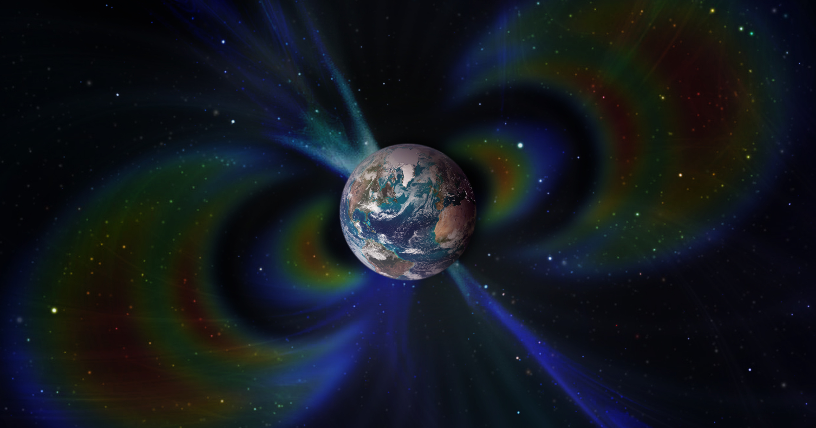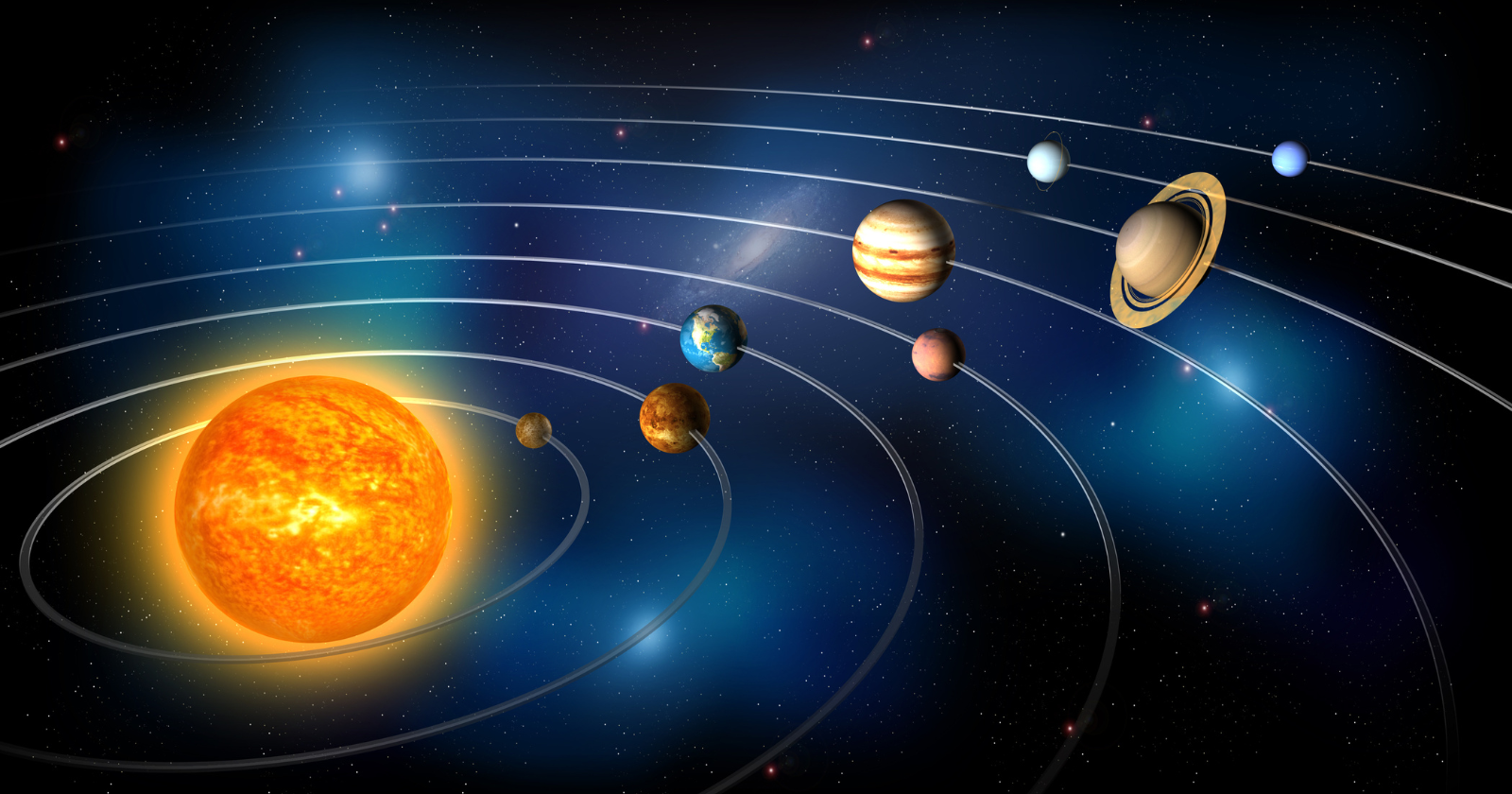
The Sun is not standing still. It is carrying the entire Solar System around the centre of the Milky Way, and one lap takes roughly 230 million years. The last time we were this far around the galaxy, Earth was in the Triassic Period and the very first dinosaurs were only just beginning to walk.
The Sun is not fixed in space. It carries the entire Solar System around the centre of the Milky Way, completing one lap in roughly 230 million years. One galactic year ago, Earth was in the Late Triassic, and the first dinosaurs were only just beginning to appear in the fossil record.
The image is tidy and the underlying facts hold up reasonably well. But both numbers carry more uncertainty than the neat pairing suggests, and the idea that we have come back to the same place is, on closer reading, not quite right.
How well we actually know the number
The Sun’s orbital period around the galactic centre is not pinned to a single value. Estimates run from about 225 to 250 million years, with 230 million the figure most often quoted. Keith Hawkins, an astronomer at the University of Texas at Austin, put it at around 220 to 230 million years and made the point that this so-called galactic year is specific to our position in the galaxy: stars closer to the centre orbit faster, those further out more slowly.
The numbers underneath are better constrained than the period itself. The Sun sits roughly 26,000 light-years from the galactic centre and moves through its orbit at about 230 kilometres a second, a figure the National Radio Astronomy Observatory gives alongside a period of about 226 million years. Data from the European Space Agency’s Gaia mission has since tightened the rotation curve and nudged the favoured period towards the lower end of the range. So when anyone says 230 million years, the honest reading is a figure good to within a few tens of millions of years, not a precise count.
The Triassic check
The dinosaur half of the claim survives scrutiny. One galactic year ago lands in the Late Triassic, in the stage palaeontologists call the Carnian. The oldest dinosaurs that are confidently identified as dinosaurs come from the Ischigualasto Formation in northwestern Argentina, dated to around 230 to 233 million years ago: small bipedal animals such as Eoraptor and Eodromaeus, and the larger predator Herrerasaurus.
What the popular version tends to leave out is that these animals were not yet the rulers of anything. The Natural History Museum in London, drawing on the work of dinosaur researcher Paul Barrett, notes that the first definite dinosaurs around 230 million years ago were rare members of the fauna, overshadowed by crocodile-line reptiles. Their dominance did not begin until the end-Triassic extinction about 201 million years ago cleared the field. The coincidence with the galactic year works as well as it does partly because two independently uncertain dates, the orbital period and the first-dinosaur date, happen to fall in the same window.
Why “this far around” is the wrong picture
The phrase that does the heavy lifting in the original observation is “this far around the galaxy,” and it implies a return to the same spot. We have not returned to the same spot.
Several things get in the way. The galaxy rotates differentially, so there is no single rigid sweep that carries everything around together. The spiral arms are not solid structures made of fixed stars; they behave more like wave patterns moving through the disc, which means the arm we sit near now is not the arm we sat near in the Triassic. The Sun also bobs up and down through the galactic plane, crossing it every few tens of millions of years, with a full vertical cycle of roughly 60 to 70 million years. Over hundreds of millions of years it drifts in galactic radius as well.
Put together, one lap brings the Sun back to a similar distance from the centre and a similar angular position, while the actual neighbourhood, the nearby stars, the gas clouds, the arms, is entirely different. The clock comes back around. The place does not.
What not to read into it
The tempting next step is to treat galactic position as a cause of what happens on Earth, and there is a real line of research that flirts with exactly this. In 1984, Schwartz and James proposed in Nature that an apparent periodicity in mass extinctions might track the Sun’s oscillation through the galactic plane, the suggested mechanism being that plane crossings disturb the outer comet cloud and send impactors towards the inner Solar System.
The idea has been revisited and challenged repeatedly in the decades since. The main objections are that the plane-crossing interval does not cleanly match the claimed extinction period, and that the extinction periodicity itself is disputed. It remains an unconfirmed hypothesis, not an established link. The galactic year is a useful way to feel the depth of geological time. On the available evidence it is not a lever on terrestrial biology.
The figure will keep moving as Gaia data accumulates and the Milky Way’s rotation curve is measured more precisely. The defensible version of the dinosaur line is the modest one: roughly one trip around the galaxy ago, by a clock we can only read to within tens of millions of years, the first dinosaurs were small, rare, and a long way from inheriting the planet.
The post The Sun is not standing still. It is carrying the entire Solar System around the centre of the Milky Way, and one lap takes roughly 230 million years. The last time we were this far around the galaxy, Earth was in the Triassic Period and the very first dinosaurs were only just beginning to walk. appeared first on Space Daily.