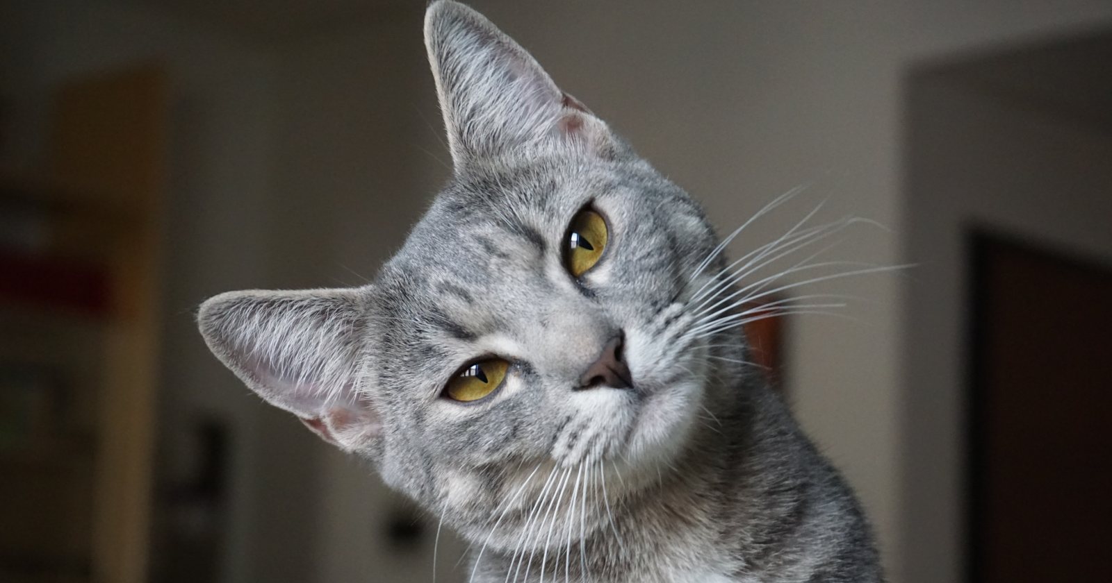
We talk about anxiety as if it starts in the mind — but for some people, the eyes may be the first place it shows up
The first sign was never a thought.
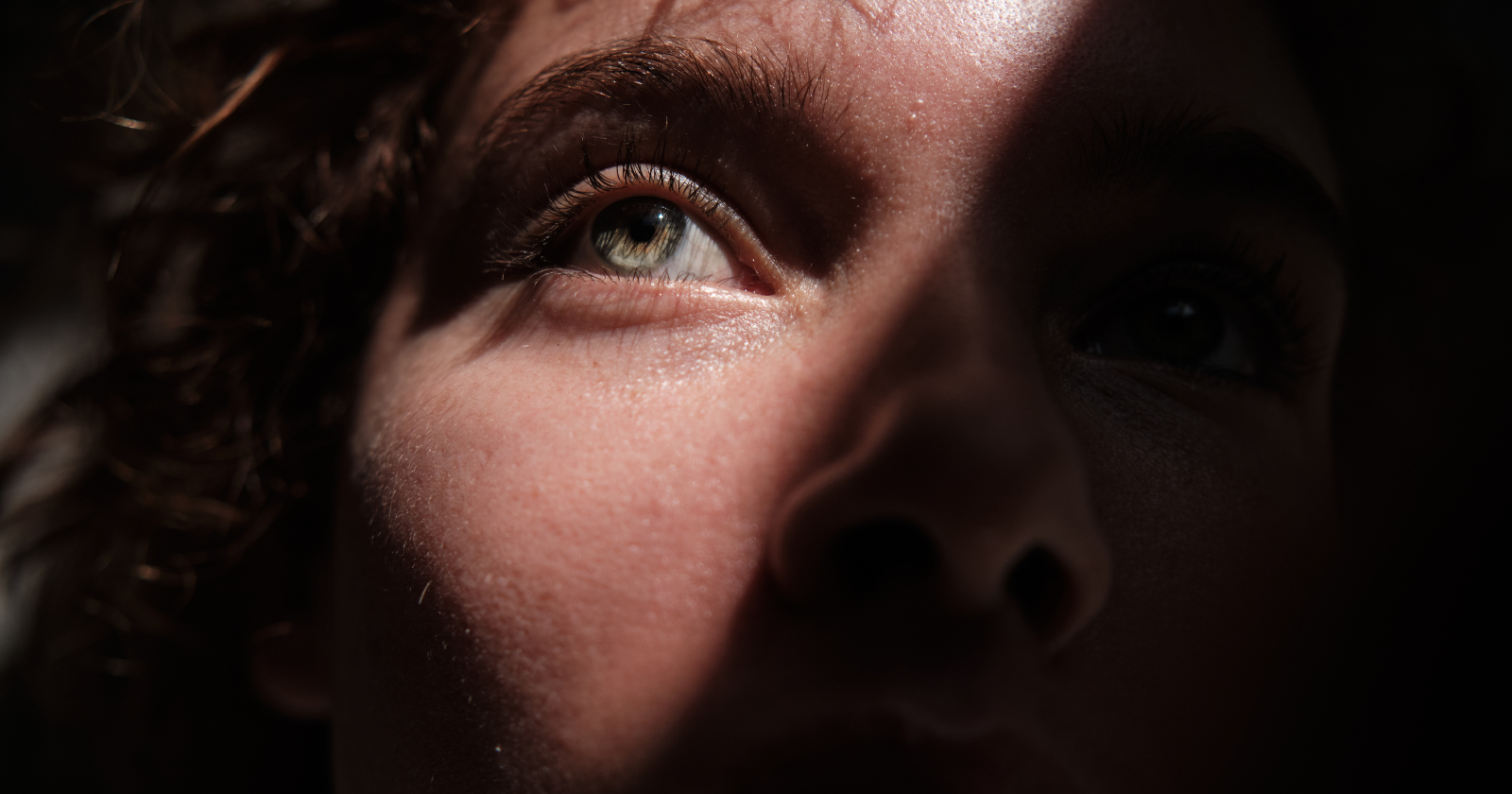
It was visual. Something in the way the room looked. The walls would seem slightly farther away than they had been a moment before. Colours stayed, shapes stayed, the furniture stayed in exactly the right places — and yet something about the scene lost a quality I can only describe as immediacy. The world was still there. It just stopped feeling available.
This would happen before I felt afraid. Before I could name what was coming. Before any thought had formed that I could call anxious. Something changed in the way I was receiving the world through my eyes, and only later — sometimes much later — would the rest of the experience catch up.
I spent years not knowing what to call this.
I tried “dizzy,” which wasn’t right. I tried “tired,” which was too soft. I tried “dissociating,” which felt too clinical for something that happened in quiet moments, not only in crises. What I was looking for was a word for the way the world could go slightly flat. Not dark. Not frightening in any obvious way. Just — less textured. Less arrived. As if someone had turned the resolution of reality down just slightly, and I was the only one in the room who noticed.
The world went flat before I had words for it
What I was experiencing had a name. Derealization — the sense that the external world has become unreal, distant, or visually altered — is a well-documented symptom that occurs frequently in anxiety and panic, and in the broader condition known as depersonalization-derealization disorder. It affects a surprising number of people, though most, like me, spend a long time describing it badly before they discover it has a name at all.
What I did not expect, once I found the name, was to realize how early in the anxiety sequence it was arriving for me.
Most descriptions of anxiety lead with thought. The worry, the spiral, the catastrophizing. The racing mind. And for many people that may be accurate — the cognitive element comes first, and the body follows. But for me, the sequence ran differently. The visual alteration came before the worry. My eyes created distance before my mind could explain why. By the time I was consciously afraid, I had already been looking at the world through a kind of filter for several minutes. Sometimes longer.
The world went flat before I had words for what was happening.
Once I recognized this, I started paying attention to it differently. Not as a malfunction, but as a signal. Something my system was doing before it had time to speak.
Before anxiety had language, it had a way of altering sight
The neuroscience here is not fully settled, but the broad shape of it makes sense.
The brain does not passively receive visual information and then decide what it means. It actively constructs perception, using prior experience, expectation, and internal state to shape what we experience as seeing. When the nervous system is in a state of hyperarousal — even before that state is consciously registered — the way the brain builds the visual world can shift. Attention narrows. Certain details flatten. The sense of depth and richness that makes the world feel real can diminish, because the system is already doing something else with its resources.
The amygdala, which processes emotional and threat-relevant stimuli, is thought to receive threat-relevant signals very rapidly — in some models, before the slower analytical pathways that give us conscious perception have fully resolved what we’re seeing. This means the body’s threat response can activate before the thinking mind has noticed anything. The alarm goes off, the nervous system reorganizes, and the first sign you have — if you are paying attention to your body rather than your thoughts — might be something as subtle as the way the room looks.
That was my experience. I didn’t first think anxiety. I saw it.
The first thing anxiety stole, reliably, was the texture of the world.
Learning to read the signal
For years, the visual shift frightened me in its own right. The unreality was unsettling before any worry arrived to explain it. There were moments when I genuinely questioned whether I was losing something — my grip on reality, my trust in my own perception, something I couldn’t name. The derealization felt like a symptom without a cause, which is one of the lonelier things you can experience.
It is also disorienting in a specific way: when perception itself becomes the thing you can’t trust, you lose the ground you’d normally stand on to figure out what is wrong. You can’t think your way out of a problem that is currently happening in your thinking. You can’t look clearly at something when it is your looking that has shifted.
What changed was noticing the pattern.
Not during the episode, but afterward. Tracing the sequence: where had I been, what had I been carrying before I noticed the flatness, what came before the flatness itself. And what I found, slowly, was that the visual shift was not random. It was a leading indicator. Something had already been building in my nervous system — a stress response, a low-grade overwhelm I hadn’t consciously registered — and my eyes were the first thing that showed it. Before my thoughts caught up. Before my chest tightened. Before I would have said, if anyone had asked, that anything was wrong.
My eyes were filtering the world before I knew I needed a filter.
Maybe it was never malfunction
I am careful about what I claim here. I am not saying anxiety lives in the eyes, or that this is how it works for everyone. What I am saying is something smaller and, to me, more useful: for some people, the first felt experience of anxiety may be visual. Perceptual. Something that shows up in how the world looks before it shows up in what the mind thinks.
And if that is true — even sometimes, even for some people — then it changes where you learn to look for the early signs.
I used to search for the anxious thought. The belief I could challenge, the worry I could reframe, the cognitive distortion I could name and dispute. These have their place. But I kept arriving at them too late, after the nervous system had already been organizing itself around something I hadn’t consciously noticed. I was looking for the fire after the smoke had already been there for a while.
Now I know to check in with what I’m seeing. Whether the room feels arrived. Whether the world has its texture. Whether reality is still emotionally available, or whether it has quietly started to step back — a little flatter, a little more distant, a little less like itself — without explanation.
Those were never signs that something was wrong with my eyes.
They were signs that something in me was trying to protect itself before I understood what from. The nervous system, doing what nervous systems do — adjusting the aperture, reducing the input, creating a small buffer between me and a world it had decided, for some reason, was temporarily too much.
That is not a disorder. That is a system trying to survive.
It just took me a long time to recognize the signal for what it was, instead of fearing it as one more thing that was wrong.
The post We talk about anxiety as if it starts in the mind — but for some people, the eyes may be the first place it shows up appeared first on Space Daily.