❌

Reading view

Summer Goes Out With a Heat Dome

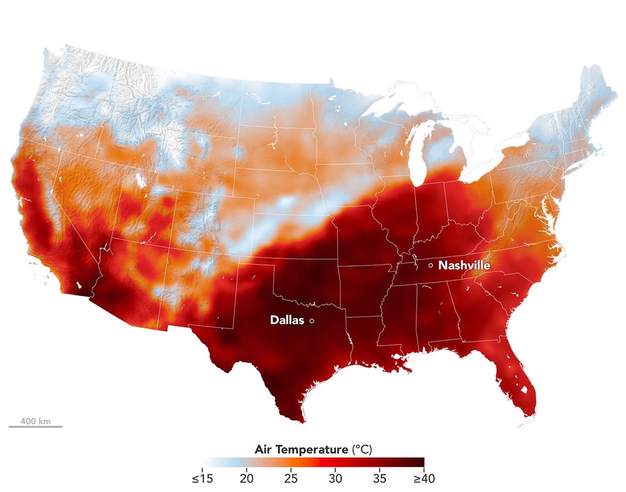
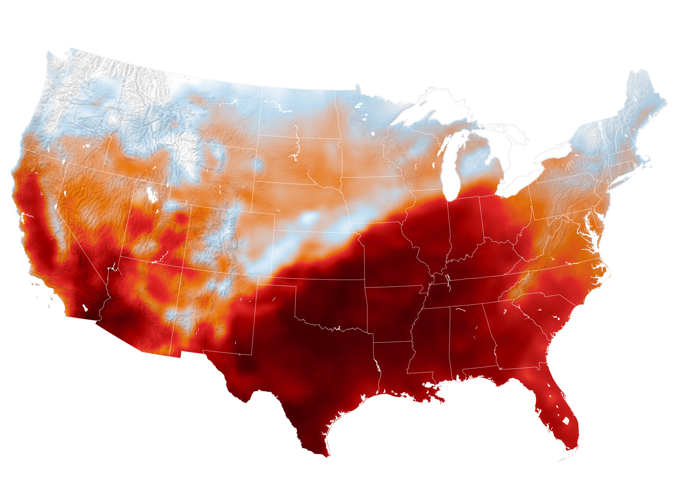
Air temperatures in the United States are depicted in white to light blue (cooler) and orange to red (warmer). An area of red, indicating temperatures around 100 degrees Fahrenheit, covers Texas and several states to the east and northeast.
An area of high pressure over the south-central U.S. produced unseasonable and, in some places, record-breaking warmth on September 15, 2026, as shown in this map of modeled air temperatures from GEOS (Goddard Earth Observing System).
NASA Earth Observatory/Michala Garrison

While the calendar indicated that astronomical summer was winding down, a swath of the south-central United States was sweltering under a heat dome in mid-September 2026.

This map shows air temperatures in the contiguous U.S. on September 15, 2026, at 4 p.m. Central Time (21:00 Universal Time), modeled at 2 meters (6.5 feet) above the ground. It was produced by combining satellite observations with temperatures predicted by a version of the GEOS (Goddard Earth Observing System) model, which uses mathematical equations to represent physical processes in the atmosphere. The darkest reds indicate areas where temperatures approached or exceeded 40 degrees Celsius (104 degrees Fahrenheit).

More than 41 million people in the U.S.—about 12 percent of the population—were under a National Weather Service extreme heat advisory, extreme heat watch, or extreme heat warning on September 15. The high temperatures spanned large portions of several states, such as Texas, Oklahoma, Arkansas, Missouri, and Tennessee. Meteorologists warned that high humidity, limited cloud cover, and light winds could make temperatures feel higher than thermometer readings and increase the risk of heat-related illnesses.

Several locations set new daily high temperature records on September 15. These included Dallas, Texas, at 101ºF (38ºC), Memphis, Tennessee, at 99ºF (37ºC), and Nashville, Tennessee, at 100ºF (38ºC). The cities were all at least 12ºF warmer than normal that day, with Nashville breaking its daily-high record from 1927. The day before, Nashville also set a record-high minimum temperature of 75ºF (24ºC).

A weather phenomenon meteorologists call a heat dome was responsible for driving temperatures up across the region. A heat dome develops when an area of high pressure in the upper atmosphere pushes hot air toward the surface and traps it there. Heat domes put the brakes on convection and suppress clouds and precipitation. This allows sunlight to reach Earth’s surface relatively unhindered and further elevate air temperatures.

The stretch of unseasonable temperatures follows the warmest June through August in the contiguous United States in a 132-year record, according to NOAA. The three-month period in 2026 was 0.4ºF warmer than the previous records, set in 1936 and 2021.

NASA Earth Observatory image by Michala Garrison, using GEOS-FP data from the Global Modeling and Assimilation Office at NASA GSFC. Story by Lindsey Doermann.
Downloads

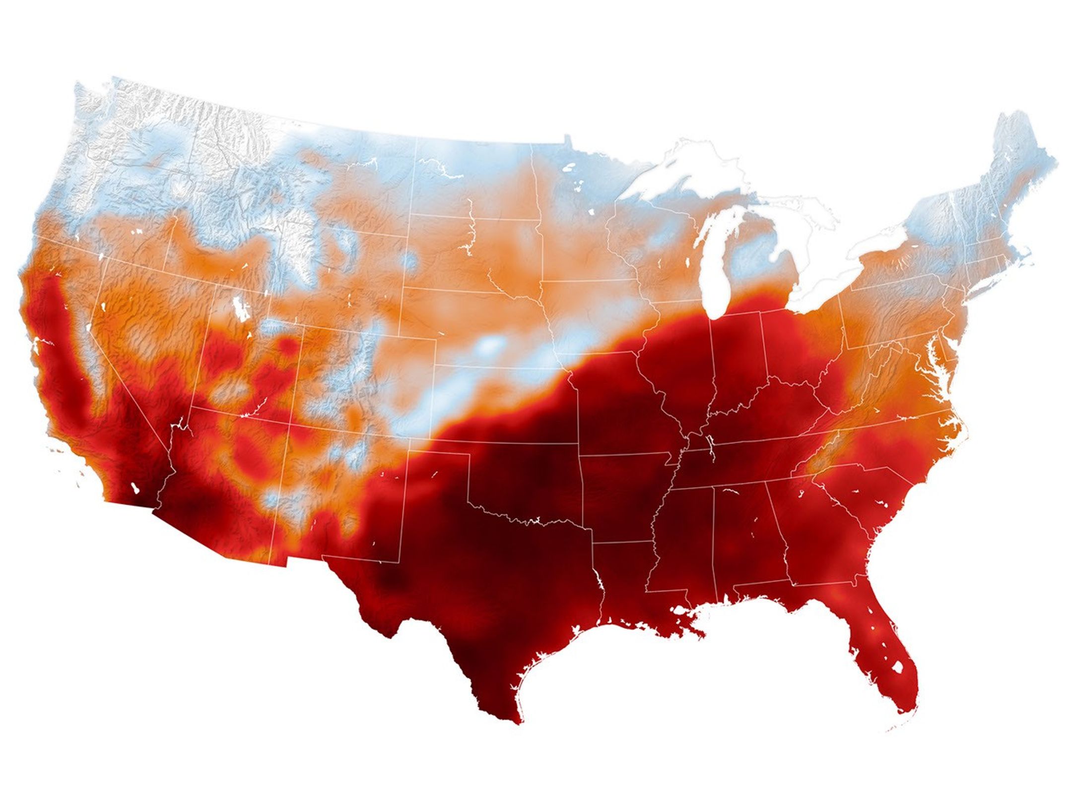
Air temperatures in the United States are depicted in white to light blue (cooler) and orange to red (warmer). An area of red, indicating temperatures around 100 degrees Fahrenheit, covers Texas and several states to the east and northeast.

September 15, 2026

JPEG (1.22 MB)

References & Resources

You may also be interested in:

Stay up-to-date with the latest content from NASA as we explore the universe and discover more about our home planet.
Heat Dome Broils the Western U.S.
4 min read

A ridge of high pressure fueled record-breaking temperatures in Montana, Utah, and Wyoming on July 12, 2026.
Article
Europe’s Scorching Summer
6 min read

A series of heat waves in 2026 is breaking records and taking a toll in Europe.
Article
Sensing the Poles’ Hidden Heat
3 min read

New animations from NASA’s PREFIRE mission reveal two years of seasonal temperature swings at the Arctic and Antarctic.

Article

The post Summer Goes Out With a Heat Dome appeared first on NASA Science.

  •  

Summer Goes Out With a Heat Dome

Air temperatures in the United States are depicted in white to light blue (cooler) and orange to red (warmer). An area of red, indicating temperatures around 100 degrees Fahrenheit, covers Texas and several states to the east and northeast.
An area of high pressure over the south-central U.S. produced unseasonable and, in some places, record-breaking warmth on September 15, 2026, as shown in this map of modeled air temperatures from GEOS (Goddard Earth Observing System).
NASA Earth Observatory/Michala Garrison

While the calendar indicated that astronomical summer was winding down, a swath of the south-central United States was sweltering under a heat dome in mid-September 2026.

This map shows air temperatures in the contiguous U.S. on September 15, 2026, at 4 p.m. Central Time (21:00 Universal Time), modeled at 2 meters (6.5 feet) above the ground. It was produced by combining satellite observations with temperatures predicted by a version of the GEOS (Goddard Earth Observing System) model, which uses mathematical equations to represent physical processes in the atmosphere. The darkest reds indicate areas where temperatures approached or exceeded 40 degrees Celsius (104 degrees Fahrenheit).

More than 41 million people in the U.S.—about 12 percent of the population—were under a National Weather Service extreme heat advisory, extreme heat watch, or extreme heat warning on September 15. The high temperatures spanned large portions of several states, such as Texas, Oklahoma, Arkansas, Missouri, and Tennessee. Meteorologists warned that high humidity, limited cloud cover, and light winds could make temperatures feel higher than thermometer readings and increase the risk of heat-related illnesses.

Several locations set new daily high temperature records on September 15. These included Dallas, Texas, at 101ºF (38ºC), Memphis, Tennessee, at 99ºF (37ºC), and Nashville, Tennessee, at 100ºF (38ºC). The cities were all at least 12ºF warmer than normal that day, with Nashville breaking its daily-high record from 1927. The day before, Nashville also set a record-high minimum temperature of 75ºF (24ºC).

A weather phenomenon meteorologists call a heat dome was responsible for driving temperatures up across the region. A heat dome develops when an area of high pressure in the upper atmosphere pushes hot air toward the surface and traps it there. Heat domes put the brakes on convection and suppress clouds and precipitation. This allows sunlight to reach Earth’s surface relatively unhindered and further elevate air temperatures.

The stretch of unseasonable temperatures follows the warmest June through August in the contiguous United States in a 132-year record, according to NOAA. The three-month period in 2026 was 0.4ºF warmer than the previous records, set in 1936 and 2021.

NASA Earth Observatory image by Michala Garrison, using GEOS-FP data from the Global Modeling and Assimilation Office at NASA GSFC. Story by Lindsey Doermann.

Downloads

Air temperatures in the United States are depicted in white to light blue (cooler) and orange to red (warmer). An area of red, indicating temperatures around 100 degrees Fahrenheit, covers Texas and several states to the east and northeast.

September 15, 2026

JPEG (1.22 MB)

References & Resources

You may also be interested in:

Stay up-to-date with the latest content from NASA as we explore the universe and discover more about our home planet.

Heat Dome Broils the Western U.S.

4 min read

A ridge of high pressure fueled record-breaking temperatures in Montana, Utah, and Wyoming on July 12, 2026.

Article

Europe’s Scorching Summer

6 min read

A series of heat waves in 2026 is breaking records and taking a toll in Europe.

Article

Sensing the Poles’ Hidden Heat

3 min read

New animations from NASA’s PREFIRE mission reveal two years of seasonal temperature swings at the Arctic and Antarctic.

Article
  •  

Sensing the Poles’ Hidden Heat

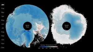
Surface temperatures across Earth’s poles pulse with the seasons, as seen in this animation based on two years of data collected by NASA’s PREFIRE (Polar Radiant Energy in the Far-InfraRed Experiment) mission.
NASA/Chad Greene

At the top and bottom of the planet, the seasons arrive on a schedule all their own. Satellite data from a mission measuring infrared energy reveal just how differently—and how dramatically—surface temperatures swing across two full years at the poles.

In this animation, surface temperatures across the Arctic and Antarctic pulse between cold (dark blue) and milder to warm (lighter blue to red). Data for the animation come from NASA’s PREFIRE (Polar Radiant Energy in the Far-InfraRed Experiment) satellites. The mission’s twin CubeSats began collecting science data in July 2024 and have now captured two complete seasonal cycles at each pole.

Because the two poles sit in opposite hemispheres, their seasons occur at opposite times—and the swing between seasons differs, too. In the Arctic, cold, dark winters give way to summers warm enough to thaw vast stretches of tundra and sea ice. In Antarctica, Earth’s coldest continent, summer temperatures rarely climb above freezing before the bitter cold of winter returns.

Surface temperatures, and how they fluctuate, offer a window into Earth’s energy budget, the net flow of energy into and out of the Earth system. Sunlight absorbed by the surface is re-radiated as infrared heat, which bounces between Earth’s surface and atmosphere before escaping to space. The poles play an important role in this process. Atmospheric and ocean circulation carries excess heat absorbed in the tropics toward the poles, where it radiates away to space, helping regulate the planet’s temperature.

“By measuring invisible heat radiating from Earth’s coldest places, PREFIRE is helping scientists understand why the poles are changing so rapidly, and what those changes might mean for the rest of the planet,” said Chad Greene, a glaciologist at NASA’s Jet Propulsion Laboratory.

Scientists have long known that far-infrared radiation accounts for nearly 60 percent of the energy Earth loses to space, but that portion of the spectrum—invisible to human eyes—had never been comprehensively measured on a global scale. By directly tracking this invisible energy in near-real-time, the PREFIRE mission is helping scientists refine models and gain a better understanding of the Earth system.

“Weather systems, river flows, shipping routes, and ice sheet stability are all influenced by energy movement in a part of the spectrum that only PREFIRE can see,” said Tristan L’Ecuyer, an atmospheric scientist at the University of Wisconsin-Madison and principal investigator of the PREFIRE mission. “Now that the invisible has been made visible, we can begin to improve weather and climate predictions that industries, our national defense, and Arctic communities rely on.”

Maps courtesy of Chad Greene, NASA/JPL, using data from NASA’s PREFIRE mission. Story by Kathryn Hansen.

References & Resources

You may also be interested in:

Stay up-to-date with the latest content from NASA as we explore the universe and discover more about our home planet.

A Moonlit Earth as Seen From Artemis II

4 min read

An astronaut’s photo, taken en route to the Moon, reveals our planet and its place in space in a novel…

Article

Earthset From the Lunar Far Side

2 min read

The crew of NASA’s Artemis II mission captured extraordinary images of our home planet during their journey around the far…

Article

June 2026 Satellite Puzzler

2 min read

Your challenge is to tell us the location of the satellite image and why it is interesting.

Article
  •  
❌