❌

Reading view

Arkansas researchers map genetic neighborhoods to identify disease-causing bacteria

Scientists in Arkansas have developed a machine-learning approach that can identify potentially disease-causing strains of a poultry bacterium by analyzing not only which genes are present, but also how those genes are arranged across the genome. The method focuses on the “genetic neighborhoods” surrounding genes, offering a new way to distinguish harmful strains of Enterococcus cecorum from closely related strains that do not cause disease.

E. cecorum is commonly found in poultry environments, and many of its strains are harmless. However, pathogenic strains can cause arthritis, bone infections and lameness, creating serious animal-welfare problems and economic losses for poultry producers. Because pathogenic and nonpathogenic strains can share many of the same genes, identifying the genetic features associated with disease has been challenging.

The research team, led by Aranyak Goswami of the Arkansas Agricultural Experiment Station’s Center for Agricultural Data Analytics, examined the organization of genes within genomic islands. These are segments of DNA that bacteria often acquire from other microorganisms through horizontal gene transfer. Genomic islands can carry genes involved in antibiotic resistance, bacterial survival, movement of DNA and virulence, making them important regions for understanding how pathogens emerge.

Rather than treating the bacterial genome as a simple list of genetic components, the researchers analyzed it as a structured map. They investigated which genes occurred near one another, the order in which they appeared and the way groups of neighboring genes formed recurring units known as genomic-island cassettes. This architecture provided information that could be missed when genes are examined individually.

“The machine-learning model recognizes patterns in gene order much like it recognizes patterns in language,” Goswami said. In the same way that a language model can learn that certain words frequently appear together, the computational system learned that particular combinations and arrangements of bacterial genes were associated with pathogenic strains. The approach therefore captures relationships among genes rather than relying only on the presence or absence of individual DNA sequences.

For the proof-of-concept study, the researchers analyzed the genomes of 145 E. cecorum strains isolated from poultry. The dataset included 95 nonpathogenic strains and 50 pathogenic strains capable of causing illness. The analysis found that disease-associated strains were more likely to contain genomic islands enriched in genes linked to antimicrobial resistance and the transfer of genetic material between bacteria.

Those findings do not mean that every bacterium carrying such genes will necessarily cause disease. Instead, the researchers describe the system as an exploratory classification and research tool. It identifies patterns that may help scientists investigate why some bacterial lineages become harmful, while also providing clues about how resistance and virulence traits move through bacterial populations.

Current monitoring methods for E. cecorum often depend on culturing the bacterium or screening for specific genes. Such techniques remain valuable, but they may overlook broader genomic relationships. The new pipeline could complement these approaches by evaluating the wider context in which genes occur. Additional testing with larger and more geographically diverse datasets will be necessary before the method can be used for routine flock surveillance or diagnostic decision-making.

The researchers believe the strategy could eventually be adapted to other bacterial species affecting animals, humans, wildlife and plants. Goswami’s team is beginning to examine Enterococcus faecalis, a close relative of E. cecorum and a frequent cause of hospital-acquired infections in humans. They also plan to apply the pipeline to Escherichia coli and other bacteria to study how nonpathogenic lineages acquire the genomic configurations associated with disease. The study, published in Frontiers in Microbiology, demonstrates how machine learning and comparative genomics can reveal hidden signals in bacterial DNA and may help researchers track the evolution of emerging pathogens.

Subject of Research: Animals

Article Title: Genomic-island cassette architecture provides interpretable signal for exploratory classification of poultry-associated Enterococcus cecorum lineages

News Publication Date: 7-Jul-2026

Web References: https://doi.org/10.3389/fmicb.2026.1882753

References: Frontiers in Microbiology, DOI: 10.3389/fmicb.2026.1882753

Image Credits: UA University Relations photo by Chieko Hara

Keywords: artificial intelligence, machine learning, deep learning, computational biology, bacterial pathogens, Enterococcus cecorum, genomic islands, genomic architecture, antibiotic resistance, poultry disease, pathogen surveillance, comparative genomics

  •  

Ancient Warming Event Reveals Possible Climate Tipping Point

A climate shock that unfolded about 304 million years ago is offering scientists a dramatic warning about how quickly Earth’s climate system can amplify an initial temperature rise. During the Late Paleozoic Ice Age, a relatively modest increase in global temperatures appears to have triggered a much larger episode of warming, as methane released from thawing permafrost intensified the greenhouse effect. Researchers say the ancient event provides a powerful geological parallel for the climate changes occurring today.

The study, led by Le Yao of the Nanjing Institute of Geology and Paleontology with contributions from University of Cincinnati geosciences professor Thomas Algeo and international colleagues, examined a short-lived warming episode during Earth’s penultimate ice age. Their findings suggest that global sea surface temperatures eventually increased by more than 7 degrees Celsius, or approximately 12 degrees Fahrenheit. The rise was not necessarily caused by one enormous initial pulse of carbon. Instead, it may have developed through a chain reaction in which warming activated additional natural sources of greenhouse gases.

The Late Paleozoic Ice Age extended across a vast span of geological time, when large ice sheets covered parts of the supercontinent Gondwana. Although the planet was in an “icehouse” state, atmospheric carbon dioxide and methane still had the power to destabilize the climate. The newly analyzed warming event is particularly significant because it occurred under ice-age conditions rather than during an already warm greenhouse world. That makes it a valuable analog for the modern Earth, which still contains continent-scale ice masses in Greenland and Antarctica.

According to the researchers, the initial climate disturbance may have been linked to volcanic activity. Volcanic emissions can inject carbon dioxide and other gases into the atmosphere, where they absorb outgoing infrared radiation and prevent some heat from escaping into space. The warming may also have been assisted by changes in Earth’s orbit. Over long cycles, variations in orbital shape alter the distribution of sunlight across the planet, influencing the growth and retreat of ice sheets and changing the seasonal balance of solar energy.

At first, the additional carbon may have produced only a limited temperature increase. But once warming crossed a critical threshold, frozen ground in high-latitude regions began to thaw. Permafrost contains large quantities of organic carbon preserved in frozen soils. When that material becomes available to microbes, decomposition can release carbon dioxide and methane. Methane is especially powerful over shorter atmospheric timescales because, molecule for molecule, it absorbs considerably more infrared radiation than carbon dioxide, even though it remains in the atmosphere for less time.

This process can create a positive climate feedback. An initial warming causes permafrost to thaw, thawing releases greenhouse gases, and the additional gases produce further warming. That extra heat can accelerate more thawing, allowing the cycle to reinforce itself. The researchers describe the ancient event as a transient global warming episode in which a comparatively modest carbon release appears to have crossed a climatic tipping point and initiated much more extensive carbon emissions from natural reservoirs.

The geological timescale of the ancient warming is also central to the study’s relevance. Algeo said the temperature change unfolded over tens of thousands of years, with warming occurring at an average rate of roughly one-tenth of a degree Celsius per 1,000 years. Modern warming is progressing far more rapidly. Researchers have observed an increase of nearly 1 degree Celsius in global sea surface temperature over approximately the past century, a rate many times faster than the average change reconstructed for the ancient event.

The comparison does not mean that Earth is destined to repeat the precise conditions of 304 million years ago. Continents, ecosystems, atmospheric composition and ice-sheet geometry were all different in the Late Paleozoic. However, the physics of greenhouse warming and the existence of carbon feedbacks remain relevant. Ancient climate records reveal how a system that appears stable can respond nonlinearly when warming activates processes capable of releasing additional greenhouse gases.

The findings also place human history in a broader planetary context. All recorded human civilization has developed during the most recent ice age, despite the fact that the term can sound incompatible with today’s climate. In scientific usage, Earth remains in an ice age because substantial permanent ice sheets still exist in Greenland and Antarctica. The ancient warming episode matters precisely because it demonstrates that an ice age does not guarantee a permanently cold or stable climate. Even within an icehouse world, a small disturbance can trigger rapid and substantial changes when reinforcing feedbacks are engaged.

The research, published in the Proceedings of the National Academy of Sciences, underscores why scientists closely monitor permafrost, polar ice and other climate-sensitive carbon stores. The ancient record cannot provide an exact forecast of future warming, but it shows that Earth’s climate has repeatedly responded to carbon disturbances with amplifying feedbacks. As modern emissions continue to raise temperatures at an exceptional rate, the geological evidence offers a clear message: the danger lies not only in the carbon released directly by human activity, but also in the natural carbon sources that warming can unlock.

Subject of Research: Ancient global warming, permafrost methane feedbacks, and climate tipping points during the Late Paleozoic Ice Age

Article Title: A transient global warming event during Earth’s penultimate icehouse

Web References: https://doi.org/10.1073/pnas.2601643123

References: Proceedings of the National Academy of Sciences, DOI: 10.1073/pnas.2601643123

Image Credits: Andrew Higley, University of Cincinnati

Keywords: climate change, global warming, ice age, Late Paleozoic Ice Age, permafrost, methane, climate feedback, tipping point, paleoclimate, geology, volcanic activity, Earth’s climate history

  •  

Which Families Pay Most for Neonatal Intensive Care? Analyzing NICU Out-of-Pocket Costs

The price of saving a newborn’s life can extend far beyond the hospital walls. A new analysis published in the Journal of Perinatology is drawing attention to a largely invisible consequence of neonatal intensive care: the direct medical out-of-pocket costs paid by families. The study, led by researchers Gorka, Profit and Phibbs, examines who carries the greatest financial burden during a neonatal intensive care unit admission and investigates how structural conditions may shape those costs.

Neonatal intensive care is among the most technologically advanced forms of medicine. Infants in NICUs may require mechanical ventilation, incubators that regulate temperature and humidity, continuous heart and oxygen monitoring, intravenous nutrition, specialized medications and repeated laboratory testing. These interventions can be lifesaving, particularly for babies born extremely prematurely or with serious medical complications. Yet the financial consequences of receiving this care are not experienced equally by every household, even when families receive treatment in the same health-care system.

The researchers’ focus is direct medical out-of-pocket spending: the money families must pay themselves for medical services connected to a NICU admission. This can include deductibles, copayments, coinsurance and other forms of cost sharing that remain after insurance has paid its portion. Unlike the total hospital charge or the amount reimbursed by an insurer, out-of-pocket cost reflects the portion that reaches a family’s own budget. For households already coping with an unexpected high-risk birth, even relatively small individual charges can accumulate rapidly.

The study is designed not only to document these expenses, but also to explore the structural forces behind differences in cost burden. In health economics, structural contributions refer to the way institutions and systems distribute risk and resources. Insurance design, employment-linked coverage, household income, geographic location, hospital characteristics and access to public assistance can all affect how much a family ultimately pays. Two infants with similar clinical needs may therefore generate very different financial experiences for their parents, depending on the architecture of coverage surrounding them.

That distinction matters because the effects of a NICU admission are not limited to the newborn’s medical condition. Parents may need to travel long distances to reach a specialized hospital, arrange accommodation near the facility, pay for transportation or meals, and take unpaid leave from work. These expenses may not always appear in estimates of direct medical out-of-pocket costs, but they can intensify the economic shock associated with a prolonged admission. The medical bill is only one component of the broader financial strain that can accompany neonatal illness.

A central question raised by the analysis is whether the families with the fewest financial resources are also the ones most exposed to high cost sharing. A payment that is manageable for a high-income household may consume a substantial share of a lower-income family’s monthly budget. Economists often describe this pattern as a disproportionate cost burden: the absolute amount paid may not be the highest, yet the payment represents a greater fraction of household resources. This distinction can reveal inequities that remain hidden when researchers look only at average dollar amounts.

The findings are expected to be relevant to health-policy debates about medical debt, insurance protection and the financial consequences of premature birth. If structural factors account for meaningful differences in family payments, reducing inequality may require more than improving clinical care. Potential responses could include limits on neonatal cost sharing, stronger protections against unexpected bills, expanded eligibility for public coverage and assistance with transportation or family support services. The analysis may also help hospitals and policymakers identify families at risk of financial hardship while an infant is still receiving care.

The issue has significance beyond individual hospitalizations because NICU care can influence a family’s financial stability long after discharge. Parents may face follow-up appointments, medications, developmental assessments and specialist care for children who experienced complications of prematurity or serious illness. Medical expenses can overlap with reduced work hours, job loss or the need for one parent to become a full-time caregiver. A short period of intensive treatment can therefore produce a long economic aftershock, particularly when families lack savings or paid leave.

By placing family payments at the center of neonatal research, Gorka, Profit and Phibbs emphasize a dimension of NICU care that is often absent from clinical success measures. Survival, complications and length of stay remain essential indicators, but they do not fully describe the experience of families navigating intensive care. Understanding who pays the most, why they pay it and how those payments relate to broader social structures could help redefine quality in neonatal medicine. The study’s message is potentially viral because it connects cutting-edge life-saving technology with a simple but consequential question: when medicine saves a baby, how much of the cost is left for the family to survive?

Subject of Research: Direct medical out-of-pocket costs of neonatal intensive care admissions and structural factors contributing to differences in financial burden among NICU families.

Article Title: Who pays the most for neonatal intensive care? An analysis of the out-of-pocket cost burden borne by NICU families

Article References: Gorka, N., Profit, J. & Phibbs, C.S. “Who pays the most for neonatal intensive care? An analysis of the out-of-pocket cost burden borne by NICU families.” Journal of Perinatology (2026). https://doi.org/10.1038/s41372-026-02869-6

Image Credits: AI Generated

DOI: 10.1038/s41372-026-02869-6

Keywords: neonatal intensive care, NICU, out-of-pocket costs, medical expenses, health-care inequality, premature birth, financial burden, insurance, neonatal health, health policy

  •  

Transit-based exoplanet survey finds its first microlensing exoplanet

NASA’s Transiting Exoplanet Survey Satellite (TESS) mission has notched up its first discovery of an exoplanet via a method known as microlensing. The planet is a “super Jupiter” known as Gaia23bra b, and TESS observed it when the planet and its host star acted as a gravitational lens, magnifying the light from a second, more distant background star.

Astronomers have several ways of finding planets beyond our solar system. The most successful of these by far – and the one that TESS was designed for – is the transit method, which is responsible for roughly 75% of all exoplanet detections to date. This approach relies on observing the periodic dimming of a star’s light as a planet passes between the star and an observer here on Earth.

The transit method does have limitations, however. The main limitation is that we can see transits for only a small number of planets, namely those with orbital planes that are almost exactly edge-on to Earth. An alternative approach known as photometric microlensing is somewhat more flexible in this respect, as it relies on the star-planet system magnifying the light from a background star, which is known as the source. This magnification occurs because the gravitational pull of the planet-star system warps space, bending and magnifying the source’s light (as Albert Einstein predicted as part of his general theory of relativity) like a lens and producing characteristic spikes in its brightness.

A second bite at the exoplanetary cherry

Astronomers initially identified a planet in the Gaia23bra system using observations made in 2023 by the European Space Agency’s now-retired Gaia space telescope. However, while Gaia picked up the unexpected brightening of a background star, it did not identify this event as coming from a binary-star system, and it could not pick out the planet itself because its observations were too sparse, explains Mallory Harris, an astronomer at the University of New Mexico, US who led the TESS study.

In the new work, Harris and colleagues scoured TESS data from the same period. Because TESS’ observations were much denser – it observed the region every 200 seconds for nearly 60 days – they were able to identify extra features in the brightness of the light curve that indicated the presence of a planet in the system. Subsequent analyses revealed that this planet is about 1.63 times the size of Jupiter, and it orbits its host – an orange dwarf star 20% smaller than our Sun – at a distance similar to that of Jupiter from our Sun.

Complementary techniques

The transit technique is particularly sensitive to planets that orbit close to their star because these planets are the most likely to transit and block out most of their host stars’ light as they pass in front of them. In contrast, Harris explains that microlensing is most sensitive to planets orbiting at Earth-like distances or further from their stars, making it better for studying planetary systems more like our own solar system. “With microlensing, we can find smaller planets with greater orbital distances, including worlds in the habitable zone of their star and even farther away,” she says.

The transit technique and microlensing are therefore complementary because each reveals a category of planet that the other may not be able to detect, adds team member Diana Dragomir. The only problem, Harris notes, is that microlensing observations are limited-time opportunities. “Microlensing events happen once and they’re gone – they don’t repeat,” Harris says. “I like to joke that we’ll probably find the first Earth analogue with microlensing and then wave at it as it goes by because we’ll never see it again.”

That said, Harris says that Gaia23bra will be an important observing target for the Nancy Grace Roman Space Telescope. “Microlensing is currently the only method capable of detecting Earth‑mass planets at Earth‑like orbital distances,” she explains. “We already knew that this technique could find planets, because it has done so in the past using ground-based observatories.

“What we demonstrated in this work is that high-cadence observations (even with low spatial precision) and high-precision long-baseline observations can work together to find a microlensing planet. And that it is possible to specifically do this by pairing TESS observations with those from another instrument.”

This synergy between long-time-scale surveys and high cadence observations could be therefore applied towards future searches for potentially habitable worlds, she tells Physics World. Although Gaia was retired last January, making it unlikely that astronomers will find many additional events via a Gaia–TESS combination, Harris adds that there could nevertheless be other microlensing planets in the past eight years of archived TESS observations. “I’m excited to see whether there are other events like this already hiding in the TESS data and whether future surveys can work together with TESS to find more microlensing planets in different parts of the galaxy,” she says.

The post Transit-based exoplanet survey finds its first microlensing exoplanet appeared first on Physics World.

  •  

Archaeologist Finally Decodes 2,200-Year-Old Mysterious Stonemason Inscriptions That Have Stumped Researchers for Centuries

A University of Warsaw scientist has determined that a series of mysterious stonemason inscriptions on the Tauchira Gate at Ptolemais, on Libya’s northern coast, which have perplexed researchers for centuries, are likely stonemason marks intentionally left visible by the artisans who built the ancient structure.

The new analysis, which was performed by Anna Urszula Kordas of the Faculty of Culture and Arts at the University of Warsaw in Poland, also dates the gate’s construction to the reign of Ptolemy VIII, roughly 2,200 years ago.

If correct, the new dates for the site would help settle a longstanding debate about the gate’s precise age.

Mysterious Stonemason Inscriptions Regularly Misidentified

According to Korda’s research study, archaeologists consider the Tauchira Gate to be the best-preserved section of the ancient fortifications built around the ancient Egyptian city of Ptolemais. Several visitors and scholars have noted the gate over the centuries, with a particular focus on its mysterious stonemason inscriptions.

The earliest documented attempt by a Western researcher to decipher their meaning comes from a French traveler identified as Granger, who recorded the marks sometime between 1733 and 1734. According to Korda, that first attempt mistakenly described the marks as likely instructions for masons to arrange the gate’s stones during its construction.

mysterious stonemason inscriptions
The north wall of the Tauchira Gate bears mysterious stonemason marks. Image Credit: Miron Bogacki, University of Warsaw/European Journal of Archaeology, © Kordas, A.U. 2026. Published by Cambridge University Press on behalf of The European Association of Archaeologists.

A second, 19th-century effort inaccurately ascribed the mysterious stonemason inscriptions to donors financing specific blocks. In the 1970’s, another researcher suggested the inscriptions were ‘ephebic’ names added after construction as graffiti “unrelated to the gate’s construction but connected to the functioning of the nearby gymnasium.”

Although the most recent effort dated the inscriptions to sometime during the city’s Roman period, Korda notes that the date is still in debate. She also points out that the meanings of the mysterious stone inscriptions were unlikely to be any of the proposed explanations, motivating the new analysis.

2006 Photos Enable Digital Recreation and Discovery of Techniques

To decipher the mysterious stone inscriptions, Korda said she reconstructed the gate’s construction process, organization, and chronology by applying the “chaîne opératoire approach.” This method allowed Korda to study these variables “within its technological and socio-cultural context.”

Thanks to a series of photographs captured by the Polish Archaeological Mission to Ptolemais in 2006, Korda was able to trace the location of each inscription using digital mapping software. The researcher notes that this process still included challenges, including “damaged stone surfaces, suboptimal picture quality, invasive plants, and later inscriptions,” all of which made some of the actual stone markings illegible. Korda said these limitations also hampered the “observation of stone processing techniques.”

mysterious stone inscriptions
Above: A view of the Tauchira Gate from the eastern side of the town (Image Credit: Photographs by Miron Bogacki). 

After a thorough initial examination, Korda separated the mysterious stonemason inscriptions into 27 ‘types’ and then split them into two groups. The first group represented marks found on rough, unfinished blocks. These marks were also mostly hidden from view, suggesting they were recorded during a block’s quarrying and transport.

Korda’s second group included inscriptions found on finished, textured outer surfaces of the gate’s two towers. Notably, the second group of markings appeared to be carved with more care than those in the first group.

Mysterious Stonemason Inscriptions Likely Stonemason Marks Identifying Workers and Work

Korda ultimately determined that the inscription pattern represented two distinct systems used to organize and pay for stonemason work. For example, some marks appear to follow a simple letter sequence, which Korda suggests shows how the team was divided for work.

“The stonemasons’ marks on the Tauchira Gate consist of single Greek letters, double letters, ligatures, and elaborate monograms,” the study author writes. “The marks A, Β, Γ, Δ, AP/Ε, Ζ, and Η likely form a letter-label system representing the division of labour among stonemasons’ teams.”

The analysis also revealed some of the mysterious stone inscriptions combine to form complex monograms. Korda said these inscriptions “appear as ligatures or monograms, possibly abbreviating stonemasons’ names.” The inscriptions also likely represent names or workshop owners or private donors who helped fund the project, a common Greek practice during this era.

“The hypothesis presented here is that the marks, especially attested in the lower levels, correspond to the division of stonemasons into seven teams numbered A to H and suggest a well-organized system, possibly financed from public funds,” Korda writes.

mysterious stone inscriptions
Didyma, Temple of Apollo: stonemasons’ marks on unprocessed stone blocks visible on the southern inner wall of the temple, along with smoothed blocks without marks (Image Credit: Photographs by Miron Bogacki).

One unusual aspect highlighted by Korda’s work was that the mysterious stonemason inscriptions were not hidden during construction, unlike stonemason marks found at other ancient construction sites. The researcher suggests that the marks on the Tauchira Gate being left visible were an intentional act representing a local tradition instead of a wider societal practice.

“Even in the absence of instructive parallels—whether due to lost evidence or gaps in research—it may be inferred that the practice of inscribing rusticated blocks with masons’ or patrons’ names, while inspired by the broader Greek tradition of commemorating benefactors on public buildings, represents a local innovation,” Korda writes, adding that the Tauchira Gate is, therefore, “remarkable for its distinctiveness, as fortifications displaying comparable evidence for labour organization and the public display of stonemasons’ marks remain without close parallels.”

Analysis Includes Early Second Century Construction Date

Along with successfully deciphering the meaning of the mysterious stone inscriptions, Korda’s analysis determined that the gate’s two towers were built at the same time instead of one after another. Kordas said this finding contradicts a 2009 German team that examined the site in person.

Because the gates lack organic material for radiocarbon testing, Kordas dated their construction by comparing the shapes of the letters used in the inscriptions with other inscriptions from the same region that have been conclusively dated. The researcher also factored in nearby graffiti mentioning a visitor from Rhodes, which helped narrow the site to the earlier half of the second century BC.

“The arguments deployed by the epigraphic analysis of the marks on the Tauchira Gate and the evidence of the stonemasons’ marks visible there and presented in the analysis submitted here suggest that the gate was remodeled during the reign of Ptolemy VIII Physcon in the second century BC,” Korda concludes, adding that “at the very least, the hypothesis merits serious consideration.”

The article “Life on a Hellenistic Construction Site: Stonemasons’ Marks on the Tauchira Gate at Ptolemais in Cyrenaica” was published by Cambridge University Press.

Christopher Plain is a Science Fiction and Fantasy novelist and has spent the last six years as Associate News Editor and Head Science Writer at The Debrief. Follow and connect with him on X, learn about his books at plainfiction.com, or email him at christopher@thedebrief.org

  •  

OPPO K15 Smartphone Review: The Truly Practical Choice in the 2K Price Segment

1. Introduction: Cooling Is Usually Reserved for Gaming Flagships, But Mid-Range Phones Need It More

There are plenty of smartphones in the 2,000-yuan price range that focus on stacking specifications, but very few invest in advanced cooling systems.

Looking across the market, phones in this price segment are usually competing on performance, cameras, and fast charging. Cooling solutions are often mentioned only briefly—or ignored completely.

It is not because cooling is unimportant. The reason is simple: with limited costs, manufacturers usually spend their budget on features that users can immediately notice.

However, overheating and performance throttling are exactly the problems that trouble mid-range smartphone users the most.
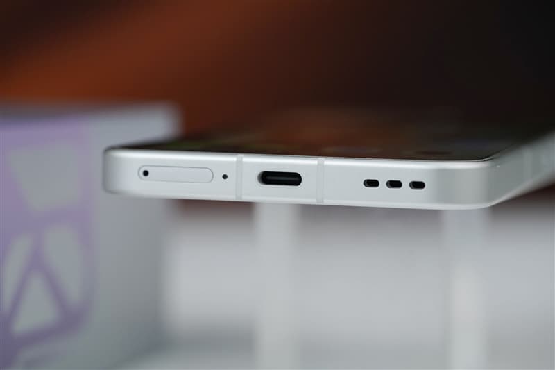
Examples include:

  • A phone becoming too hot to hold while navigating outdoors in summer
  • Gaming frame rates dropping from 60fps to 40fps after half an hour
  • The device overheating while charging and being used at the same time
  • Reduced battery lifespan caused by long-term heat exposure

OPPO K15 is a practical all-round smartphone that brings an active cooling fan system into the 2K price segment.

OPPO K15 Review: 8000mAh Battery + Active Cooling Fan Makes It the Most Practical 2K Phone

The OPPO K15 is equipped with the MediaTek Dimensity 7360 SUPER processor, OPPO’s Tidal Engine optimization system, an 8000mAh large-capacity battery, and IP69 flagship-level water resistance.

It also features:

  • Three 50MP cameras
  • A large 5000mAh-class imaging system
  • Active cooling fan
  • Long-lasting battery performance

The phone aims to solve two of the biggest complaints among mid-range smartphone users:

  1. Overheating
  2. Running out of battery

Honestly, I did not have very high expectations for cooling performance on a 2K-range smartphone. With cost limitations, simply keeping temperatures under control is already considered good enough.

However, OPPO added an active cooling fan this time, making me curious:

Is the cooling fan just a marketing gimmick, or can it actually reduce temperatures?
Active Cooling Fan: More Than Just a Marketing Feature

The OPPO K15 uses a new-generation Wind Cooling Engine, featuring a built-in micro cooling fan.

According to OPPO, the cooling system can:

  • Reduce temperature by 5°C within 5 minutes
  • Keep fan noise as low as 30dB during full-speed operation

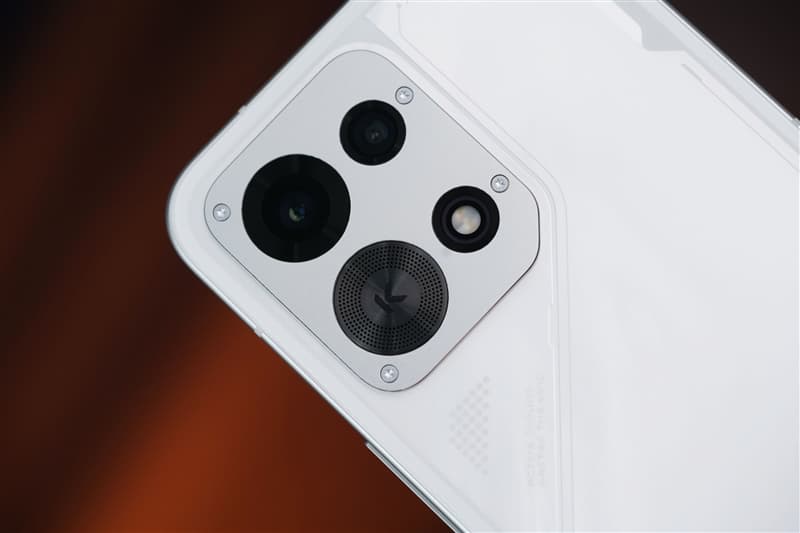
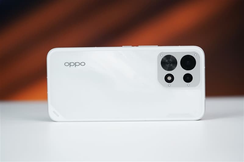
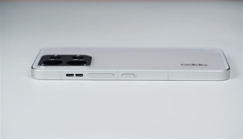
The fan is integrated with the rear camera module design. Thanks to this approach, the back cover remains completely flat without a large camera bump.

The entire phone is only:

  • 8.27mm thick

This means the cooling system does not negatively affect the grip or overall feel.

After completing temperature tests, I found that the fan performed better than expected.

Adding a cooling fan to a 2K-range smartphone reminds me of installing a turbocharger on an economy car—not to make it a racing machine, but to ensure it does not lose power when climbing uphill.
For flagship gaming phones, cooling is about achieving peak performance.

For mid-range phones, cooling is about maintaining stable performance during daily use.

Battery and Charging: 8000mAh Battery Designed for All-Day Use

The OPPO K15 features an 8000mAh Glacier Battery, providing enough endurance for heavy daily usage.

It supports:

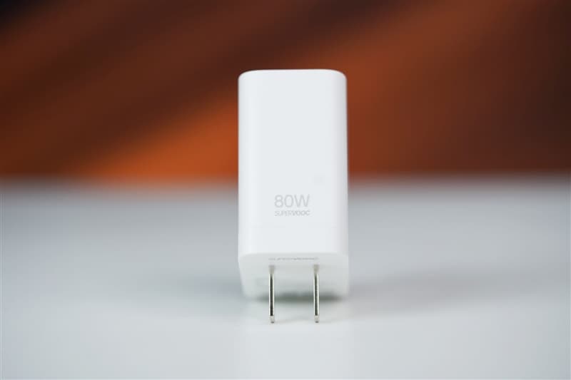
  • 80W SUPERVOOC fast charging
  • UFCS universal fast charging protocol
  • PPS charging protocol
  • Bypass charging
  • Wired reverse charging

The bypass charging feature allows power to directly supply the motherboard instead of continuously charging the battery during gaming sessions.

This helps:

  • Reduce heat generation
  • Protect battery health
  • Improve long-term durability

The reverse charging function also allows the phone to act as an emergency power source for accessories such as:

  • Earbuds
  • Smartwatches
  • Other small devices


Camera System: Three 50MP Cameras in the 2K Segment

The OPPO K15 features three 50MP cameras:

  • Rear main camera
  • Ultra-wide-angle camera
  • Front selfie camera

The main camera includes:

  • 1/2-inch large sensor
  • f/1.88 aperture
  • Optical Image Stabilization (OIS)

The ultra-wide-angle camera offers:

  • 143.3° ultra-wide field of view

The front camera supports:

  • 50MP resolution
  • Autofocus (AF)

For a phone in the 2K price segment, this camera configuration is quite generous.


Durability: IP69/IP68/IP66 Protection and Military-Grade Testing

The OPPO K15 focuses heavily on durability.

It supports:

  • IP69 waterproof rating
  • IP68 dust and water resistance
  • IP66 protection
  • Eight military-standard durability tests

The phone also features:

  • Crystal Shield glass protection
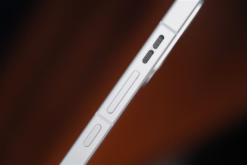
  • Metal middle frame

The combination makes it more resistant to:

  • Drops
  • Water exposure
  • Dust
  • Extreme environments

2. Design Review: Cloud Pattern Back Cover with Hidden Cooling Fan

The OPPO K15 features a 6.59-inch centered punch-hole flat display.

The rounded corners and narrow bezels provide a comfortable viewing experience.

The display supports:

  • 1.5K resolution
  • 120Hz refresh rate

Daily activities such as:

  • Watching videos
  • Switching apps
  • Scrolling webpages

all feel smooth and responsive.

The front panel uses high-strength Crystal Shield glass, while the back cover has a smooth texture that reduces fingerprints.


Colors and Rear Design

The OPPO K15 comes in two colors:

  • Speed White
  • Wind Gray

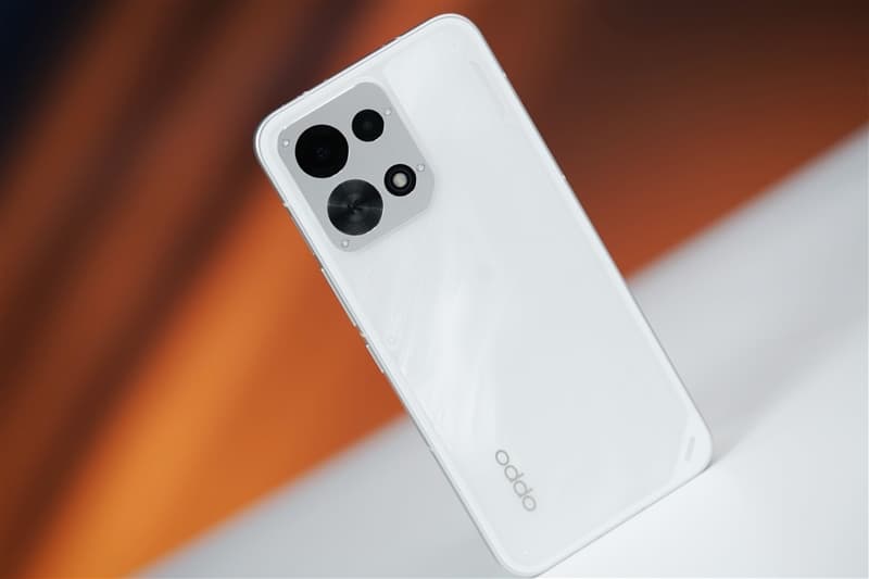
The review unit is the Speed White version, featuring a unique cloud-pattern texture.

When light reflects across the surface, it creates a flowing storm-like visual effect.

At the bottom of the back panel is the text:

“ACTIVE COOLING, MASTER THE WIND”

This highlights the phone’s cooling identity without making the design look aggressive.


Camera Module and Cooling Fan Integration

The rear camera module is one of the most distinctive parts of the phone.

It uses:

  • A square silver camera base
  • Four corner screws
  • Industrial-style design elements

Layout:

  • Top left: Main camera
  • Top right: Ultra-wide camera
  • Bottom left: Cooling fan air intake
  • Bottom right: Flash

The fan and camera system are integrated into one flat module.

Despite including an internal fan, the phone remains:

  • 8.27mm thick
  • Comfortable to hold
  • Free from a large camera bump

This design is clever because many flagship phones now have large protruding camera modules, while the OPPO K15 maintains a cleaner back design.

3. Cooling Test: The Active Fan Actually Works — Overheating and Throttling Become Less of a Concern
When people think of smartphones with built-in cooling fans, gaming flagships usually come to mind.

However, for users in the 2K price segment, long-term stable performance is arguably more important.

Common scenarios such as:

  • Outdoor navigation under strong sunlight
  • Long gaming sessions
  • Recording videos for extended periods
  • Using the phone while charging

can easily cause mid-range phones to heat up and reduce performance.

The OPPO K15 features the new-generation Wind Cooling Engine, which uses a three-layer cooling solution:
  1. Large-area VC vapor chamber

    The VC cooling plate quickly spreads heat away from the processor area.

  2. High-conductivity graphite layer

    The graphite material helps transfer heat more efficiently throughout the body.

  3. Built-in micro cooling fan

    The active fan pulls hot air away through the exhaust outlet, actively accelerating heat dissipation.

The key difference is that this is active cooling, not traditional passive cooling.

The fan is physically running, and heat is actively being removed.


Temperature Reduction Test

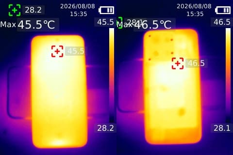
First, we used the AnTuTu stress test to push the OPPO K15 into a high-load state.

After continuous full-load operation:

  • Front temperature reached: 45.5°C
  • Rear temperature reached: 46.5°C

At this point, the phone felt noticeably hot in the hand.

Then we activated the cooling fan.

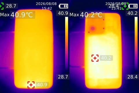
After 7 minutes:

  • Front temperature dropped to 40.9°C
  • Rear temperature dropped to 40.2°C

The phone changed from hot to only slightly warm.

After waiting 12 minutes:

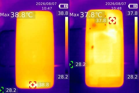
  • Front temperature: 38.8°C
  • Rear temperature: 36.5°C

Compared with the peak temperature of 46.5°C, the rear temperature dropped by approximately 10°C.

The thermal imaging results clearly showed that heat was being transferred away through the fan system.

The temperature around the cooling fan area was noticeably lower than other parts of the phone, proving that the fan was actively removing heat.


High-Energy Outdoor Mode

The OPPO K15 also includes a High-Energy Outdoor Mode, which can be enabled through the accessibility settings.

Once activated, the system automatically:

  • Starts the cooling fan
  • Optimizes temperature control
  • Keeps the phone operating within a stable performance range

This mode also includes several practical outdoor improvements:

Enhanced Screen Brightness

The display automatically increases brightness, making it easier to see under direct sunlight.

Improved Voice Volume

When Bluetooth devices are disconnected, the phone automatically switches to the speaker and increases volume.

Extended Screen Timeout

The display stays active longer, preventing interruptions during:

  • Navigation
  • Outdoor work
  • Long-term map usage

Quick Access Optimization

Frequently used applications can be pinned to a shortcut bar for faster switching.

There are also desktop shortcut cards that allow one-tap access to important functions.

The combination of cooling assistance and outdoor optimization makes the OPPO K15 more convenient for real-world use.

The purpose of active cooling in a 2K smartphone is not chasing the highest benchmark score.

It is about maintaining stable performance during long gaming sessions, navigation, and video recording.

Other phones compete for peak performance.

The OPPO K15 focuses on staying stable for longer.

4. Performance Test: Dimensity 7360 SUPER + Tidal Engine Focus on Stability

The OPPO K15 is powered by the MediaTek Dimensity 7360 SUPER processor.

Although positioned as a mid-range chipset, OPPO has added its own Tidal Engine optimization system to improve long-term performance.

The phone also features:

  • 4950mm² VC vapor chamber
  • High-conductivity graphite cooling layer
  • Built-in active cooling fan

This combination provides a strong thermal foundation for a phone in this price category.

To evaluate real-world performance, we tested two popular mobile games.


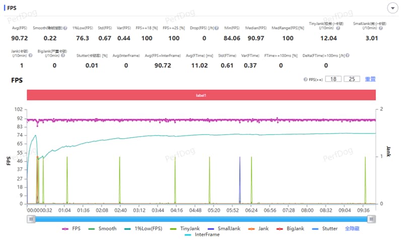
Gaming Test 1: Honor of Kings

For Honor of Kings, we set:

  • Frame rate: Ultra-high
  • Graphics quality: HD
  • Performance mode: Enabled

During a full 5v5 match:

Results:

  • Average frame rate: 90.72 FPS
  • Frame fluctuation index: 0.22

The phone maintained smooth performance throughout the match.

Whether during:

  • Large team fights
  • High-density skill effects
  • Tower battles

there were no obvious frame drops or visible lag.

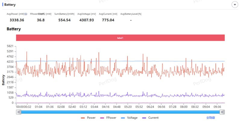
Average power consumption:

  • 3.34W

Energy consumption per frame:

  • 36.8mW

After enabling the cooling fan in smart variable-speed mode, temperatures remained well controlled.


Gaming Test 2: PUBG Mobile

For PUBG Mobile, settings were:

  • Graphics: Smooth
  • Frame rate: Extreme (60 FPS)
  • Mode: Classic Squad Battle

During the entire match:

  • Landing
  • Rotating zones
  • Fighting enemies
  • Final circle battles

the frame rate remained around 60 FPS.
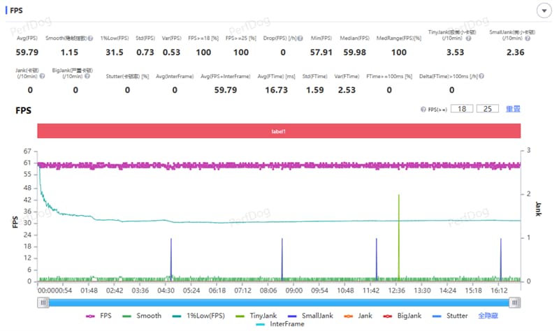
There were no common mid-range phone issues such as:

  • Sudden frame drops when entering the zone
  • Delayed aiming response
  • Stuttering during combat

Average power consumption:

  • 2.84W

Energy consumption per frame:

  • 47.5mW

The cooling fan helped maintain stable temperature during the gaming session.


5. Camera Review: Three 50MP Cameras Deliver Strong Image Quality

The OPPO K15 represents a major improvement in imaging for the K series.
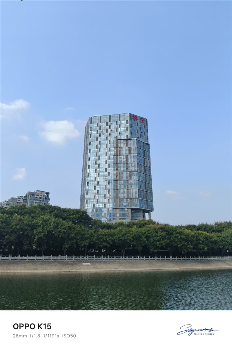
It features three 50MP cameras:

  • Main camera
  • Ultra-wide camera
  • Front camera

The main camera includes:

  • 1/2-inch large sensor
  • f/1.88 aperture
  • OIS optical stabilization

The ultra-wide camera provides:

  • 143.3° ultra-wide field of view

Unlike many mid-range phones where secondary cameras are mainly for marketing, the OPPO K15 gives more attention to practical photography.


Main Camera Experience

The 50MP main camera performs well in daylight scenes.

Strengths include:

  • Good detail retention
  • Natural colors
  • Strong dynamic range
  • Stable handheld shooting thanks to OIS

Photos maintain good clarity even when zooming into details.

The large sensor also helps improve:

  • Low-light performance
  • Background separation
  • Night photography quality

Ultra-Wide Camera Experience

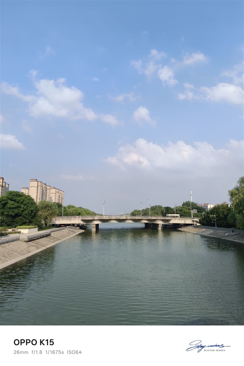
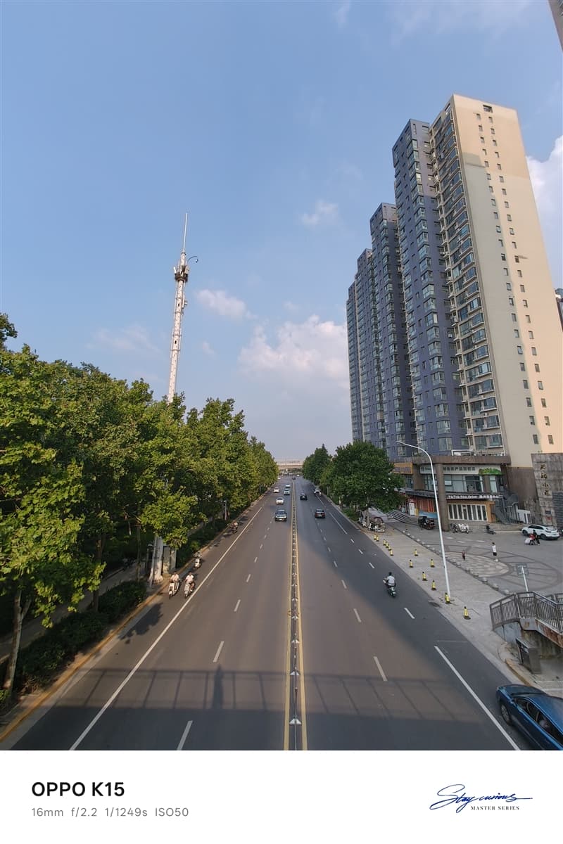
The 143.3° ultra-wide camera is useful for:

  • Architecture photography
  • Landscape shots
  • Group photos
  • Travel scenes

The wider perspective allows users to capture more content in a single frame.


Night Photography

The main camera’s large sensor and optical stabilization help improve nighttime shooting.

Night photos show:

  • Better light control
  • Reduced motion blur
  • Improved shadow details

For a mid-range smartphone, the camera performance is above average.

6. Battery and Charging: 8000mAh Battery Easily Lasts a Full Day, 80W Flash Charging Keeps You Going

Battery life is one of the strongest selling points of the OPPO K15.

The phone comes with an 8000mAh Glacier Battery, which is significantly larger than the batteries commonly found in mainstream smartphones.

For users who rely heavily on their phones every day, such as:

  • Outdoor workers
  • Travelers
  • Navigation users
  • Mobile gamers
  • Video streamers

the large battery capacity provides a clear advantage.


Battery Life Test

To evaluate real-world endurance, we used the Battery Dog testing tool developed by Kuai Technology.

The test simulated typical daily usage scenarios, including:

  • CPU high-load operation
  • Multi-thread processing
  • AI recognition
  • Image browsing
  • Video playback
  • Web browsing

Testing conditions:

  • Screen brightness: 50%
  • Auto brightness: Disabled
  • Volume: 30%

The results showed:

The OPPO K15 lasted:

14 hours and 33 minutes from 100% battery down to 20%.

Based on this result, the theoretical full battery endurance is approximately:

18 hours of continuous usage.

This result matches the expectations of an 8000mAh battery and demonstrates the phone’s excellent endurance.

For normal users, the OPPO K15 can easily handle:

  • A full day of heavy usage
  • Long outdoor navigation
  • Extended gaming sessions
  • Continuous video playback

without worrying about battery anxiety.


80W SUPERVOOC Fast Charging Experience

The OPPO K15 supports:

  • 80W SUPERVOOC fast charging
  • UFCS universal fast charging
  • PPS fast charging protocol

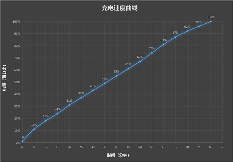
We tested charging with the included 80W charger.

Starting from:

1% battery

Charging results:

Charging Time Battery Level
5 minutes 11%
10 minutes 18%
30 minutes 43%
60 minutes 81%
80 minutes 100%

Although the phone uses a large 8000mAh battery, it can still reach a full charge within around 80 minutes.

This provides a good balance between battery capacity and charging speed.


Bypass Charging: Better for Long Gaming Sessions

The OPPO K15 supports bypass charging, which is especially useful for gamers.

When enabled:

  • Power goes directly to the motherboard
  • Battery charging is reduced
  • Heat generation is lowered
  • Battery aging is minimized

This means users can keep playing games while connected to power without constantly stressing the battery.

For people who often:

  • Play games while charging
  • Watch videos for long periods
  • Use the phone as a stationary entertainment device

this feature is very practical.

Wired Reverse Charging

The OPPO K15 also supports wired reverse charging.

The phone can temporarily act as a power bank for devices such as:

  • Wireless earbuds
  • Smartwatches
  • Other smartphones

When traveling, this feature provides an emergency power solution without carrying an additional charger.


7. Special Features: IP69 Protection, Breathing Light, NFC and Infrared

Beyond cooling, performance, and battery life, the OPPO K15 also includes many practical features that improve everyday experience.


IP69 Protection: Designed for Tough Environments

The OPPO K15 supports:

  • IP69 waterproof protection
  • IP68 dust and water resistance
  • IP66 protection

It also passed eight military-standard durability tests covering:

  • High temperature
  • Low temperature
  • Rain exposure
  • Dust environments
  • Drop resistance

This makes the phone suitable for more demanding environments.


Water Resistance Test

During testing, we played Douyin videos on the OPPO K15 while placing it under running water.

The results:

  • Video playback continued normally
  • Touch controls remained responsive
  • Wet fingers could still operate the screen

The phone remained fully functional after exposure to water.

While IP69 protection does not mean users should intentionally abuse their devices, it provides additional confidence for:

  • Outdoor workers
  • Travelers
  • Users in rainy environments

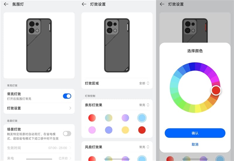
Mist Shadow Breathing Light: Adding Gaming Atmosphere

The rear panel includes OPPO’s Mist Shadow Breathing Light system.

Users can customize:

  • Full lighting area
  • Strip lighting
  • Fan lighting

Lighting effects include:

  • Flowing effects
  • Breathing effects
  • Always-on mode
  • Flashing effects

The fan lighting also supports:

  • Breathing mode
  • Constant lighting
  • Flashing mode

Multiple colors are available.

At night, the lighting can synchronize with music, creating a gaming-style atmosphere.

Unlike inexpensive RGB lighting effects, the implementation feels more refined.

Users can also configure:

  • Activation time
  • Lighting behavior
  • Automatic disabling when the phone is in a pocket

Mountain-Sea Communication Technology: Better Signal in Weak Areas

The OPPO K15 includes OPPO’s self-developed Mountain-Sea Communication Technology.

The system uses:

  • 360° surround antenna design
  • Multi-source signal optimization algorithms

It is designed to improve connectivity in difficult environments such as:

  • Underground parking areas
  • Elevators
  • Buildings with weak signals

During testing in an underground parking area:

Network results:

  • Ping latency: 37ms
  • Download speed: 8.37Mbps
  • Upload speed: 16.12Mbps

The phone maintained stable connectivity without obvious disconnections.
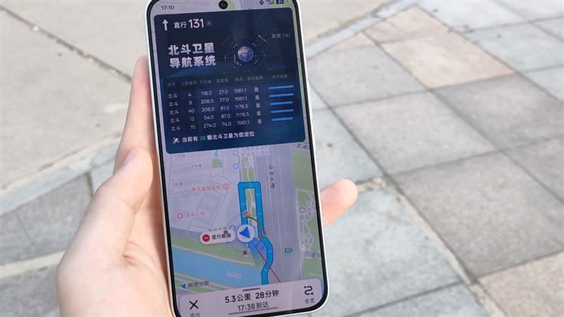
Dual-Frequency GPS: Faster and More Accurate Positioning

The OPPO K15 is equipped with:

  • Dual-frequency GPS
  • Flagship-level sensors
  • Multi-source positioning algorithms

During navigation testing with Amap:

  • Location locking was fast
  • Navigation started quickly
  • Position accuracy remained stable

The real-time navigation interface showed:

  • 26 BeiDou satellites assisting positioning

Even in complex environments such as:

  • Urban streets
  • Tunnels
  • Underground parking areas

the positioning performance remained reliable.


8. Final Verdict: A Smartphone That Solves Real Problems

At the beginning of this review, the question was:

Is the cooling fan on a 2K-range smartphone just a gimmick, or does it really work?

After testing, the answer is clear:

It works.

During the AnTuTu stress test:

  • Rear temperature reached 46.5°C
  • After activating the fan for 12 minutes, it dropped to 36.5°C

A temperature reduction of around 10°C was confirmed through thermal imaging.

The active cooling fan is the feature that truly separates the OPPO K15 from other phones in the same price range.

Many smartphones offer:

  • Large batteries
  • Water resistance
  • Fast charging

But fewer combine these features with an integrated cooling fan.


OPPO K15 Key Strengths

The phone delivers:

8000mAh large battery
Active cooling fan
IP69/IP68/IP66 protection
Stable gaming performance
80W fast charging
Three 50MP cameras
120Hz 1.5K display
Dual-frequency GPS
Strong signal performance


Who Should Buy the OPPO K15?

The OPPO K15 is especially suitable for users who care about:

  • Long battery life
  • Stable performance
  • Outdoor usage
  • Gaming without overheating
  • Durability
  • Practical everyday features

However, users who want:

  • Maximum gaming frame rates
  • Flagship-level processor performance

may prefer higher-end gaming smartphones.

The Dimensity 7360 SUPER is not designed to chase extreme benchmark records. Instead, it focuses on delivering stable performance over long periods.

Final Conclusion

Many smartphones in the 2K price range compete by making their specification sheets look impressive.

OPPO K15 takes a different approach.

Instead of only chasing higher numbers, it focuses on solving real user problems:

  • A phone that does not become uncomfortable when hot
  • A battery that lasts all day
  • A device that remains reliable outdoors
  • A smartphone that can handle daily challenges

The built-in cooling fan is like adding a turbocharger to an economy car—not for racing, but to prevent losing power when climbing a hill.

After testing, the OPPO K15 proves that it can:

  • Stay cool under pressure
  • Maintain stable performance
  • Last through demanding usage
  • Survive tougher environments

For users looking for a practical, durable, and reliable smartphone in the 2K price segment, the OPPO K15 is one of the most complete choices available.

OPPO K15: A truly practical smartphone built for real-world use.

The post OPPO K15 Smartphone Review: The Truly Practical Choice in the 2K Price Segment appeared first on IGeeKphone China Phone, Tablet PC, VR, RC Drone News, Reviews.

  •  

AI’s potential climate benefits outweighed by role in boosting fossil fuels, study finds

Modelling finds AI-driven productivity gains in coal, oil and gas enable more emissions than applications in renewables avoid

AI-driven productivity gains enable more planet-heating pollution from fossil fuels than they avoid from renewables, a study has found.

Researchers modelled the technical potential for AI to boost clean power generation along with projections for how it can help produce coal, oil and gas. Across 64 scenarios, they found net yearly carbon pollution rose by 0.47-1.8 gigatonnes, or about 1-5% of the energy sector’s annual emissions.

Continue reading...

© Photograph: KENDALL/Alamy

© Photograph: KENDALL/Alamy

© Photograph: KENDALL/Alamy

  •  

Ce n'est plus seulement dans la tête : le stress transforme votre sang en quelques minutes

« Son sang n’a fait qu’un tour », « Ça lui a retourné les sangs », « Se faire du mauvais sang », « Se faire un sang d’encre », le langage populaire regorge d’expressions associant de fortes émotions au sang. La science commence aujourd’hui à en révéler les fondements biologiques : le stress...

  •  

In September 1983, a Soviet lieutenant colonel named Stanislav Petrov sat in a bunker south of Moscow watching his early-warning screens light up with five incoming American missiles, and instead of phoning it up the chain he decided the computer was lying and waited — a judgment call that historians now credit with preventing a retaliatory nuclear launch

In September 1983, a Soviet lieutenant colonel named Stanislav Petrov sat in a bunker south of Moscow watching his early-warning screens light up with five incoming American missiles, and instead of phoning it up the chain he decided the computer was lying and waited — a judgment call that historians now credit with preventing a retaliatory nuclear launch

Just after midnight on 26 September 1983, an alarm sounded inside the Serpukhov-15 command bunker south of Moscow. A satellite feed from the Soviet Union’s new early-warning system, Oko, reported that the United States had launched a nuclear missile. Within minutes it reported four more. The officer on duty, Lieutenant Colonel Stanislav Petrov, had a screen in front of him with the word LAUNCH in Cyrillic, a bank of phones connecting him to the Soviet high command, and roughly the length of a coffee break to decide whether the warning was real.

He decided it wasn’t. He picked up the intercom to the operations duty officer and reported a system malfunction.

He was guessing.

Soviet bunker command console

What the screen actually said

The Oko constellation was Moscow’s answer to the American Defense Support Program satellites: a ring of spacecraft in highly elliptical orbits designed to spot the infrared bloom of a US intercontinental ballistic missile the moment its engines lit. The system had gone operational only months earlier. According to a HistoryExtra account of the incident, Petrov knew Oko was new and relatively untested, and that fact was doing quiet work in the back of his mind as the alarm escalated.

Protocol was unambiguous. A confirmed launch detection went up the chain immediately. From there, the Soviet doctrine of the day — launch on warning — would have compressed the decision window to minutes. The general staff would consult, wake Yuri Andropov if he wasn’t already awake, and either sit on the report or authorise a retaliatory salvo of hundreds of warheads at American cities and silos.

Petrov’s job was not to make that decision. His job was to pass the alert along cleanly, quickly, and without editorial. He did not do his job.

Why he thought the computer was lying

Two things nagged at him. The first was arithmetic. A genuine American first strike, in the Soviet threat models of 1983, would look like a wall — hundreds of missiles arriving in a coordinated wave designed to destroy Soviet retaliation capability before it could launch. Five missiles was not a decapitation strike. Five missiles was almost a taunt. As The Guardian noted in its obituary, Petrov reasoned that the shape of the attack made no strategic sense.

The second was the ground picture. Soviet over-the-horizon radars could not see American missiles until they crested the earth’s curvature, and at that moment those radars were showing nothing. Waiting for confirmation from ground radar meant burning the warning window down to almost zero. If the satellites were right and he waited, the Soviet Union would have only minutes to respond, and possibly not even that.

He waited anyway.

The room, the phones, the interval

The Serpukhov-15 bunker was not a small room with one man at a desk. It was a full command post, staffed with duty officers and analysts, and Petrov later described the atmosphere in the minutes after the first alert as loud and physically disorienting. The alarm was audible. Screens flashed. Junior officers around him were shouting numbers.

He held the intercom. He listened to the ground-radar operators reporting nothing. He counted the missiles as Oko reported them: one, then four more.

According to NPR’s account of the night, Petrov later said he had a funny feeling in his gut. That was the phrase he used. It is not the phrase military historians prefer. It is, however, the phrase that survived.

He reported a system malfunction to the operations duty officer. The report he filed said false alarm.

early warning satellite

What had actually happened

Investigators reconstructed the fault over the following weeks. The Oko satellites had been positioned to look at the horizon rather than straight down at American silo fields, a design choice that reduced background noise from Earth’s own thermal emissions. But it made the system vulnerable to a specific optical trick: sunlight at a shallow angle, reflecting off high-altitude clouds above North Dakota, hit the satellite’s infrared sensor with the same signature as a rocket exhaust.

Five reflections, five “missiles.” A weather artifact, dressed up by a young algorithm as the end of the world.

The engineers who built Oko later patched the system to cross-check any launch detection against geostationary satellite data before triggering the top-level alert. That patch existed because of the night Petrov spent staring at the screen.

How close it actually came

Historians and former Soviet officers have argued for decades about how close the world really came to launch. Petrov did not have his finger on any button. He was one node in a decision chain that included the general staff, the defence minister, and ultimately Andropov himself, and each of those nodes could in principle have declined to authorise a strike even if Petrov had passed the warning up.

But context mattered. Three weeks earlier, a Soviet Su-15 interceptor had shot down Korean Air Lines Flight 007 over Sakhalin, killing 269 people including a US congressman. Washington’s rhetoric had turned incandescent. Andropov, ill and paranoid, had spent the previous year convinced the Reagan administration was planning a genuine first strike, and had ordered the KGB to hunt for evidence of it under a programme codenamed RYaN. The Soviet posture in September 1983 was hair-trigger by design.

A warning delivered up that chain, into that room, on that night, would not have been filed and forgotten. Whether it would have produced a launch order is unknowable. That it might have is why the story persists.

What happened to Petrov afterwards

He was not decorated. He was interrogated. His superiors were embarrassed — the malfunction pointed at design failures in a system the Soviet military had just spent enormous sums fielding, and honouring the officer who exposed it would have been an implicit indictment of the engineers and generals who signed off on it. Yuri Votintsev, then commander of Soviet missile-defence forces, privately praised Petrov’s judgment and mentioned an award. The award never came.

Petrov was reprimanded on paperwork grounds: his log entries from the night were incomplete. He was reassigned to a less sensitive post and took early retirement in 1984, in part because the stress of the incident had contributed to a nervous breakdown. He lived out the rest of his life in a small apartment in Fryazino, a satellite town outside Moscow, on a modest pension, growing potatoes.

The incident stayed classified until the late 1990s, when Votintsev published a memoir mentioning it. Western journalists tracked Petrov down. He gave interviews reluctantly. He never claimed to have saved the world, and got irritated when interviewers tried to write him as a hero. He said he was doing his job — that his job included judgment, and that judgment had told him the computer was wrong.

He died in May 2017, aged 77, of pneumonia. A German friend, Karl Schumacher, found out months later, when he called that September to wish Petrov a happy birthday and was told by Petrov’s son that his father had already died. According to later reporting on the incident, the delay in the news reaching the wider world was itself a kind of coda: the man who may have prevented the end of civilisation had died without anyone outside his family noticing.

Why the story keeps getting retold

Space Daily has looked before at what Petrov’s night reveals about human judgment against automated systems, and at a similar moment aboard a Soviet submarine during the Cuban Missile Crisis, when Vasili Arkhipov refused to authorise a nuclear torpedo launch against American destroyers. Both stories share a shape: a single officer, a broken or misleading input, a rule that says escalate, and a person who declines.

The engineering point buried in the Petrov story is worth pulling out. Oko was not a bad system in principle. It did what it was designed to do — detect the infrared plume of a rising ballistic missile — and it did so within its physical envelope. The failure was in the confidence with which its output was treated. The Soviet doctrine of launch on warning assumed the satellites would only ever be wrong in one direction, missing real attacks. It did not adequately model what would happen when the satellites reported an attack that wasn’t there.

Every early-warning architecture built since has had to reckon with the same asymmetry. The American BMEWS radars in Greenland famously mistook the rising moon for a Soviet ICBM salvo in October 1960, and the fix there was similar in spirit to what Oko needed: cross-checking, corroboration, redundancy across sensor types. The North American Aerospace Defense Command has publicly discussed multiple false alerts in the 1970s and 1980s that were caught before they reached the level of a launch order.

The number to remember

Five. The system reported five American missiles. Not one, which might have been dismissed as a rogue launch or a test gone wrong. Not four hundred, which would have matched the Soviet mental model of a genuine first strike and would probably have been believed. Five — a number small enough to be plausibly a glitch, large enough to be plausibly a warning shot, and squarely inside the gap where a human being had to decide which.

Petrov decided glitch. He was right. If Oko had reported a single missile, or a hundred, the story ends differently — either dismissed at a lower level, or believed at a higher one. It was the specific number, and the specific man watching the specific screen at 00:15 Moscow time, that made the incident hinge.

He kept the intercom in his hand. He did not press it up the chain. The clouds over North Dakota drifted east. The sun climbed. The satellites recalibrated. The morning shift arrived at Serpukhov-15 to find their new early-warning system had, overnight, tried to end the world, and a middle-aged engineer with a headache had told it no.

The post In September 1983, a Soviet lieutenant colonel named Stanislav Petrov sat in a bunker south of Moscow watching his early-warning screens light up with five incoming American missiles, and instead of phoning it up the chain he decided the computer was lying and waited — a judgment call that historians now credit with preventing a retaliatory nuclear launch appeared first on Space Daily.

  •  

Did Neanderthals and Modern Humans Share a Culture for 20,000 Years?

Neanderthals and modern humans did not simply occupy the same landscape and disappear from one another’s story. A study of Üçağızlı II Cave in southern Türkiye points to a longer period of cultural continuity in the northern Levant, where stone tools, shell ornaments and other remains appear across a sequence spanning more than 20,000 years. […]

The post Did Neanderthals and Modern Humans Share a Culture for 20,000 Years? appeared first on Curiosmos.

  •  

Fun with a Quadra 950 and a Whole Lot of RAM

A Little History My first experience with a Quadra 950 was back when they were new. Mike Bean, then president of the Arizona Macintosh User’s Group, had one. It was big. It was loud. It was fast… and it was beige. I loved it! Mike also had a Workgroup Server 95, the Unix-based file-server version […]

The post Fun with a Quadra 950 and a Whole Lot of RAM appeared first on Low End Mac.

  •  

Kepler books Neutron for 2028 optical relay launch

Kepler Communications plans to deploy next-generation optical relay satellites on Rocket Lab’s upcoming Neutron rocket in one of several launches the Canadian operator has slated for 2028.

The post Kepler books Neutron for 2028 optical relay launch appeared first on SpaceNews.

  •  

NASA’s PUNCH Mission Cut Solar-Storm Arrival Uncertainty to 30 Minutes

Forecasting a solar storm is a little like watching a wave leave a distant coast and trying to guess when it will reach the beach. Scientists can see a coronal mass ejection (CME) leave the Sun, but its speed and shape can change as it crosses space. By the time it reaches Earth, the warning […]

The post NASA’s PUNCH Mission Cut Solar-Storm Arrival Uncertainty to 30 Minutes appeared first on Curiosmos.

  •  

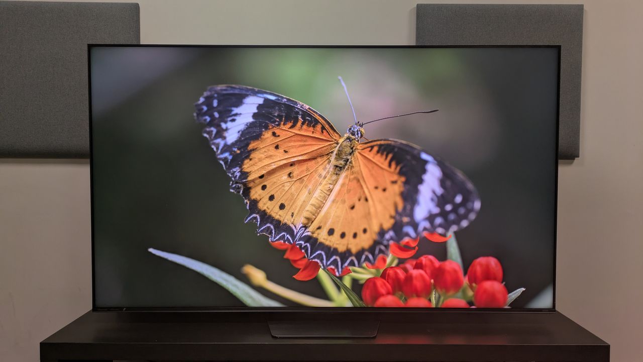
'It's not an OLED-killer yet': I tested Hisense’s affordable RGB TV, and while I like its picture quality and performance, it surprisingly falls short in the area I had the highest hopes for

Hisense UR8 review: Two-minute review

The Hisense UR8 is the first ‘affordable’ RGB TV on the market, and while it has a strong feature set and mostly good picture quality, the UR8 doesn't demonstrate the ‘OLED-killer’ status the RGB tech has been given. While it’s a good TV, it can’t count itself among the best TVs I've tested this year.

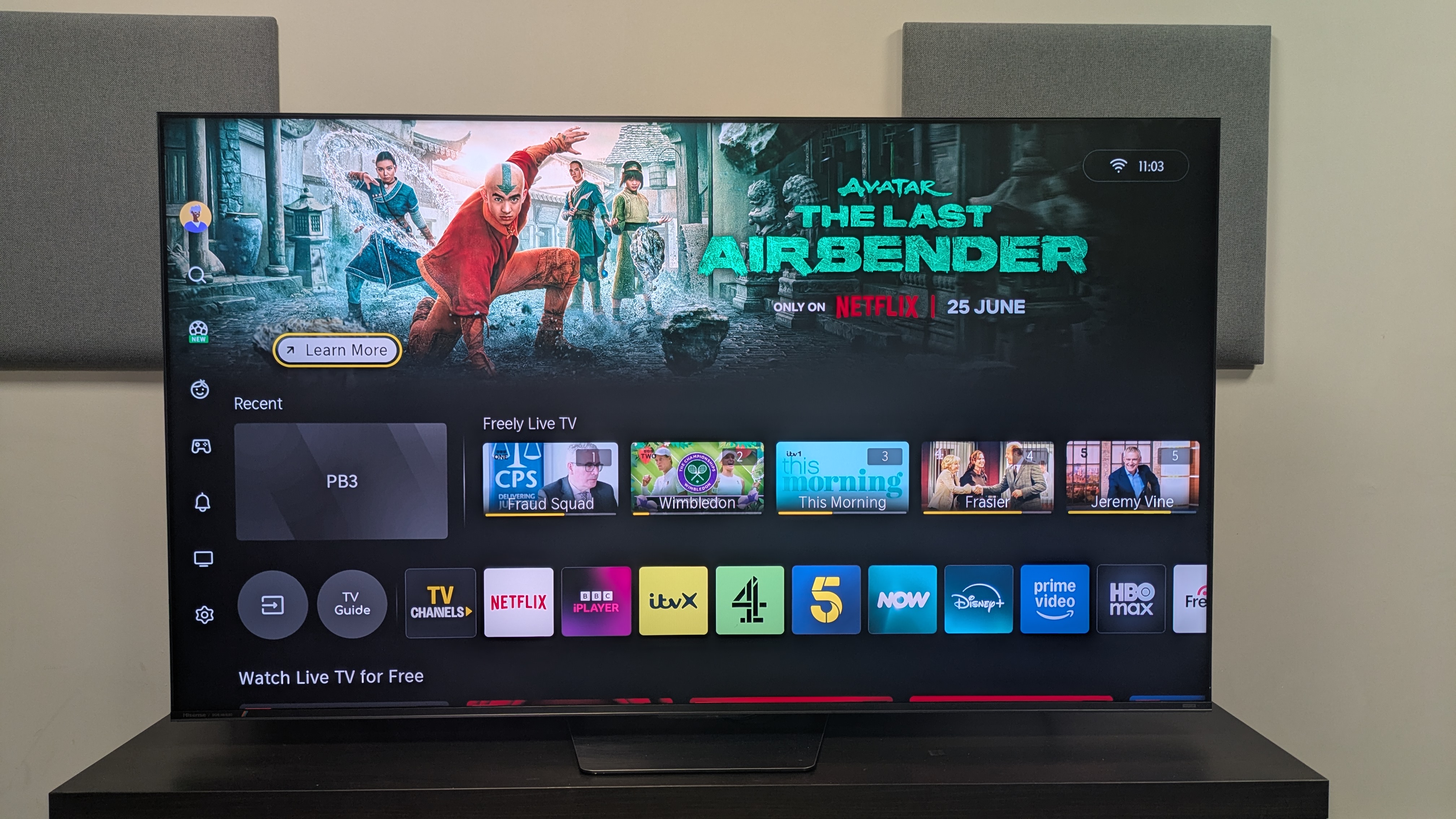
The UR8 has a good number of smart and AI features, as well as features for gaming. It also has four HDMI 2.1 ports, an anti-glare screen akin to Samsung’s own Glare Free screens, and comes equipped with Hisense’s Hi-View AI RGB processor.

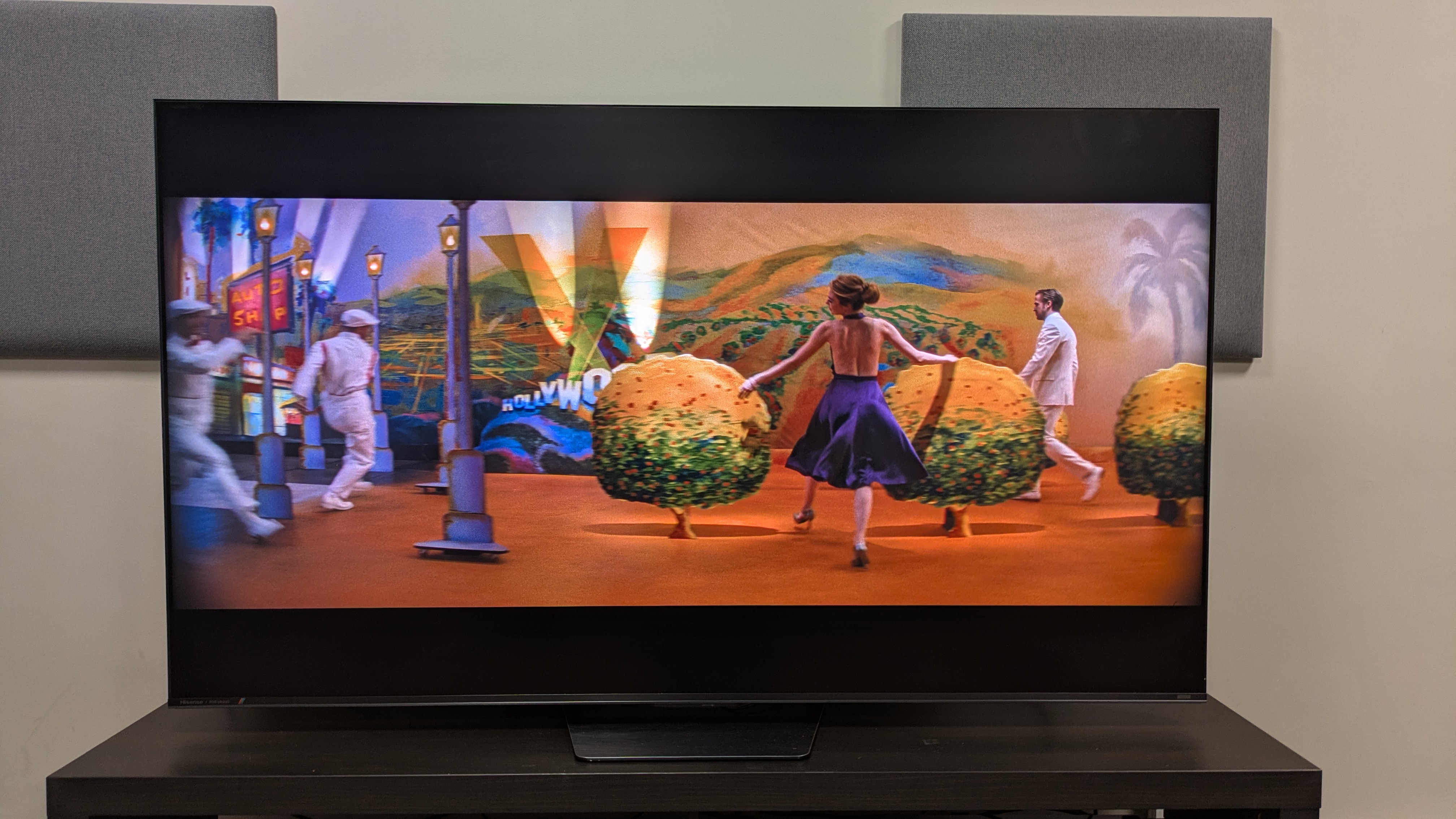
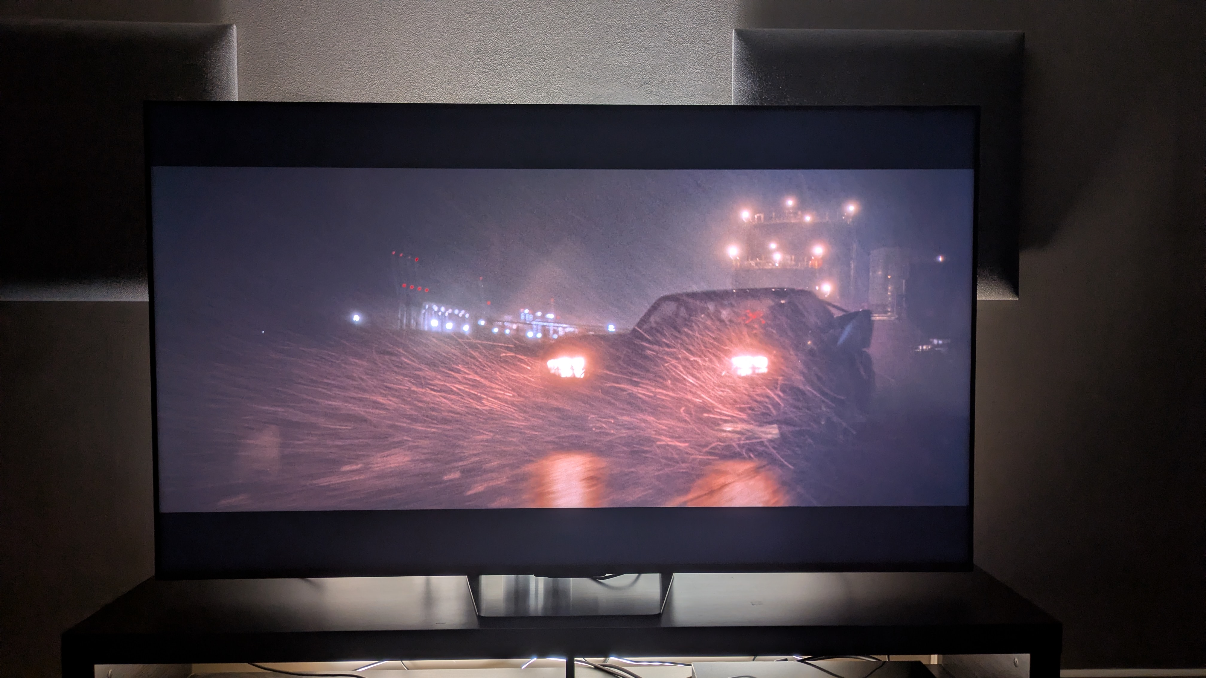
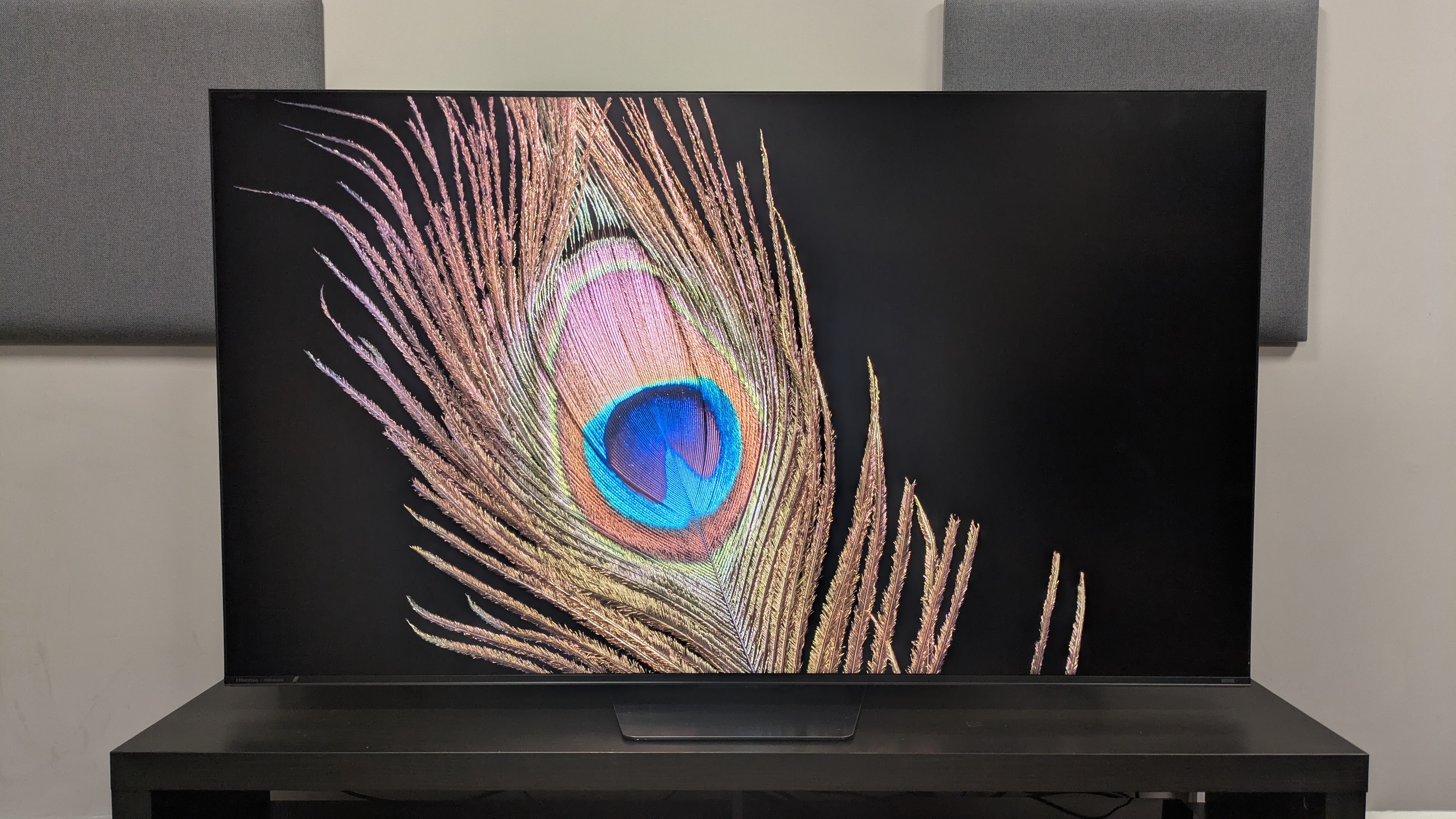
Picture quality on the UR8 is good, but delivers some disappointments. It demonstrates excellent backlight control for an LED, backlit TV, as well as strong contrast, decent black levels, and crisp textures. Its motion is also good, even with out-of-the-box picture modes, though I did note some blurring at times.

However, as this is an RGB TV, its big selling point should be its colors, and while they are natural, and can appear punchy, they’re not as bold as I hoped for, especially given its ostensibly impressive test measurements (more on that below). While RGB is a step forward in some aspects for mini-LED, TVs using the technology still can’t compete with the best OLED TVs.

Sound quality is solid. The UR8 delivers some weighty bass, good accuracy and precise sound mapping, and delivers clear speech in movies and TV shows. The soundstage can sound narrow, however, and Dolby Atmos effects aren’t always clear. While the built-in sound is good for the most part, home theater fans will likely want to supplement it with one of the best soundbars.

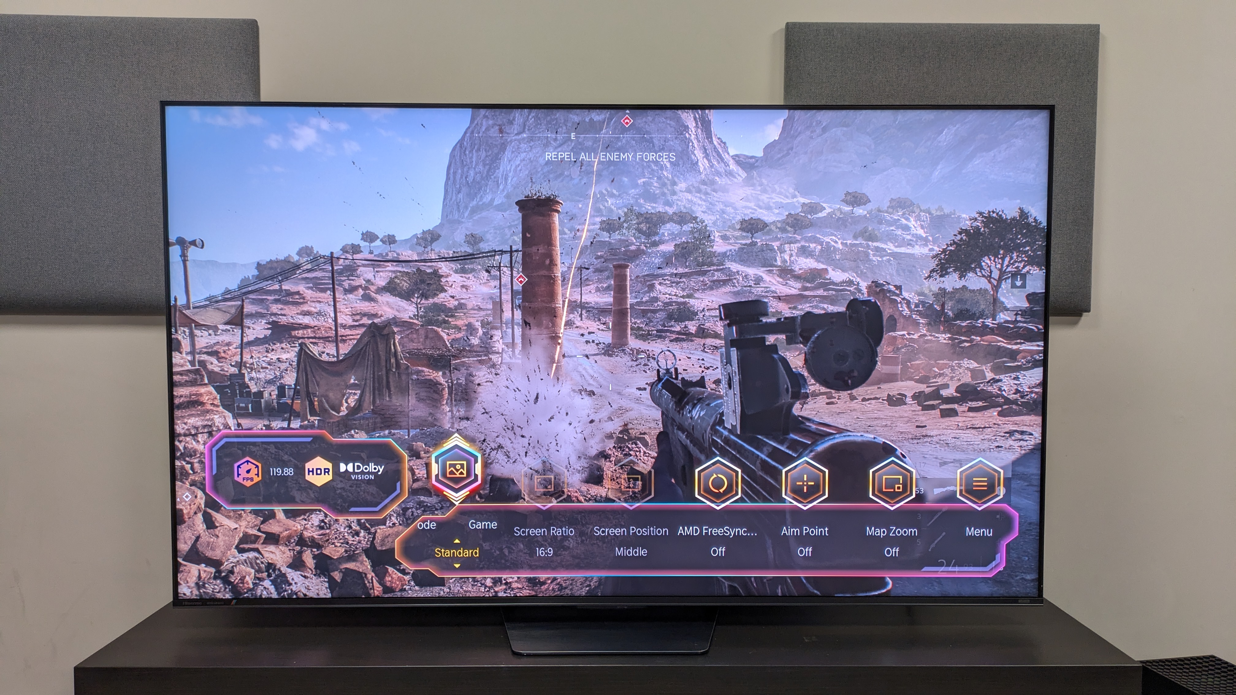
Gaming is one of the UR8’s strengths. With four HDMI 2.1 ports, all kitted out for gaming, it supports up to 4K 180Hz and VRR. When actually playing games, the UR8 feels responsive and delivers a smooth experience. Getting a low input lag time does require adjustment of settings and the picture isn’t always perfect; but while it doesn’t beat the best gaming TVs, the UR8 is still good for gaming.

Value is a mixed bag with the UR8. The 65-inch model I tested launched for $1,999 / £2,299 / AU$2,495, and while prices are already dropping in the US, and it's great value in Australia, its price in the UK puts it in direct competition with some of the best OLED TVs, like the LG C6. While it does deliver good performance and features for the price in the US and Australia, the same isn’t true for the UK.

Hisense UR8 review: Prices & release dates

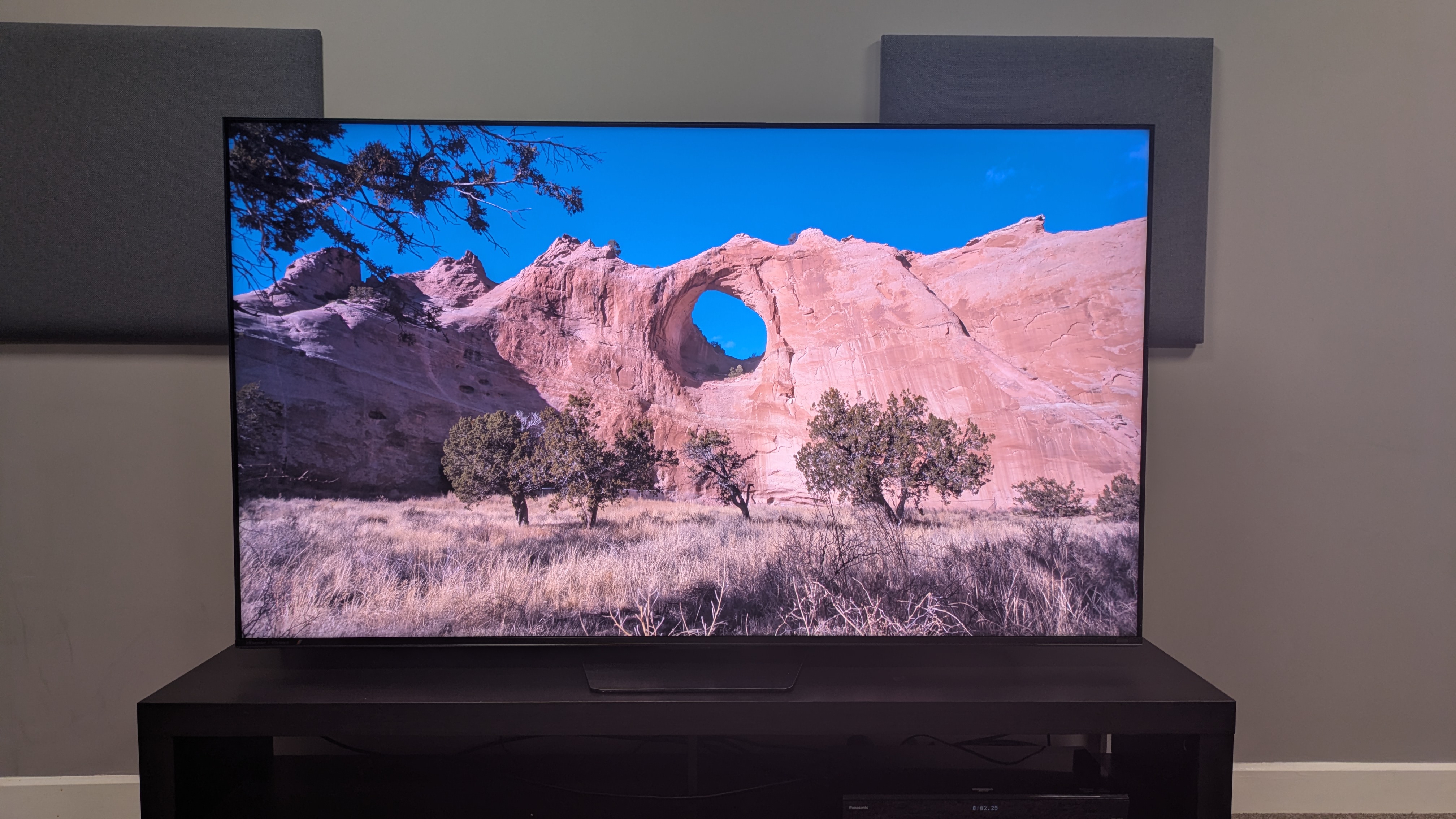
Hisense UR8 showing a bright canyon cliff on screen. The image shows good brightness with accurate colors

(Image credit: Future)
  • Release dates: June 2026 (US) / July 2026 (UK)
  • 55-inch: $1,299 / £1,699 / AU$1,895
  • 65-inch: $1,999 / £2,299 / AU$2,495
  • 75-inch: $2,499 / £2,999 / AU$3,195
  • 85-inch: $3,499 / £3,499 / AU$4,695
  • 100-inch: $5,999 / £7,999 / AU$N/A

The UR8 is the Hisense's entry-level RGB mini-LED TV, sitting below the flagship Hisense UR9, but above TVs in the brand's standard mini-LED range such as the Hisense U7S. It’s available in sizes 55-85-inch in most regions, and available in 100-inch in the US and UK (there's no listing for an Australian model yet). The 65-inch model I tested launched for $1,999 / £2,299 / AU$2,495.

Since its release, the UR8’s prices have already dropped in the US, with the 65-inch now available for $1,499. The 55-inch has dropped as low as $999, putting it in the same price bracket as some standard mini-LED models. The same can’t be said in the UK, where its prices are not only higher than standard mini-LED competition, but even pricier than the LG C6 OLED.

Hisense UR8 review: Specs

Hisense UR8

Screen type:

RGB mini-LED

Refresh rate:

Up to 180Hz

HDR support

Dolby Vision, HDR10+, HDR10, HLG

Audio support:

Dolby Atmos and DTS:X

Smart TV:

Google TV (US), VIDAA (UK/Australia)

HDMI 2.1 ports:

4 x HDMI 2.1

Built-in tuner:

ATSC 3.0

Hisense UR8 review: Benchmark results

1 / 4

Brightness measurements

Taken using a colorimeter and test pattern generator. Click the test name for measurements and select the chosen test from the dropdown menu.

Hisense UR8
HDR Filmmaker Mode (10% window)
2097
HDR Filmmaker Mode (Fullscreen)
771
TCL QM8L
HDR Filmmaker Mode (10% window)
3719
HDR Filmmaker Mode (Fullscreen)
759
Samsung QN80H
HDR Filmmaker Mode (10% window)
1149
HDR Filmmaker Mode (Fullscreen)
603
01,0002,0003,0004,000
nits
HDR Filmmaker Mode Data
ProductHDR Filmmaker Mode (10% window) (nits)HDR Filmmaker Mode (Fullscreen) (nits)
Hisense UR82097771
TCL QM8L3719759
Samsung QN80H1149603
Hisense UR8
HDR Standard Mode (10% window)
2394
HDR Standard Mode (Fullscreen)
767
TCL QM8L
HDR Standard Mode (10% window)
3771
HDR Standard Mode (Fullscreen)
795
Samsung QN80H
HDR Standard Mode (10% window)
1204
HDR Standard Mode (Fullscreen)
672
01,0002,0003,0004,000
nits
HDR Standard Data
ProductHDR Standard Mode (10% window) (nits)HDR Standard Mode (Fullscreen) (nits)
Hisense UR82394767
TCL QM8L3771795
Samsung QN80H1204672
Hisense UR8
SDR Filmmaker Mode (10% window)
314
SDR Filmmaker Mode (Fullscreen)
372
TCL QM8L
SDR Filmmaker Mode (10% window)
229
SDR Filmmaker Mode (Fullscreen)
0
Samsung QN80H
SDR Filmmaker Mode (10% window)
199
SDR Filmmaker Mode (Fullscreen)
231
0100200300400
nits
SDR Filmmaker Mode Data
ProductSDR Filmmaker Mode (10% window) (nits)SDR Filmmaker Mode (Fullscreen) (nits)
Hisense UR8314372
TCL QM8L229N/A
Samsung QN80H199231
Hisense UR8
SDR Standard Mode (10% window)
1514
SDR Standard Mode (Fullscreen)
778
TCL QM8L
SDR Standard Mode (10% window)
581
SDR Standard Mode (Fullscreen)
0
Samsung QN80H
SDR Standard Mode (10% window)
588
SDR Standard Mode (Fullscreen)
340
05001,0001,5002,000
nits
SDR Standard Data
ProductSDR Standard Mode (10% window) (nits)SDR Standard Mode (Fullscreen) (nits)
Hisense UR81514778
TCL QM8L581N/A
Samsung QN80H588340
TechRadar Logo

HDR color gamut

Closer to 100% is better. Taken using a colorimeter and test pattern generator.

Hisense UR8
UHDA-P3
145.2
BT.2020
95.1
TCL QM8L
UHDA-P3
97.9
BT.2020
90.2
Samsung QN80H
UHDA-P3
95.2
BT.2020
75
037.575112.5150
HDR Filmmaker Mode Data
ProductUHDA-P3 ()BT.2020 ()
Hisense UR8145.295.1
TCL QM8L97.990.2
Samsung QN80H95.275
TechRadar Logo

Picture accuracy

A lower score is better. Taken using a colorimeter and test pattern generator.

SDR Delta-E

Hisense UR8
7.9
TCL QM8L
3.7
Samsung QN80H
1.8
012345678
SDR Delta-E Data
ProductValue
Hisense UR87.9
TCL QM8L3.7
Samsung QN80H1.8
TechRadar Logo

Input lag

Lower is better. Taken using a Leo Bodnar 4K HDMI Video Signal Lag Tester.

Hisense UR8
4K 60Hz
11.7
1080p 120Hz
11.7
TCL QM8L
4K 60Hz
9.5
1080p 120Hz
0
Samsung QN80H
4K 60Hz
12.3
1080p 120Hz
5.8
03.757.511.2515
ms
HDR Filmmaker Mode Data
Product4K 60Hz (ms)1080p 120Hz (ms)
Hisense UR811.711.7
TCL QM8L9.5N/A
Samsung QN80H12.35.8
TechRadar Logo

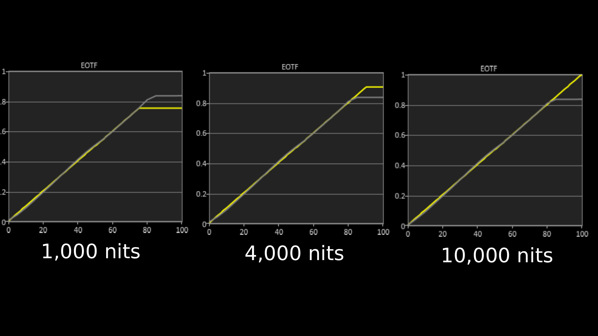
Hisense UR8 EOTF graphs for 1,000, 4,000 and 10,000 nits

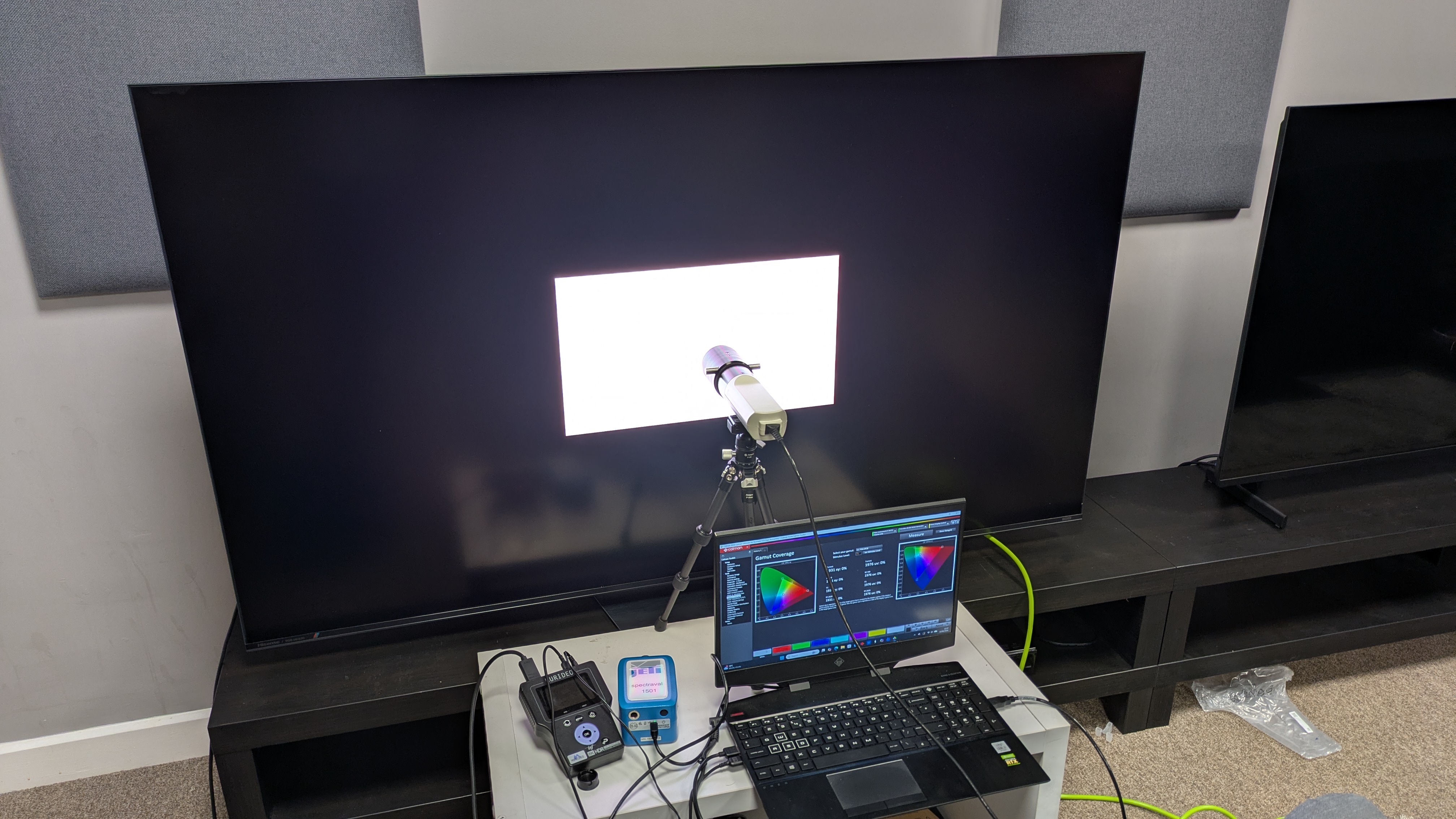
The above EOTF graphs show the accuracy of the Hisense UR8 for hitting different HDR brightness levels in grayscale. The closer to the yellow line, the more accurate a TV is. As with all our tests, these results are out of the box, without calibration, to demonstrate the performance most people will get. As you can see, the UR8 did very well on all three target tests, showing little deviation from the reference line. (Image credit: Future)

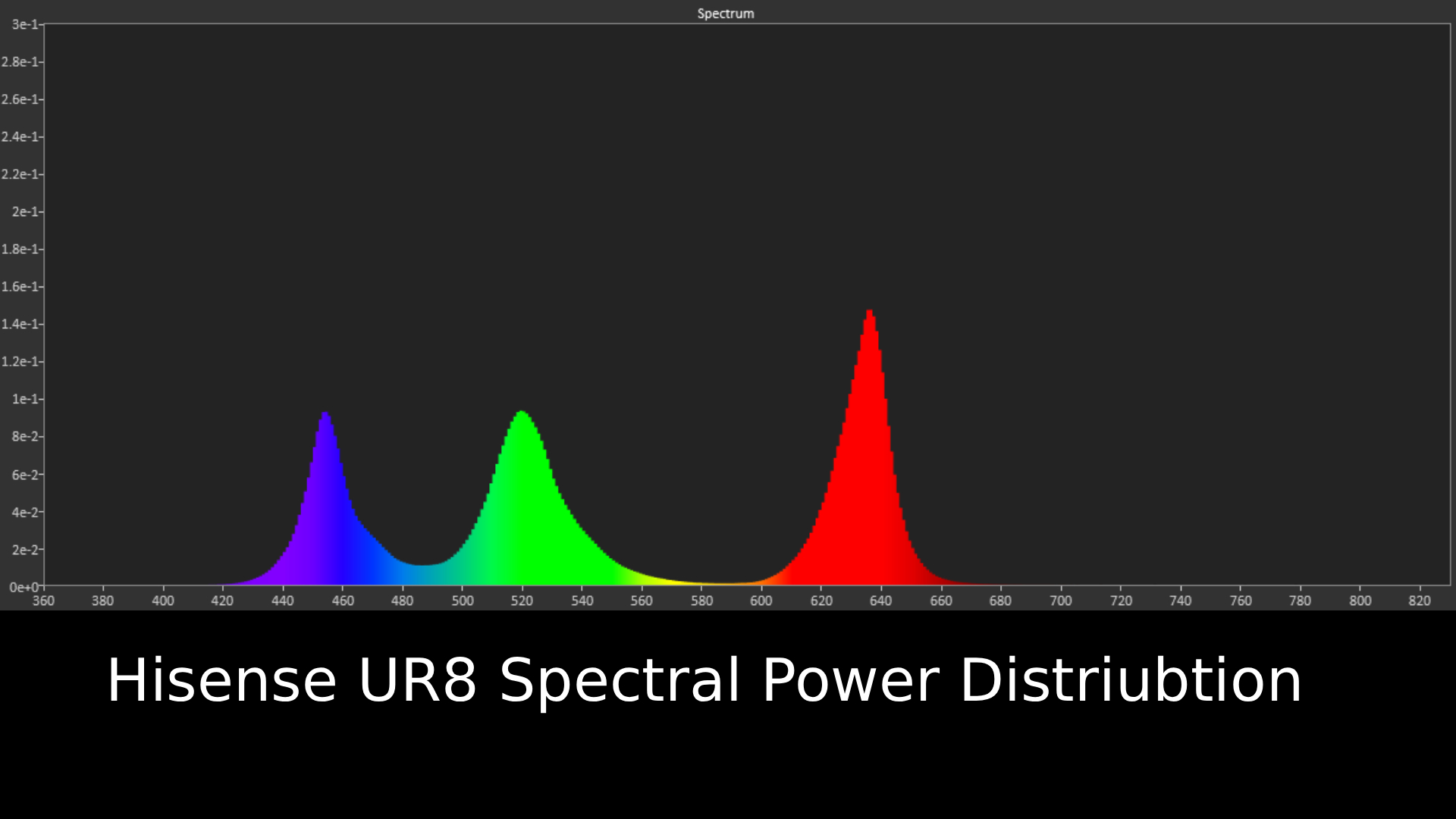
Hisense UR8 Spectral Power Distribution graph

Spectral power distribution refers to the intensity of light that a source will display at various wavelengths of color. It can reveal how accurate a source can show color at different light levels, and can be instructive in understanding how a TV is handling color (Image credit: Future)

Hisense UR8 review: Features

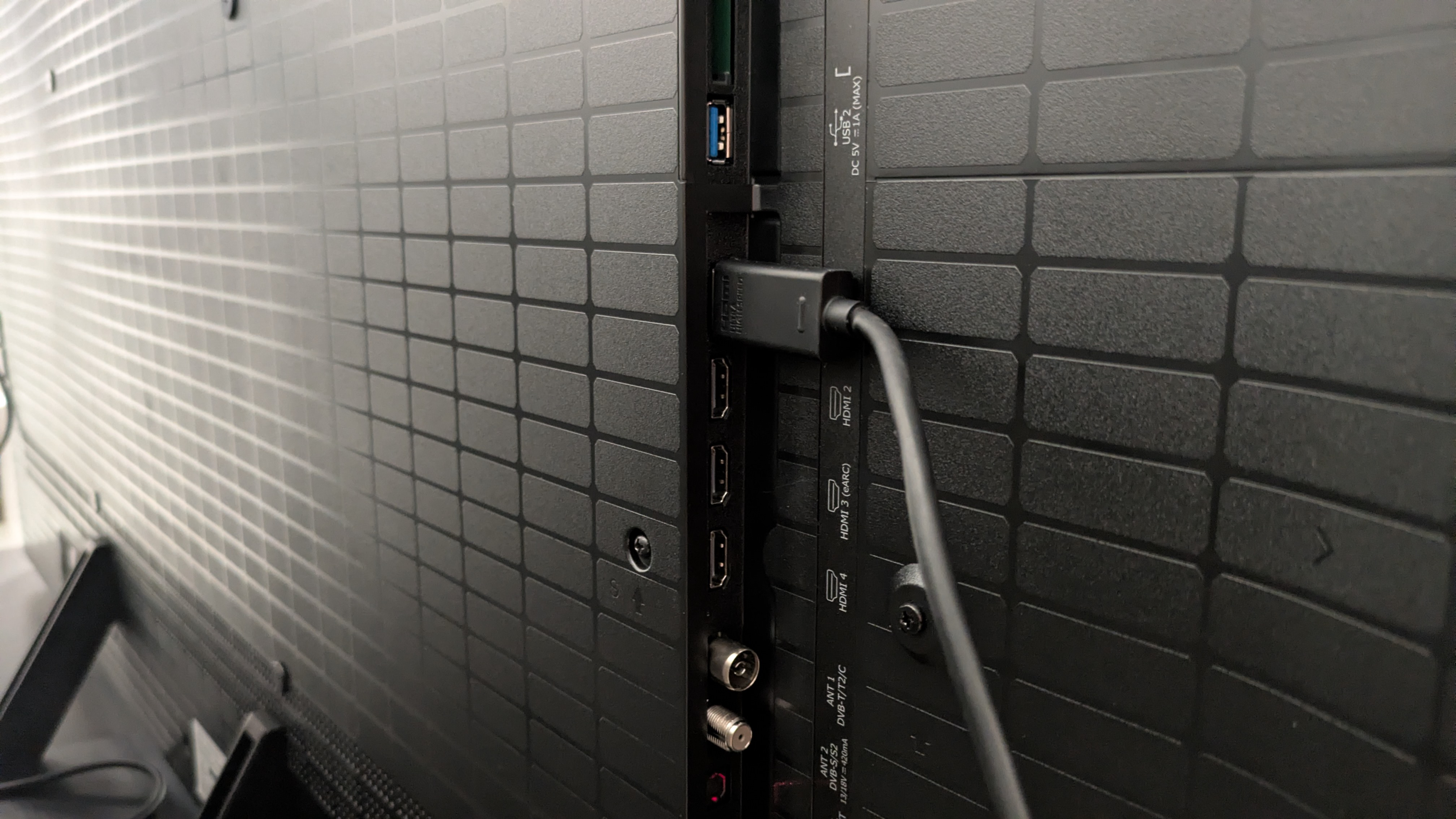
Hisense UR8 ports with HDMI cable connected

The UR8 has four HDMI 2.1 ports (Image credit: Future)
  • RGB mini-LED panel
  • Four HDMI 2.1 ports, up to 180Hz refresh rate
  • Anti-glare screen

The Hisense UR8 is the first affordable RGB mini-LED TV to come onto the market, with the Hisense UR9 taking the flagship spot. The UR8 and UR9 are the first RGB mini-LEDs available in smaller sizes, after the tech's introduction in the Hisense 116UX last year. While the UR9 and UR8 are both significantly cheaper than the 116UX, the UR8 is the more affordable option of the two, although it is still pricier than some standard mini-LED.

RGB mini-LED has a similar setup to standard mini-LED, but instead of purely white LEDs within the TV’s backlight, there are red, blue and green LEDs, which are designed to produce bolder colors and higher brightness than a standard mini-LED in the same bracket. Hisense claims that RGB mini-LED can hit 100% of the BT.2020 color space (more on that below).

The UR8 comes equipped with an anti-glare screen, similar to Samsung’s Glare Free screens. It’s a matte screen designed to reduce distracting, mirror-like reflections, to make viewing in brighter conditions easier.

The UR8 is equipped with Hisense’s Hi-View AI Engine RGB processor, which is designed to help boost color performance, as well as offer AI picture and sound features.The UR8 supports both Dolby Vision and HDR10+ HDR formats, as well as the new Dolby Vision 2 format, though no content is currently available for this format at the time of writing. IMAX Enhanced is also supported.

The UR8 comes with a great list of gaming features, including four HDMI 2.1 ports which all support up to 4K 180Hz (up to 4K 120Hz for consoles), VRR including AMD FreeSync Premium Pro, Dolby Vision and HDR10+ gaming, and ALLM. There’s also a game menu, where settings for brightness boosting can be adjusted.

For sound, there’s a Devialet-tuned, 2.1.2 channel speaker system, totaling 70W of power. Dolby Atmos and DTS: X are both supported, and there are a plethora of audio settings and preset modes to dig into.

Which smart TV system the UR8 uses depends on your region. In the US, you get Google TV, while in the UK and Australia the UR8 uses Hisense’s own VIDAA smart TV. As I’m based in the UK, I’ll be discussing VIDAA. It supports an extensive number of apps, including big hitters like Netflix and Prime Video, as well as BBC iPlayer and ITVX in the UK. It also supports Freely in the UK, which can be used to watch live, broadcast TV over Wi-Fi, without the need for satellite or antenna connections.

  • Features score: 4.5 / 5

Hisense UR8 review: Picture quality

Hisense UR8 with purple waterfall from Elemental on screen. The purple looks vibrant and shiny, with impressive colors

The UR8 delivers some vibrant colors (shown here in a scene from Elemental), but they seem lacking for RGB (Image credit: Disney / Future )
  • Great backlight control
  • Effective anti-glare screen
  • Colors don’t live up to measurements

In terms of brightness, the UR8 hits some interesting numbers. In Filmmaker Mode, it hit a measured peak HDR brightness of 2,097 nits and in Standard, it hit 2,394 nits. These are solid results, and while flagship OLEDs such as the Samsung S99H are now beating this (it hits 2,743 nits peak HDR), it does beat more standard mini-LEDs in its price bracket such as the Samsung QN80H, which I measured at 1,149 nits peak HDR (though this was on the 55-inch model).

Fullscreen HDR brightness is also solid, clocking in at 771 nits and 767 nits in Filmmaker and Standard modes respectively. Where the UR8 delivers more impressive brightness is in SDR Standard, where it hit a peak of 1,514 nits and fullscreen of 778.

The most surprising measurement, though, was the UR8’s HDR color gamut coverage. Not only did it hit 95.1% of the BT.2020 color space, the highest I’ve measured on a TV to date, but it registered a staggering 145.2% of the UHDA-P3 color space, which massively exceeds the high of 100% I registered on the Samsung S95F last year with the same color space.

Looking at these results, I expected colors to be spectacular — and this brings me to my main criticism of the UR8: the colors I saw did not reflect those measurements. When I watched Elemental, the UR8 still delivered punchy, vibrant colors such as Ember’s flame and the blue of Wade’s water, but they didn’t have the pop I was expecting. In La La Land, at the Spring party, Mia’s yellow dress is bright and natural looking, but I’d seen more engaging colors on other TVs.

I found when I compared the UR8 to the Samsung QN80H, a standard mini-LED in the same price range, the QN80H actually delivered bolder colors. Taking the same La La Land scene for comparison, Mia’s yellow dress, the green bushes, and the red outfits of some party-goers all looked much more vibrant on the QN80H. The UR8’s colors looked natural, but lacked that wow factor I expected from an RGB TV.

Hisense UR8 showing Batman on a subway platform. The TV shows strong contrast with good detail

The UR8 has some of the best backlight control I've seen from a mini-LED TV (Image credit: Warner Bros. / Future )

It was a shame the UR8’s colors weren’t as dazzling as I’d hoped, because in other areas, the UR8 shines, especially its backlight control. Standard mini-LED TVs can really suffer from blooming (where light from a bright object against a dark background can create a halo effect around said object), but this wasn’t the case with the UR8, which demonstrated little to no blooming through most tests. Watching the UR8 at more extreme angles did reveal some blooming, but it was better than what I’ve seen on some mini-LED TVs in the past.

Watching The Batman, the UR8 demonstrated solid contrast too, with mostly deep black tones and a good balance between light and dark tones, shown as Batman wanders around the crime scene at Mayor Mithcell’s home, or in the bright lights around the Batcave. I did notice blacks could take on a gray hue in some scenes, but for the most part, The Batman looked good.

I did find that the Dolby Vision Dark picture mode was too dim to watch in a bright room, despite the anti-reflection screen, but worked well in ambient and dimmer conditions. The brighter Dolby Vision IQ picture mode works best for brighter rooms. If you do use Dolby Vision IQ, I recommend dropping the brightness from 50 to 49 and turning off precision detail and super resolution for a more natural-looking image with better contrast.

It was a similar story with Alien: Romulus. The UR8 did a solid job displaying the scenes in space, with good contrast between the light from the moon and the black of space as the crew approached the Renaissance station. The black of space was occasionally gray, but still very good for a mini-LED, backlit TV. Again, backlight control proved to be the UR8’s strong suit.

Hisense UR8 showing Mia dancing on a studio set from La La Land. The UR8 has vibrant colors with nice punch

Textures and details appear crisp in most movies, seen here in La La Land (Image credit: Future)

In all HDR movies, the UR8 delivered crisp textures, with refined detail in people, clothing and objects. The UR8 did a good job showing the intricate textures of the various consoles onboard the mining ship in Alien: Romulus. Close-up shots showed sweat, hairs, and facial details like wrinkles with real clarity as well.

One thing I did find odd was that for non-Dolby Vision content, the Filmmaker, Movie, and IMAX Enhanced picture modes all looked identical. There seemed to be no real difference in brightness, color or contrast — something I would expect from a TV.

The UR8 did a good job with sports. Watching some World Cup highlights on BBC iPlayer, motion was smooth in the default Sports picture mode. While most of the motion styles worked, I found myself using either Clear or Standard. Color enhancer is on by default in this mode, and I personally found the colors too oversaturated, so I turned this off, and colors looked more natural. I did notice there was muddying of textures during very quick camera pans, but for the most part, the UR8 worked well for sports.

  • Picture quality score: 4 / 5

Hisense UR8 review: Sound quality

Hisense UR8 showing the Batmobile from The Batman on screen.

The UR8 delivers solid overall built-in sound (Image credit: Warner Bros. / Future )
  • 2.1.2 channel speaker array
  • Good bass and accuracy
  • Soundstage can be narrow

The UR8 has a built-in 2.1.2 channel speaker array, tuned by Devialet, with a total power of 70W. There are a good number of preset sound modes and settings, but I mainly used Standard and Theater mode for my testing.

Watching the Penguin chase scene from The Batman, the UR8 delivered good bass levels, accurately conveying the loud rumble of the Batmobile’s engine. The UR8 demonstrated good accuracy too, mapping the sound of swerving tires, bullet sprays and the horns of passing traffic to the action on screen with solid precision.

While I typically use Theater mode on most TVs, I found that the UR8’s could get harsh at times, with a sudden brightness that I found distracting. Standard mode was a more than suitable alternative, and although it didn't have as wide a sound field as Theater mode, it was more controlled.

The UR8 delivers solid sound overall, but I did feel its soundstage was narrow, meaning not every element of The Batman scene was given room to breathe. It’s a decent sound system for a TV, but overall I’d still recommend a soundbar to go with it.

  • Sound quality score: 4 / 5

Hisense UR8 review: Design

Hisense UR8 pedestal stand

The UR8 has a safe, solid design, and uses a central pedestal stand (Image credit: Future)
  • Sturdy build
  • Solid pedestal stand
  • Slightly bulkier depth

The UR8 has a functional, safe design. The TV itself feels sturdy when installed on its central pedestal stand, which does feel solid even though it’s made of a plastic material. The TV is slighter deeper than some rivals, such as the Samsung QN80H, but again it feels well built.

As I mentioned above, the UR8 features an anti-glare screen, which does a good job of limiting reflections in brighter conditions. The 65-inch model I tested felt light for its size and it has a trim bezel, although the bottom bezel is thicker than those on the top and sides. Connections are easily accessible on the side of the rear of the TV.

The UR8 comes with Hisense’s own USB-C and solar rechargeable remote, which for me is one of the better controllers on the market. It does feel a bit light, but for me the button layout is logical, and it’s nice to see a rechargeable remote supplied with a cheaper TV.

  • Design score: 4 / 5

Hisense UR8 review: Smart TV & menus

Hisense UR8 with VIDAA home page on screen

Your smart TV will vary depending on region. The UR8 uses Google TV in the US and VIDAA (home screen pictured) in the UK and Australia. (Image credit: Future)
  • Google TV US, VIDAA UK and Australia
  • Good number of picture and audio settings
  • Dated appearance

As I’m based in the UK, I’ll be discussing the VIDAA smart TV platform featured in the UR8 (also used in Australian models). If you’re based in the US, the UR8 uses Google TV as its smart TV platform instead.

VIDAA is a serviceable smart TV system. It supports a good number of major apps including Netflix, Disney Plus and Prime Video, as well apps from UK broadcasters, including BBC iPlayer and ITVX. The home screen offers a lot of content recommendations, but there's also a large banner space at the top of the screen for ads, which can be distracting.

The menus are neatly and logically laid out, with most settings easy to find. Response times when navigating these menus is good too. There are plenty of settings for adjusting both the picture and sound, although I didn’t use a lot of them.

VIDAA does, however, look a little dated, especially in the menus. It doesn’t have the sleekness of Samsung’s Tizen or Google TV, or the simplicity and color of Roku. Secondly, as someone who does change settings a lot, a pop-up eco warning appears every time and this can get frustrating; and there seems to be no way to turn it off.

  • Smart TV score: 3.5 or 4

Hisense UR8 review: Gaming

Hisense UR8 with shot from Battlefield V on screen, with game menu along the bottom

The UR8 has an excellent choice of gaming features, and delivers solid gaming performance (Image credit: Future)
  • Near-full suite of features
  • 11.7ms input lag (with the right settings)
  • Up to 4K 180Hz refresh rate supported

The UR8 is actually very well equipped for gaming. It has four HDMI 2.1 ports that support 4K up to 180Hz (4K 120Hz for consoles is supported), VRR including FreeSync Premium Pro, both Dolby Vision and HDR10+ gaming, and ALLM.

To get the lowest input lag time, which I measured at 11.7ms in 4K 60Hz, you do have to mess around with some settings. Having put the UR8 into Game mode, I then had to turn on a refresh rate feature, which prioritized faster frame rates, and this is how I got the above result. Without adjusting those settings I measured the input lag time at 20ms, above the 15ms threshold we look for in testing.

Playing Battlefield V in 4K 120Hz, actual gameplay felt smooth, and the UR8 did a good job handling fast-moving action sequences like a shootout in a desert mission. The overall picture quality was good, with high brightness, bold color and solid contrast. I did notice that, during particularly quick camera pans, some textures could muddy, but this didn’t happen every time.

  • Gaming score: 4.5 / 5

Hisense UR8 review: Value

Hisense UR8 remote

(Image credit: Future)
  • Great value in the US and Australia
  • Overpriced in the UK
  • Overall good performance for the price

Value is a tough attribute to grade for the Hisense UR8. As RGB mini-LED is still in its infancy (having only been introduced in 2025, and only come to smaller screens for the first time this year), I did anticipate that RGB TVs would be pricey, even more entry-level models like the UR8.

With the UR8, it all comes down to where you are. When it's on sale, you can pick the 65-inch model up for $1,499 in the US, and prices are only going to drop. This puts the UR8 in direct competition price-wise with standard mini-LED, giving people looking for a TV within that price range more choice. It's also good value in Australia, with the 65-inch launching for AU$2,495, which translates to $1,799 / £1,299. I expect prices in Australia to come down reasonably quickly too.

The same can’t be said for the UK, unfortunately. The 65-inch launched recently at £2,299, which is actually pricier than the LG C6 OLED — and while RGB is meant to be a direct rival to OLED, as I've mentioned, it’s not there yet. I have seen the UR8 drop to £1,999 at some retailers, but this is still OLED-level pricing.

Overall, the UR8 does deliver pretty good value for money. It’s got a good feature set, delivers decent built-in sound, and is good for gaming, and while the picture doesn’t quite deliver what I’d hoped for, it’s still solid compared to most mini-LED. It’s just a shame that the value proposition is region-dependent.

  • Value score: 4 / 5

Should you buy the Hisense UR8?

Hisense UR8 with peacock feather on screen. Image has good detail and brightness while handling reflection well

(Image credit: Future)
Hisense UR8

Attributes

Notes

Rating

Features

A great list of features, especially for gaming

4.5/5

Picture quality

Detailed picture with good contrast and backlight control, though colors don't have the RGB wow-factor

4/5

Sound quality

Solid built-in sound with good bass and clear speech, but soundstage can be narrow

4/5

Design

Sturdy build and safe design. Slightly bulkier than other TVs

4/5

Smart TV and menus

Google TV (US) or VIDAA (UK/Aus) smart TV. Plenty of useful settings, but design is dated

4/5

Gaming

Near-full suite of features, including four HDMI 2.1 ports, with very good performance

4.5/5

Value

Affordably priced for RGB in US and Aus; overpriced at launch in the UK

4/5

Buy it if...

You want a mini-LED with good backlighting
The UR8's backlight control is great, meaning darker movies show less blooming and viewing angles are improved.

You want a great TV for gaming
The UR8 has a near-full suite of gaming features, and offers very good overall performance once you've adjusted some settings.

You want a good TV for daytime viewing
The UR8 has an anti-glare screen that's good at reducing mirror-like reflections in brighter rooms.

Don't buy it if...

You want the best of RGB mini-LED
While the UR8's picture quality is good overall, its colors don't match my test measurements, lacking the vibrancy I'd hoped for.

You like variety in your movie picture modes
The UR8's three movie picture modes — Filmmaker, Movie, and IMAX Enhanced — all look pretty much the same.

You want the best TV for motion
I noticed during some of my testing that textures could blur during fast-paced action, meaning some detail was lost in games and sport.

Also consider

Hisense UR8

Hisense UR9

Samsung QN80H

LG C6

Price (65-inch)

$1,499 / £2,299 / AU$2,495

$1,699 / £2,299 / AU$3,499

$1,599 / £1,299 / AU$1,999

$1,799 / £2,299 / AU$3,499

Screen type

RGB mini-LED

RGB mini-LED

Mini-LED

OLED

Refresh rate

120Hz (Up to 180Hz)

120Hz (up to 170Hz)

144Hz

165Hz

HDR support

Dolby Vision, HDR10+, HDR10, HLG

Dolby Vision, HDR10+, HDR10, HLG

HDR10+, HDR10, HLG

Dolby Vision, HDR10 and HLG

Smart TV

Google TV (US) / VIDAA (UK/Aus)

Google TV (US) / VIDAA (UK/Aus)

Tizen

webOS 26

HDMI ports

4 x HDMI 2.1

3 x HDMI 2.1

4 x HDMI 2.1

4 x HDMI 2.1

Hisense UR9
The step-up model from the UR8, the UR9 delivers higher brightness, more dimming zones and bolder colors. It's also the same price as the UR8 in the UK at the time of writing. The UR8 is the better choice for gamers with multiple consoles, however, as the UR9 only offers 3 HDMI 2.1 against the UR8's 4.

Samsung QN80H
A standard mini-LED, the QN80H isn't as bright as the UR8, and its backlight control isn't as good, resulting in more blooming than the UR8. Side-by-side however, the QN80H does seem to deliver bolder, punchier colors than the UR8.

Check out my Samsung QN80H vs Hisense UR8 comparison

LG C6
The LG C6 is an OLED with deeper blacks, bolder colors and better motion handling than the UR8, while the UR8 offers higher brightness for better bright-room viewing. In the US and UK, the C6 is priced very similarly to the UR8, but in Australia, the C6 is closer to the step-up UR9 in price.

Read our full LG C6 reviewView Deal

How I tested the Hisense UR8

Hisense UR8 with testing equipment attached for measurements

(Image credit: Future)
  • Tested over two weeks
  • Tested in different lighting conditions in lab
  • Measurements taken using Portrait Displays' Calman color calibration software

My first step in testing the Hisense UR8 was to establish the best picture modes for critical testing, and I landed on Filmmaker Mode and Cinema mode (which admittedly looked very similar).

I then used reference scenes to test the UR8's picture quality, focusing on brightness, color, detail, upscaling, contrast and backlight control. I used a couple of these same scenes to test the TV's built-in speakers.

I also used an Xbox Series X to test the TV's gaming features and performance, playing Battlefield V.

Apart from objective testing, I took measurements of the UR8 using specialized equipment. This included a Jeti Spctral 15VA Spectroradiometer and Klein K-10A colorimeter (with both meters profiled together), with a Murideo Six G 8K Metal test-pattern generator. I took measurements using Portrait Displays' Calman color calibration software.

The first measurements I took were the UR8's brightness, in both SDR and HDR. I used white window patterns in sizes ranging from 1-100%, with peak (10%) and fullscreen (100%) windows serving as the primary focus. I took measurements in the UR8's Standard and Filmmaker Mode pictures modes.

After this, I measured the color and grayscale accuracy (in SDR), focusing on the Delta-E values (the margin for error between the test signal sent and what's displayed on screen).

Next, I measured the UR8's HDR color gamut coverage, focusing on the BT.2020 and UHDA-P3 color spaces.

I also measured the UR8's HDR EOTF in 1,000, 4,000 and 10,000 nits. This shows the UR8 accuracy at both light and dark levels. I also tested the UR8's spectral power distribution, which demonstrates color performance.

Finally, I tested the UR8's input lag time using a Leo Bodnar 4K HDMi Input Lag Tester.

Read our in-depth overview of how we test TVs at TechRadar.

  •  

A Rare Iron Age Marsh Fort Is Being Excavated Again After 40 Years

Archaeologists have returned to a rare Iron Age fort in Shropshire that sits in a wetland landscape rather than on a hill. The University of Birmingham has begun a new, ten-year project at Wall Camp near Telford, reopening a site that had not seen a major excavation since the 1980s. The first three-week season took […]

The post A Rare Iron Age Marsh Fort Is Being Excavated Again After 40 Years appeared first on Curiosmos.

  •  
❌