❌

Normal view

Advertising Cognitive Dissonance

24 July 2026 at 19:09

John Gruber (Mastodon):

This to me is proof that Apple leadership is suffering from cognitive dissonance over their slide into advertising. They’re conflating cause and effect. The Apple brand stands for high-quality superior user experiences because the devices and software Apple makes traditionally deliver high-quality superior user experiences. The work Apple ships is what makes the brand what it is. But now they’re stricken with the mindset that it’s the Apple brand that makes something a high-quality superior experience.

[…]

If you refuse to admit that the ads make these services worse, you also can’t admit that there’s a reason to offer an ad-free experience. So the thinking is something like “Apple always focuses on the user experience, and never deliberately makes the user experience worse. Therefore, if an Apple service shows ads, those ads are high quality and don’t detract from the quality of the product or the experience of using it. Therefore, there’s no reason to offer users a paid ad-free tier, because there’s no reason to want to avoid Apple’s ads.”

What a brand stands for can change over time. It’s eventually determined by the products, not the mantras.

  • “It just works.”
  • “A thousand no’s for every yes.”
  • “What happens on your iPhone, stays on your iPhone.”
  • “Music runs deep in Apple’s DNA.”
  • “Design is how it works.”

Manton Reece (2010):

I feel bad admitting it, because some of my friends are betting on iAd revenue to feed their family, but I’m just not on board with Apple running an advertising network. I don’t want to see ads in my apps, and I don’t want Apple to ever lose even a little of what it means to be a product-driven company.

Previously:

Update (2026-07-28): John Gruber (Mastodon):

The whole thing is funny because at a fundamental level we all just know in our bones that Apple never even considered putting “Intel Inside” stickers on Macs.

[…]

Apple still treats its hardware with that level of respect. With reverence. iPhones don’t even say “iPhone” on the hardware. No model or serial numbers. No small print. Just an Apple logo on the back.

[…]

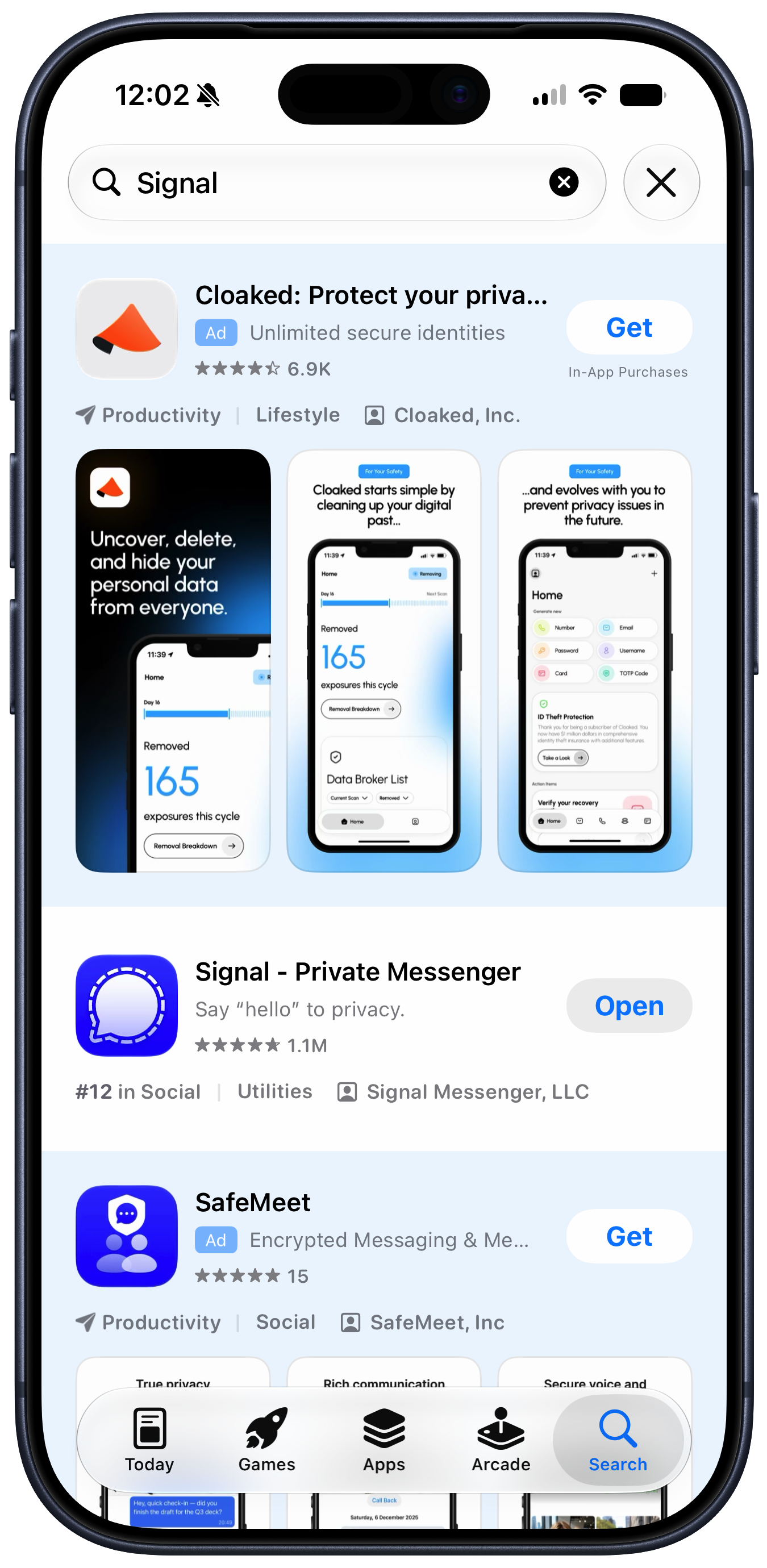
Putting themselves in customers’ shoes today, how many ads do Apple’s executives want stuck in the results when they search for an app in the App Store? We know the honest answer. But the answer evidenced by the actual App Store is “Two really big ones, including one in the first spot.”

At least you could peel off the stickers.

Jason Snell:

While Apple can spin adding ads to Apple Maps as a revolutionary new way for businesses to be discovered, it’s telling that its initial announcement was hidden inside a press release about an entirely different product, and introduced as “Enhanced Discoverability in Apple Maps.” Those choices show that this isn’t something Apple is actually proud of—and that the people in charge of communicating and explaining Apple’s decisions to the world are at odds with those who are making the decisions about expanding revenue.

[…]

To this day, you’re confronted with an ad for Creator Studio every time you create a new document in those apps, and their default toolbars contain buttons that won’t work unless you subscribe to the bundle. As a result, Apple has essentially turned its free productivity suite—software that was designed to enhance the inherent value of Apple’s products—into a freemium package with upsell to a creative professional subscription bundle that’s irrelevant (and a terrible value!) for most of its existing users.

[…]

There are many more examples. Using notifications to promote subscriptions and badging the Settings app to push AppleCare plans are among the ways Apple has chosen to intervene in the user experience to drive revenue. I’m actually not opposed to the idea that Apple should communicate opportunities for its customers to get more out of their devices—but it should be careful not to cross the line into actively annoying those customers. If someone doesn’t want to see what you offer, you need to accept that and go away—not keep needling them. Apple often falls on the wrong side of that line.

[…]

It makes me wonder if the people making these decisions at Apple have lost track of the Apple brand and what it stands for.

John Gruber:

What Snell’s column makes clear is that the incremental revenue Apple is gaining from putting shitty ads in its software comes at a price. They’re withdrawals from Apple’s brand equity. And I would argue that the value they’re detracting from the brand far out-values the dollar amount they’d padding to Apple’s bottom line.

[…]

If your competitors’ stores all smell like dogshit, don’t aim to have the store that smells the least like shit. Aim to have a store that smells pristine. “Our stores only carry a vague whiff of dogshit” is not insanely great.

Hotelling’s Law, like I was saying.

Adam Chandler:

This is not an “update”. This is an advertisement.

Update (2026-07-29): John Gruber:

The people haven’t changed, but Apple has. Strong leaders inevitably shape the personality — the spirit — of organizations over time. Apple in 2011 was peak Steve Jobs Apple. Apple in 2026 is peak Tim Cook Apple. But it was Cook who popularized the “you’re not the customer, you’re the product” argument against “free with ads” online services. But that was in 2014.

Marcin Wichary:

“Slippery slope” is a perfect term. But I wanted to add something here. In my experience, in the realm of UI, there is no middle notch. I’ve seen it time and time again… the moment you open the door to One, Infinity starts exerting its pull[…]

Previously:

Update (2026-08-03): Jon Snader:

I HATE, HATE, HATE having ads pop up when I’m trying to do something else. It’s bad enough on Web sites where at least they have the excuse of having to make money some how but it rises to intolerable when they put them up on a device I’ve already paid for.

The annoyance is reason enough to dislike Apple’s ads but for me the worst thing is that they’re corrupting and inevitably lead to the user being replaced by the advertiser as the customer.

Update (2026-08-05): John Gruber:

Only search engines that agree to pay Apple for the traffic are in the list, and there’s no option for users to add custom ones.

Tyler Hall:

It says a lot about modern Apple that I can’t find an unsubscribe link in this marketing email.

John Gruber:

Apple News ads have been going down the toilet for years, but it didn’t used to be literal.

Study Finds Cannabis Branding Could Attract Youth Despite Regulations

16 June 2026 at 13:57

In recent years, the landscape of cannabis consumption has undergone a significant transformation, with edible cannabis products rapidly gaining popularity among adult consumers. Unlike traditional cannabis forms such as smoking or vaping, edibles—ranging from gummies and chocolates to beverages—often resemble familiar and colorful snacks commonly found in grocery stores. This resemblance, while appealing to adult users, raises concerns about the inadvertent attraction of underage consumers to these products, posing a complex challenge for regulators who aim to restrict youth access while ensuring legal adult availability.

A pioneering study conducted by Washington State University shines a critical light on this issue. The research specifically examines how design elements of cannabis edible packaging, even when compliant with stringent state regulations, may still captivate the attention of teenagers and young adults under the legal age limit. Involving a sample of 454 participants aged between 13 and 20, the study revealed that over 80% of these young individuals found certain cannabis products—particularly gummies and candies—intriguingly appealing, despite the packaging adhering to Washington State’s current legal standards.

This research builds substantially on prior work that indicated adolescents’ favorable perceptions of cannabis edibles stemmed largely from their resemblance to everyday snacks and health food items. What differentiates the current study is its granular analysis of specific visual cues within the packaging that drive youth appeal. Funded by Seattle & King County Public Health and the Washington State Liquor and Cannabis Board, the investigation deployed innovative visual attention tracking methodologies to decipher exactly which features commanded the gaze and interest of the younger demographic.

The methodology involved surveying two distinct age groups: 149 teenagers aged 13 to 17 and 305 young adults aged 18 to 20. Participants were shown high-resolution images of five cannabis edible products legal in Washington State, spanning categories such as gummies, chocolates, pretzels, candies, and cannabis-infused sodas. Using hotspot analysis—where participants clicked on packaging areas they found most captivating—the researchers obtained precise data pinpointing the predominant design characteristics that ignited youthful curiosity and interest.

Analyzing the aggregated data revealed a strong predilection towards colorful logos, prominently displayed brand names, bold typography, and graphical elements mimicking familiar food imagery. These features dominated visual attention, far surpassing regulatory-mandated components like warning labels, ingredient lists, and nutritional information, which attracted minimal engagement from younger viewers. This disparity underscores the profound influence of branding aesthetics over informative content in shaping youth perceptions.

One particularly illuminating discovery pertained to the power of logos and brand identity. Despite compliance with existing regulations, certain branding elements resonated strongly with the youth cohort. A notable example is the turtle logo on a cannabis chocolate package, which, although meeting all state packaging requirements, was repeatedly highlighted by participants as an eye-catching feature. This finding calls into question the sufficiency of current regulations in mitigating youth appeal derived from brand-associated imagery.

Researchers emphasized that branding plays a pivotal role in how adolescents interpret packaging designs. According to Jessica Fitts Willoughby, a professor involved in the study, teenagers often do not distinguish between various package design elements and the intrinsic identity of the brand itself. Instead, they interpret logos, colors, and symbolic images as features that potentially appeal to underage users, complicating regulatory efforts aimed at limiting youth attraction solely through prohibiting overtly child-oriented design elements.

Washington State regulations already prohibit cartoons and bubble-letter fonts on cannabis product packaging to reduce youth appeal. However, the study’s data demonstrated that participants frequently identified colorful logos, playful fonts, and other visually dynamic branding features as appealing, even when these aligned with regulatory frameworks. This suggests an evolving understanding among underage consumers that the allure of branding can transcend explicit design prohibitions, highlighting a critical regulatory grey area.

This issue mirrors historical regulatory challenges faced in the tobacco industry, where decades ago, companies employed cartoon mascots such as Joe Camel to market cigarettes, sparking public health backlash. The eventual removal of such imagery resulted from concerns that these mascots disproportionately attracted children. While cannabis regulations have already banned cartoons, the current findings indicate that subtler branding cues may sustain youth interest despite such restrictions, necessitating a nuanced regulatory reassessment.

Lead author Stacey J.T. Hust points to a disconnect between regulator expectations and adolescent interpretations of packaging visuals. The research suggests that regulatory language is not fully capturing the nuanced way adolescents process visual stimuli on cannabis packages. A more informed regulatory approach would integrate adolescent perspectives, ensuring that interpretations of “youth-appealing” packaging align with how these products are genuinely perceived by underage individuals.

The findings hold profound implications for future regulatory policy development and public health strategies. By incorporating youth feedback into regulatory design criteria, policymakers can better anticipate and address visual elements that sustain youth interest while preserving adult consumer access. This balance is crucial for minimizing unintentional underage cannabis exposure and consumption without curtailing the legal adult market.

Furthermore, the study advocates for ongoing dialogue between researchers, regulators, and youths to continuously refine the understanding of how cannabis packaging influences youth behavior. Such collaboration will be vital as the legal cannabis marketplace evolves, ensuring that prevention efforts remain adaptive and effective in mitigating risks associated with youth appeal.

In summary, this Washington State University study underscores the complex interplay between cannabis packaging design and youth perception. Despite compliance with state regulations intended to reduce youth appeal, specific branding and design attributes continue to attract significant attention from underage demographics. This calls for a sophisticated reevaluation of packaging standards—one that incorporates adolescent perspectives and adopts a scientifically informed approach to limit the inadvertent allure of cannabis edibles to minors.


Subject of Research: Youth perception of cannabis edible packaging design and regulatory implications.
Article Title: Appealing to Whom? Identifying Design Features on Cannabis Edible Packaging That Attract Underage Consumers.
News Publication Date: 9 June 2026.
Web References: DOI:10.1016/j.drugpo.2026.105355
References: International Journal of Drug Policy.
Keywords: Cannabis edibles, youth appeal, packaging design, branding, regulatory compliance, adolescent perception, public health, visual attention, hotspot analysis.

❌